Concept Collection 12
/New set of concept art for you this evening.
Keep them coming! Send in your work by email to have it included in a future post.
New set of concept art for you this evening.


Keep them coming! Send in your work by email to have it included in a future post.
Got a new set of concept art for Trade Deadline Day.


That Panthers logo is a little frightening. Your thoughts?
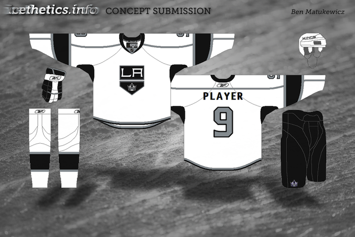
As the title would indicate, with today's concept post on this the first Hockey Day in America, we're sticking to the Eastern Conference — but not excluding Canada. Been receiving a lot of really creative artwork lately that should garner some interesting feedback.
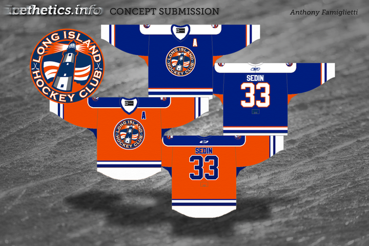
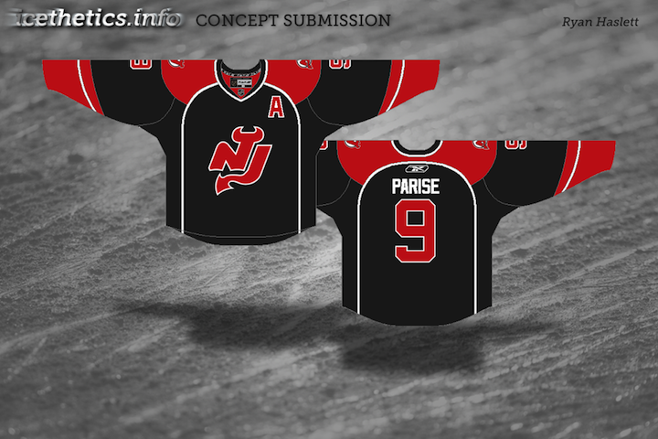
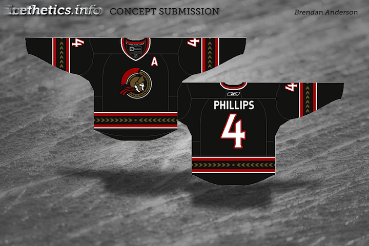
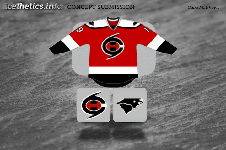
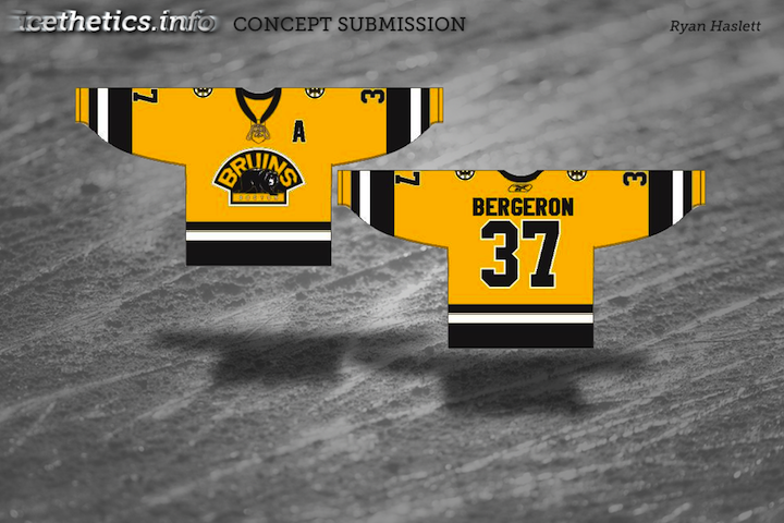
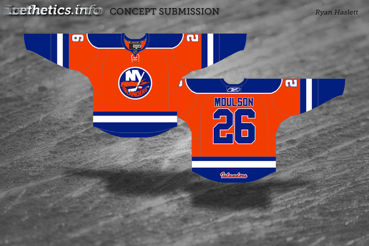
So let that ruminate a bit. Long Island Hockey Club... a more overt NJ... and so on. Then leave your feedback in the comments. One thing, though...
At the moment, comments on concept posts are unmoderated. I'm trusting you guys. Please remember that these artists spent time and creativity on the work above. If you don't like it, you're entitled to that opinion, but please be thoughtful when unleashing it on the world. Be constructive with your criticism or don't offer any. Especially if you've never submitted work yourself. Just some things to keep in mind.
You guys weren't impressed with Sunday's crop of Ducks concepts, so let's try something a little different. These are all designs I think you might actually like.
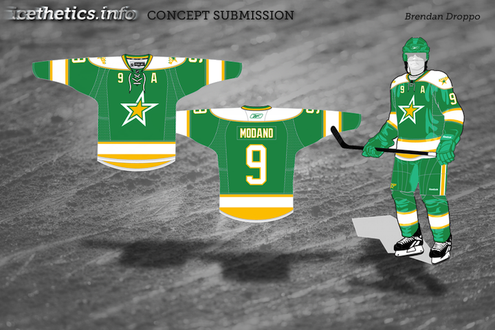


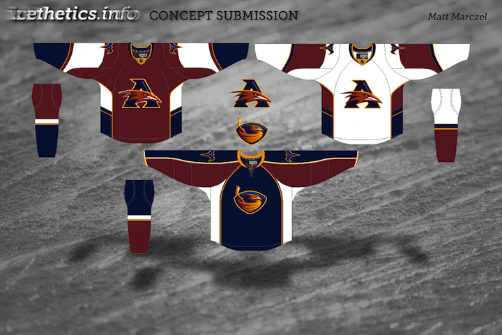
Keep the artwork coming! My email address is in the Quick Links box at the top of the page.
Concept art took a bit of a backseat this week as I prepared the re-launch of the new jersey galleries. I think it's one of the best features of Icethetics. Today's new batch of artwork is all about the Anaheim Ducks.

Hadn't thought of turning the webbed D into an A before. That's interesting. But what if the Ducks brought back the purple instead of playing up the orange?


This last one by Mike is your typical cookie cutter third jersey as of late. Stick your logo in a circle, wrap the team name around it, and add some retro striping. How hard can it be?
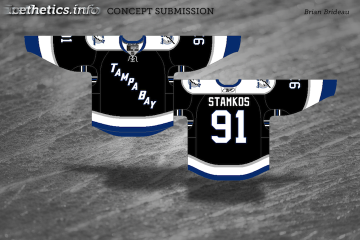
The Lightning's new identity has been controversial, as we all know. So once again, Icethetics concept artists are trying their hands at improving it. You be the judge.


I think that wraps up the Tampa Bay concepts — for now.
No theme today, just another random assortment of concept art here.

Up first, Mike Ivall provides his take on a 2012 Winter Classic possibility. Rumors have suggested the game could be played in Philadelphia or New York next year.

Dallas Stars concept removed at artist's request


By the way, the Lightning concepts just keep streaming in, so I imagine that'll require another post or two in the near future. That's all for now.
The Tampa Bay Lightning unveiled new logos and uniforms today. It brought a surprisingly divisive reaction — some saying the changes were too drastic and oversimplified, others saying it's exactly the kind of look the NHL needs. So let's see what some Icethetics concept artists think would be ideal.

To start, Jacob merely took the uniforms the Bolts actually unveiled today and reconfigured the placement of some of the logos. I like the bolt on the pants, but I prefer the actual jersey crests, myself. Here are some other ideas...


So what do you think? Is anything here an improvement on what the Bolts actually unveiled today? Or did they get it right already?
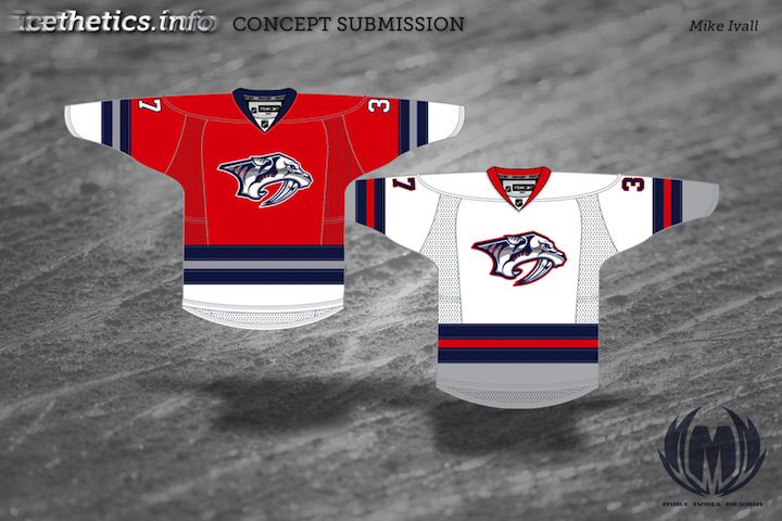
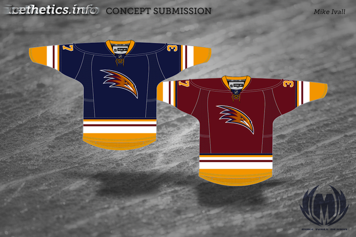
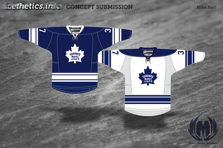
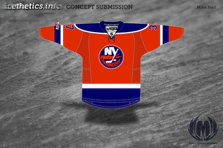
I've got a handful of new concepts to share from Mike Ivall. He's tackling Predators, Thrashers and Islanders as well as revisiting the Bolts and Leafs.
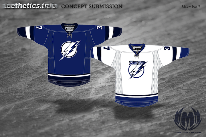
Knowing the Lightning are looking to ditch the black and silver and go with a blue/white color scheme, Mike thought perhaps they might try a two-tone blue. Personally, I'm a fan.
A lot of you have been asking about how to make your own concept art. Unfortunately, there's no simple or quick way to throw stuff together. Most of the designers who submit work are very talented graphic artists with knowledge of image editing software. If you want something free to get started, look up something like Gimp or Inkscape. I'd love to put together some kind of tutorial, but it's not really that simple. I will try to get together some templates at some point though. So keep an eye out for that.
The newly reformatted concept art has been quite a popular feature lately. I can't remember the last time these posts have had so much feedback on a consistent basis. So let's keep it rolling. I've got another mish-mash to share this morning.


Paul had a similar idea to Mike Ivall's concept from the last post. Once again, there's just something about that color combination for me. The Cats can keep the light blue as a trim color so long as they keep the red. That's my decree.


Coming up this week: Mike Ivall has sent in enough new artwork fill another post. He's been working hard lately. He's covering the Preds, Isles and Thrashers among others.
Long time concept contributor and friend of Icethetics, Mike Ivall has caught the creativity bug, eager to express himself with jersey artwork. And I think that's something we're all happy to hear. Over the last few days he's immersed himself in the following designs.

After the St. Pete Times shared some new details on what the Lightning may be planning for their upcoming uniform redesign, Mike took a stab with some familiar elements. The lack of any black or silver does squarely put the look in Maple Leafs territory, which I'm not wild about. But you never know what Stevie Y has up his sleeve (i.e.: Dwayne Roloson).

I don't know what it is about this color combination but I absolutely love it. I saw Mike's concept and it's made me want to completely redesign Icethetics again — in these colors. The two-tone blue is all right if not overused these days, but add the red and suddenly it's completely unique. Anybody else with me on this?

How can Ottawa improve upon this? It's simple. They can't. Do this and the Senators will never need another jersey for the next century.


As usual, Mr. Ivall's work is outstanding and worthy of a post all to himself. And I can assure you there is more coming not only from Mike but many other talented artists as well.
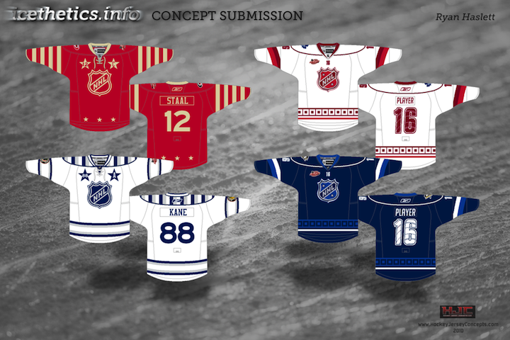
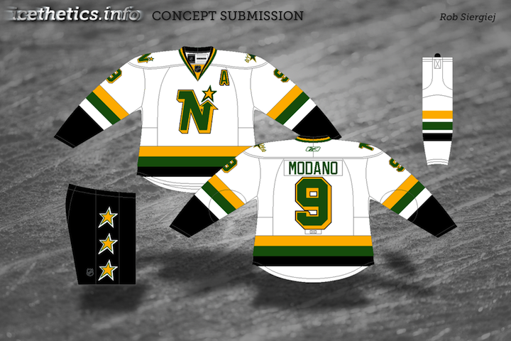
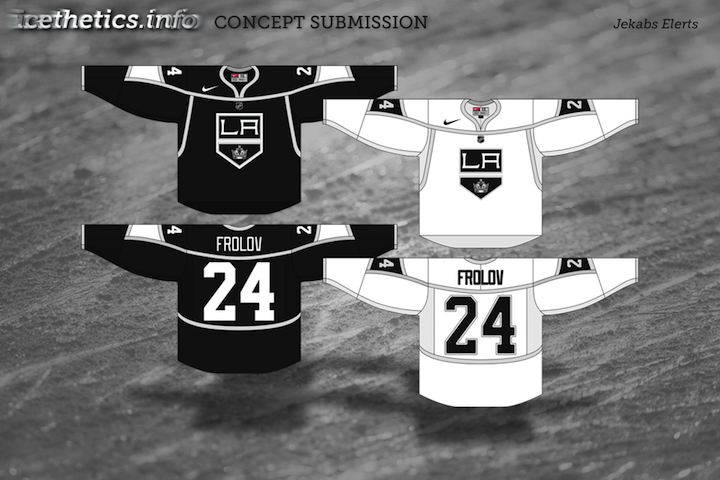
Continuing with the new concept art format. Seems to be getting good reviews. Today brings a handful of great designs by some Icethetics regulars.


If you recognize the logo in Ryan's Capitals concept, you're not alone. It's not an original design. In fact, it's a logo commissioned by the Capitals years ago but never used. It was included in a post a couple years ago about lost logos registered with the patent office but later abandoned.
I'm testing out a new format for concept posts. It features a standardized look for all submissions as well and limited commentary from me. Some posts will still have a particular theme, but from now on, most will just be a hodge-podge of whatever's in the Icethetics inbox. Feel free to leave your thoughts in the comments.
I know I said the last Connecticut Whale concepts would be the last. But Ross' attempt was too good not to share. We always talk about logo simplicity. This is one of those great designs that you can see a kid drawing on his notebook.
Unfortunately, this new format doesn't yet include ratings but I'm sure the artists will appreciate your feedback in the comments. Just added ratings. Enjoy!
The Connecticut Whale concepts continue pouring in at a slow but steady pace. I'm starting a new post tonight to share them with you.
 Caleb Fuller Caleb Fuller
We'll begin this set with the only one that's actually made me laugh out loud as I perused my inbox. Caleb took his inspiration of the infamous Twitter fail whale. And the execution is an absolute riot. As if the crest alone weren't enough, he's created the sweater from a combination of elements from some of the worst NHL uniforms in recent history — namely the Sabres and Senators. This may have been a joke and doesn't "fix" anything, but it wins for the laugh factor as far as I'm concerned. |
 Brendan Klein Brendan Klein
Next, Brendan has gone in a new direction while still keeping the spirit of the old Hartford Whalers. I don't think it needs an explanation as the logo pretty much speaks for itself. But I'm not sure I'm a fan of the white jersey's complete lack of blue. But maybe I'm alone there. |
 Christopher Lewis Christopher Lewis
Finally, Christopher came up with a fix that simplifies the idea of a logo built around a C for Connecticut. He shows you don't have to draw a cartoon to do it. And I like that. Still, I can't help but feel like the logo is more of a fusion of the Whalers and New Jersey Devils. The pointy tail just looks a little demonic. |
Later this week I'll have new concepts, including some All-Star designs. I think we've put the Whale subject to bed at this point.
I know I said the last set of Whale concepts would be the last set. But you guys kept emailing in your work. And it would be terrible of me to ignore it. So here's some other artwork that came in this week.
 Jonathan Sparks Jonathan Sparks
Jonathan put in a great effort with newly designed logos. I particularly like the new primary mark on the dark sweater. It's a great play on the New York Rangers' old Lady Liberty logo. It's the perfect mix between the Whale and their NHL affiliate. Regarding the secondary mark on the green jersey, I'll let Jonathan explain: "I was just looking online for inspiration and came across the Hylian shield from the Legend of Zelda and came up with the secondary logo." He also created a white sweater which is the inverse of the blue one. It's nice to see the Hartford Whalers colors and striping intact on this effort. One of my favorites. |
 Craig Mazuchowski Craig Mazuchowski
Craig may not have the logo design chops of some of our other designers, but it's hard not to like where he's going — simplicity. Often when we talk about a team with a good history, we like to see them in something isn't too complicated. And this fits the bill. Though if it were me, I'd make the establishment date 1972. I know the Connecticut name is new, but why not go all the way back to the WHA and celebrate the spirit of the Whale? |
 Dallas Hicks Dallas Hicks
Dallas has also gone with a simpler approach, but for me to describe his work wouldn't do it justice. So here's what he says about the jerseys: "It’s one thing for me to say that the Connecticut Whale jerseys are craptacular, but I figured I’d put my money where my mouth is and try to do better. This is close enough to classic Whalers while still different enough to establish a new identity. The green is more of a “sea green” but it’s different and clean. The third jersey uses the navy blue as a primary with the gray taking a bigger role." And regarding the logo, Dallas explains: "The front of the whale forms the C while the tail creates a negative space T. The spout of water is (roughly) in the shape of the state. |
 Anthony Colson Anthony Colson
And lastly, Anthony has used good old Pucky and the classic Whalers "W" to create a "C" in the negative space for his logo. I lauded previous designers for simplified work but I think this one is a bit oversimplified. While something like this may have worked in the 1970s, we are now a decade into the 21st century and the kids just don't respond to this. (Nor should they respond to mad, toothy whales carrying hockey sticks.) |
That should wrap things up for real. We'll find a new topic for the next set of concepts.
In a recent blog post about the miserable failure that is the branding of the AHL's Connecticut Whale, I put out the call for Icethetics concept artists to improve it. Here's what they came up with.
What do the rest of you think? Are any of these the way to go or is the Whale better off with what they have? Weigh in, and if you have a concept of your own, email it in and I'll add it to this post.
Still taking Connecticut Whale concept art if you've got any improvements.
Again, keep the concepts coming. I'll have more posted soon.
Last week, fans rallied to bring the NHL back to Quebec City. So let's look at some Quebec Nordiques concept art this afternoon.
Email in your concept art and it may well find its way onto this very page.
Hey, looks like it's time again for our monthly concept post. Really sorry about that, but as I've said, the blog and logo tournaments come first because that's what most people seem to be interested in — though I recognize there's a core group here that just can't get enough concept art. This one's for you.
Today's theme deals with the future — our designers taking a stab in the dark at what could be. Bookmark this page. We'll see how close they get.
Until next time... (which I do hope to be sooner than a month from now.)
Today's batch of concept art deals with a handful of teams with new sweater designs on the way. While we wait for official unveilings, our concept artists get to work on some predictions of their own.
As always, feel free to email in concepts. I'm working on adding a bunch more to the Facebook page this weekend.
They say fashion is cyclical. Trends come and go and come around again. In the NHL, we seem to be re-entering a retro phase. Throwback jerseys have always been popular with fans, but it seems only in the last few years have teams started to take advantage of that. Classic designs that bring history back to life have started making their way back into the mainstream, in the form of alternate jerseys and special events such as the Winter Classic.
So "retro" is the theme of today's post. Let's see what our artists have come up with.
By the way, I have lots of new concept art ready and waiting. Someone needs to stay on me about keeping this page updated. I'm very forgetful.
Has it really been seven weeks since the last concept post? Unacceptable. Yes, there have been a lot of blog and tournament updates. And yes, I've been busy lately. But seven weeks is a long time. So I'm going to try some new things to keep the concepts flowing.
Since getting this page updated is lower on my list of website priorities due to the time/effort required, I'm going to start adding new concept art to our brand new Facebook page on a regular basis to keep everyone satisfied. However, I will continue to save some items to be showcased here on the site.
So I'm taking some time out this holiday weekend to post a handful of new work. Most of the concepts sent in tend to be a slight re-imagining of a team's uniform. Usually some stripes are rearranged or colors changed. But every so often, an especially creative concept appears. That's today's topic.
I'm shooting for concept updates on a weekly basis, but that may be too much to ask for. Just know that I'm doing the best I can. I'm assuming things will quiet down on the news front as the summer goes on, which will allow more time for concept posts.