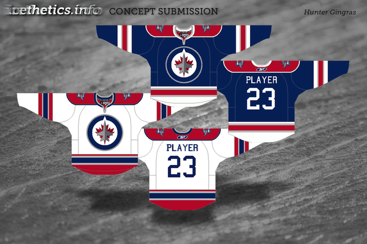
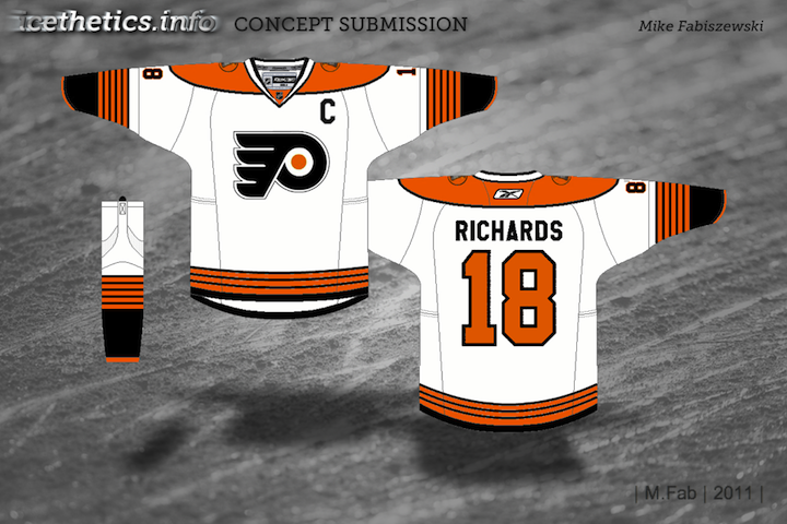
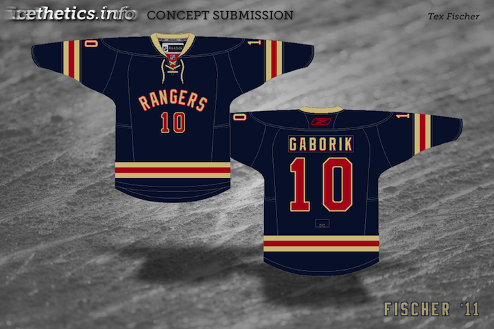
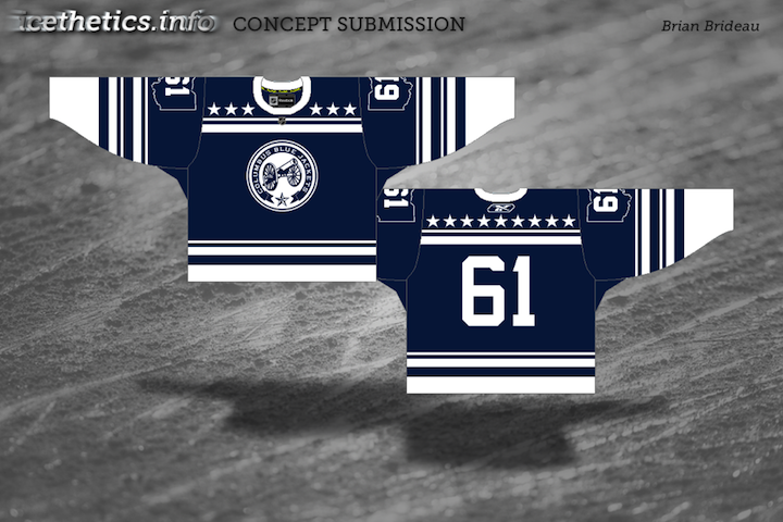
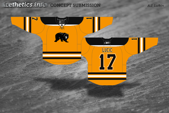
Concept Collection 50

I wanted the 50th collection to be something special. Instead, it's just something to fill the gap so we don't go a full month without concept art. I've been keeping busy lately, blah blah, you already know. I have a new plan to keep this Concepts page fresh which I will be rolling out just as soon as... I have the time. For now, look at these...

If I go another several weeks without an update, just be patient with me. Doing my best.

Concept Collection 34

Today is my birthday so I'm celebrating with this gift to you: New concept art! Since I didn't feel like coming up with a theme, here are five randomly selected concepts which have been submitted to Icethetics. Enjoy!

Obviously, the next set, which should be up this week, will feature the Winnipeg concepts that have come in.

Concept Collection 11

Got a new set of concept art for Trade Deadline Day.

That Panthers logo is a little frightening. Your thoughts?

Concept Collection 6

No theme today, just another random assortment of concept art here.

Up first, Mike Ivall provides his take on a 2012 Winter Classic possibility. Rumors have suggested the game could be played in Philadelphia or New York next year.

Dallas Stars concept removed at artist's request

By the way, the Lightning concepts just keep streaming in, so I imagine that'll require another post or two in the near future. That's all for now.

Strauss NHL Rebrand X

Time for the big finale. Here is the final installment in Elliott Strauss' NHL rebrand series. His descriptions appear in bold text.


Elliott Strauss

I think this is one of the more interesting concepts of the series because it gives a fairly drastic change to an untouchable team. I updated the familiar shield and brought back the Lady Liberty logo. The diagonal stripe on the uniforms has the same angle as the wordmark and is meant to match the diagonal sash on the primary logo.

The wordmark/numbers contrast the sleeve stripe order on the home and away jersey. The alternate is almost an exact replica of the pre edge alts, but the silver is dropped in favor of royal blue.

Definitely a shock at first glance — in a good way. All the key elements are still there. They just don't look the way we're accustomed to seeing them. This is one of my favorites of the entire series.

Elliott Strauss

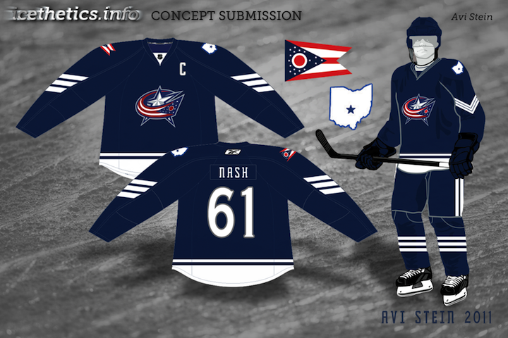
Originally I had left some gray in here, but considering the nickname represents the Union army, I found the color gray pointless, as this is what the Confederates wore. I think these uniforms are inspired by the original jerseys for the franchise.

The red pants stay and a blue insert with star on the pants match up with the panel that you can see on the road jersey. I created no alternate because a red jersey would go against the nickname and another blue jersey would be redundant.

Straight after one my favorites is my least favorite of Elliott's series. I'm not here to put down anyone's work but this set feels lazy. Gray was never one of Columbus' colors. It's always been silver. It's an important distinction. Without the silver, the star in the logo looks out of place. And the Blue Jackets made a second blue jersey work in 2003. Just a little creativity is required.

Now with that out of the way, I love the jersey design! The sleeves are cool and so are the stars under the arms. It's a little like the stripes on the armpits of the Lightning's jerseys. Adds an interesting visual element when the players raise their arms to celebrate a goal.

Elliott Strauss

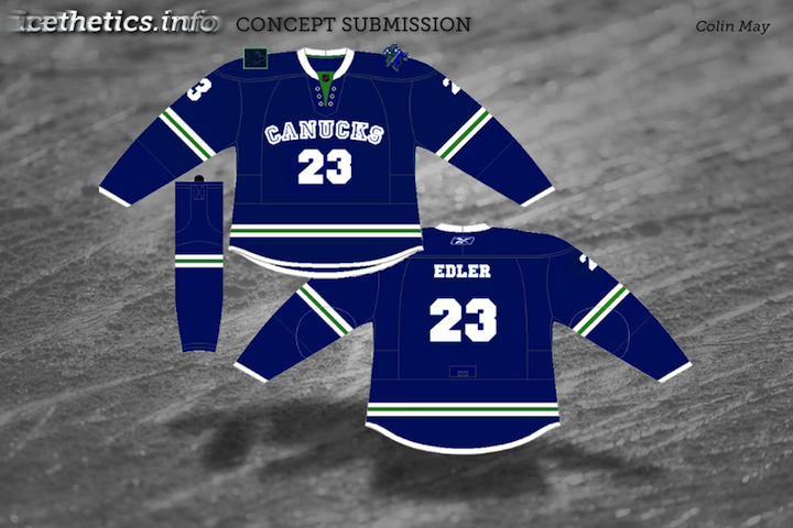
I feel that the Johnny Canuck V logo is the best they have, so it becomes the main crest in my design. The orca stays, just modified, and has a much less prominent role. Green and blue also stay, as I like this unique scheme. I've always wondered what a green alternate would look like, I think this simple striping pattern would make the blue stand out on the green.

Here I applaud Elliott's use of an existing logo because the Canucks have never had a more uniquely identifiable logo in their arsenal. It's just a shame they haven't put it to good use yet. And for what it's worth, the whale doesn't look half bad on green.

There it is. All 30 teams as envisioned by Icethetics concept artist Elliott Strauss. Do you think you have what it takes to rebrand the NHL? Send in your concepts and show us you can think outside the box when it comes to branding pro hockey!

JerseyWatch Concepts

In today's brand new concept post, we take a look at what's in store for the 2010-11 season. The following designs are what Icethetics artists came up with based on descriptions in the initial JerseyWatch 2010 post.


A.J. Bloomquist

One concept that caused a stir after the JerseyWatch post went live was this one by A.J. He posted his work on Sabres' message board months ago. The crest, a script similar to what was described to me, is taken from the old logo of the Buffalo Bisons of the AHL.

A.J. submitted a clean version of his concept so we could all get a good look at it. And who wouldn't love to see Buffalo paying tribute to their town's hockey history on their 40th anniversary?

Jeff Wozniak

Similarly, Jeff sent in his understanding of the rumored new script crest. But this veers pretty far from what I was originally told — which is that it's basically a baseball-type script with the 1970s logo positioned in the tail.

Still, that was just a preliminary concept and things can change. So Jeff may be right on the scent.

Doug Graham

The Penguins are also big news right now. Word from Reebok is they're launching a new alternate sweater for 2010, not to mention all the rumors that the Pens will see action in their second Winter Classic in four years.

Doug's concept is based on the rumor that the Penguins will dig up another blue jersey from their past. He could be on the right track with this. I could see them making it the home jersey one day.

Tony Galiffo

The Blue Jackets will allegedly be debuting a new third jersey in the fall. The team has said it will feature a cannon as its primary emblem. So Tony's incorporated that as well as his own little tribute to the old Cleveland Barons, who wore large patches shaped like Ohio on their sleeves.

Michael Lapsley

Michael tackled a couple of JerseyWatch rumors. The Maple Leafs will be putting stripes and shoulder patches back on their mostly-plain jerseys next season. This is more than likely what we should expect to see — unless the Leafs design a brand new shoulder patch.

Michael Lapsley

And the Ducks are on the list to add a new third jersey in 2010. Absolutely no details have circulated as of yet, but Michael's thinking they go with an orange sweater with the webbed D front and center on the chest.

He's done some nice work but I kind of hope he's wrong. I'd like to see the Ducks introduce a new logo with this alternate sweater. Maybe something that actually resembles a duck wouldn't be too much to ask?

Our NHL rebrand series continues with Part 7 this weekend!

Midwest Modifications

It's Super Bowl Sunday so that means a super-sized concept post. (Also I haven't put up anything new since Wednesday, so I owe you.) Normally I'd make the big game the theme, but as there are no NHL franchises in Indiana or Louisiana, we'll have to settle for the Central Division.


Matt Marczel

Lately, I've been seeing a lot of great Blackhawks concept art. This one has to be one of my favorites. Matt has ditched white for "vintage white" and it's made all the difference. I love the color combination and the use of color in this uniform set.

He's got home/road/third jersey, in that order, and I have to say the third may be the best. If that was ever a real NHL sweater, I'd buy it in a heartbeat. No question. Very nice work here, Matt!

Brad McPelican

One thing you don't seen an awful lot of in hockey is striped shoulder yokes, the assumption being that it would look terrible. I think this design proves the opposite.

I think Brad's design is a winner right up until the third jersey. I just don't think that trumpet logo ever worked for the Blues. Just wasn't meant to be. I think the Blue Note represents the club much better than a literal logo.

So what about the third jersey then?

Mike Bell

Mike has this to offer and I think he hit the nail on the head. Throwbacks work for some teams and not others. For example, it was bad news for the Flyers at the Winter Classic but good news for the Blackhawks at the Winter Classic.

The Blues would look great in those vintage colors and stylings. All we need is that nameplate.

Ryan Haslett

But if your idea of a third jersey is something completely different, Ryan has the answer. I didn't think I'd like a gold Blues jersey. This has changed my mind. Great colors and striping. That is a hockey sweater.

Jeff Kennedy

One team that has struggled with their identity for the last decade — no, not the Canucks — is the Blue Jackets. I think they've finally settled on a good solid look. So that's a plus.

What they don't have yet is a third jersey, so Jeff has taken it upon himself to put forth a couple ideas. They're certainly unique, but I'm not sure I'm sold on these.

Josh Gagnon

So how about this one? Many of you will say you don't like the sweater number on the front, but it is presented in a unique way. However, I'm not sure the vintage white works with such bright shades of blue and red. Maybe something a bit muted.

To be sure, the last thing the Jackets need is to introduce yet another new jersey logo. So we'll just wait and see if 2010-11 is the year the alternate uniform returns to Ohio's capital.

Ryan Haslett

We can't leave out the winningest team in the Central Division. Ryan's made some minor changes to the Red Wings' unis. Not sure about the shoulder piping or the repetition of the winged wheel, but the rest of the striping works.

Matt McElroy

We'll finish off the division with the Predators. Actually, Matt has given us simplified jerseys and primary logos for both the Preds and the Wild. It sort of works for the Wild, but the saber-toothed tiger just looks washed out. And the jerseys may be a little too simple.

But let this final graphic today serve as a bit of foreshadowing to the next concept post.

I'll have new artwork up in a day or two featuring the self-proclaimed State of Hockey.

Concept Collection VI

That post featuring all the non-winning entries from the USF Ice Bulls logo contest is and probably will continue to stand as the LONGEST concept post in the history of Icethetics. Now it's time to get some new stuff posted.

One of my favorite artists, who I haven't heard from in a while, is Aaron Masik. He came up with these alternate logo designs for the Carolina Hurricanes.

Carolina Hurricanes concept logos by Aaron Masik

Ask any Southeasterner, myself included. That windblown palm tree is the classic hurricane image.

Ryan Haslett sent in a handful of jersey redesigns. He's put the Ducks in orange and managed to keep them from looking anything like the Flyers. How? No white and more modern striping.

Anaheim Ducks concept jersey by Ryan Haslett

He's also given the Coyotes a little something to improve their alternates. I think the lack of that brick color helps make it more different to the home and road sweaters.

Phoenix Coyotes concept jersey by Ryan Haslett

This next one starts taking us into the realm of the weird. Imagine the Nordiques lived to see the days of third jerseys. Could they have gone with red or would that simply have given the good folks in Quebec another reason to revolt?

Quebec Nordiques concept jersey by Ryan Haslett

Since we're here, we might as well go full on freak out. Jeff Kennedy considers a re-envisioning of that ridiculous bug from a decade ago.
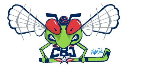
Columbus Blue Jackets concept logo by Jeff Kennedy

Keep the concept art coming in — even if especially if its freaky. I'd like to be able to offer up new concept posts every few days. Email your work in at icethetics@gmail.com and don't forget to include your name so you can be credited! (By the way, this is just for fun so you don't have to give up any rights or anything like that. Just a way to share interesting ideas with fellow design nuts.)