Concept Collection 48

Today's set of new concept art is just a random collection. Enjoy!
Lots of creative ideas in this group. Keep them coming!

Collection 26: Long Time No See

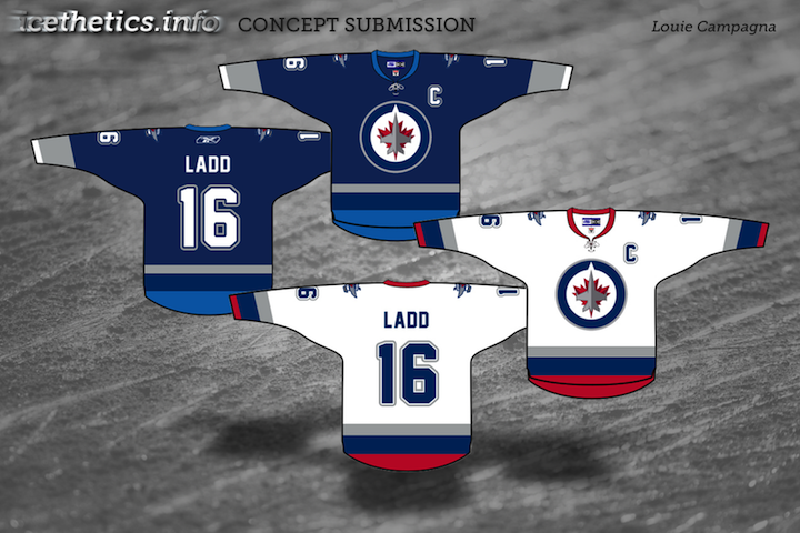
As I was considering themes for today's concept post, I started wondering which teams have gotten the least love on this page. So I took a look back, and as it turns out, there are five teams that have yet to be represented with concept art in 2011. We'll rectify that today.

Now these teams won't have to feel left out. Coming in a future concept post, some phenomenal redesigns for another often overlooked group — the minor leagues.

Quebec, Conceptually

Last week, fans rallied to bring the NHL back to Quebec City. So let's look at some Quebec Nordiques concept art this afternoon.


Brendan Anderson

Brendan kicks things off with a rather traditional blast from the past. That is, until you get to the alternate jersey. The Nordiques missed the NHL Third Jersey Program by a year but I'm not sure they would've gone with a number on the front. Still, I don't think anybody in Quebec would complain if it meant getting their team back.

Peter Debay

We get a completely new direction from Peter. Rather than the classic logo with its subtle NQ, we here's a lowercase q made out of a distorted hockey stick.

The one I really like, however, is the vintage design with its retro striping and crest design. That would be a nice looking hockey sweater — even with the red helmet and pants.

Scot McCormack

Scot also tried his hand at new Nordiques logos. The jersey remains mostly unchanged.

Personally, I'm not as big a fan of this set as the previous one and I think that's because of the difference in creativity levels. I think if fans had their pick, they'd go with more of a retro style to the uniforms.

Jack Martineau

And just for the heck of it, I thought we'd toss in an Avalanche concept. After all, they used to be the Nordiques.

With his design, Jack is bringing back the abstract mountain at the base of the jersey. Personally, I'd love to see the mountain range that used to be on the sleeves. I think more than any other team, the Avs were ruined by Reebok. This helps, but it's just not what it could be.

Email in your concept art and it may well find its way onto this very page.

Creative Inspiration

Has it really been seven weeks since the last concept post? Unacceptable. Yes, there have been a lot of blog and tournament updates. And yes, I've been busy lately. But seven weeks is a long time. So I'm going to try some new things to keep the concepts flowing.

Since getting this page updated is lower on my list of website priorities due to the time/effort required, I'm going to start adding new concept art to our brand new Facebook page on a regular basis to keep everyone satisfied. However, I will continue to save some items to be showcased here on the site.

So I'm taking some time out this holiday weekend to post a handful of new work. Most of the concepts sent in tend to be a slight re-imagining of a team's uniform. Usually some stripes are rearranged or colors changed. But every so often, an especially creative concept appears. That's today's topic.


Peter Debay

Peter has an interesting take on the look of the Vancouver Canucks. Interesting choice of colors and type. Gives the sweater a very classic feel.

Ryan Haslett

Ryan is one of our most prolific designers, and here I've got three of my favorites. (I know there's only one rating, by the way, so just make it an average.) First, awesome Canucks jersey. Forgot the Johnny Canuck V logo, go Johnny Canuck all the way!

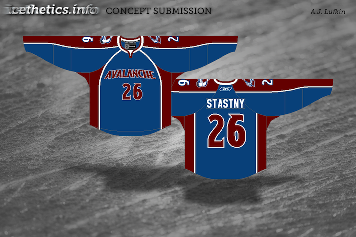
I also like this Avalanche concept. Great callback to the old Colorado Rockies logo in the burgundy and blue. And green is just what the doctor ordered for the Ducks. Heck, I'd settle for orange if they'd just use the webbed D on the front!

Matthew Duke

This post is about creativity and sometimes that can yield a somewhat disappointing result. I like where Matthew is going with the uniform designs, but that ATL logo was not well-liked as a 10th anniversary mark, and it's sure not any better here. But at least it gets us thinking about things for the Thrashers.

Vin Maccioli

Here's a cool one. Vin offers up a unique alternate sweater with a very retro feel. It may not work for the Red Wings on a regular basis, but maybe as a one-off specialty thing instead. And yes, I'm also posting this one as a tribute to my Bolts' new GM — Stevie Y! I'm expecting great things from him.

Jake Slavik

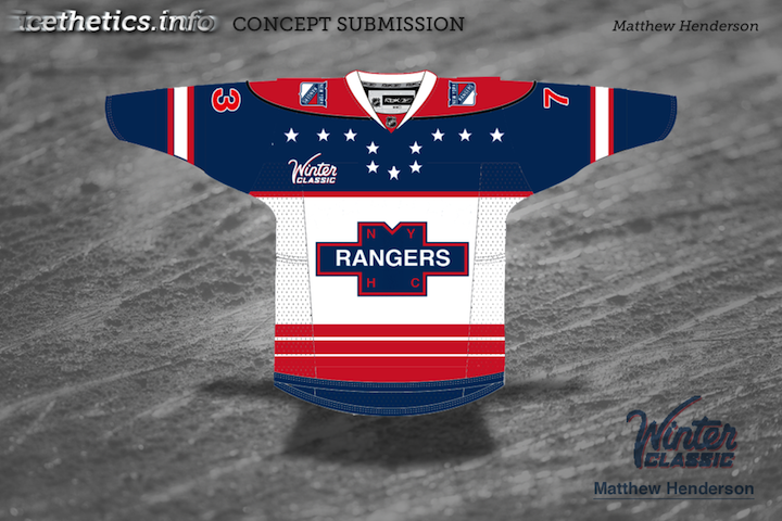
The last concept is a little Winter Classic 2011 bonus. And with all respect to Jake, this is pretty far out. He's combined so many different eras of the Penguins and Capitals that it's become kind of a jumble.

On the other hand, it does help us see what was good and what was bad about these clubs' past uniforms. For example, Weagle good, funky striping not. And sadly, he's left the gold out of the Penguins' jersey entirely. Despite the blue sweaters in the Pens' early years, the penguin logo was never without gold.

I'm shooting for concept updates on a weekly basis, but that may be too much to ask for. Just know that I'm doing the best I can. I'm assuming things will quiet down on the news front as the summer goes on, which will allow more time for concept posts.

Strauss NHL Rebrand VI

It's been about six weeks since the last edition of Elliott Strauss' NHL rebranding series. And just when you almost forgot about it, it's time to finish it up!

If this is new to you, catch up here. In a nutshell, Elliott set out with some specific goals in mind when he began this series back in November: lose the uglier elements of the Reebok Edge jerseys, create some new modern designs and make sure every team has a distinct identity, and keep in line with tradition when appropriate.

Having said that, let's kick off the second half of the Strauss NHL Rebrand series, as promised, with the Colorado Avalanche. Elliott's own descriptions appear in bold text.


Elliott Strauss

I dropped a color, added a color, and darkened a color here, as the scheme moves from maroon/medium blue/black/silver to maroon/navy/light blue/silver. I simplified the primary logo and changed some colors, and while it's not too different when at first glance, compare it to the current logo.

On the uniforms, I tried for a modern yet somewhat chaotic look with movement that the nickname implies. The alternate is a darker, less contrasting uniform with a new take on the familiar diagonal wordmark.

One of the best things about these uniforms is the number style. And the striping isn't bad either. He's given the Avs an incredible look without really changing much.

Elliott Strauss

The logo is tweaked to modernize the classic Blue Note. I rearranged the colors a bit to make the yellow pop a lot more. The navy logo on blue and blue logo on white does not change, but the numbers now match this theme.

The yellow slashes on the home/away and pants mimic the Gateway Arch, a motif which is featured on the shoulders and alternate crest. I brought back the music staff with accents of yellow on the sleeves.

Another great set with a couple of minor flaws. I think the Blue Note under the Arch looks fantastic. Unfortunately, within the logo itself, that sharp point toward the bottom just sticks out in the worst way. Clean things up in there and you have a concept waiting for NHL approval.

Elliott Strauss

I put my own spin on the current primary, simplifying and making it more symmetrical. One thing that is bothersome about their identity is the lack of a double flag flying on the secondary to indicate a hurricane as opposed to tropical storm. Here we see that on the CH logo.

These unis ended up being some of my least favorite in the series and I had another more classic jersey design but I scrapped it at the last second for this. The font is custom and the alternate is pretty simple.

Gut reaction: Elliott knocked this one out of the park. He says he's unsure of the uniforms, but I'm impressed. They take some of the best elements from the Hurricanes' present look and improve upon the rest. And the new logos are just amazing.

Based on this, I'd say the second half of Elliott's NHL rebrand series looks quite promising. Next edition in about a week. In the meantime, we should have some concepts coming based on some of what's in my JerseyWatch post from the blog.

Concepts Out of Thin Air

We head to the Mile High City for the latest batch of concepts. Enjoy this Colorado Avalanche artwork.


Matthew Duke

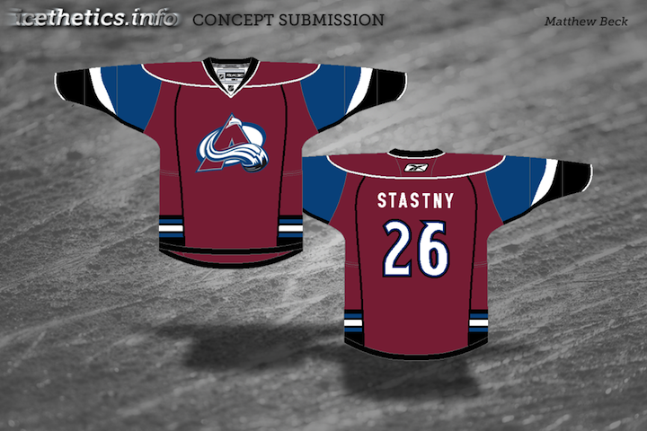
At first glance, Matthew's concept may look like one for the old Colorado Rockies club. But look closer. It's all about the Avs. It's a unique design with a new color added.

Should it replace what is arguably one of the best logos in all of hockey? Of course not. But I could see it gaining a following as an alternate. Maybe not the white one. I prefer the way the striping works on the burgundy sweater.

Shameless promotion for Matthew: He's got a Carolina Hurricanes concept that will knock your socks off. I'll try to get it posted soon.

Ryan Haslett

I'm not sure that removing the classic "A" logo is the way to go about making an improved Avs jersey concept, but what Ryan has isn't half bad. Plus, the Caps-inspired sleeve design gives the effect of snow-covered mountains. And I have been enjoying watching Colorado play in blue.

Glen Cuthbert

But if you do have to replace the crest, I certainly don't think diagonal text is a good thing. The sasquatch footprint, however, could be a keeper. Glen has placed it on the original Avs third jersey for us.

Brian Brideau

Perhaps the real solution is just to fix the striping on the Avalanche's home and road sweaters. Is Brian's Phoenix-style concept the cure-all? Maybe not, but it's a step in the right direction. Why not just go back to the original look from 1995? Don't let Reebok stand in your way.

Jeff Wozniak

Finally, as we wait for word on the locale(s) for the 2011 Winter Classic, Icethetics artists are more than glad to throw in their opinions. Jeff pits the Avalanche, dressed as the Quebec Nordiques, against the Montreal Canadiens in the epic Battle of Quebec.

Who wouldn't love to see that old Nordiques logo back on NHL ice? This would be a cool match-up for a Canadian game. Any other outdoor match-ups you'd like to see?

Hope you liked those Avs concepts. Our creative designers work very hard. Up next: Elliott Strauss' NHL rebranding series returns this week! And, as a perfect segue, it starts in Colorado.

What's in a Third?

Monday is here again. But while you guys are headed back to work or school, I'm probably in a casino wondering what time it is or something like that. Not to rub it in or anything.

Here we are at the fourth of five auto-posts featuring all new concept art from talented Icethetics artists. Today's theme is another fan favorite — third jerseys. Several of you have come up with ideas for alternate sweaters based on what's actually being worn in the league right now. Let's get started.


Ryan Haslett

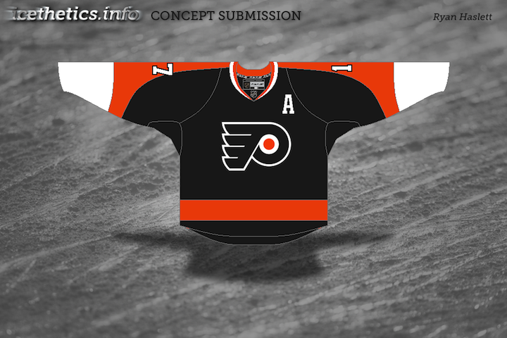
The Pittsburgh Penguins are up first because we're pretty sure they're actually getting a new third jersey next fall. Folks keep saying the powder blue sweater is on its way out. Personally, I think that paves the way for an '80s style third reminiscent of the Mario Lemieux/Jaromir Jagr days, but I digress.

Ryan's got a whole new set of jerseys here which includes a black third loosely based on the team's earliest NHL days — sans the blue, of course. But it might suffer from the same problem that Bruins currently have. That being both the home and alternate sweaters are black.

One of them needs to be gold (I'm speaking both about the Bruins and Penguins). Gold will solve all their problems.

Charles Cadieux

Also in the east, the Canadiens introduced — or should I say re-introduced — a handful of vintage sweaters to celebrate their 100th anniversary. They started last season and continued into this one.

One of the favorites was the blue one with the big white C. I believe Charles' attempt was to turn it into a third jersey but putting the classic CH we've all come to know and love, front and center.

I'm torn. Part of me likes it because it means this jersey could stick around. But the other part of me says it's just wrong.

Brian Brideau

Moving ever westward, we now land in Nashville. The Predators have discussed making wholesale uniform changes to just simplify. Brian, here, thinks they'd be wise to just make a light version of the new third jersey and go with it.

He's saved them the extra steps by having already designed it. This is hard not to like and the Preds are in need of some jersey overhauls. This could just be the ticket.

The only thing I'm not sure about is the triangle on the white jersey. It's not necessary to making the logo stand out and it actually takes away from the simplicity effort. That aside, these are top notch.

Chris Fraterrigo

Sticking to the direction of the sunset, Chris Fraterrigo thinks the Avalanche could use a uni redo. And ever since the Age of Reebok was ushered in, I can't say I disagree with him.

In this new set, the "modern" striping elements are gone. Instead, the simple striping from the new third jersey is carried over to the home and road shirts. And the alternate here is simplified losing all striping — which actually doesn't hurt it.

I'm a big fan of incorporating the black into the burgundy sweater. However it's not done as well on the white one here. Overall, though, a solid look. The only thing I might add is some striping around the bottom — just so it doesn't look like a t-shirt.

Uncleben

At last we find ourselves as close to the west coast we're going to get today. I think the Coyotes have a pretty decent third as it is and this one may be a little cluttered. Still I'm a big fan of that paw logo and traditional jersey striping.

It has its pros and cons. But the largest con is probably the use of the Maple Leafs' lettering and numbering. Huge no-no. But we won't crucify anyone for it. We just don't want to see it on a real Phoenix jersey is all.

One more auto-post to go! You'll see right here tomorrow morning at 9. But at this point, my concept art reserves are beginning to dwindle. If you've thought at all about dipping your toe into the artistic pool, email your designs to me at icethetics@gmail.com.

Concept Collection VIII

You've been patient (most of you). My inbox has seen a lot of concept art over the past few weeks and I'm thrilled to finally be posting it! (Seriously, if someone can help me figure out a way to make Icethetics my only job, we'll all be a lot happier. A lot.)

All right, I've got 14 items to get to tonight, so let's not waste time. We'll begin with the Colorado Avalanche, whose brand new third jersey has recently been leaked (see the blog for more info on that).

A lot of readers have bemoaned a lack of creativity, I believe having to do with the fact that it's simply a revision of the Avs' previous third. This first concept certainly avoids drawing on past designs while simultaneously reminding us the Nordique spirit will never die.

BD

The other team soon releasing a brand new third will be the Florida Panthers. Rumor would have us believe it may look a little something like this.

Ryan Haslett

It's a return to red, which I'm sure longtime Cats fans will appreciate, and it borrows very heavily from the Wild's home uni — easily one of the best in the NHL.

Seeing all these new third jerseys the last couple of years makes me wonder who got it right and who didn't. Some teams don't have one and could really use it. Obviously, the Penguins, Wild, Sabres and Blues got it right.

I've been hoping the Rangers would one day return to the Lady Liberty jersey which at one point was my favorite in the league. Here's a re-envisioning of that.

nyr1583

The Capitals would do well to add a blue jersey. Many have suggested the Weagle take center stage, but why not a red version of the primary logo? How would it all look on a Lethbridge Hurricanes sweater?

Ryan Haslett

The Canucks dropped the ball with their third last year. It was what we all expected, but that should be their home sweater, and not an alternate. Here's one idea for an alternate with yet another brand new logo.

Matt Marczel

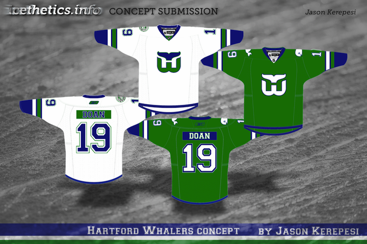
Now that Whalers merchandise is making its way back onto store shelves, maybe the Hurricanes could pay tribute on one St. Patrick's Day sometime.

Matt Marczel

Maybe even the Red Wings could get in on the third jersey action — even though they've never been one to follow that crowd.

Matt Marczel

The Dallas Stars dropped the ball worse than anyone two years in a row — bad home and road sweaters followed by a shockingly worse third. Since we're talking nostalgia and vintage these days, why not a trip down memory lane the heart of Texas?

Matthew Duke

Lastly, the Ducks. It seems like every concept post at some point feels the need to help out those poor Anaheim Ducks. Nobody was sad to see the "Mighty" go away, but nor were they glad to see the artistic carnage that would ensue on the sweaters to follow.

mcskilz

I'm not saying gold is the way to go necessarily, but maybe stepping outside the box isn't a bad thing. Anyway, the colors are great, but the logo could use a lift.

Jake Niehl

Hey, an actual duck. Go figure.

I enjoy ending a concept post with a little something to freak you out, if at all possible. Tonight is no exception. The Sabres and Canucks have their 40th anniversaries coming up next season. Let's get started by putting an actual saber on the Sabres' jersey.

J.B.

And hell, why not just run the gamut of past logos and colors for the Canucks? You know they never did have a red jersey.

J.B.

A little something to frighten Panthers fans. As we near Halloween, perhaps this could be a costume.

Jules

And lastly, one of the most ridiculous Atlanta Thrashers concepts ever to grace these pages.

mcskilz

Show your mcskilz! To the first person who can legitimately make the rest of the numerals out of that simple Thrash logo — bragging rights for life!

Hope the wait was worth it. I'm really trying to keep this updated. And since I know it's what you guys want, I'll make a special effort to have something new hear at least once a week — though it likely won't be in the quantity you see tonight.

Keep those concepts coming! Email them to icethetics@gmail.com.