Concept Collection 48
/Today's set of new concept art is just a random collection. Enjoy!
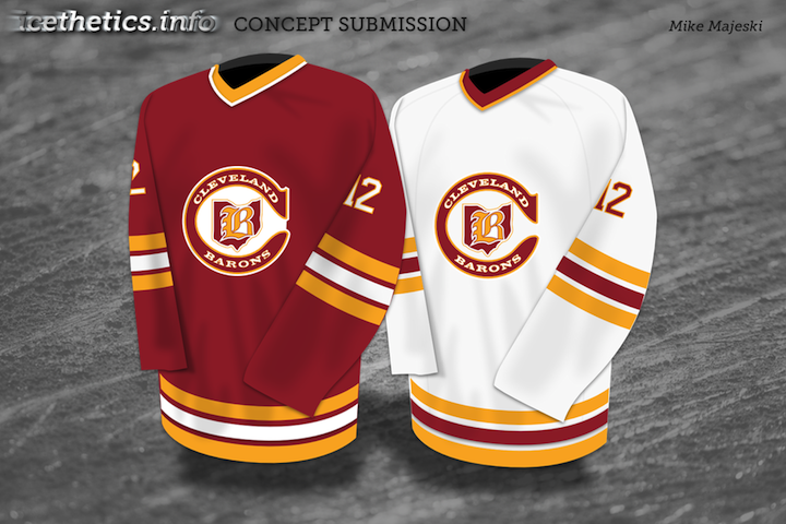
Lots of creative ideas in this group. Keep them coming!
Today's set of new concept art is just a random collection. Enjoy!


Lots of creative ideas in this group. Keep them coming!
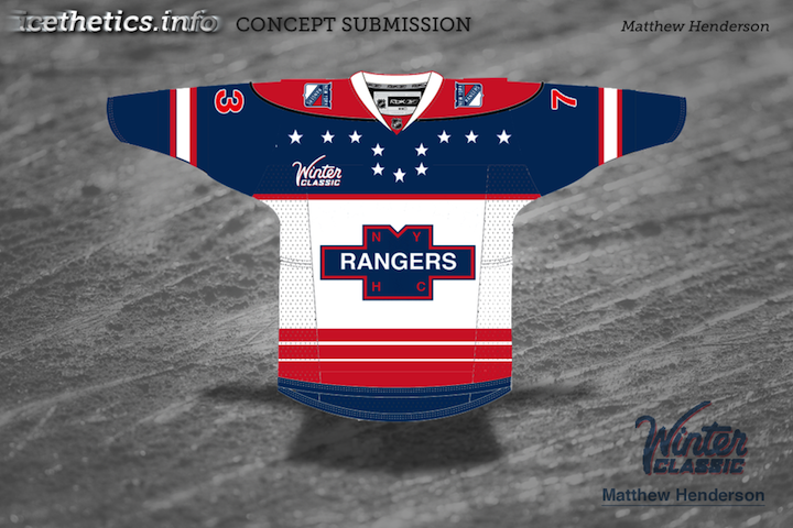
Today we go without a theme. Just a few random concepts I thought you might appreciate.
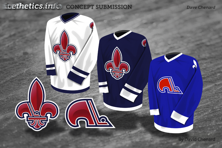
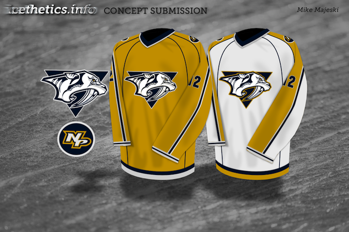
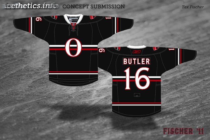
This is the final auto-published post of the week. I should be able to get the site back to normal in the next couple of days. Hope you've enjoyed these concept designs during my absence.
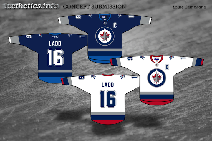
All the Winnipeg Jets talk of late is practically begging for a concept post in which we look at other defunct franchises. What have our talented artists envisioned? Let's see.


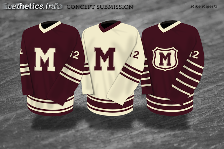
Above, you'll recognize the illustrious California Gold Seals of old — and below, the Montreal Maroons of even older.

There are no Jets concepts here but we've seen plenty of them recently and I'm certain there will be more to come in the near future. If you've got one, you know where to send it.
Today's batch of concept art brings us to the Northeast Division.

Last month, I re-posted some early sketches from the Sabres' 2006 rebranding on the blog. Here, Ross decided to spruce up one of the sketches and put it on the current uniforms. I get the feeling something like this would've gone over a lot better with fans than the "Buffaslug."

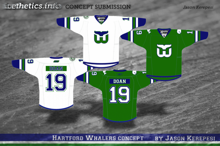
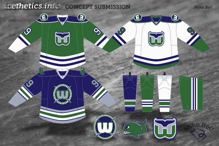
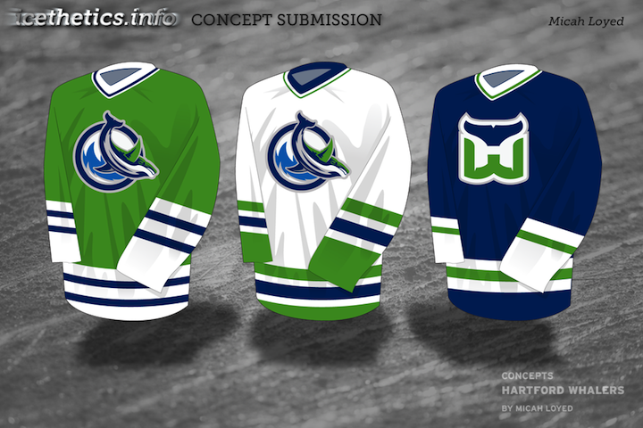
We've gotten Jets and Nordiques concepts on this page recently, and I didn't want to leave the Whalers out. They were part of the Northeast Division back in their day.


Benoit brings a unique set to the table. A bold choice with the red-free, two-tone blue jerseys for the Habs, but that's why it's interesting to look at.

New concepts are rolling in all the time. If you'd like to submit yours, just send a JPG or PNG file by email.
The newly reformatted concept art has been quite a popular feature lately. I can't remember the last time these posts have had so much feedback on a consistent basis. So let's keep it rolling. I've got another mish-mash to share this morning.


Paul had a similar idea to Mike Ivall's concept from the last post. Once again, there's just something about that color combination for me. The Cats can keep the light blue as a trim color so long as they keep the red. That's my decree.


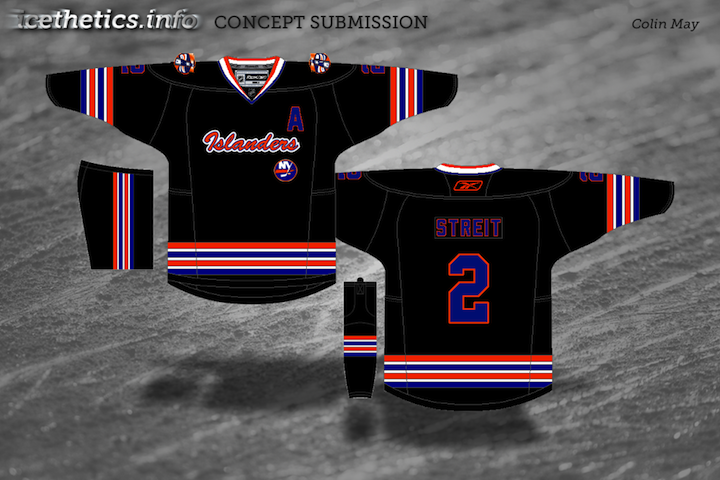
Coming up this week: Mike Ivall has sent in enough new artwork fill another post. He's been working hard lately. He's covering the Preds, Isles and Thrashers among others.
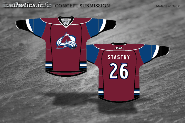
Today's batch of concept art deals with a handful of teams with new sweater designs on the way. While we wait for official unveilings, our concept artists get to work on some predictions of their own.
As always, feel free to email in concepts. I'm working on adding a bunch more to the Facebook page this weekend.