Collection 38: Seeing Stars

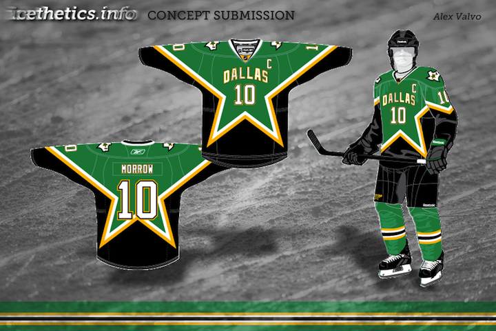
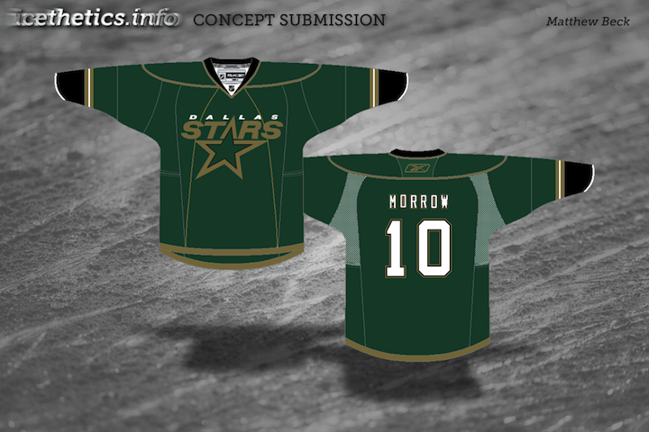
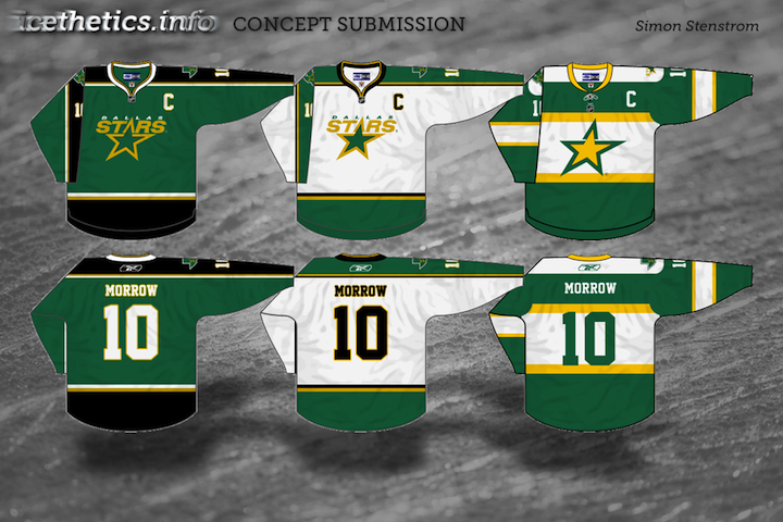
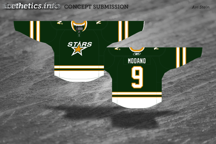
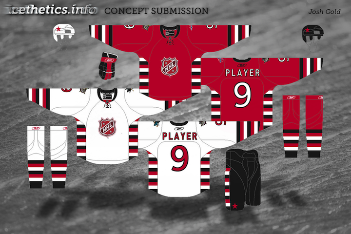
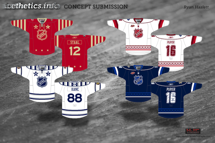
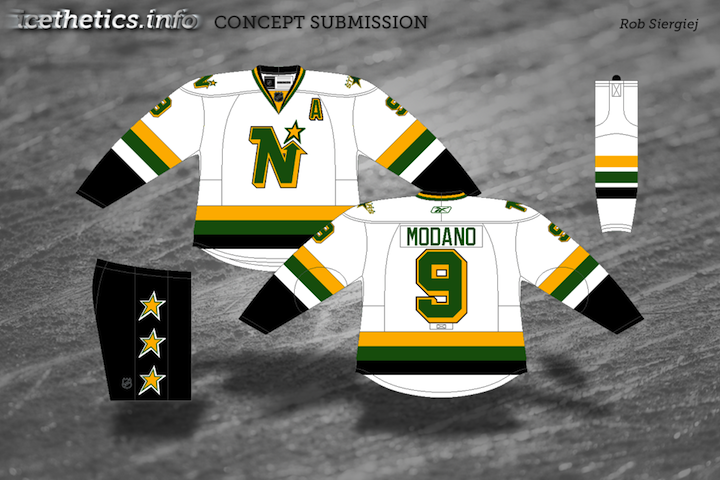
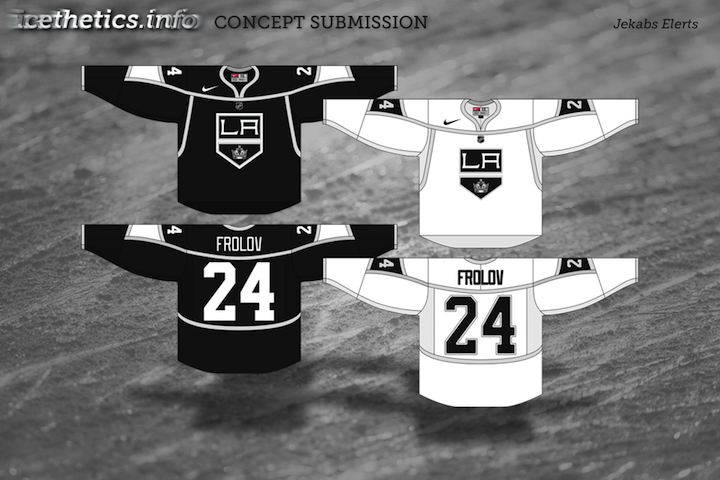
Sadly, my trip will be wrapping up soon but as promised, I did prepare a new concept art post. Today's theme is stars — of all varieties. We'll start with the Dallas Stars, work in the Minnesota North Stars, and finish off with an All-Star design. Enjoy!

One more auto-published post awaits Sunday before I get back on Tuesday.

Concept Collection 3

The newly reformatted concept art has been quite a popular feature lately. I can't remember the last time these posts have had so much feedback on a consistent basis. So let's keep it rolling. I've got another mish-mash to share this morning.

Paul had a similar idea to Mike Ivall's concept from the last post. Once again, there's just something about that color combination for me. The Cats can keep the light blue as a trim color so long as they keep the red. That's my decree.

Coming up this week: Mike Ivall has sent in enough new artwork fill another post. He's been working hard lately. He's covering the Preds, Isles and Thrashers among others.

Concept Collection 2

Continuing with the new concept art format. Seems to be getting good reviews. Today brings a handful of great designs by some Icethetics regulars.

If you recognize the logo in Ryan's Capitals concept, you're not alone. It's not an original design. In fact, it's a logo commissioned by the Capitals years ago but never used. It was included in a post a couple years ago about lost logos registered with the patent office but later abandoned.

Concept Collection 1

I'm testing out a new format for concept posts. It features a standardized look for all submissions as well and limited commentary from me. Some posts will still have a particular theme, but from now on, most will just be a hodge-podge of whatever's in the Icethetics inbox. Feel free to leave your thoughts in the comments.

I know I said the last Connecticut Whale concepts would be the last. But Ross' attempt was too good not to share. We always talk about logo simplicity. This is one of those great designs that you can see a kid drawing on his notebook.

Unfortunately, this new format doesn't yet include ratings but I'm sure the artists will appreciate your feedback in the comments. Just added ratings. Enjoy!

All-Star Anticipation

As you know, the Carolina Hurricanes were recently awarded the NHL All-Star weekend for 2011. A logo has not yet been released. In anticipation of that, a lot of artists have been sending in all-star concepts so I wanted to share some of those tonight.


Tyler Rodgers

Tyler has created the most original/complete logo and uniform set for the 2011 All-Star Game. Something like this could very well be the logo. Despite its similarity to the 2009 game in Montreal, it does what most all-star logos do. It takes elements of the host team's logo and combines it with stars.

The uniform designs are also surprisingly feasible. I would not be at all surprised to see something like this when the official logos and jerseys are unveiled. Is it the most creative all-star set we've ever seen? At the risk of offending Tyler, no. But to his credit, it is very realistic.

Ezra Brouwer

Ezra sends in this uniform set, a fitting follow-up to the 2009 all-star jerseys. Not bad, but maybe a little too heavy-handed with the stars.

Matt Marczel

Matt's submission is pretty sharp. Great use of stars and striping. Only odd thing I noticed was the use of Avalanche jersey numbers. Seems a little out of place. But overall, very nice jerseys.

Tony Galiffo

This last concept logo isn't about the 2011 All-Star Game, obviously. Instead, it's Tony's suggestion for a 2012 edition of the Winter Classic in Ohio featuring the Columbus Blue Jackets. He's even set up a Facebook page to promote his cause. Feel free to join him if you support it too.

Got some really excellent concepts on the way. Heading to the Northeast for those so check back soon.

Carolina In My Mind

So much concept art coming in and so much of it is so good. I'm working on adding new posts every chance I get this week to share as much as possible. You guys deserve it for all the awesome work you send in.

Today our focus is North Carolina. The Hurricanes were just awarded the 2011 NHL All-Star Game last week. While we wait for the official logos and uniforms to be designed and unveiled, I thought we take a look at some fan concepts.


Ryan Haslett

Ryan put together this logo and uniform set. The jerseys borrow elements from the 2008 game in Atlanta. And the logo works in elements of the host team's logo — a common technique in all-star logos. A little vanilla perhaps, but at least he took the time to put something together.

Michael Lapsley

Michael went another direction by essentially turning the Canes' own uniforms into all-star uniforms. Notice the stars inside the storm flags that line the base of the sweaters. He also used the official conference logos, similar to the 2007 jerseys worn when Dallas hosted.

Matt Marczel

Matt went in yet another direction by opting for throwback all-star jerseys — from the days when the league was split into the Clarence Campbell and Prince of Wales Conferences. All-star uniforms were just simpler in those days, weren't they? Oh well.

Pete Hurdle

We'll wrap up with Carolina's soon-to-be relocated AHL affiliate, the Charlotte Checkers — who begin play in North Carolina in 2010-11. Pete put these jersey designs together. He's got a black one with the recolored logo and a white one with an ECHL throwback logo.

Can't believe somebody at some point thought that was a good idea. We need to do a tournament of vintage minor league logos just for the visual travesties.

Can't get enough Hurricanes concepts? Check out Johnny's Totally 80s redesign over at PuckDrawn last year.

Should have more concepts up this week, including a few based off of our JerseyWatch 2010 updates. Plus, Winnipeg Jets concepts have been flooding the inbox lately. You guys hoping for the Coyotes to return home?