Dreaming of the Jets

Though the city of Glendale just promised millions to support the Phoenix Coyotes franchise, nothing is final and no sale has yet been completed. And despite inching closer to a deal that would keep the team in its present home, we can't help but wonder if the team isn't destined to return from whence it came. So here are some Winnipeg Jets concepts that have been submitted for your enjoyment.

Also, we're debuting a new feature. You can now rate each concept, 1 to 5 stars.


Dallas Hicks

While I often receive classic Winnipeg Jets concepts, typically the designer is merely copying the old design onto a Reebok Edge jersey template. Nothing we haven't seen before.

Dallas, on the other hand, has gone a step further by creating a new brand — which would be likely in the unlikely event of the team moving back to Manitoba. That being said, he has incorporated the jet in the original logo into his design. And I like how the jet's exhaust forms the shape of a J and a hockey stick all at the same time.

Dallas Hicks

But wait, there's more! Dallas also came up with these. They're not necessarily from the same set, just different color options for the same basic concept. I'd be pulling for the two-tone blue/gold look, personally, as it's time to stop dressing every team in blue and red — even if it is traditional.

Connor Hanley

Connor's concept is more about striping and uniform design than original logos. He's borrowed the Houston Aeros short-lived primary mark (2002-2006) for the home and road while sticking with the classic Jets jet on the alternate.

But it's the striping on these jerseys that are the most interesting and unique. My favorite is the blue one. NHL teams just don't look like that anymore. And that's a shame.

Jake Slavik

Jake has gone in a whole new direction too. His Winnipeg Jets are blue and silver, and flaunt their hopeful hometown. Of course we'd have to do some work on the numbers and nameplate on the back. Those would be all but unreadable from the nosebleeds. Forget TV. But I like the direction he's going with the colors.

Matt McElroy

But perhaps not all hope is lost. What if Coyotes fans get their way and keep their team. Obviously the ideal situation. Matt's trying this quasi-throwback look as a possible light alternate jersey.

Usman Shabbar

And now for something completely different. Imagine crossing the Coyotes with the Blackhawks. What do you get? Maybe something like Usman's design here. It's an interesting look, but I'm not sure it's something we'd ever really see in the NHL.

If you'd like to submit your suggestions for the possible future Winnipeg Jets team, you know where to send them. Or if you're passionate about Coyotes remaining the Coyotes, let's have some of those concepts too!

Wenatchee Wild Contest Entries

Many talented artists responded to the Wenatchee Wild logo design contest! Now as the team prepares to make its decision on the winning design, they want your help. Take a look at the following eligible entries and rate each from 1 to 5 stars!


Gary Cekus Gary Cekus
Gary Cekus
Ryan Muraro
Jesse Feltner
Jesse Feltner
Sean Ryan Cooley
Joel Masson
Richard Lunghino
Jim Simko
Dallas Hicks
Matthew McElroy
Christian Ryder
Nevill Carney
Ben Abeles
 
Jason Villanti
Johnny Griswold
Chad Stilson
Chad Stilson
Ben Uhrich
Sam Stuber
Gary Punzak
Mark Poutenis
Marcin Nowicki
Jeff Ingalls
Jeff Ingalls
Shawn Robinson
Shawn Robinson
Neil Baseley

All logo designs are copyrighted and property of their respective owners. Do not use without permission.


Designers After a decision has been made by the Wild, I will be adding portfolio URLs and/or email addresses for any artist interested. In the meantime, any parties interested in contacting Icethetics artists should email icethetics@gmail.com for details.

Comments on this post are disabled. Please allow your vote to serve as your comment on these designs.

Strauss NHL Rebrand X

Time for the big finale. Here is the final installment in Elliott Strauss' NHL rebrand series. His descriptions appear in bold text.


Elliott Strauss

I think this is one of the more interesting concepts of the series because it gives a fairly drastic change to an untouchable team. I updated the familiar shield and brought back the Lady Liberty logo. The diagonal stripe on the uniforms has the same angle as the wordmark and is meant to match the diagonal sash on the primary logo.

The wordmark/numbers contrast the sleeve stripe order on the home and away jersey. The alternate is almost an exact replica of the pre edge alts, but the silver is dropped in favor of royal blue.

Definitely a shock at first glance — in a good way. All the key elements are still there. They just don't look the way we're accustomed to seeing them. This is one of my favorites of the entire series.

Elliott Strauss

Originally I had left some gray in here, but considering the nickname represents the Union army, I found the color gray pointless, as this is what the Confederates wore. I think these uniforms are inspired by the original jerseys for the franchise.

The red pants stay and a blue insert with star on the pants match up with the panel that you can see on the road jersey. I created no alternate because a red jersey would go against the nickname and another blue jersey would be redundant.

Straight after one my favorites is my least favorite of Elliott's series. I'm not here to put down anyone's work but this set feels lazy. Gray was never one of Columbus' colors. It's always been silver. It's an important distinction. Without the silver, the star in the logo looks out of place. And the Blue Jackets made a second blue jersey work in 2003. Just a little creativity is required.

Now with that out of the way, I love the jersey design! The sleeves are cool and so are the stars under the arms. It's a little like the stripes on the armpits of the Lightning's jerseys. Adds an interesting visual element when the players raise their arms to celebrate a goal.

Elliott Strauss

I feel that the Johnny Canuck V logo is the best they have, so it becomes the main crest in my design. The orca stays, just modified, and has a much less prominent role. Green and blue also stay, as I like this unique scheme. I've always wondered what a green alternate would look like, I think this simple striping pattern would make the blue stand out on the green.

Here I applaud Elliott's use of an existing logo because the Canucks have never had a more uniquely identifiable logo in their arsenal. It's just a shame they haven't put it to good use yet. And for what it's worth, the whale doesn't look half bad on green.

There it is. All 30 teams as envisioned by Icethetics concept artist Elliott Strauss. Do you think you have what it takes to rebrand the NHL? Send in your concepts and show us you can think outside the box when it comes to branding pro hockey!

Numerous Northeast Concepts

Settle in, folks. This is one of the biggest sets of concept art I've ever posted. Because I haven't had a lot of time to write new posts, obviously the artwork has been piling up. The Northeast Division seems to be the most popular for Icethetics artists, so I thought it'd be the best way to unload a dozen new designs. Here we go.


John Fusco

Had to start with this one. It's just phenomenal. You wouldn't think this type of design would make a good hockey sweater. Then you look at it. I'm waiting for an NHL team to jump onto an idea like this. Very sharp look. Well done, John!

Drew Krause

Another great Maple Leafs concept comes from Drew. He's made some updates to the traditional leaf logos, and they look great. Even the striping on the uniforms really works. Can't believe I haven't gotten around to posting some of these sooner.

Matt Marczel

By now we all know the Sabres will go back to their original uniforms next season — or at least something similar. Matt's put together a solid concept here with a nice modern flair.

Joni Oksanen

However, if you want more of a throwback feel, Joni's concept is the way to go. It's much simpler and features a royal blue just like the originals did in 1970. The only thing he's changed a bit is the striping on the dark jersey.

But either way you go would be a win for the Sabres and their fans, desperate for a return to the vintage uniforms. Sometimes you get it right the first time, don't you?

Jake Slavik

And sometimes we mix things that probably shouldn't mix. Jake's concept plays off of every era in Sabres history. And it's not ideal. Stare into those yellow eyes. Stare deep.

Frightening. Let's move onto another team.

Joshua Heckman Adam L'Italien

Joshua and Adam have both opted to experiment with brown jerseys for the Bruins — something I half expected to see at the Winter Classic earlier this year. Joshua's could even work as a third jersey this coming season if they were up for a change.

Adam's isn't bad either but doesn't lend itself well to Reebok Edge or television, for that matter. It's a very drab-looking jersey with the dark brown and the slight striping. However, I really do like the crest.

Dallas Hicks Ryan Haslett

Got a couple of new Senators concepts here. Dallas tries his hand at a Winter Classic-insipired concept... you know, in the event the NHL decides Canada should play an outdoor version of its own sport.

Ryan's isn't bad either — though without the stripes, the O just looks like a zero and nobody wants that associated with their team. Unless it's in the goals-against column, I guess. But if nothing else, this uniform has the best socks so far!

Ryan Haslett

That's right, it's all Ryan all the time for the rest of this post. This is his Canadiens throwback. Unfortunately, the numbers are rather illegible on the striped back of the jersey. Other than that, it's a nice-looking sweater with an old-time feel.

Ryan Haslett

Lastly, as a bonus, this concept is based off of a Quebec Nordiques logo that designed in 1995 but never implemented as the club was relocated Denver to become the Avalanche. And that is, in fact, where Ryan gets most of the elements of his design. I'll be honest. Makes more sense in the Rocky Mountains. Oh, what could have been.

And breathe. That was a lot to take in. Up next, it's Elliott Strauss' final rebranding set. That comes this weekend. After that, I'm implementing a new element into our concept posts. Details to come.

All-Star Anticipation

As you know, the Carolina Hurricanes were recently awarded the NHL All-Star weekend for 2011. A logo has not yet been released. In anticipation of that, a lot of artists have been sending in all-star concepts so I wanted to share some of those tonight.


Tyler Rodgers

Tyler has created the most original/complete logo and uniform set for the 2011 All-Star Game. Something like this could very well be the logo. Despite its similarity to the 2009 game in Montreal, it does what most all-star logos do. It takes elements of the host team's logo and combines it with stars.

The uniform designs are also surprisingly feasible. I would not be at all surprised to see something like this when the official logos and jerseys are unveiled. Is it the most creative all-star set we've ever seen? At the risk of offending Tyler, no. But to his credit, it is very realistic.

Ezra Brouwer

Ezra sends in this uniform set, a fitting follow-up to the 2009 all-star jerseys. Not bad, but maybe a little too heavy-handed with the stars.

Matt Marczel

Matt's submission is pretty sharp. Great use of stars and striping. Only odd thing I noticed was the use of Avalanche jersey numbers. Seems a little out of place. But overall, very nice jerseys.

Tony Galiffo

This last concept logo isn't about the 2011 All-Star Game, obviously. Instead, it's Tony's suggestion for a 2012 edition of the Winter Classic in Ohio featuring the Columbus Blue Jackets. He's even set up a Facebook page to promote his cause. Feel free to join him if you support it too.

Got some really excellent concepts on the way. Heading to the Northeast for those so check back soon.

Strauss NHL Rebrand IX

The NHL Rebrand series by Elliott Strauss is starting to wind down. This week he tackles the Devils, Wild and Predators. His own comments are in bold text.


Elliott Strauss

I thought that the old mustard alternate crest had potential to make an interesting primary logo, so I just cleaned it up. A simplified version of the current primary remains as a secondary. I came up with a custom font for the wordmark and numbers, and I'm happy with the way the numbers look on the jerseys.

The color scheme keeps navy and silver but adds an icy blue-gray in the place of yellow. The home jersey color of "steel blue" would make a unique addition to the NHL. The alternate slightly modifies the home/away template.

A strong entry here, to be sure. Personally, I never realized what a great logo the Predators' had on that old alternate until Elliott did some work to it. Certainly looks more like a hockey logo now. And overall, this is a really sharp uniform set. I'd by that home jersey in a heartbeat.

Elliott Strauss

I dropped the two-tone gold thing they have going, the darker yellow is gone, and wheat takes its place. Other than that, the logos stay the same, this is one of my favorite primaries of all time, so I got rid of the circle thing on the primary crest to focus on the awesomeness of this logo.

Pretty simple uniforms. No white in the homes, but I think the small amount of wheat really makes the red stand out. Then green has a prominent role in the roads as well. The alternate simplifies things even further. I do like how these uniforms turned out.

Great to see that primary logo back on the front of a green jersey. That's where it belongs. Only thing I don't like about this set is the alternate uniform. I understand what Elliott was going for but the style of that wordmark clashes with the simplicity of the sweater. At least the team got that right for real with the new thirds this year.

Elliott Strauss

I love what they wear now, but I wanted to try a modernization. I actually made the home jersey black, which is new, and then tried some devil-horn striping. I had to keep a lot of red, so the alternate brings back the red base, with a different take on a modern devil-horn stripe.

The striping on these jerseys is just flat-out cool. The shift back to classic style uniforms means we probably won't get to see anything like this in the NHL for another 15 to 20 years. I also like the secondary logo, borrowed from the AHL's Lowell Devils, but disappointed it didn't make an appearance on the uniforms, not even the shoulders of the alternate.

And if I'm being completely honest in my review, I'm also disappointed that we didn't get a modernization of the logo along with the updated jerseys. The Devils' logo is very clearly a product of the early '80s. That's not necessarily a bad thing, but it seems out of place on the "futuristic" jersey designs. However I do like the re-coloring on the home sweater.

One more edition of Elliott's NHL rebrands to come. And by process of elimination, I'm sure you've figured out that the Rangers, Canucks and Blue Jackets are on deck. Spoiler alert: Rangers get the best rebrand!

Carolina In My Mind

So much concept art coming in and so much of it is so good. I'm working on adding new posts every chance I get this week to share as much as possible. You guys deserve it for all the awesome work you send in.

Today our focus is North Carolina. The Hurricanes were just awarded the 2011 NHL All-Star Game last week. While we wait for the official logos and uniforms to be designed and unveiled, I thought we take a look at some fan concepts.


Ryan Haslett

Ryan put together this logo and uniform set. The jerseys borrow elements from the 2008 game in Atlanta. And the logo works in elements of the host team's logo — a common technique in all-star logos. A little vanilla perhaps, but at least he took the time to put something together.

Michael Lapsley

Michael went another direction by essentially turning the Canes' own uniforms into all-star uniforms. Notice the stars inside the storm flags that line the base of the sweaters. He also used the official conference logos, similar to the 2007 jerseys worn when Dallas hosted.

Matt Marczel

Matt went in yet another direction by opting for throwback all-star jerseys — from the days when the league was split into the Clarence Campbell and Prince of Wales Conferences. All-star uniforms were just simpler in those days, weren't they? Oh well.

Pete Hurdle

We'll wrap up with Carolina's soon-to-be relocated AHL affiliate, the Charlotte Checkers — who begin play in North Carolina in 2010-11. Pete put these jersey designs together. He's got a black one with the recolored logo and a white one with an ECHL throwback logo.

Can't believe somebody at some point thought that was a good idea. We need to do a tournament of vintage minor league logos just for the visual travesties.

Can't get enough Hurricanes concepts? Check out Johnny's Totally 80s redesign over at PuckDrawn last year.

Should have more concepts up this week, including a few based off of our JerseyWatch 2010 updates. Plus, Winnipeg Jets concepts have been flooding the inbox lately. You guys hoping for the Coyotes to return home?

Strauss NHL Rebrand VIII

After a slight delay we pick up with Part 8 of the NHL Rebrand series by Elliott Strauss. Today we see big changes out west and sometimes change isn't really necessary — if you're part of the Original Six.

The Kings, Bruins and Canadiens are featured this week. Elliott's descriptions are in bold text.


Elliott Strauss

This is the one concept that gave me the most trouble. I went through about five drafts, with secondary logos that included a lion and an interlocking LA, but all secondaries were eventually scrapped.

I finished with this rendering of a crown and the lack of purple in favor for the Gretzky era colors of black and silver. The striping is very atypical and was inspired by the old alternates from the mid-90s.

Unfortunately I am not happy with the final product here but I'm showing it anyway. I'm thinking about a complete redo, which I will send to Chris if I get around to doing it.

It's certainly not as bad as Elliott is making it out to be. But it does look like it is still in the process of being perfected. Is it better than what the Kings currently have? Maybe not. But with a little more work it could be.

Elliott Strauss

Not many changes here. I made the stripes on the arms go white-yellow-white on the home to match the white outlining on the numbers. Same goes for the shoulders, reversed on the roads. A new thing is yellow socks on the roads as well with stripes tweaked to match the arms.

Not much has changed at all here. Kudos to Elliott for recognizing some teams are perfect already.

Elliott Strauss

Obviously this team's identity is timeless but lets face it, the home and away aren't consistent, which is slightly bothersome to me. I tried making them correspond more, it's a little hard to even explain my thinking here, but hopefully you can see the consistency this design brings. I actually sort of like the blue backdrop stripe for the logo and numbers, which plays off the current homes.

The uniform change is significant and might require some getting used to, but it's certainly not the worst thing we've ever seen. And here again, there are some classic, iconic logos you just can't change.

Just six more teams left to cover in this series. Check back for some very sharp rebrands for the Predators, Canucks and Rangers in the next two weeks.

Black & Blue in Pittsburgh

The playoffs start next week so I figured why not post some concepts in honor of the Stanley Cup champion that's soon to be unseated. My prediction: Sharks vs Caps for the chalice. So here are some Penguins concepts that have been sent in — some dating back over a year!


Matt Marczel

Is it bad that I still have concept submissions waiting to be posted from December 2008? The first two items were sent by Matt long ago. But I haven't forgotten about them. And now as the Pens mull a third jersey overhaul, they certainly have piqued my interest.

The second one, titled Version 3, incorporates a little black and calls back to the logo introduced in 1992. Seems strange in blue.

But two more recent black-based designs are also pretty slick. The Penguins seem to like black and light blue, so why not combine them? And while I think the '90s logo is the best the Pens have had, I'm sure a lot of Pittsburgh fans would disagree.

Joshua Heckman

So let's just lose the logo altogether. After all, the dark jerseys from that era were just black and yellow with text on the front. But those were based on the original 1967 sweaters — before the team was comfortable placing a skating penguin there.

Joshua's design is based in part on the distant past and more recent past — the Reebok Edge era excluded. But this dark blue is looking better and better the more we see it, as long as the light blue doesn't make itself too scarce.

Brad McPelican

Brad gives us another way of looking at it — going back to the classic gold in the primary logo only. It's always odd to see a crest that doesn't match the rest of the uniform. Odd in a good way, that is. I could see the Pens wearing an alternate like this one day.

Ryan Haslett

Ryan's going both ways. He likes a blue jersey and a gold jersey. His two-tone blue incorporates the Vegas gold penguin and some odd striping patterns that Reebok would just adore, I'm sure. But it does give the uniform a cutting-edge look.

As for the other... Personally, while I think the yellow gold worked for the Bruins at the Winter Classic, I'm not sure it's a good way to go for Pittsburgh. If you want to return to the glory days, do it properly. Lemieux and Jagr would be proud only then.

Doug Graham

Doug has tried a few things. First, he's got a throwback-based look using current Vegas gold. It's not bad but it's not great. And it looks like Pittsburgh's coat of arms on the shoulder.

He also went back to the vintage yellow in what's essentially a recoloring of the current powder blue third jersey. Works better in blue if you ask me — and I know no one did.

Matt McElroy

We finish where we started — with a Matt. In the most sweeping change, Mr. McElroy changed the logo by losing the penguin's legs. He's also added a gold jersey reminiscent of the Habs' in a way. But man that's a lot of yellow. I'm sticking with my hopes for a dark blue third in 2010.

Even more concepts on the way this week as any blog-worthy news seems to have slowed down. Don't forget that Elliott Strauss' NHL Rebrand series picks up with Part 8 this weekend.

Strauss NHL Rebrand VII

This is the Strauss NHL Rebrand series, Part 7 of 10, in which graphic designer and hockey fan Elliott Strauss gives a makeover to the National Hockey League. If you're new to this series, I highly recommend catching up on the first 18 teams to which he's given new looks.

Now we move on to his latest updates, which include the Senators, Sharks and Islanders. Elliott has provides commentary on his work in bold text.


Elliott Strauss

Not much change in the logos here, but the vegas gold returns in favor of yellow. This is one of my most modern uniforms designs. Number font is custom. The alternate keeps the same side/hem design as the home/away, but adds a new arm striping scheme to match, and the pants still match up on the sides.

Definitely looking at a unique uniform design here. The striping is unlike anything we've seen ever — in real life or in concept. I'm rather liberal when it comes to concept designs. I like things you don't often see. But personally this strikes me as a tad disjointed, mixing what I'd consider a classic-looking logo with a very non-classic sweater design.

That being said I'm a huge fan of this 2D Sens logo and I wish we could see it on a uniform one of these days. I'd even prefer it to the vintage "O" jersey that's been talked about. But that's just my opinion.

Elliott Strauss

The colors return to teal-black-silver, and orange is out. I modified both primary and secondary logos, simplifying in some places, dropping the fade on the patch logo.


The shark fin-based striping pattern on the sleeves is somewhat subtle. The uniforms are modern and busy, but I think they'd look decent on the ice. The alternate is based on the diagonal stripes they use on the black alternate currently.

Burnt orange has always been part of the Sharks' color scheme but was introduced as a uniform accent in 2007. While I like that look, Elliott has certainly taken the Sharks' identity to the next level by losing it. And the only the critique I have is that the crest could probably use a white stroke on the home sweater so as to add some contrast.

Otherwise, a great update to a team that's always had a distinctive identity.

Elliott Strauss

This might be my favorite of the series. I took the fisherman era wordmark and swooshy wave from the primary logo. The lighthouse is original and takes the perspective of the wordmark.

The four-stripe motif stays on the patch logo and on the arms of the home and away. The numbers continue the drop-shadow from the wordmark. Finally, an orange alternate uses a more classic stripe scheme.

In one of the biggest revamps of the series, Elliott digs into the Isles' past to find an incredible look hidden within one of the most despised designs in sports logo history.

He calls this his favorite of the series and I'm inclined to agree. And it's about time for the Isles to ditch their '70s-era logo anyway.

Working on more concept posts for this week. Tons of great artwork coming in that I can't wait to share with you guys!

JerseyWatch Concepts

In today's brand new concept post, we take a look at what's in store for the 2010-11 season. The following designs are what Icethetics artists came up with based on descriptions in the initial JerseyWatch 2010 post.


A.J. Bloomquist

One concept that caused a stir after the JerseyWatch post went live was this one by A.J. He posted his work on Sabres' message board months ago. The crest, a script similar to what was described to me, is taken from the old logo of the Buffalo Bisons of the AHL.

A.J. submitted a clean version of his concept so we could all get a good look at it. And who wouldn't love to see Buffalo paying tribute to their town's hockey history on their 40th anniversary?

Jeff Wozniak

Similarly, Jeff sent in his understanding of the rumored new script crest. But this veers pretty far from what I was originally told — which is that it's basically a baseball-type script with the 1970s logo positioned in the tail.

Still, that was just a preliminary concept and things can change. So Jeff may be right on the scent.

Doug Graham

The Penguins are also big news right now. Word from Reebok is they're launching a new alternate sweater for 2010, not to mention all the rumors that the Pens will see action in their second Winter Classic in four years.

Doug's concept is based on the rumor that the Penguins will dig up another blue jersey from their past. He could be on the right track with this. I could see them making it the home jersey one day.

Tony Galiffo

The Blue Jackets will allegedly be debuting a new third jersey in the fall. The team has said it will feature a cannon as its primary emblem. So Tony's incorporated that as well as his own little tribute to the old Cleveland Barons, who wore large patches shaped like Ohio on their sleeves.

Michael Lapsley

Michael tackled a couple of JerseyWatch rumors. The Maple Leafs will be putting stripes and shoulder patches back on their mostly-plain jerseys next season. This is more than likely what we should expect to see — unless the Leafs design a brand new shoulder patch.

Michael Lapsley

And the Ducks are on the list to add a new third jersey in 2010. Absolutely no details have circulated as of yet, but Michael's thinking they go with an orange sweater with the webbed D front and center on the chest.

He's done some nice work but I kind of hope he's wrong. I'd like to see the Ducks introduce a new logo with this alternate sweater. Maybe something that actually resembles a duck wouldn't be too much to ask?

Our NHL rebrand series continues with Part 7 this weekend!

Strauss NHL Rebrand VI

It's been about six weeks since the last edition of Elliott Strauss' NHL rebranding series. And just when you almost forgot about it, it's time to finish it up!

If this is new to you, catch up here. In a nutshell, Elliott set out with some specific goals in mind when he began this series back in November: lose the uglier elements of the Reebok Edge jerseys, create some new modern designs and make sure every team has a distinct identity, and keep in line with tradition when appropriate.

Having said that, let's kick off the second half of the Strauss NHL Rebrand series, as promised, with the Colorado Avalanche. Elliott's own descriptions appear in bold text.


Elliott Strauss

I dropped a color, added a color, and darkened a color here, as the scheme moves from maroon/medium blue/black/silver to maroon/navy/light blue/silver. I simplified the primary logo and changed some colors, and while it's not too different when at first glance, compare it to the current logo.

On the uniforms, I tried for a modern yet somewhat chaotic look with movement that the nickname implies. The alternate is a darker, less contrasting uniform with a new take on the familiar diagonal wordmark.

One of the best things about these uniforms is the number style. And the striping isn't bad either. He's given the Avs an incredible look without really changing much.

Elliott Strauss

The logo is tweaked to modernize the classic Blue Note. I rearranged the colors a bit to make the yellow pop a lot more. The navy logo on blue and blue logo on white does not change, but the numbers now match this theme.

The yellow slashes on the home/away and pants mimic the Gateway Arch, a motif which is featured on the shoulders and alternate crest. I brought back the music staff with accents of yellow on the sleeves.

Another great set with a couple of minor flaws. I think the Blue Note under the Arch looks fantastic. Unfortunately, within the logo itself, that sharp point toward the bottom just sticks out in the worst way. Clean things up in there and you have a concept waiting for NHL approval.

Elliott Strauss

I put my own spin on the current primary, simplifying and making it more symmetrical. One thing that is bothersome about their identity is the lack of a double flag flying on the secondary to indicate a hurricane as opposed to tropical storm. Here we see that on the CH logo.

These unis ended up being some of my least favorite in the series and I had another more classic jersey design but I scrapped it at the last second for this. The font is custom and the alternate is pretty simple.

Gut reaction: Elliott knocked this one out of the park. He says he's unsure of the uniforms, but I'm impressed. They take some of the best elements from the Hurricanes' present look and improve upon the rest. And the new logos are just amazing.

Based on this, I'd say the second half of Elliott's NHL rebrand series looks quite promising. Next edition in about a week. In the meantime, we should have some concepts coming based on some of what's in my JerseyWatch post from the blog.

Concepts Out of Thin Air

We head to the Mile High City for the latest batch of concepts. Enjoy this Colorado Avalanche artwork.


Matthew Duke

At first glance, Matthew's concept may look like one for the old Colorado Rockies club. But look closer. It's all about the Avs. It's a unique design with a new color added.

Should it replace what is arguably one of the best logos in all of hockey? Of course not. But I could see it gaining a following as an alternate. Maybe not the white one. I prefer the way the striping works on the burgundy sweater.

Shameless promotion for Matthew: He's got a Carolina Hurricanes concept that will knock your socks off. I'll try to get it posted soon.

Ryan Haslett

I'm not sure that removing the classic "A" logo is the way to go about making an improved Avs jersey concept, but what Ryan has isn't half bad. Plus, the Caps-inspired sleeve design gives the effect of snow-covered mountains. And I have been enjoying watching Colorado play in blue.

Glen Cuthbert

But if you do have to replace the crest, I certainly don't think diagonal text is a good thing. The sasquatch footprint, however, could be a keeper. Glen has placed it on the original Avs third jersey for us.

Brian Brideau

Perhaps the real solution is just to fix the striping on the Avalanche's home and road sweaters. Is Brian's Phoenix-style concept the cure-all? Maybe not, but it's a step in the right direction. Why not just go back to the original look from 1995? Don't let Reebok stand in your way.

Jeff Wozniak

Finally, as we wait for word on the locale(s) for the 2011 Winter Classic, Icethetics artists are more than glad to throw in their opinions. Jeff pits the Avalanche, dressed as the Quebec Nordiques, against the Montreal Canadiens in the epic Battle of Quebec.

Who wouldn't love to see that old Nordiques logo back on NHL ice? This would be a cool match-up for a Canadian game. Any other outdoor match-ups you'd like to see?

Hope you liked those Avs concepts. Our creative designers work very hard. Up next: Elliott Strauss' NHL rebranding series returns this week! And, as a perfect segue, it starts in Colorado.

Post-Olympic Extras

Had a few leftovers from the Olympic Spirit series that ran during the Vancouver Games.


Dallas Hicks

By far the most popular part of the series was Dallas' flag-based jersey concepts for Finland, Sweden and Norway. Now he's tackling Canada with the same principle in mind.

White in the middle with a red maple leaf (in the form of the classic Team Canada crest) and red sleeves to mimic the red stripes on either side. He's also put the Canadian flag itself on the sleeves.

Connor Hanley

Here's another Canadian concept, this time from Connor. The first thing I noticed was the merging of two classic sweaters — those belonging to the oldest Canadian NHL franchises, the Canadiens and Maple Leafs.

Obviously, the maple leaf on the crest belongs to Toronto and the striping across the chest comes direct from Montreal. Aside from that, it's not a bad look. Just needs to be a little more original.

Jason Pires

I don't know when was the last time Portugal sent a hockey team to the Olympics (if ever), but I'm sure it wasn't recently. Still, Jason has sent in this Portuguese sweater for our enjoyment.

Ethan Proulx

Another nation not seeing ice hockey action in Vancouver was South Korea. But why should that stop Ethan? Here is his attempt. It's a little busy, but definitely one of a kind.

Matt McElroy

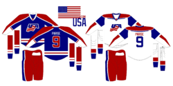
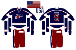
Now we finish where we started — Team USA. Matt submitted this concept. I actually like it better than the current blue United States jersey. That one's a little dark. At least this has a lot of white and red in it.

That wraps things up for the Olympic series. More in 2014!

Winter Winding Down

As the winter winds down, there's been a lot of talk about next year's Winter Classic. Rumor has it the Washington Capitals will get to host. And by far, the most popular opponent among Icethetics readers seems to be the Ottawa Senators. That's our theme for today's post.


Tyler Allen

There's no question in my mind that the Senators need to wear something like this when they eventually get selected for the outdoor game. Tyler's done a great job with this concept.

But his Capitals jersey is more of a Frankenstein creation than anything else. It seems he's literally taken element from every past Caps uniform and injected the Weagle. It's not terrible, but I think the stars are a bit distracting. Might be different on the ice.

Drew Krause

If it's simplicity the Sens would like in a Winter Classic sweater, Tyler's may be the right look. But if it's true vintage they want, look no further than Drew's concept. I didn't like the crazy stripes when Montreal did it, but that might've been because the blue threw it off. Maybe the Sens could do it better in black.

Drew also threw in a couple of logos, including a simplified version of the old primary mark along with a new heritage mark to go with that jersey.

Mike Bell

The Caps' owner may have recently nixed plans for an actual third jersey, but that doesn't mean concept versions can't live on here at Icethetics. Rather than incorporating the Weagle, which many have done (because of its awesomeness), Mike opted for a simple color reversal. Blue jersey, red logo. Not sure about the number being on the front though. We have enough to read there as it is.

Brad McPelican

Brad went the more traditional route with his third, but the key in this concept are the home and road jerseys. Check out the stars on the shoulders! That jersey belongs on a bit marquee sign, rather than a hockey player.

And if that logo looks familiar to you, it comes from the Capitals' old primary logo from the late '90s.

Ryan Haslett

And lest we leave Canada out of the Winter Classic one more time, Ryan Haslett has put together this 2011 concept for a match-up between the Flames and Canucks in Calgary. You don't get any more classic with a Flames jersey.

However, I'm not sure it's the best idea to go with a Canucks jersey from the era in which they wore the same colors as Calgary. For the Canucks, there'd be no choice but to go back to the 1970s and the classic stick-in-rink log.

By the way, I do have a few more Olympic concepts to share. I'll try to get those posted before the weekend.

Olympic Spirit, Finale

I promised one final Olympic concept post. I meant to have it ready Sunday, but as you can see time sort of got away from me. So here's some of the last of the international artwork series.


John B.

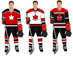
The last three Olympic Spirit posts have opened with a Team USA concept. That's not really fair is it? So here's John's attempt at jerseys for Canada. And yes, that is the Toronto maple leaf in red on the front of the home and road jerseys.

The alternate design, which kind of makes me think of the Devils, features the Canadian coat of arms. A nice effort, but I think one of the keys to the maple leaf on the Canada jersey is that it keeps you from having to spell out Canada at the same time.

Jack Gambro

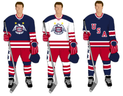
Now we can get to the United States. Jack put together these simple but bold sweaters. That is a lot striping going on there on the sleeves. Not bad at all.

John B.

Here's a new look for Norway. John's replaced the traditional blue on the flag with a powder blue more reminiscent of the Penguins' throwback third. He's also got some interesting striping on the shoulders of that blue jersey.

Howie Crawford

Howie's back with a new look for the Swiss. He's added black and put the white cross front and center. Too much?

John B.

John has one more concept to share — for a nation that's never had an ice hockey team. Go Jamaica!

It's not over yet. In the next update to this post, I'll add all of the remaining Olympic artwork for your enjoyment. Stay tuned for that.


Classic makes a comeback. 3.8.10

Olympic Spirit, Part III

You guys are clearly loving this Olympic concept art, so here's even more!


Glen Cuthbert

In the previous post, Glen had a very sharp white Team USA jersey. This is the blue one that completes the set. Not too bad. But I think with a crest that simple, the striping could be even simpler as well.

Evan Maldonado

That brings us to Evan's Team USA concept, which employs the same ghosted effect seen on some of the jerseys in this year's tournament. I'm really liking the letters in red on this one. Seems way better than the current dark jersey, but not that much is really different.

Matt Marczel

The rest of today's concepts take us to Scandinavia. Here, Matt simplifies Sweden's jerseys and gives them a white one for a change. But personally, I've always been more a fan of the blue jerseys. And technically, white isn't one of their colors. Still, a great effort.

Dallas Hicks

Dallas is trying something completely different with some of the teams that have simple flags. Here, he's adapted the cross on Finland's flag to stretch across the entire front of the jersey...

Dallas Hicks

...and he's also done the same for Norway. Nice to see the polar bear make a return. What do you guys think of these?

And as always, there's more art on tap. In the next day or so, look for more USA concepts plus one from a country that didn't even send a single athlete to Vancouver this year.

Olympic Spirit, Part II

This is an extension of Thursday's post. Concept art has just been flying in over the last couple of days and some of it is pretty awesome!


Glen Cuthbert

Glen put together this blast from the past. Call me crazy, but this would be an awesome alternate jersey. Much better than the U.S.'s New York Rangers-based third. Plus, that's just a great all around crest. Where has it been all these years?

Matt Marczel

While we're on the United States, Matt is looking for a return to something a little more recent. Personally, I think USA Hockey needs a new logo.

Jared LeBlanc

Jared has put together concepts for several countries, including this Canadian one I really like. The black goes away, as it should, and another shade of red is added for contrast. I'm not sure so about the alternate jersey. May be a little too red. That's Russian territory, right?

Jared LeBlanc

Now, I take back what I said yesterday about Elias' Swiss design. Nothing against it, but this is just too cool. At first glance, it may seem plain — which is what I accused the current Swiss jerseys of being — but really take another look. That's just a really sharp design.

Jared LeBlanc

The only one of Jared's concepts I'm not crazy about is this one. Sweden arguably has the best jerseys in this year's tournament, but I feel like this re-imagining takes away from that.

I've still got more artwork waiting in the wings. Keep checking back for updates!