
Freaky Blue Pens
/If it's Friday, be prepared to freak out. Spencer Ford mixes the old '90s penguin with the two-tone blue palette of the 1970s for this Pittsburgh concept. It's unusual to be sure but I don't think that's a bad thing at all.
If it's Friday, be prepared to freak out. Spencer Ford mixes the old '90s penguin with the two-tone blue palette of the 1970s for this Pittsburgh concept. It's unusual to be sure but I don't think that's a bad thing at all.
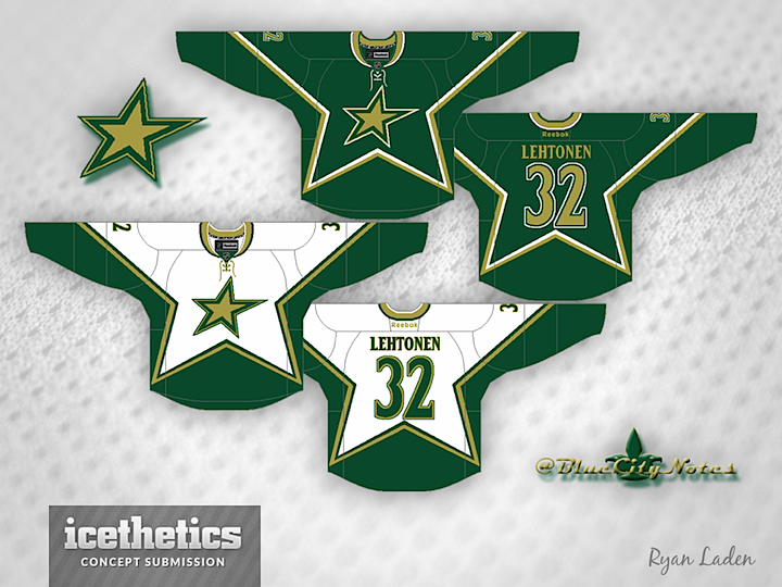
Today is all about the lone star. Maybe you like the Dallas Stars' current star logo. Maybe you just think it needs to lose the text. These guys agree with you. Ryan Laden (a.k.a. the GM of the IceHL's St. Louis Archers) did that with a tried and true jersey style from the club's own history.
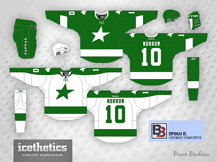
The über-prolific Brian Brideau went with an idea that borders on Freak Out Friday-worthy. He calls it the "Dallas Bay Green Wing Stars" — a clear jab at the monochromatic stylings of the Lightning and Red Wings. But truth be told, it's not really a bad look. Plain, perhaps, but not terrible.
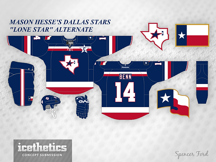
Lastly, a variation on the "lone star" theme. Mason Hesse has the Stars decked out in the red, white and blue of the Texas state flag. You can't see it, but inside the collar reads: "DON'T MESS WITH TEXAS!" We'll leave it at that.

Spencer Ford put together a neat set for the Calgary Flames. I particularly like the alternate logo with the silhouette of the Calgary Tower.
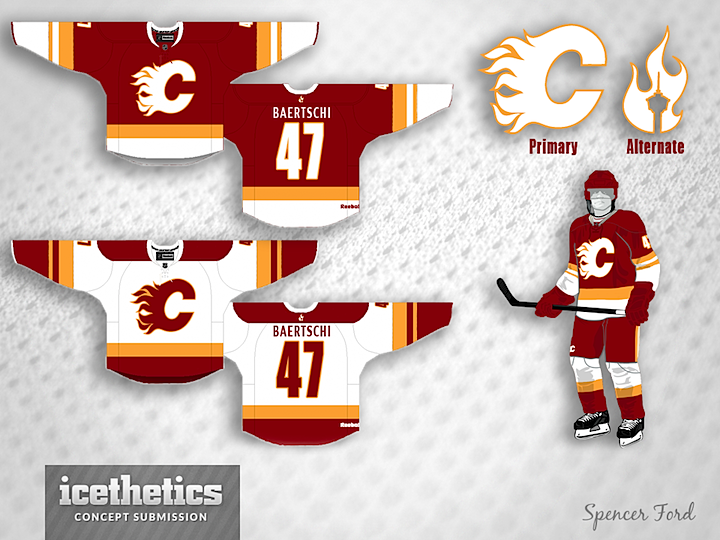
Not a fan of the "vintage white" look? Spencer heard you loud and clear and swapped in some genuine white. Better or worse?