Flames Revisited
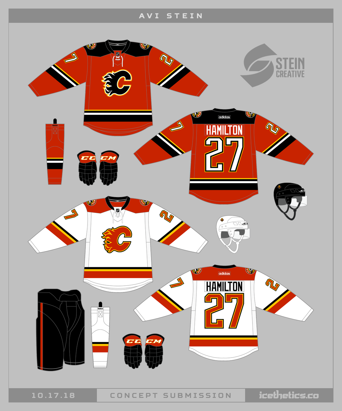
/We saw a concept not too different from this one last week, but I thought it might be fun to compare. The simplicity is really nice. What do you think?
We saw a concept not too different from this one last week, but I thought it might be fun to compare. The simplicity is really nice. What do you think?
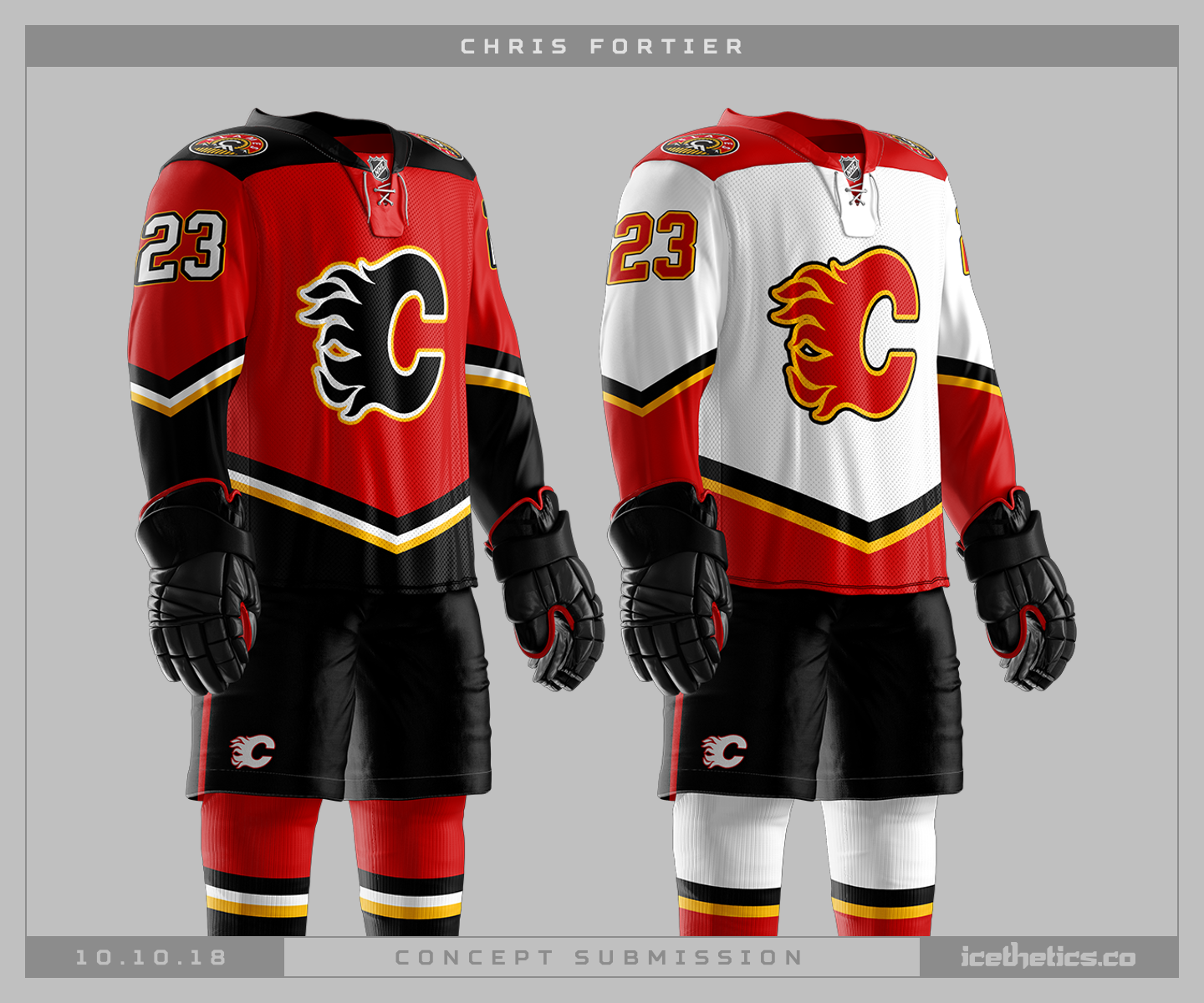
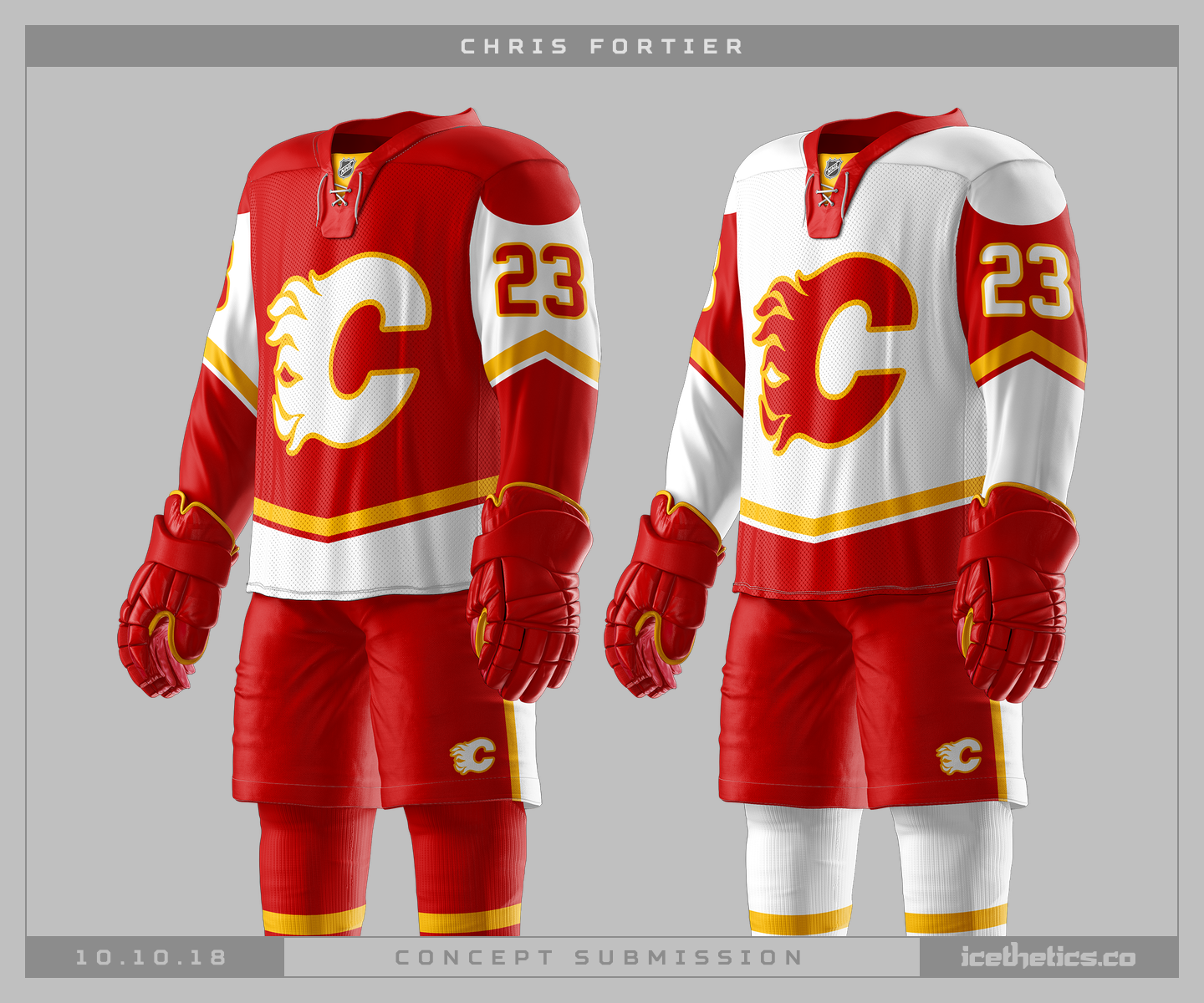
Chris Fortier has a couple of Calgary Flames concepts for us today — similar ideas with modern colors versus retro colors. Have a favorite?
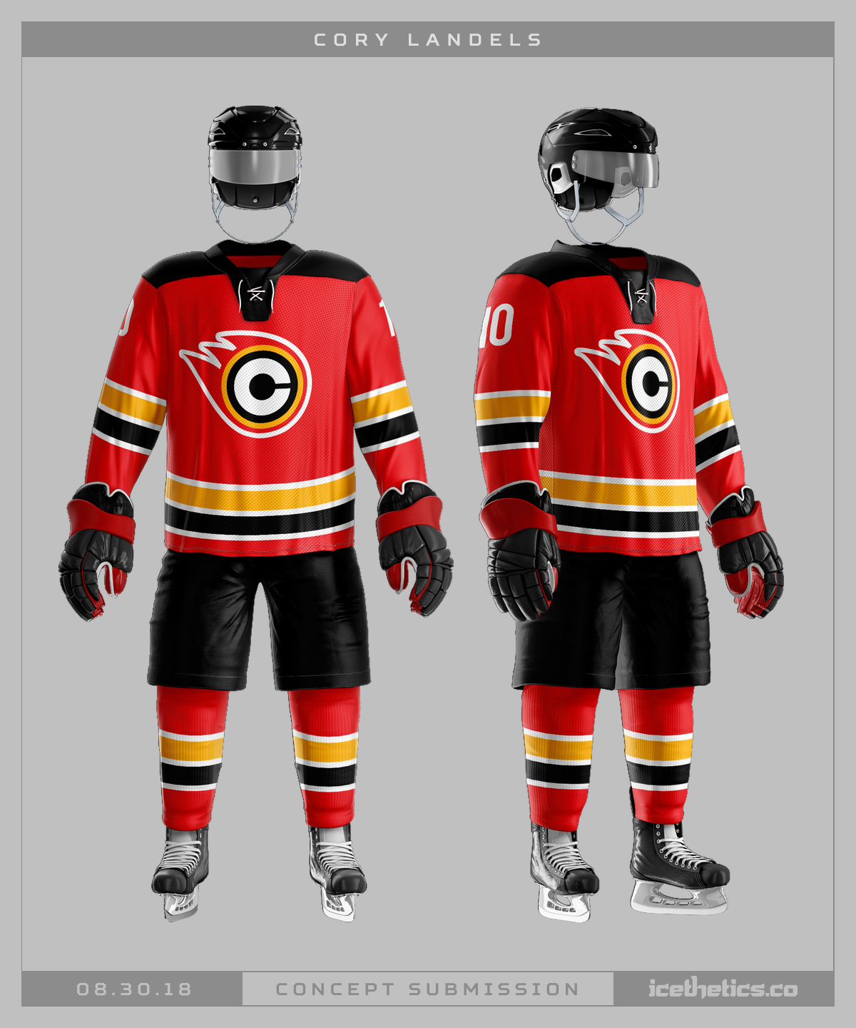
It's pretty rare to see specially designed logos on our jerseys concepts around here these days, but Cory Landels took a stab at minimalist new look for the Calgary Flames.
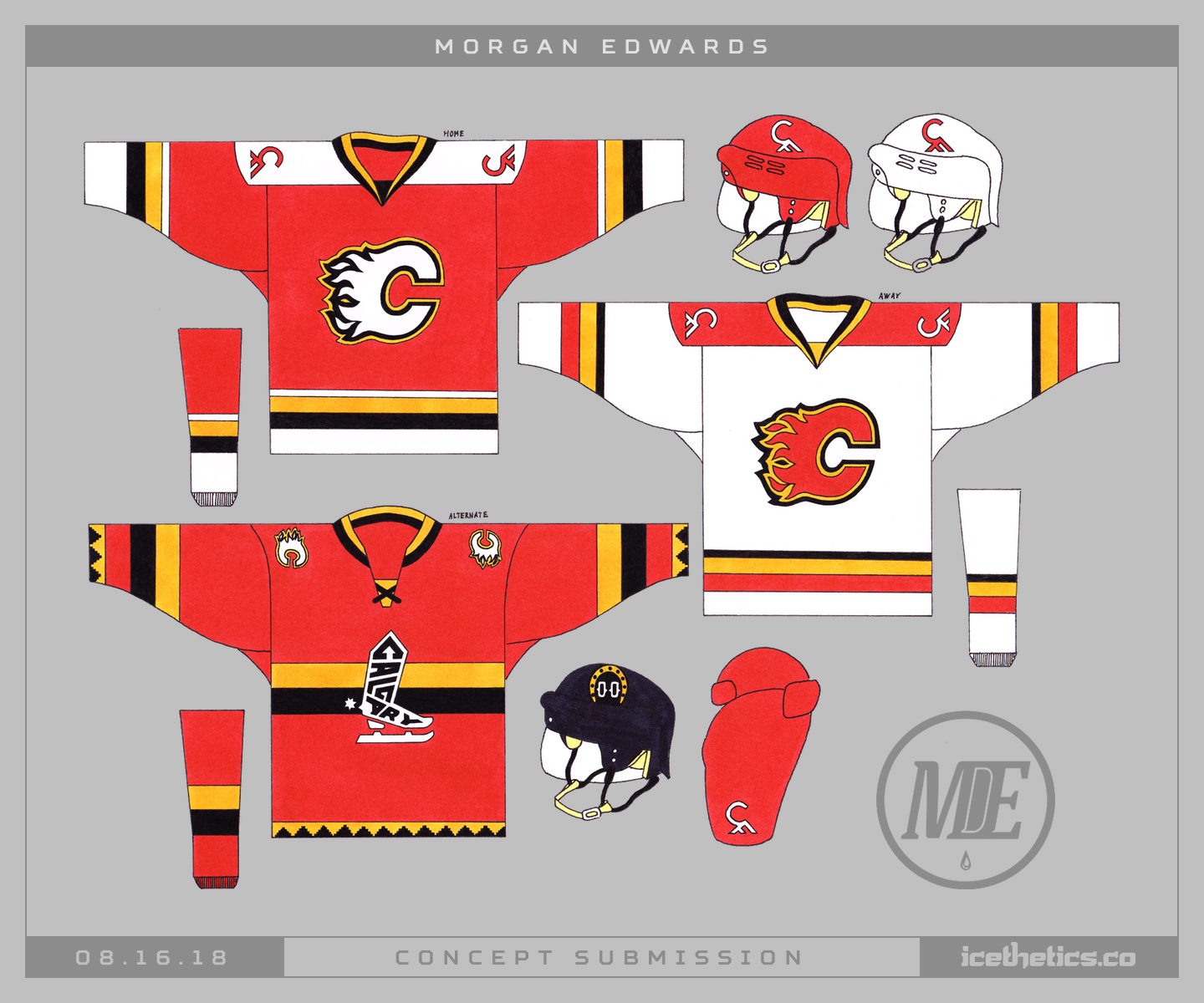
Morgan Edwards is here today with a cool new handmade take on Calgary Flames. His third jersey includes an unused logo from the club's 2013 third jersey design process.
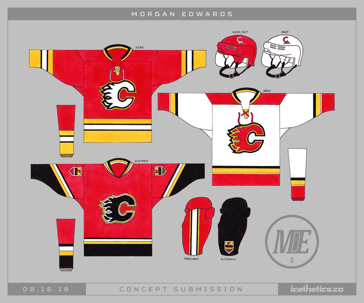
And as a bonus, here's another one he submitted recently with a more traditional look.
Kevin Dion updates the Calgary Flames' third jersey from five years ago by putting the shoulder patch front and center. Not a bad look, if you ask me.
