0515: Alternate Greys

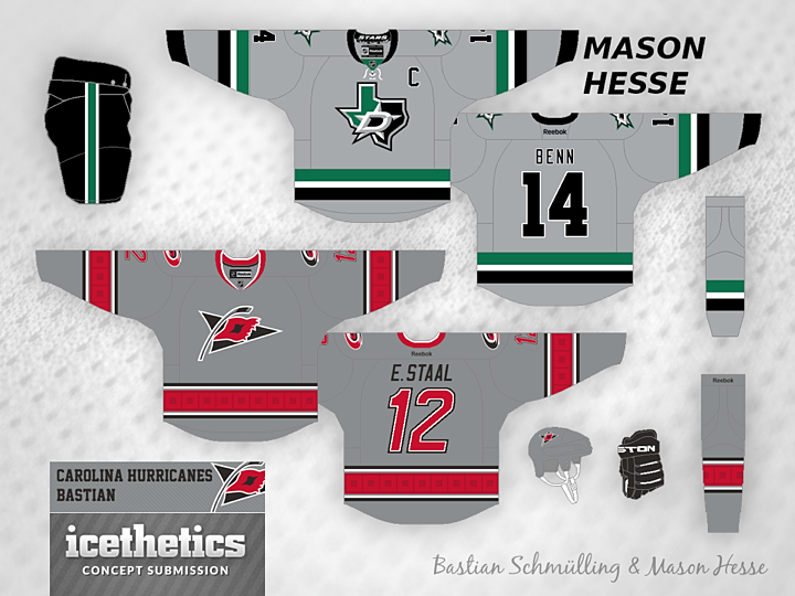
About six weeks ago, the Dallas Stars and Carolina Hurricanes treated us to their new looks. Both use silver/grey in the logos but not as a primary part of their color palette. That hasn't stopped these two artists from producing grey third jerseys for each — separately, of course. Bastian Schmülling came up with the Canes look while Mason Hesse did a little something for the Stars. What do you think? Should grey be the next odd color we see take over an NHL sweater?

0472: Unveiling Day, Part 2

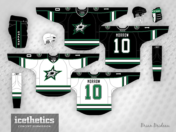
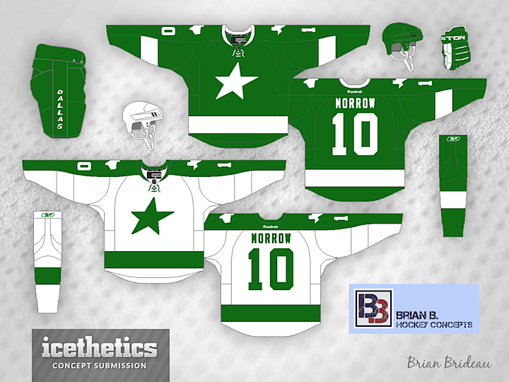
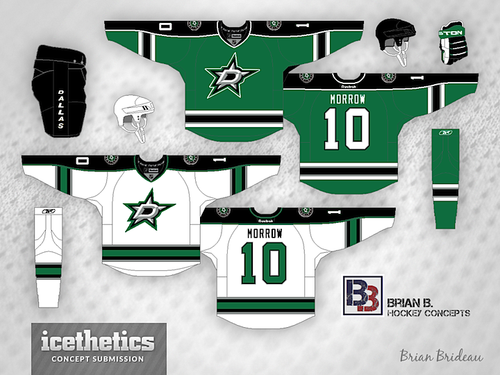
Brian says this green Stars jersey is his prediction for this evening based on everything he's heard and seen from the team. Stars owner Tom Gaglardi has talked a lot about the team's history when discussing the new uniform designs.

And this is another of the wishful-thinking variety. That logo sure looks good on black. Guess we'll see what happens tonight!

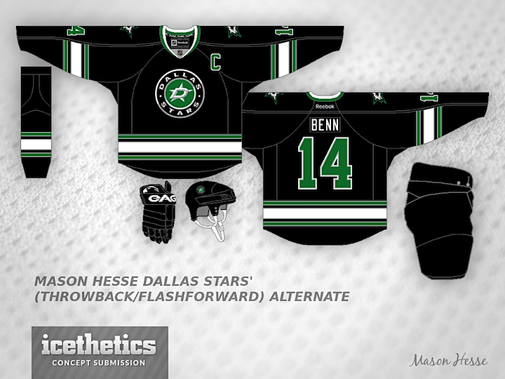
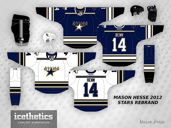
And finally, Mason Hesse puts forth a possible look for a future third jersey. Great looks all around.

0467: The Lone Stars

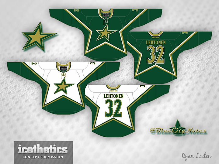
Today is all about the lone star. Maybe you like the Dallas Stars' current star logo. Maybe you just think it needs to lose the text. These guys agree with you. Ryan Laden (a.k.a. the GM of the IceHL's St. Louis Archers) did that with a tried and true jersey style from the club's own history.


The über-prolific Brian Brideau went with an idea that borders on Freak Out Friday-worthy. He calls it the "Dallas Bay Green Wing Stars" — a clear jab at the monochromatic stylings of the Lightning and Red Wings. But truth be told, it's not really a bad look. Plain, perhaps, but not terrible.


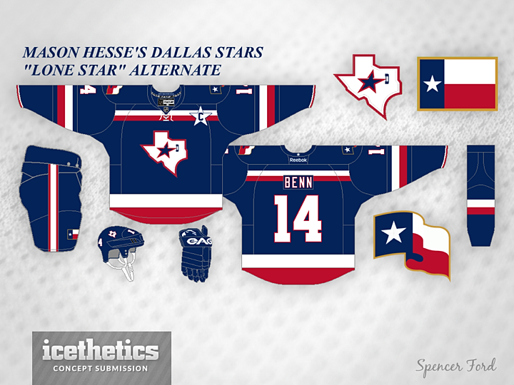
Lastly, a variation on the "lone star" theme. Mason Hesse has the Stars decked out in the red, white and blue of the Texas state flag. You can't see it, but inside the collar reads: "DON'T MESS WITH TEXAS!" We'll leave it at that.

0466: Saddle Up, Cowboys

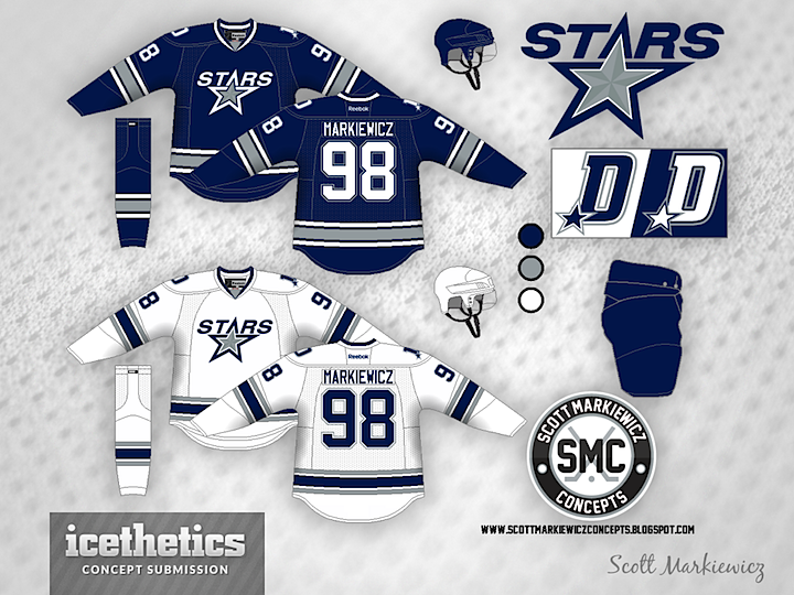
Today's theme is very obviously the Dallas Cowboys. Imagine the Stars decided to align their brand with one of the most well-known in all of sports — and certainly most well-known in their city. It might look something like this option from Scott Markiewicz.


Mason Hesse also tried the blue/silver route with somewhat different results. In fact, despite using the same colors as Scott, Mason's concept feels more like an idea for the Tampa Bay Lightning than the Cowboys. If you had to choose, which option would you prefer?

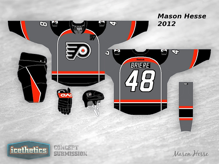
0277: Philadelphia Grey

Gotta throw in something a little outside the box every so often, even though I realize it may not be the most popular thing. Mason Hesse is trying out an interesting grey jersey for the Philadelphia Flyers. And to be honest, I really like it. How about you?