Great Griffins: Revisited

The AHL's Grand Rapids Griffins wrapped up a fan jersey contest yesterday by announcing the two winning designs. Unfortunately, that meant a lot of great ideas fell by the wayside, including this one by Matt McElroy. Anyone else feel like he was robbed?

Meanwhile, Geil Schock tells me he just missed the submission deadline but wanted to share his design anyway. 

Here's a look at the two winning designs. What do you think?

Big Apple Blue

Anyone else tired of all the text-based jerseys the Rangers have brought out in recent years? Matt McElroy tried a retro version of the shield on the front. Not bad at all!

Seattle Sea Lions

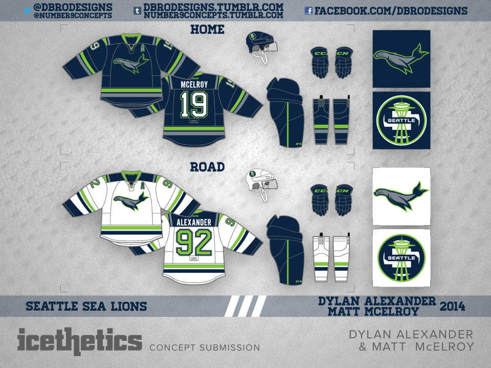
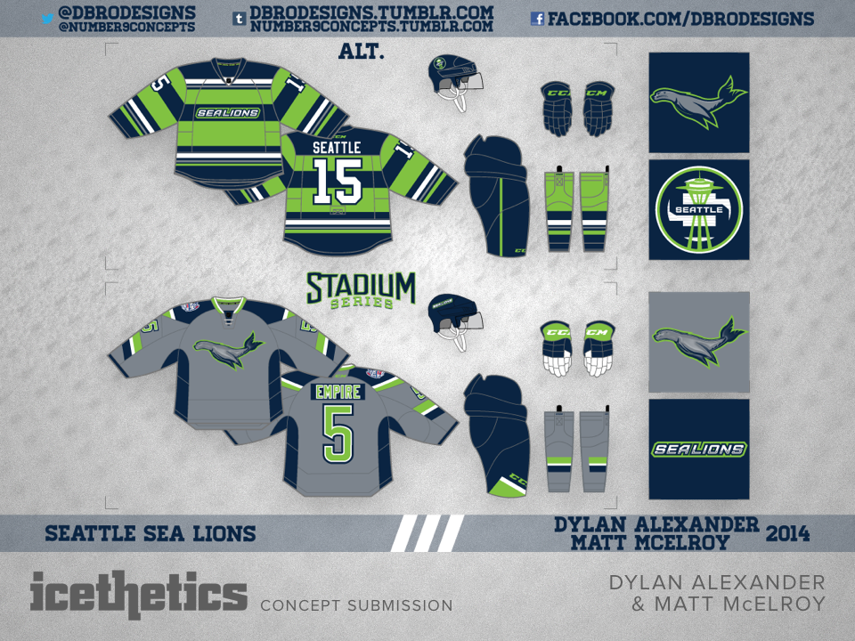
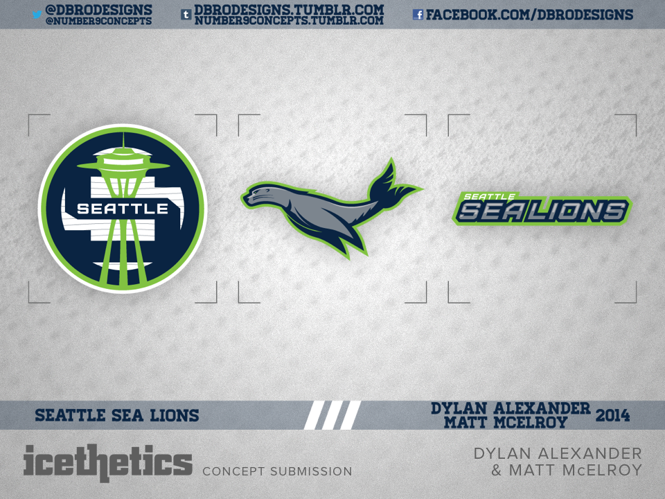
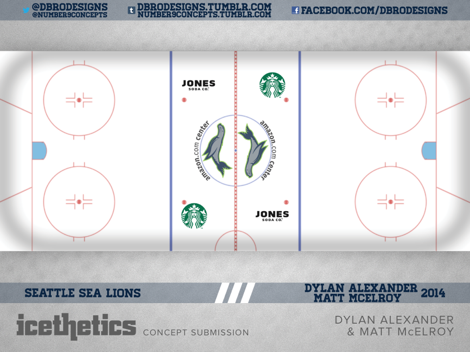
I thought we'd revisit some past Sunday series over the next few weekends. Today, we get a look at a collaboration between two frequent contributors who were not featured this past week. Dylan Alexander and Matt McElroy collaborated on this complete branding package for a Seattle expansion team named the Sea Lions.

Blue and Grey

Around here we talk a lot about the idea of NHL teams without white jerseys. For some, it makes sense. But it just isn't necessary anymore. The World Cup is proof of that. Fans can tell the teams apart even if one is not wearing white.

Today, Matt McElroy shares this idea for a Columbus Blue Jackets jersey set free of white. I think it looks pretty sharp. How about you?

Black and Blue Bolts

Once again, proof that the Tampa Bay Lightning did not need to lose black from their color palette in 2011. The ever-prolific and talented Matt McElroy offers up this sharp look today.