0520: Predicting Buffalo's New Third

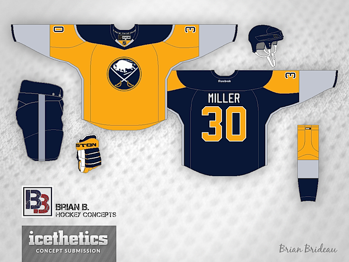
The Buffalo Sabres this summer have been offering up sneak peeks of their new third jersey, debuting in the fall. Based on these cryptic photos, some of our favorite concept artists have been hard at work trying to sort it all out. For my money, Brian Brideau has come closest, but not quite on the money.

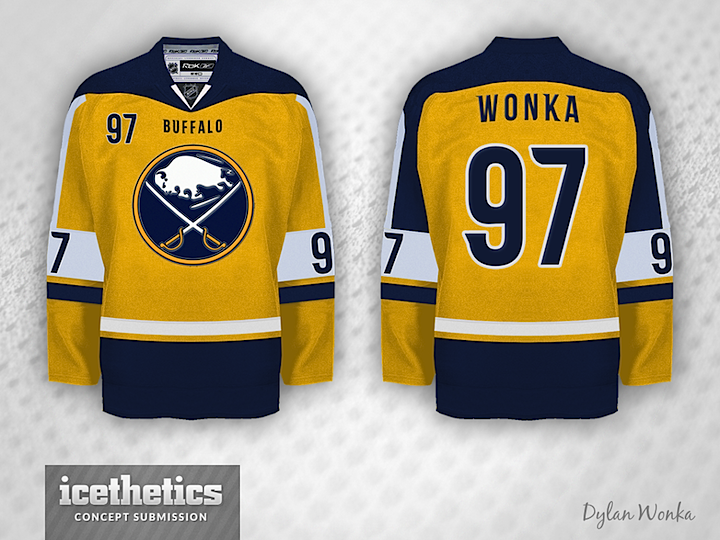
Dylan Wonka may be on to something, but I've been told the front will be gold and the back will be navy. I don't know why I believe it; it sounds ridiculous. But it's just crazy enough that I could see a team like the Sabres doing it.

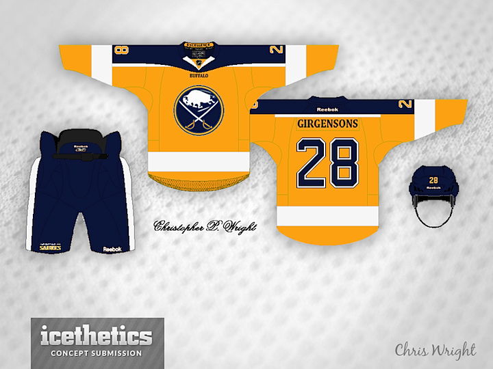
Lastly, Chris Wright shares this take. Simple, but a little too Nashville. I think we're going to find that in any number of ways, Buffalo will be distancing themselves from the Predators' look despite going with a primarily gold sweater. I'm looking forward to the unveiling. And not to worry, there will be plenty more of these Sabres concepts to come.

0516: Buffalo Blue

Under the circumstances, a blue Sabres jersey isn't exactly topical. But I plan out these posts in advance. So until I get around to some of the gold Buffalo concepts that have been coming in, enjoy this blue one from Brian Brideau. And let's ask ourselves why this isn't already the team's primary uniform.

0472: Unveiling Day, Part 2

Brian says this green Stars jersey is his prediction for this evening based on everything he's heard and seen from the team. Stars owner Tom Gaglardi has talked a lot about the team's history when discussing the new uniform designs.

And this is another of the wishful-thinking variety. That logo sure looks good on black. Guess we'll see what happens tonight!

And finally, Mason Hesse puts forth a possible look for a future third jersey. Great looks all around.

0472: Unveiling Day, Part 1

This day is a little unprecedented. Two NHL teams are unveiling new uniforms today. So in order to get some last-minute concepts out before the official reveals, I'm actually doing not one but two separate concept posts. Hurricanes are up first right now with the unveiling set for 12pm ET, then the Stars later this afternoon ahead of their unveiling, which will be around 6pm CT.

Up top, frequent contributor and GM of the IceHL's North Carolina Nighthawks (imagine that) Brendan Anderson takes a stab with his prediction for Carolina's new look. It's based on the bits and pieces we've seen over the last 12 days from the Canes' Instagram teaser photos.

Next another regular, Brian Brideau, tries his hand. I think ultimately, we might see a mix of these two designs. Brian's paid attention to the template change, which shows the shoulder seam beneath the nameplate instead of above it. But he doesn't seem to have the dual striping pattern or the new font.

All signs point to the Hurricanes opting for non-matching home and road jerseys with this new set. That's what Adam Ravenhill had in mind when he made this concept. Not sure where the Jets-style striping comes from on the red jersey, but it's not a bad look. What do you think of the idea of non-matching jerseys?

Remember to come back this afternoon for one last set of Stars concepts ahead of tonight's unveiling.

0467: The Lone Stars

Today is all about the lone star. Maybe you like the Dallas Stars' current star logo. Maybe you just think it needs to lose the text. These guys agree with you. Ryan Laden (a.k.a. the GM of the IceHL's St. Louis Archers) did that with a tried and true jersey style from the club's own history.


The über-prolific Brian Brideau went with an idea that borders on Freak Out Friday-worthy. He calls it the "Dallas Bay Green Wing Stars" — a clear jab at the monochromatic stylings of the Lightning and Red Wings. But truth be told, it's not really a bad look. Plain, perhaps, but not terrible.


Lastly, a variation on the "lone star" theme. Mason Hesse has the Stars decked out in the red, white and blue of the Texas state flag. You can't see it, but inside the collar reads: "DON'T MESS WITH TEXAS!" We'll leave it at that.