0089: Vintage Blackhawks

i
666 VOTES

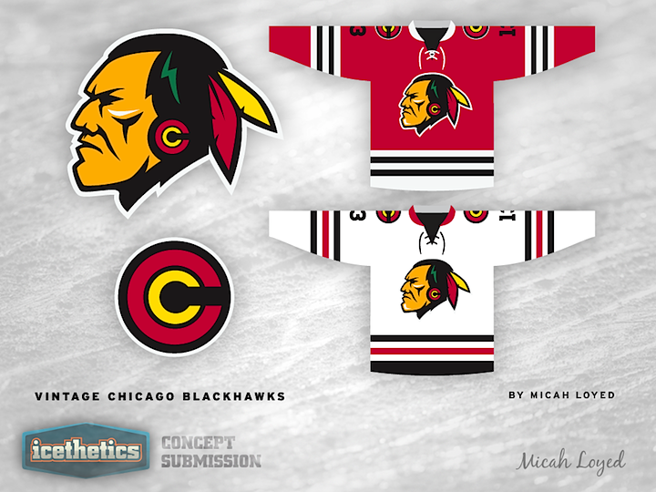
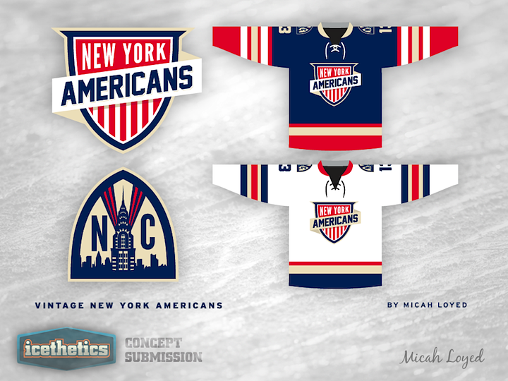
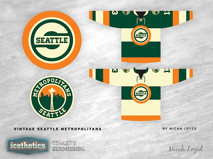
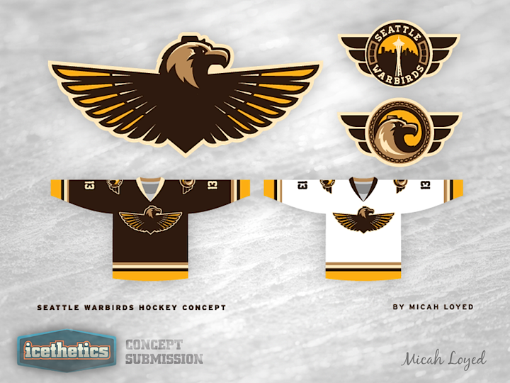
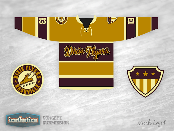
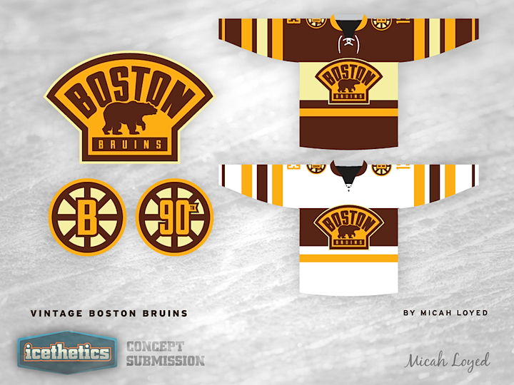
Recently, Micah Loyed's work was the subject of a concepts series called Vintage Week. Afterward, he wanted to throw in one more idea. This is what he put together for the Blackhawks. I really do like the simplified crest design.

0 Comments
Share
i
RATE THIS CONCEPT

0084: New York Americans

i
666 VOTES

It's a Retro Weekend so Micah Loyed is digging up the past with his New York Americans concept, which is absolutely superb, in my view. I'm especially enjoying the secondary logo. But overall, I like the simplistic look. More NHL teams could stand to look this good.

0 Comments
Share

0075: Vintage Seattle

i
825 VOTES

Vintage Week wraps up today as Micah Loyed gives us Seattleites something to think about. He's resurrected the Seattle Metropolitans. Here's how he describes the design: "The main crest has a nod to the Supersonics but incorporating 'Seattle' in a manor that is a tad more legible than the beloved 'Seattle on the path of the S' design."

But wait, there's more...

i
621 VOTES

This one is just a bonus. Micah also put together another Emerald City-inspired concept for us. Thoughts on the Seattle Warbirds?

0 Comments
Share

0074: Vintage Dixie Flyers

i
450 VOTES

Micah Loyed's Vintage Week is straying away from the NHL now to look back at a minor league team from the 1960s — one seemingly tailor-made for a vintage concept series. The Nashville Dixie Flyers played in the Eastern Hockey League from 1962 to 1971. They're known for their purple and gold uniform colors.

0 Comments
Share

0073: Vintage Bruins

i
567 VOTES

Vintage Week rages on with a fantastic retro-style Boston Bruins concept by featured concept artist Micah Loyed. The set even includes a 90th anniversary patch — an event which is still a couple of years off. Still, with great colors and a beautiful uncluttered design, I've yet to see anything bad from Micah in this series.

0 Comments
Share