A New Chief Revisited

Back in May, Mark Morgan committed the "cardinal sin" of redesigning the Blackhawks logo and sharing it with the world. I liked what he brought to the table, but you guys clearly did not. So he's taking another stab with a more traditional look. What do you think?

A New Chief

I know, I know. The Blackhawks are untouchable. But just look for a second. Mark Morgan reimagines the classic Indian head with a fresh perspective and it's actually pretty awesome. Or is it just me?

A More Natural Leaf

Mark Morgan writes:

I know that it is hard to mess with an original six design, but I cannot understand why the "Toronto Maple Leafs" needs to be spelled out on their logo designs — especially because the maple leaf shape can stand alone (see Canadian flag).
Here is my leafs concept that drops the words and tweaks the logo just a touch, giving it a more "natural" leaf feel.

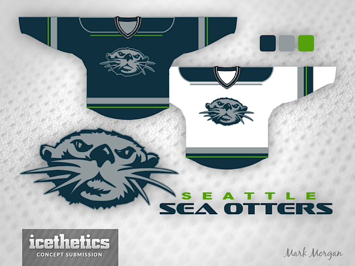
0554: The Seattle Sea Otters

Well, I said I was tired of posting Seattle Metropolitans concepts. Mark Morgan was tired of it too. So he imagined a new team named the Seattle Sea Otters. (Try saying it a bunch of times in a row.) I will say this: I love the colors!

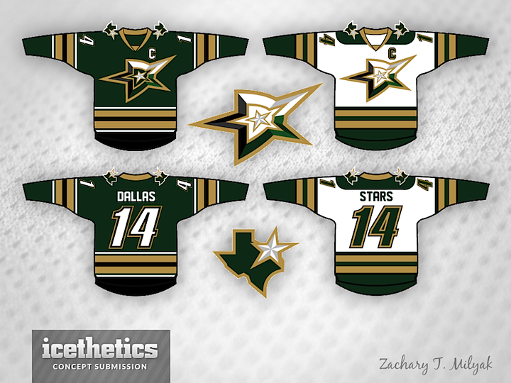
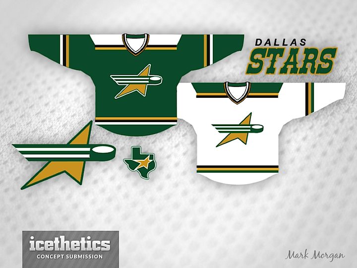
0458: Dallas Stars II

Dallas Stars Week proceeds with a pair of unique redesigns. Zachary T. Milyak had an interesting idea I've never seen before — turning the "D" itself into a star.


Meanwhile, Mark Morgan opted to simplify with his concept. Which of the two do you prefer?