Minimalized
/Today's Freak Out Friday foursome comes from Felix Puchinsky, who takes a stab at making minimalist logos for some untouchable NHL identities.
Today's Freak Out Friday foursome comes from Felix Puchinsky, who takes a stab at making minimalist logos for some untouchable NHL identities.
Felix Puchinsky has been working on a handful of logo ideas for the Carolina Hurricanes. And for all their simplicity, they're pretty freaky. Got any favorites?

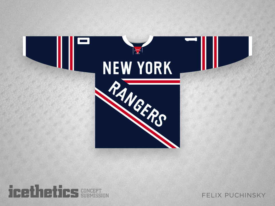
I'm sure in some alternate universe, the New York Rangers wear a jersey like this one designed by Felix Puchinsky. I'm just glad I don't live in that universe. Happy Friday!


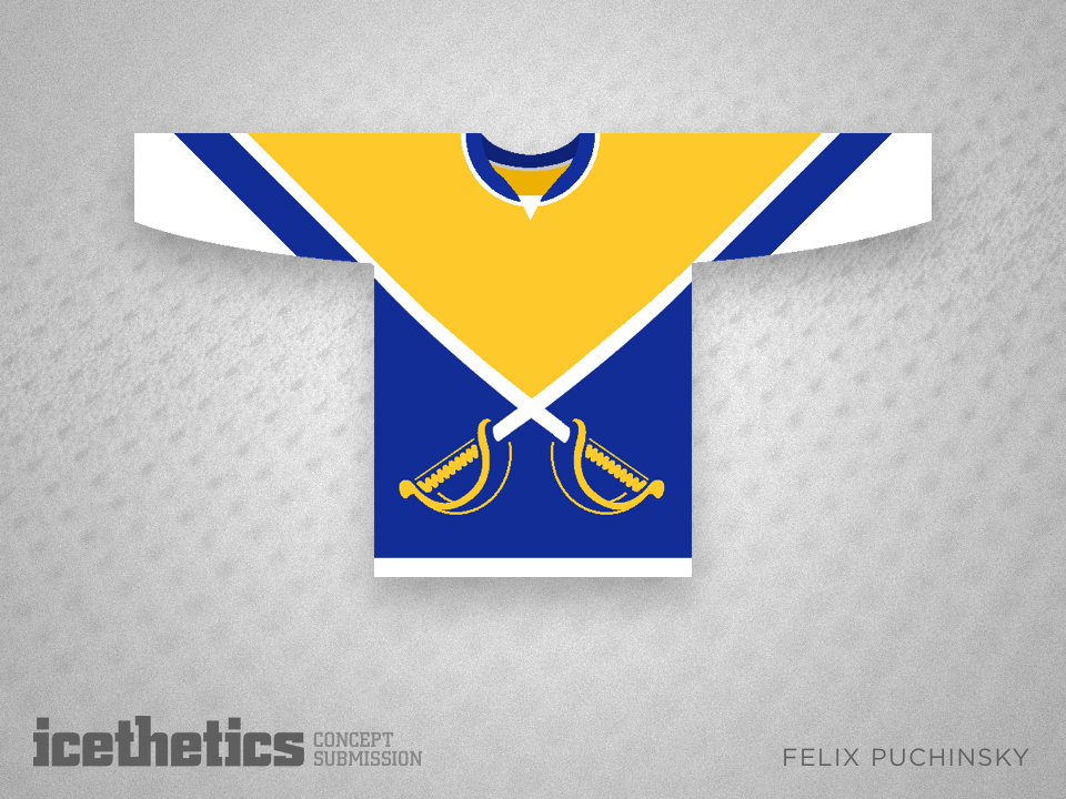
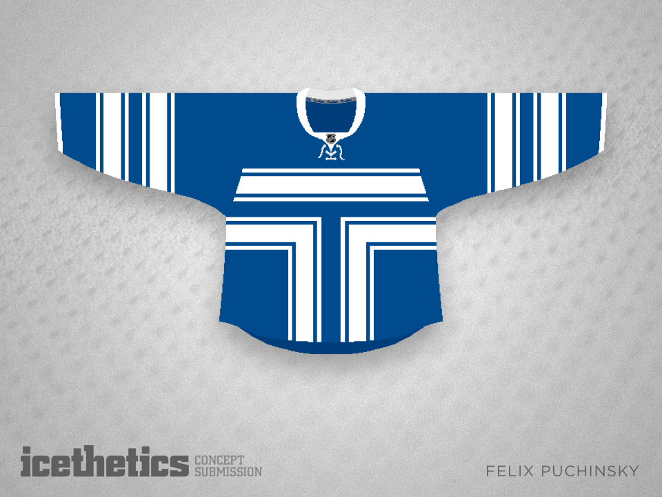
Why should a team's logo be confined to one square foot on the chest? Felix Puchinsky doesn't think it's necessary, and this Freak Out Friday the 13th, he's showing us three jerseys to prove his point. I really don't think there's much more I can say about it. Enjoy.
In honor of the unveiling of the new Toronto Maple Leafs logo today, here's a fun one. Felix Puchinsky has been sketching out ideas for Leafs logos for months. I've assembled them all here in this post. What do you think? Have any favorites?