K-Wings Klassik
/Charles Noerenberg shares a beautiful old-timey concept for the ECHL’s Kalamazoo Wings.
Charles Noerenberg shares a beautiful old-timey concept for the ECHL’s Kalamazoo Wings.

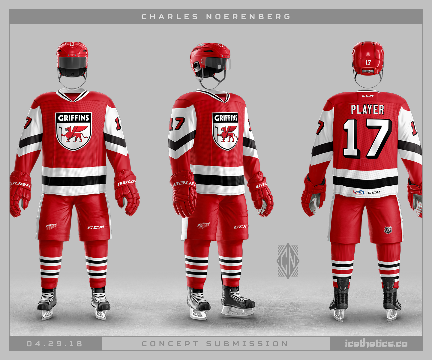
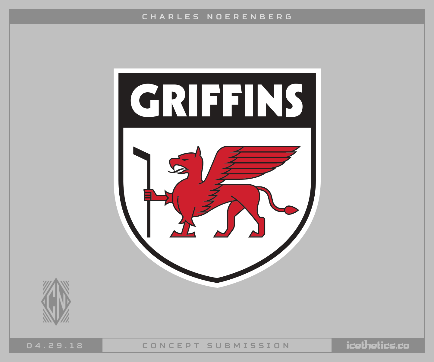
The Grand Rapids Griffins recently held another one of the jersey design contests — this time with a 1980s theme. Charles Noerenberg put this one together.


Charles Noerenberg returns with a new look for the Winnipeg Jets. He writes:
I was going for a clean, modern update to the beloved RCAF Flyers look, utilizing the light blue more. I created a new name and number typeface as well.
I made the revisions to the Jets' primary logo to make the plane more visible, to give the maple leaf a better form, and to give the logo better balance overall, so there isn't as much negative space on the left and right sides of the circle. I also removed the bombs from the plane's wings, to play down the militarism of the logo, and flipped the shadow to the left side of the plane, indicating a "bright future."
This one's a bit odd — almost perhaps warranting a Friday placement. But I think Charles Noerenberg has the right idea in that the Flames don't really need black. The red and gold work very well together. As far as nameplates at the bottom... that's another story.

A new artist tackles a new team today. With just three weeks until the official reveal, Charles Noerenberg offers up this take on the Golden Knights uniforms.
