Rebranding The Stars, Revisited

I've got new artwork from Matt today and an update on his next rebrand.

Two weeks ago he added the Dallas Stars to his Rebranding the NHL series. One major factor in his design was dropping one of the primary colors — green. He even explained why but that doesn't mean green wouldn't have looked good on the uniforms.

Here's a different take on the uniforms of his latest rebrand.

The St. Louis Blues are next on Matt's list. He's planning to have it done soon and has offered up a few tidbits about what to expect from it. He calls the new primary logo a "tasteful, vintage style" modernization of the Blue Note the club has worn for more than 40 years. He is, however, working on two additional original logos so you will get something new.

I know I'm looking forward to seeing what he comes up with.

Rebranding The Stars

Your favorite Icethetics partner artist is back tonight with another concept for his series, Rebranding The NHL. I know you're excited! Matt is taking his shot at the Dallas Stars and it's quite likely one of his best yet. But first, read his explanation in his own words.

After my exhaustive research into the Dallas Stars, many of the Stars fans really like their new uniforms. So taking cue from that, I ended up removing green from the color scheme. Why? Because the time has finally come to put the North Stars days away for good. This is the Dallas Stars. Minnesota has their new team. Time to turn the page in Stars history and embrace their home.

The goal of this new identity is to embrace the new "Lone" Stars. The completely custom wordmark is styled after an old saloon sign. The new secondary logo is a much better attempt to symbolize Texas than the failed "Mooterus" from a few years ago. The striping on the home and away feature barb wire lining the jersey, and the alternate jersey design resembles the horns of a steer...


So here are the logos he created for the Stars.

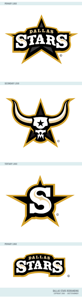
As usual, it's truly great work and that secondary logo is just downright scary. Like a lot of you, at first I was concerned with the lack of green. But after reading Matt's explanation, I think it's perfect. A true, individual branding for a great team.

Naturally, he's done uniform concepts to go with it.

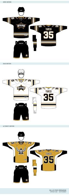
I'd buy that gold jersey in a heartbeat.

But for all the fans of Matt's work, he's donated a neat little surprise for. A lot of folks have asked about getting a copy of Matt's uniform template. He's now generously offering it for the first time. Enjoy!

So what's next? Matt tells me he's hard at work on a new rebranding of the St. Louis Blues. But he's a little stumped. He says, "The only thing is I have no idea how I can give them a better identity than the Blue Note. So I would like to call out to all Icethetic-ites for aid in coming up with ideas for Blues logos..."

For one thing, he needs help determining a secondary color. And who better to ask than the awesome readers of Icethetics? In the sidebar is a new poll where you can voice your opinion. Choose between navy blue, yellow and red to go with the primary color of blue.

And if you have any brilliant ideas for a new direction for the Blues' logo, you can post them here in the comments or contact Matt directly by emailing him at gfb_designs@yahoo.com. Voice your thoughts and get ready for an exciting new look for the Blues!

Rebranding The Sabres

As promised, today brings the unveiling of the 11th design in Matt's Rebranding The NHL series — the Buffalo Sabres.

And naturally, he's designed uniforms to go with these logos.

To me it seems like the best Sabres logo always revolves around the same basic theme — the original logo from the team's inception. Sometimes you just can't improve upon what came first. Or at least it's just difficult to come up with something entirely new.

Anyway, as soon as Matt tells me what team he's rebranding next, I'll tell you. In the meantime, let us know what you think of the new Sabres artwork. Leave a comment!

New Rebrand Coming Tomorrow!

You got your first peek at it on the day Icethetics launched. But just wait until tomorrow! Matt's Rebranding The NHL series continues with the unveiling of his new Buffalo Sabres logo and jersey designs.

Don't you hate being teased? What's that? You say you love it! All right then, you know the uniform series you guys have been enjoying from capn89? He's currently working on the Sens' new duds and put together a video to tease you.

Not to worry though, tomorrow afternoon you'll get to see the Sabres rebrand that's been almost two months in the making. Get excited!

Preview Matt's Sabres Rebrand!

Aw, you didn't really think I'd do a launch with nothing more than a post about things you already know, did you?

Icethetics partner artist Matt (aka GhettoFarmBoy) has been hard at work on his latest design in the Rebranding The NHL series. And today, as we launch the new blog, he's offering up a preview of his new Buffalo Sabres logo.

It's looking good. He assures me that the final design will be ready soon.

But just so you don't walk away empty-handed, he's sharing with us one of the logos that didn't make the cut in his final Washington Capitals rebrand.

So I hope it was worth it on moving day. And I've been reading some of the comments posted so far. Here's some quick responses. The logo at the top is not final. It's a placeholder. I understand you like/dislike the color scheme (we can hold a poll on that if you want). The center ice tournament will feature "natural" logos — no all-star or anniversary symbols. We'll get to the mascots but I wanted the first Icethetics tournament to feature all 30 clubs.

Think that answers everything so far. Got any other questions? Feel free to email me or leave a comment.