Preview Matt's Sabres Rebrand!
/Aw, you didn't really think I'd do a launch with nothing more than a post about things you already know, did you?
Icethetics partner artist Matt (aka GhettoFarmBoy) has been hard at work on his latest design in the Rebranding The NHL series. And today, as we launch the new blog, he's offering up a preview of his new Buffalo Sabres logo.
It's looking good. He assures me that the final design will be ready soon.
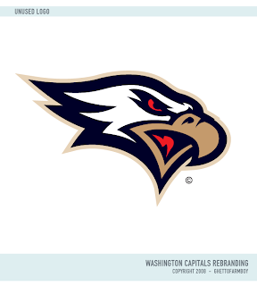
But just so you don't walk away empty-handed, he's sharing with us one of the logos that didn't make the cut in his final Washington Capitals rebrand.
So I hope it was worth it on moving day. And I've been reading some of the comments posted so far. Here's some quick responses. The logo at the top is not final. It's a placeholder. I understand you like/dislike the color scheme (we can hold a poll on that if you want). The center ice tournament will feature "natural" logos — no all-star or anniversary symbols. We'll get to the mascots but I wanted the first Icethetics tournament to feature all 30 clubs.
Think that answers everything so far. Got any other questions? Feel free to email me or leave a comment.


