Minor leagues teem with milestone marks
/The ECHL turns 30, the Hershey Bears hit 80 and the Utica Comets are... well, 5. Cute. See all the new logos here.
Read MoreThe ECHL turns 30, the Hershey Bears hit 80 and the Utica Comets are... well, 5. Cute. See all the new logos here.
Read MoreIt's one of the best new sweaters to come out of the minors in quite a while!
Read MoreIt's basically become a yearly tradition at this point. Minor league hockey teams shed the shackles of social norms by persuading large, lumbering men to sport hot pink hockey jerseys for a game or two. But it's the good cause at the heart of it all that keeps everybody coming back for more every season.
Pink in the Rink Night. It's a simple event celebrated at hockey arenas around the continent in a bid to both increase awareness of breast cancer and raise money for related charities. These silly jerseys are normally auctioned off after the game with the proceeds going to a group like Susan G. Komen or a hospital researching a cure for the disease.
Of course this year is no different. Let's take a look at some of the pink sweaters that have been put to use in the AHL to this point in 2014.
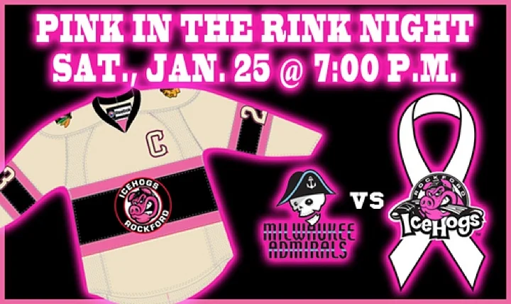
The IceHogs get us started with their pink-accented jerseys — really nothing more than their thirds with the red swapped for pink.

They wore them Jan. 25 for a 2-1 victory over the Milwaukee Admirals.
The sweaters are hung on the hooks with care, just 2 hours until puck drop @BMOHarrisCenter! #PinkintheRink | pic.twitter.com/NXVjSRJvZk
— Rockford IceHogs (@goicehogs) January 25, 2014
On Jan. 31, one of the AHL's newest members — the Comets — took to the ice in our favorite hue. They knocked out the Syracuse Crunch 3-1.
The club auctioned off their jerseys at the end of the game to benefit the Breast Care Center at Faxton St. Luke’s Healthcare.
Even the officials got it on the pink action. The black and pink striped referee outfits are a sight to see. Click through the slideshow above to catch a glimpse.
By the way, if those few photos aren't enough for you, be sure to check out the full gallery on the team's Facebook page. There are some great shots in there.
@icethetics @UticaComets "Pink The Rink" jerseys unveiled. They will be worn on January 31st vs the @SyracuseCrunch pic.twitter.com/ldEOZrUjp8
— James Misercola (@sabresfan9715) January 23, 2014
Photos from Worcester Sharks via Facebook
Photo from Worcester Sharks via Facebook
Photo from Worcester Sharks via Facebook
Photo from Worcester Sharks via Facebook
On Saturday, Feb. 1, the Sharks entered the mix with these numbers — and a rink full of pink ice. They defeated the Providence Bruins 3-2.
It was the third year in a row the Sharks have held such an event. This one benefited The Cup Crusaders, a team that participates in the annual Komen Foundation's Breast Cancer 3-Day walk in Massachusetts.
@sportslogosnet @icethetics Worcester sharks pink in the rink jersey for this Saturday night #WorSharks pic.twitter.com/bV8N5GIGC7
— Tyler Lowell (@TmanLowell11) January 30, 2014
Photo from Hartford Wolf Pack via Facebook
Photos from Hartford Wolf Pack via Facebook
Photo from @Concepts_SM
Photo from Hartford Wolf Pack via Facebook
Just across the state line, the newly re-christened Wolf Pack also held Pink in the Rink on the same night. They beat the Albany Devils 4-3 in a shootout.
The pink-infused jerseys were auctioned off after the game to benefit Komen Connecticut. And here's a fun tidbit from the Pack's website.
The Pink in the Rink theme will include concessions and the Comcast Coliseum Club as well. The concession stands will be offering pink popcorn, pink cotton candy and pink lemonade, and the Coliseum Club menu will feature cherry plank salmon with pink sauce, pink grapefruit salad and pink lobster bisque.
That's a lot of pink around the building.
By the way, thanks to Wolf Pack fan and regular concept contributor Scott Markiewicz for all the great photos he shared via Twitter.
And a back shot of the jersey. Modeled by Danny Syvret: pic.twitter.com/14YnqxDaxk
— SMConcepts (@Concepts_SM) February 2, 2014
All the focus on breast cancer is great, but for the most part, it directly affects women. The Amerks didn't want the guys feeling left out, so they had Men's Health Night on Jan. 31.
Instead of pink, the team wore powder blue-accented sweaters and beat the Rockford IceHogs 4-1. It seems like the good karma generated by raising money for cancer charities is directly translating to wins on the ice. Not sure how that works, but it's awesome.
By the way, if you want to get your hands on one of these powder blue Americans jerseys, they'll be up for auction through the weekend. The proceeds are going to ZeroCancer.org and The Lipson Cancer Center.
#Amerks Men’s Health Night pres. by Urology Associates of #Roc 1/31 vs. Rockford. These jerseys to be worn/auctioned: pic.twitter.com/cXu44uy1EB
— Rob Sanderson (@RSandersonWHTK) January 23, 2014
There are still four more AHL teams that I know planning to wear pink this season. Here's a quick list.
Pink jersey fever has also spread to other minor leagues. I'll do a little research and put together a post like this for the ECHL next week. (And I'll try to remember to come back and update this one later in the season.)
Photo from Manchester Monarchs via Facebook
Photo from Manchester Monarchs
Photo from Manchester Monarchs via Facebook
February 9: Almost missed one. The Monarchs skated out last night wearing a pink version of their black third jersey.
Unfortunately, things didn't turn out as well for them as it did for other teams sporting the pink recently. The Monarchs fell 3-2 to the Providence Bruins.
If you'd like to see more of these jerseys in action, there's video here.
Warmups are underway! pic.twitter.com/4AYqOrbJzx
— Manchester Monarchs (@MonarchsHockey) February 8, 2014

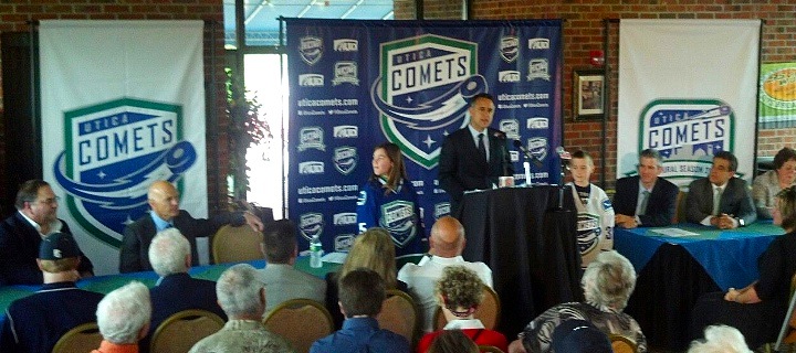
The AHL's Peoria Rivermen have been searching for a new home over the last several weeks after the Vancouver Canucks purchased the franchise and announced it would be leaving Illinois. This afternoon at a press conference in Utica, N.Y., the team officially became the Utica Comets.
The new logo was first to be unveiled. Its shield design gives it an almost soccer-like quality. But the flying puck leaves no doubt this is New York's newest hockey team. The crest is styled after the look of the Canucks, the club's owner and NHL affiliate. Which is good because the jerseys belong to Vancouver too.
 Utica Comets home, road and alternate jerseys (via Canucks website)
Also unveiled at today's news conference were the new home and road uniforms, which are essentially Canucks jerseys with a different crest. And rather than using the Canucks' primary logo on the shoulders, it's the secondary mark — the stick in the rink.
This has naturally led to questions from readers about whether it "means something" for the Canucks' future. I think it has more to do with aesthetics (the orca logo doesn't have any green) than anything else. And they're actually not alone. The Worcester Sharks wear on their shoulders the same shield logo the San Jose Sharks wear on their pants.
I like the simple carryover from the Canucks on the home and road designs. But that third jersey doesn't do it for me. There's clearly an effor there to call back to a Comets jersey from an earlier era, but text and numbers on the front rarely find favor with me.
 Comets announce name, logos and uniforms at press conference (via Facebook)
Today's announcement marks the return of AHL hockey to Utica. The city had previously been home to the Utica Devils (who are now, somewhat ironically, the Abbotsford Heat) but that was 20 years ago. The franchise left town in 1993.
The name Comets has a long history in the area. Nearby Clinton, N.Y. was home to the Clinton Comets starting way back in 1927 — though they didn't pick up the Comets moniker until 1949. The team played in a number of leagues over the years but they made their name after joining the Eastern Hockey League in 1954. Can you name the other EHL team that's now a member of the AHL? It's the Charlotte Checkers.
The Canucks posted a neat infographic on their website that delves into the history a bit. It explains how the new logo was inspired by the old Clinton Comets logo. The mixture of Canucks elements really brings it all together if you ask me.
It's a great, simple design that accomplishes everything it needs to as far as establishing an AHL franchise in a new city. Sure we'll hear complaints about the text in the logo, the puck, and probably even cracks about the lack of creativity in the jerseys themselves. But consider the amount of time the organization had to put this all together.
The Canucks bought the Rivermen franchise in April. That's just two months to get logos designed and approved and put jerseys and other merchandise into production. That's a very fast turnaround for something like this. And it's rather impressive to see what the end result was.

The Comets will hit the ice in October and have this inaugural season logo to mark the occasion. Looks familiar, right? Like the Canucks' 40th anniversary logo from a couple years ago? Certainly a logo design time-saver if I ever saw one. That said, it's well executed.
There was a lot put on the web today about the Comets, especially through official channels. So if you want to learn more, how about a nice link dump?
After you get your fill, drop back by and share your thoughts on the new Utica Comets.