Minor leagues teem with milestone marks
/The ECHL turns 30, the Hershey Bears hit 80 and the Utica Comets are... well, 5. Cute. See all the new logos here.
Read MoreThe ECHL turns 30, the Hershey Bears hit 80 and the Utica Comets are... well, 5. Cute. See all the new logos here.
Read MoreIt's similar to Minnesota's red jersey — but a little worse.
Read MoreA few weeks ago, we took a look at some Pink in the Rink Night jerseys used across the AHL this season. But more teams keep adding on so let's do it again!
On Sat., Feb. 15, the Wild debuted their pink uniforms as they hosted the Rockford IceHogs. They lost 5-3 before a touted crowd of more than 10,000. (Is that a big number in the AHL?)
The jerseys featured three different shades of pink. A live auction was held following the game with proceeds going to Susan G. Komen of Iowa.
The design was simple but I think it was a touch too much pink for these guys.
After a win on the road last night the #IAWild returns home tonight for a much anticipated #PinkintheRink at 7 PM! pic.twitter.com/DuM5gtDI8k
— Iowa Wild (@IAWild) February 15, 2014
Photo from Texas Stars via Facebook
Photo from Hamilton Bulldogs via Facebook
On the same night as the Wild, the Bulldogs also lost while wearing their Pink in the Rink jerseys. It was a 3-2 overtime nail biter against the Texas Stars.
Unfortunately, the Bulldogs didn't feel like sharing a lot of photos of their jerseys online, but I did manage to track down a couple.
All I can say is maybe tone down the "hot pink" shade a little next time around.
Two days 'til our Pink in the Rink game sponsored by @ShopprsDrugMart in support of Juravinski Cancer Centre. It's 'Dogs vs. Stars at 7pm.
— Hamilton Bulldogs (@BulldogsAHL) February 14, 2014
Speaking of the Stars, they broke out their pink-infused sweaters this past weekend. But they had better luck than Iowa and Hamilton as they won in pink on back-to-back nights.
On Friday, Texas knocked out the Charlotte Checkers 4-1. Saturday's rematch required a shootout, but the Stars still came out on top 3-2.
Maybe their jerseys were more manly since they were all black. I'm not a fan of the apron-string piping, but I'd have to say this one was the best of the three.
If you're interested, you can find more photos in their Twitter feed.
On Friday the #txstars defeated @CheckersHockey 4-1 thanks to goals from @britch20, @muckbro16 and @michaelhedden26. pic.twitter.com/BcPNYwBVW6
— Texas Stars Hockey (@TexasStars) February 23, 2014
There are still more pink nights on the horizon in the AHL.
Speaking of the Monsters, they've worn some interesting specialty jerseys lately. I've grabbed some photos for an upcoming post this week.

With the Sharks uniform reveal in our rear view mirror — which by the way, from the first teaser to the full unveiling was all inside 40 hours and as efficient as the new designs themselves — it's time to look ahead to what's next in terms of new NHL jerseys.
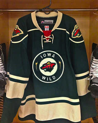 Photo from Iowa Wild (via Facebook)According to my calendar, the Minnesota Wild are 10 days away from showing us their new road threads. But yesterday, the Iowa Wild, their AHL affiliate, beat them to the punch with an unveiling via social media.
The I-Wild — as I've taken to calling them — debuted their new green sweaters on Facebook and Twitter Wednesday. They're essentially a reversed version of the home uniform with "wheat" instead of white and the alternate roundel logo on the front.
That white home jersey was unveiled four months ago, on April 22, when the team unveiled its primary logo. Both logos are borrowed from their parent club in Minnesota — with a few key words changed.
In fact, even the jersey itself comes straight from Minnesota. It's the Wild's third with the crest swapped out. Glad to see this franchise sticking with green.
I was sad to see the Houston Aeros identity disappear this summer, but I can live with that if it means getting to see more of that excellent Wild logo.
Between the two, I'm more a fan of the road jersey, both because it's green and features an actual logo on the front. The white jersey with its green wordmark is just dull, if you ask me. Nothing special there.
Seeing Iowa's road sweater logically leads us to speculate a little on what's coming to Minnesota. In this NHL, it has to be white, right? Using that wheat color might make it look old and dingy on television. But I'd definitely expect to see more green than red.
It also might be easy to assume a white version of the green jersey — like what Iowa and Houston before them used as a home sweater. But that's the reason I think we'll get something new. NHL clubs aren't in the business of copying minor league teams. Often it's the other way around.
So whatever we get from the Wild, I expect it to be entirely new. What's your prediction?

Back in April, the Iowa Wild unveiled their new logo and home uniform. Since then, we've gotten a look at some other elements of the franchise's visual identity. For one thing, the graphic above shows how the logo is colored on a dark background. It's been seen on the backdrop at recent press conferences.
Previously, we'd only seen the green version used on white backgrounds, including the white jersey that was shown to us. (We still haven't seen a road or alternate jersey yet.) Here's a reminder of what the green version of the logo looks like.

But that's not all. A few weeks ago, the Wild tweeted this photo of new T-shirts fans can get their hands on. And it showed yet
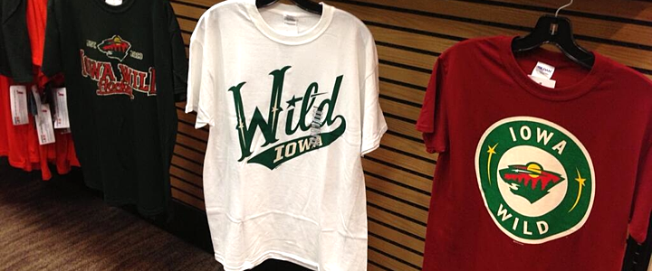 Photo from Iowa Wild (via Twitter)
On the right you can see a modified version of the logo Minnesota uses on their home sweater. Does that mean Iowa could be taking a similar route? Might not be the worst thing if they did. I know it's easy to complain when a minor league team takes on the branding of its NHL affiliate, but sometimes it's cool to see the variations.

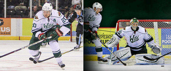
I believe that covers all of the Iowa Wild's logos for the 2013-14 season. But there is one more thing I wanted to mention. Obviously, this team has yet to take the ice, yet you can already find "photos" of the new uniforms in action — all thanks to Photoshop.
 Images from Iowa Wild (via Instagram)
The image on the left was featured in an Instagram promotion and the one on the right was part of splash page graphic on the team's official website. (They have a different splash screen now but are still using a similarly Photoshopped player.)
It's basically just the old Houston Aeros alternate jersey with the new logo pasted on. Not a terribly complex solution, but at least fans get the feel of seeing the new Wild in action, right?
What do you think of teams Photoshopping new jerseys onto their players in the offseason? We've also seen it a lot with NHL teams given all the player movement since free agency began. Does it bug you? Could you care less?