Check out all the anniversary logos for 2015-16!
/This post is packed with logos made of numbers. Wow.
Read MoreThis post is packed with logos made of numbers. Wow.
Read MoreThe 2013 QMJHL Draft was held in Chicoutimi, Quebec on June 8. And those interested in junior hockey jerseys got treated to a few new ones at the event.

Of course we have to begin with the recently rebranded Charlottetown Islanders, previously known as the PEI Rocket. Their new black sweater was on display at the draft and also given to their draftees. I haven't seen the white one so I'm not sure if it's the same style.
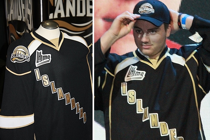
This is a bit disappointing. It's not like they knocked it out of the park on the logo, but why go even blander with a black text jersey? Charlottetown could've learned a thing or two from the mistakes of their NHL friends in Dallas. And what is with all the crazy piping?

The Victoriaville Tigres have apparently dropped their yellow sweaters in favor of black. Seems like an odd move considering the trend in hockey jerseys these days, but these actually look pretty solid.
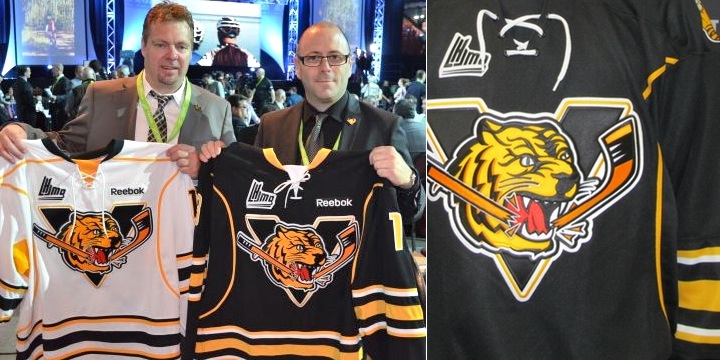 Photos from Victoriaville Tigres (via Facebook)
The Buffalo Sabres Edge template we're all quite familiar with, but it is an improvement on the Pens/Sens template they used to wear. And overall, it works.

Lastly, the Shawinigan Cataractes apparently have a new alternate jersey. I say "apparently" because they only seemed to give it to one player at the draft. And because almost everything written about all these teams is in French — a language I don't speak.
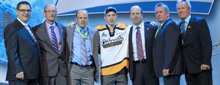 Photo from Shawinigan Cataractes (via Facebook)
Maybe some of my bilingual readers might have some more information to pass along. Keep an eye on the comments for updates from those in the know.
As for me, I'm taking a step back from the blog for a little while. Not to worry, if there's news to report, it'll be here. But I need some time to get the next IceHL yearbook together and that means making the time for daily blog posts will be difficult.
That said, I'm expecting jersey news from Buffalo, Minnesota, San Jose, Montreal and possibly Calgary over the next few months. So as soon as I know anything, I'll be sure to let you guys know.

It is official now. Two decades of Houston Aeros hockey has come to an end. But their loss is the gain of hockey fans in Des Moines, Iowa. Yesterday, the Minnesota Wild received permission from the AHL's Board of Governors to relocate and rebrand the franchise, starting in 2013-14, the Iowa Wild.
It all came down to the club's inability to secure a new lease at their arena. But Houston is one of the biggest markets in the U.S. so I can't imagine they'll be without pro hockey for too long. For now, though, they are.
The press release made no mention of a timetable for the introduction of new logos and uniforms, but obviously they'll come before the fall. Sometime this summer I'd imagine. Definitely something to keep an eye on. (UPDATE) The Minnesota Wild haven't officially announced the renaming of the Aeros but the Minnesota Star-Tribune is reporting that right now.
In other rebranding news, the QMJHL's P.E.I. Rocket were supposed to officially unveil their new logos and uniforms on Thursday. They were to be renamed the P.E.I. Islanders for next season. However, the owners suddenly put the team up for sale, according to The Guardian, taking the rebrand off the table for now.
Unless a local group can come up with the money to keep the team on Prince Edward Island, it will be sold to a group planning to relocate to Sorel, Quebec, where they'd be rebranded as the Sorel Eperviers — a team that played there from 1968 to 1981.
Either way, this team will get a new look before the start of the 2013-14 season.
Thanks to Matt M. for the tip on the Rocket story.
The QMJHL's P.E.I. Rocket will play its final season in 2012-13. But not to worry Rocket fans, your team isn't going anywhere. It's just getting a new name beginning in the 2013-14 season. And because I waited so long to report this, I can now tell you what that name will be.

A year from now, the 13-year-old club will become the P.E.I. Islanders. And if that seems like it would be awkward to say out loud, you're absolutely right. But that's the way it is.
On August 22, the team announced it would be rebranded in 2013 and that the new name would come from the fans. For two weeks, the team accepted submissions. The top three entries were put up to an online vote from Sept. 6–19. They were P.E.I. Confederation, Islanders and Riptide.
At their home opener last Friday, the team announced that the new name will be Islanders. Apparently, Reebok will be developing the new look — colors, logos, uniforms and so on.
The franchise has undergone some front office changes recently and weren't satisfied that the name was connecting with fans. The team was founded in 1999 as the Montreal Rocket — named after the legendary Maurice "Rocket" Richard and their logo was even shaped like the No. 9 on his sweater. And in 2003, when the club packed up and moved to Prince Edward Island, they took the name with them. Guess 10 years was enough.
The Guardian recently ran polls regarding the new name. And the results were unusual. First of all, when asked to choose between the three finalists (Confederation, Islanders and Riptide), 59% of voters chose Riptide. However, in a later poll, only 54% give the new name a thumbs up.
What do you guys think of the new name? And what do you think Reebok will/should come up with in terms of a new logo?
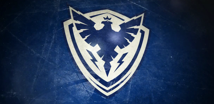
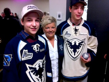 Sherbrooke Phoenix jerseys unveiledThe QMJHL's only U.S.-based team shut down over the summer, but a new one will be resurrected in that franchise's old home next fall as the Lewiston MAINEiacs give way to the Sherbrooke Phoenix.
The club's new name, logos and uniforms were unveiled at a press conference today, according to this release written in French (translated). Click here for more photos from the event.
As you may have read in the (incomplete) Icethetics Season Preview, the league bought out the floudering franchise after last season and ceased operations.
At the same time, it announced an expansion franchise had been awarded to Sherbrooke, Quebec and an ownership group led by ex-NHLer Jocelyn Thibault to begin play in the 2012-13 season. I find it a little weird. Why end the lineage of one of the league's oldest franchises? Why not simply transfer the franchise? (In the end, I'm sure it all comes down to money.) As I wrote in the Season Preview post...
The franchise itself is actually one of the QMJHL's oldest. The Trois-Rivieres Ducs were a founding member of the Q in 1969. They were renamed the Draveurs in 1973. In 1992, the club relocated to Sherbrooke and became the Faucons for six seasons. In 1998, the name was changed to Sherbrooke Castors. The club moved across the border into Maine in 2003.
There had been speculation that one of the previous Sherbrooke monikers would make a comeback, specifically Castors or Faucons. But as it turns out, they went the more literal route for a team that's "rising from the ashes." Of course this will be confusing for folks in Quebec if the Phoenix Coyotes end up moving there. (Kidding!)
Here are the other logos that were on display at today's unveiling.
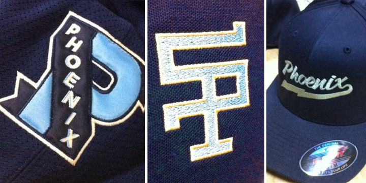 Sherbrooke Phoenix secondary logos
Brilliant logos and a fantastic overall look for this team. I'm impressed. But are you noticing a trend? Two other Q teams, the Armada and Olympiques, introduced monochromatic logos this season, just like the Tampa Bay Lightning and Los Angeles Kings. Seems like a trend toward less color. If so, I'm not sure that's a good thing.
But when you look at Sherbrooke's jerseys and logos, it's clear they're still a three-color team: dark blue, powder blue, and yes, that's the trendy vintage white rather than actual white. Don't get me wrong. I think these colors look great together, but they tick all the boxes in terms of what's "in" right now.
A local creative agency called Lubie designed the new brand (with an awesome video), which appears to have been influenced by the municipal coat of arms of the city of Sherbrooke, Quebec.
Anyway, what do you think? How is this not a great look for a hockey team?