Several teams celebrating 20th anniversaries
/The Preds, Canes, Blades and Condors are all hitting 20 next season. Logos abound!
Read MoreThe Preds, Canes, Blades and Condors are all hitting 20 next season. Logos abound!
Read MorePhoto from Florida Everblades via Facebook
Photo from Florida Everblades via Twitter
Photo by Al Larson
Photo by Al Larson
Photo by Al Larson
Photo by Al Larson
Photo from Florida Everblades via Facebook
Last weekend, the ECHL's Florida Everblades wore one of the year's ugliest minor league specialty jerseys. They were so ugly, in fact, that the players jettisoned them after only 20 minutes of action.
To be honest, the Blades' problems went deeper than jerseys. They were in the midst of a nasty rough patch, allowing 24 goals in five games.
But let's at least admit their marketing department isn't exactly helping them out. As the Everblades hit the ice last Friday (Feb. 7) against the Gwinnett Gladiators, the players wore specially-designed sweaters with a Winter Olympics theme.
Only they were "designed" by kids from a local hospital. And they were an absolute disaster — in terms of aesthetics. I think it's awesome to let sick kids help design a hockey jersey. But certainly a grown-up with taste could've come in somewhere along the way to guide the art direction a bit, no?
According to Craig Handel, Fort Myers News-Press, this happened last Friday:
The Everblades had planned to wear jerseys designed by kids at the Golisano Children’s Hospital, the uniforms feature the Everblades logo in a shiny gold—to represent the medals—over a blue background, with drawings by the children of Olympic events near the waist and flags of the world along the arms.
However, it lasted just one period. Players complained that they looked too much like Gwinnett’s road whites.
Now don't be misled. Gwinnett has great jerseys. When they say the jerseys looked too much alike, I can only assume they were talking about how much red and white were incorporated.
The Blades switched into their regular blue jerseys and had an amazing four-goal second period. Unfortunately, they blew it and ended up losing 6-5 in overtime. But at least they couldn't blame that on the jerseys.
To make matters worse, the rink had been "repainted" earlier that day as fans were invited to decorate the playing surface with all manner of graffiti — Paint the Ice Night. Be sure to flip through all the photos in that slideshow above — but be warned you may feel the urge to poke your eyes out after.
The following night, in a rematch with the Gladiators, only the Everblades' goalies wore those ridiculous jerseys and the team went on to a 3-0 shutout victory — proving that maybe the players were onto something after all.
Blades unveil their special edition Olympic jerseys for this weekend http://t.co/mPdrPLKpN3 pic.twitter.com/ja3jxUA8TH
— Florida Everblades (@FL_Everblades) February 6, 2014
A great look from upstairs from team photographer @allars pic.twitter.com/CNPH4DJytC
— Florida Everblades (@FL_Everblades) February 8, 2014
With no Tampa Bay Lightning hockey to follow at this point in the fall, I'm a little lost and turning to the minors for comfort. And it just so happens the Bolts' AHL and ECHL affiliates are sporting new uniforms this season. So let's have a look.
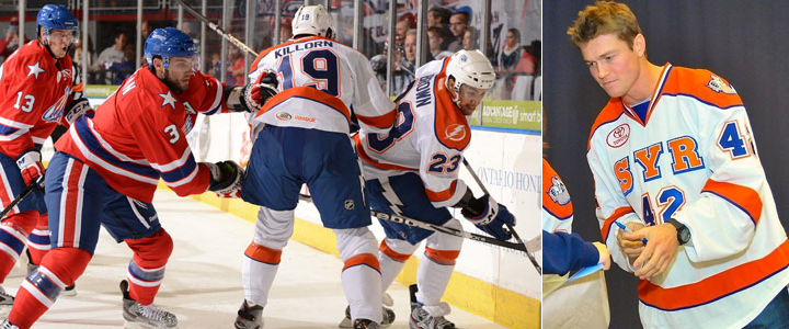 Photos from Rochester Americans and Syracuse Crunch official websites
It happened with the Norfolk Admirals a few years ago and now it's happening to the Syracuse Crunch, who opened their season last night wearing not quite what you'd expect. For a team that just unveiled a very blue logo this summer, I'm surprised to still see so much orange in their uniforms.
But who knows what goes on behind the scenes with these teams? It could very well be that the rebrand happened too late in the game to get the uniforms completely overhauled. (Plus, they probably still have a lot of orange gear leftover that they need to sell, right?)
What's cool: The lightning bolt down the pants. Crunch players are actually wearing the same pants as their NHL affiliate. (You can even see the NHL shield on them in the photo above.) This is useful for two reasons. For one thing, it ties the branding of the two teams together. But more practically, players who are getting called up already have a key piece of their gear in tow.
What's not cool: The white Lightning logo over orange on the right shoulder. Someone at SME has to be shaking their head over that. I would've at least used the blue bolt if the shoulders had to be orange. Which brings me to my other point: Why not make the shoulders blue? These are obviously not recycled jerseys. They're new, with the blue piping added all over the place. Fix it.
That's all I have to say on Syracuse for now. Their home opener is tonight so I assume we'll get to see the other jerseys. I'll add photos as an update to this post later on.
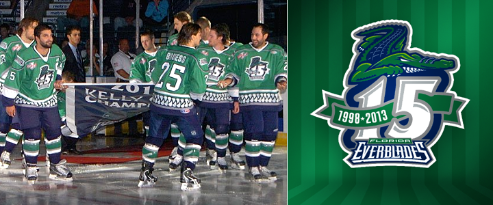 Photo from Florida Everblades (Facebook)
Also this season, the ECHL's Florida Everblades are celebrating their 15th anniversary along with their 2012 Kelly Cup championship. You can see both represented in the photo above as the team hit the ice in their new green anniversary sweaters and raised a special banner last night.
By the way, that Blades game was also the first time that expansion team Orlando Solar Bears hit the ice. You can see what their uniforms looked like in action for the first time on their Facebook page. The Orlando Sentinel also has a neat side-by-side shot of both teams' uniforms.
Interestingly, both of these games required extra time to decide. The Everblades won on a goal 26 seconds into overtime while the Crunch fell to the Rochester Americans in a shootout.
Turns out, the Crunch were just wearing an alternate jersey on Friday night. We know that because on Saturday night, they unveiled their actual home and road jerseys. They look like this.
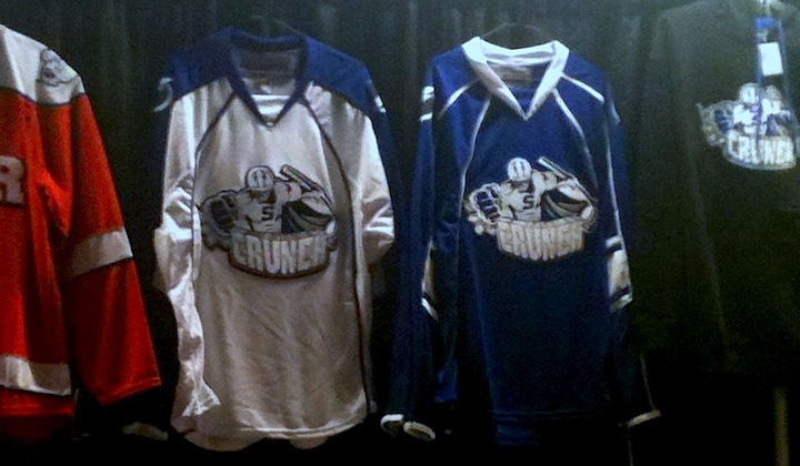 Photo by Jeremy Houghtaling (@JGHoughtaling on Twitter)
You'll note that the alternate jersey in this photo is the opposite of the white jersey the Crunch actually wore on Friday. That means they actually have four different uniforms in their arsenal this season. Seems a bit excessive. Is the attachment to orange all to do with the university?
I'll leave you with a look at the new white jersey in action.
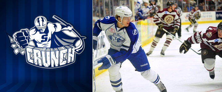 Photo by Scott Thomas Photography
Two sidebars. 1) Check out the 75th anniversary jersey the Hershey Bears are wearing! (That means four jerseys for them too, because they unveiled home, road and alternate sweaters with their rebrand over the summer.) And 2) Does anyone know what the standard is for AHL uniforms? Do they usually wear white at home or on the road? And does it switch midseason like it does in the ECHL?
Because I'm pretty awful at keeping up with minor league news, things tend to pile up. When that happens, I usually end up with a patchwork post featuring a wide variety of items. Such as this one.

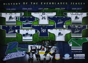 Everblades jersey history posterWhile working an event today at Germain Arena, home of the ECHL's Florida Everblades, I noticed the team was handing out a neat new poster (right).
It's the History of the Everblades Jersey — not that it's a very long one. The Blades hit the ice in 1998 and only changed their uniform once in their first decade, after a run to the Kelly Cup Finals in 2004. They wore special 10th anniversary sweaters throughout the 2007-08 season, my first year living in Southwest Florida.
Since then, I haven't seen this team wear the same uniform for more than a single season. So it makes me wonder whether they'll bring back last season's sweaters for 2010-11 or come up with something new again and end up expanding this poster. I guess I'll let you know in October.

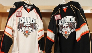 Syracuse Crunch get new sweatersIn case you missed the mention on Twitter this week, the AHL's Syracuse Crunch unveiled their new uniforms for 2010-11 on Thursday. They now feature the team's new colors — those of their NHL parent club, the Anaheim Ducks.
The Crunch were previously linked up with the Blue Jackets and as such, wore their colors. This season they'll be orange, bronze and black. And the sweaters are pretty sharp, considering. All right, in all fairness I never thought the Ducks had a bad color scheme, just a bad logo.
 Which brings me to the shoulder patch on the new Crunch jerseys. It's just further evidence the webbed "D" is awesome on its own. No one likes the "UCKS" part anyway. Disney's out of the picture — no more "Mighty" — we get it!
Hopefully this is something the Ducks have realized and will take advantage of this season when they launch their new third jersey. Of course, it would also be nice to see an entirely new logo that a little more... ducky?
If you're craving more pictures of the new sweaters — including a juxtaposition with the Ducks' threads — and the ladies who modeled them, take a trip to the Crunch's Facebook page.
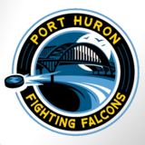 After enduring a haranguing from Icethetics readers, the NAHL's Port Huron Fighting Falcons thought it best to go in another direction with the branding of their team.
This new logo pays tribute more to the team's hometown than its moniker and is far more appropriate. It allows the nickname to be just that and instead celebrate Port Huron in its identity.
The mark appeared on the Fighting Falcons' website this week without a lot of fanfare. It doesn't specify who's behind the design. But it is a pretty solid one.
Thanks to Mike B. for the tip!

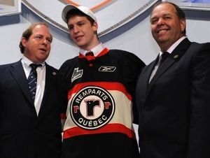 Remparts add a black sweaterThis one must've slipped under my radar. Back in June, the QMJHL's Quebec Remparts handed out a new jersey to their newest player at the draft.
It's essentially a Chicago Blackhawks' alternate with the Remparts' logo. For the record, the team previously had two jerseys — one red and the other beige.
While there's been nothing posted on their website about adding a third jersey for 2010-11, it seems there is one on the way for the Remparts, as seen on draft day.
Thanks to those loyal Icethetics readers who emailed in this info! (And sorry for the delay in getting it posted.)
I know it's hard to care about anything but Olympic hockey right now, but there is minor league jersey news to catch everyone up on. So let's get started.

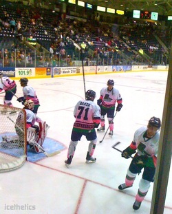 Everblades wearing pinkMy current hometown team, the Florida Everblades held their Pink in the Rink event last night.
Shockingly, I couldn't find any decent photos from the team's website to share. So you'll have to settle for the best my iPhone can offer. Shot this (right) during warm-ups before the game.
A friend of mine said it looked like the Everblades accidentally washed their jerseys with a red sock. It was her first ECHL game.
Also interesting, though I wasn't able to get a picture, the Kalamazoo Wings were wearing blue jerseys with oversized McDonald's logos on them during the pre-game.
Any Michiganites out there that can shed a little light on this? Surprising to see a team go with a warm-up jersey like that on the road.
For the record, it was a great game. Blades battled to a 4-3 shootout victory. Unfortunately, I was not up on my ECHL rules and didn't realize their shootouts are five rounds, not three. Cheered a little prematurely when Colin Nicholson scored in Round 3 for the 2-1 advantage. Oops.

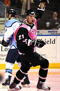 Mudbugs wearing pinkIn the last minor league report, which was exactly a week ago, the Bossier-Shreveport Mudbugs of the Central Hockey League were big news as they had two ridiculous specialty jerseys on deck.
They've worn both since then, including this Pink in the Rink night jersey, twice this week. It's probably the worst pink-infused jersey we've seen (and we've seen a lot) but the Mudbugs were able to pull out wins both nights.
If you're just dying to see what the back looks like, here's another photo. For the record, if it looks familiar, the Lightning wore that exact numbering and lettering style between 1995 and 2001. Just saying.
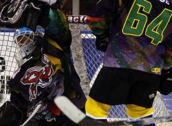 Mudbugs go Mardi Gras!The Mudbugs also wore specially-themed jerseys to ring in Mardi Gras last weekend. Just as terrible as expected. Here they've opted for the Predators' font for the numbers and nameplates.
And once again, if you just have to see more angles of this jersey, the Mudbugs are happy to provide photos.
As much as we mock them, it is fun to see the ridiculous things minor league teams will wear on the ice in honor of a good cause. By the way, bidding on those Mardi Gras jerseys ended earlier this evening. So sorry, but you can't have one.
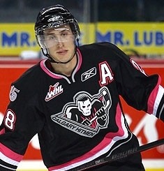 Hitmen wearing pinkSince we can't get enough of pink jerseys, the Calgary Hitmen have us covered. On Sunday, March 7 they'll go pink for Hockey Mums Fight Breast Cancer Night.
The cancer awareness promotion began in October and runs through next month. So if you are going to bid, I'd be ready to start high.
And for what it's worth, all the information you could possibly ever want about this event, including how to bid on these special sweaters, is just a simple click away.

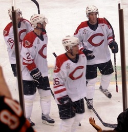 Cyclones celebrate RedsThe ECHL's Cincinnati Cyclones celebrated their Salute to the Reds night back on December 5.
Icethetics reader Andy just sent in a photo (right) of what the jerseys looked like. Imagine if the Cincinnati Reds played hockey. Probably what they'd look like.
If you want a better look, there's also this picture of the Mark Voakes modeling the sweater — possibly just before getting his mug shot done.
I couldn't find a detailed write-up on the Cyclones' website so I don't really know what the deal was — whether the jersey were auctioned off and what charity benefited — can't say.
 And finally, Icethetics reader Chip writes in to let us know that the Edmonton Oilers are re-activating their dormant AHL franchise for the 2010-11 season, but this time in Oklahoma City. So that will be another new logo and set of uniforms to look forward to when JerseyWatch 2010 kicks off this summer.
Chip says he hopes the yet-to-be-named club will get the Blazers moniker that has existed in some form since the 1960s and, most recently, as a team in the Central Hockey League. Any thoughts on that?