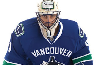
Mixed Reaction To Canucks Makeover
/It's officially official. At the time I'm writing this, there have been almost 150 comments posted on the previous post. Vancouver Canucks fans mostly seem to be upset by the new Rbk EDGE uniforms unveiled today at GM Place.
A lot of you guys seem quite unhappy. Specifically, you seem to loathe the wordmark above the crest. As a non-Canucks fan, I think it's great and that these jerseys are very sharp. Honestly, I don't have a single complaint. But I'm one voice against thousands. As a Lightning fan, I can somewhat understand your distress though. I've never been a big proponent of "TAMPA BAY" in the logo. At least the got rid of "LIGHTNING" in the new design.
Anyway, this post is about the Canucks.
The "C" on Markus Naslund's sweater is a little close to the wordmark on the chest, but it's not the end of the world.
The stylized stick-in-the-rink logo is an excellent touch that moves the uniform forward. And those colors — you can't beat them. I also find interesting the choice to put green on the jersey but not in the logo itself. A little unusual but that wouldn't be the first time.
That shot should offer a better look at the rest of the uniform as a whole. Nice touch with the logo on the pants. I'm adding all of these images and many more to the official Rbk EDGE photo gallery. Go check it out!


