Revisiting The Senators
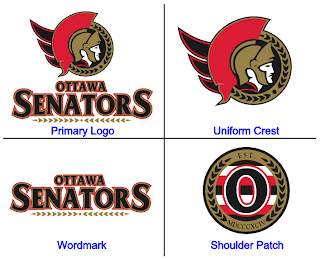
/On Monday, we got a preview of the Ottawa Senators' new logo set courtesy of Canada's government trademark web site. They were black and white on the web site, so we had to imagine how the coloring might work (at least for the secondary mark).
The image I posted had the outer circle in gold. Here's how they might look in red or white.
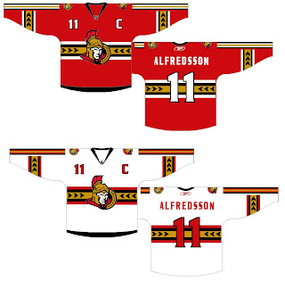
As for the primary logo, one fan ran with that on a jersey concept. See below.
Not sure how I feel about the striping across the chest. Certainly an interesting choice, though. Thoughts on that?
For the part of you that persistently resists change, one fan designer altered the new logo to mix in some of the old.
Truthfully, I'm not a fan. Until we get to the shoulder patch. I think that is pretty cool. I like the old-time stripes and the contrast in that logo, which you'd think would be hard to achieve, is excellent.
Sens fans, what do you make of all this here? Good? Bad? Ugly?


