A Few Ideas For Bolts
/As is probably more than painfully clear, I am a huge Tampa Bay Lightning fan. So when artwork for my Bolts gets submitted, naturally I'm more than eager to post it. First off, as a reminder, this is allegedly the Lightning's new logo.
Anyway, today I have lots to share. We'll start off with the cream of the crop.
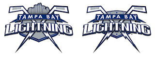
This pair of Lightning logos was designed by a local advertising firm, apparently. I was an overall fan until my girlfriend pointed out that the hockey sticks look more like golf clubs. Now that's all I can see. But if the sticks could look more like sticks, I think this would make for a very strong shoulder patch. Not a great primary, but definitely an awesome secondary. I like the skyline in the one on the left.
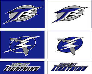
Moving along, though. Another designer emailed me some ideas for a new Lightning logo.
Everything there seems like it's about to fall over. I'm not sure why it all needs to lean so far to the right that way. I also can't speak very highly of the secondary mark, which appears to be drawn by hand. I applaud the effort in trying to make the "B" in "TB" look like a lightning bolt, but I don't think it's working out.
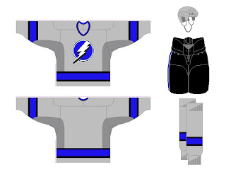
And finally, another fan designer sent in these concepts. How about a Lightning jersey in gray?
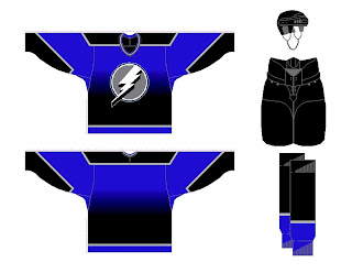
Same artist also came up with a design borrowed from the Vancouver Canucks' previous third jersey. Have a look at that one.
Any other Lightning fans out there? What do you think of these ideas? Anything worth considering in here or should we tie it all to a kite in a thunderstorm?


