Rebranding The Devils
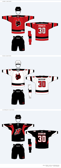
/Continuing his rebranding of the NHL, our friend Matt has taken a shot at the look of the New Jersey Devils. He emailed me these images to share with the rest of you.
If you want my opinion, the logos look fantastic, but I think the current primary works too well to throw out altogether. So my suggestion (which I feel like I've made before) would be to swap the primary and secondary marks. I think the secondary here is a great update of the classic Devils logo. I'm also a fan of the wordmark.
These jerseys are another great update, but I couldn't be more impressed by the alternate uniform. That one really grabbed me first. While overall not as impressive as some of his previous work, these are some very sharp designs.
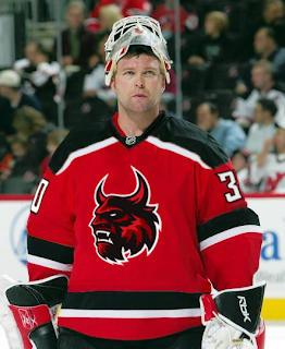
By the way, Matt went ahead and painted his home jersey onto Martin Brodeur. And while I normally wouldn't post a photo of Brodeur on my blog without a puck in the goal net behind him, I'll make an exception here.
Like I said, great logo, but it seems like it belongs more to a minor league team on the front of the jersey. Those black jerseys are my favorite.
By the way, Matt wanted me to let everyone know that if you'd like to contact him directly about his work, feel free to email him at gfb_designs@yahoo.com. Otherwise, leave your comments below for all of us to read.
UPDATE (6:34 PM): Hey guys, due to popular demand, I'm introducing a small new feature. You can now access all of the rebranding concepts by Matt (aka GhettoFarmBoy) by clicking on the link under NHLToL Series in the sidebar. Or by clicking here. I'm considering creating an album solely for his work in the Concepts Gallery.


