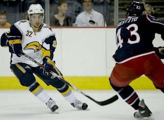
Rbk EDGE Review: Sabres
/Part 19 of 30. All 30 NHL clubs have unveiled new jerseys under the new Rbk EDGE Uniform System for the 2007-08 season. Here at the NHLToL, we're going to review every one of them. Read up and then rate the new sweaters. We'll do a full ranking after completing all of the reviews.


The Unveiling
Saturday, September 15. The Sabres didn't hold an unveiling event for their uniforms as the design wasn't changed from the previous version. But they went on sale to the public in the HSBC Arena in Buffalo on this date.
Home vs. Road
Home: Blue. Road: White. The two sweaters are essentially mirror images of each other aside from the sleeves and feature secondary logo patches on the shoulders.
The blue home jerseys feature a very unique striping pattern. A twisted silver stripe rides up the sides and around the shoulders beneath the logo patch. White, horn-shaped stripes wrap over the elbows and yellow paneling wraps under the arm down the cuff. The collar is silver with yellow trim and the primary logo serves as the crest.
The white road jerseys feature a very unique striping pattern. A twisted silver stripe rides up the sides and around the shoulders beneath the logo patch. Beneath the stripe on the arms, the sleeves are blue. White, horn-shaped stripes wrap over the elbows and yellow paneling wraps under the arm down the cuff. The collar is silver with yellow trim and the primary logo serves as the crest.
In The Details
The blue stroke around the logo on the white sweater is much thicker than on the blue one. Also the colors are swapped on the shoulder patches. The blue jersey features a yellow "B" while the white jersey features a blue one. The same numbering and lettering style has been retained.
New & Old
The new sweaters are primarily the same as the old as they were apparently designed last year with the new Rbk EDGE style in mind. The only difference would be the slight alteration to the stroke on the road jersey logo and the league-wide addition of the NHL shield to the collar.
Standard FAQ
Numbers on the front? Yes.
Laces at the collar? No.
NHLToL Editorial by Chris
Since I'm neither a product of the 1970s nor a fan of the Sabres, I never really liked their original logo that much. However, while I respected their choice to honor tradition and return to those colors last year, I was disappointed. Being a huge proponent of the red and black years, I often hoped to see them one day go with the red third jersey full time as that one actually had — of all things — sabres on it. The team is from Buffalo, not called the buffaloes, so let that be indicated in a secondary manner. I liked everything about those red jerseys and while saying so might put me in the minority, that's how I feel. The "slug" was not the right move. And while they may not agree with my particular opinion, just ask any Buffalo fan and they'll tell you so. This is pretty bad. 2/5

