Review: Lightning Fanchest IV Unboxing
/For Icethetics’ 11th birthday I’m stepping outside the box to write about what’s inside a box. It’s my first product review and it’s a fun one!
Read MoreFor Icethetics’ 11th birthday I’m stepping outside the box to write about what’s inside a box. It’s my first product review and it’s a fun one!
Read More
The wait has been long enough. This review now needs to be epic. It won't be, but at least it's here.
The Calgary Flames unveiled their new third jersey on Oct. 27. The new look made its on-ice debut on Nov.1 — so by now, we've had plenty of time to fully appreciate it.
My expectations for sweaters designs from Canadian teams are typically high. I feel like the nation that birthed the sport should have the best-looking teams. That's not necessarily sound logic, just a feeling. I tend to hold the Canadian teams on a higher pedestal in this regard.
However, when we learned the Flames had a new third jersey in the works this year, my expectations were a little different. In 2009, the Flames introduced a retro third jersey — modeled after their original uniforms from the 1980s. Most people — myself included — felt like that was the pinnacle of Calgary third jersey options. (The home and road could still have used some work, on the other hand.)
How could the Flames improve upon their first black-free jersey since 1994? Simply put, they couldn't. Even a lateral move was off the table. They could only hope to do something different. And that they achieved.
In typical fashion, the jersey was red. But for the first time in team history, a wordmark adorned the chest of a Flames sweater. The team wanted to declare pride in its city. But on first glance, it seemed like a knock-off the Buffalo Sabres' third jersey from 2010 — the retro-style script with the classic primary mark underneath.
In the last two weeks, my opinion of the crest hasn't changed much. I'm not from Calgary, so perhaps that's why it's difficult for me to appreciate the sentiment. But I am from Tampa and care little for the "TAMPA BAY" scrawled across the Lightning's road jersey. I'd prefer seeing a simple symbol represent our city. I don't think there's any better symbol for Calgary than the flaming C.

But since that's already on a couple of jerseys, this is what I would've rather seen on the chest. I will admit that roundel logos have been overdone in the NHL and the style of this one is slightly reminscent of the Flames' provincial rival in Edmonton. But with a bit of simplification, it could've made a brilliant crest.
Needless to say, I think it makes an excellent shoulder patch for this jersey. The logo represents the many natural facets of Calgary's surrounding region from wheat fields to mountain ranges in front of the setting sun. It's clever imagery and a slick design.
However, the two logos featured on this jersey do not feel like they belong on the same sweater. The styles are worlds apart. I get the sense the two logos were perhaps part of separate proposals and mashed together by a decision-maker without an eye for design. But I could be wrong.
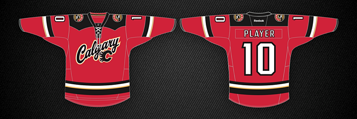
In the last few years, Reebok has appeared limited in its template variety. A handful of basic jersey designs seem to permeate all of the hockey world at this point. But the Flames' new third shows the manufacturer is willing to try new things.
Not only is this a completely new template, it's custom for a specific look the Flames were going for. Check out the shoulder yoke. That unusual design was inspired by the classic western shirt — a staple of any cowboy's closet. This is the sort of thing I absolutely love about third jerseys. Every team should try something a little outside the box now and then.
Speaking of unusual, the graphic suggests the designers were trying to take an overused feature like the lace-up collar and make it their own. Apparently, this one was designed with the intent to string it upside down. But looking through pictures of the Nov. 1 game, none of the players were interested in wearing it that way.
Good effort anyhow. By the way, you'll notice the alternate captains' "A" in the form of the Atlanta Flames logo is carried over from the primary jerseys. Nice way to keep Atlanta alive in the NHL even if it can't have a team of its own.
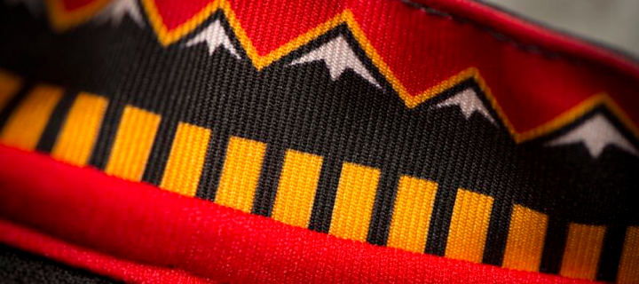 Photo from Calgary Flames (via Twitter)
What I love most about this jersey is the attention to detail. Hardly any jersey introduced in the last couple of years has been able to avoid Reebok's trendy "hanger effect" — the design on the inside of the collar. Here we see elements of the shoulder patch reprised.
It's a great feature for jersey buyers. Owning it is really the only way to appreciate it. And I'm certain that was Reebok's goal. They are a business after all.
On the other hand, I don't love every detail. The 5 — along with the full number set — was designed to be distinctive. But I'm afraid the it missed the mark a bit. It's distinctive, but not for the better. It just looks like a flipped two. Our brains are not accustomed to quick recognition of a shape like this. Until we get used to it, it's going to feel like an error — like someone stitched a digit upside down.
I can't help but wonder if it ends up being a situation similar to what the Lightning had back when they introduced the italicized electric numbers in 1995. The 1 always looked like a 7 and the 8 barely looked like an 8. Adjustments were made quickly to help with legibility.
Apart from the 5, I do like the rest of the numbers. In particular, I like that they're white. The black on red isn't unreadable, but it's not as easy on the eyes. And the thin yellow stripes on the jersey help to tone down any similarities to the New Jersey Devils' look.
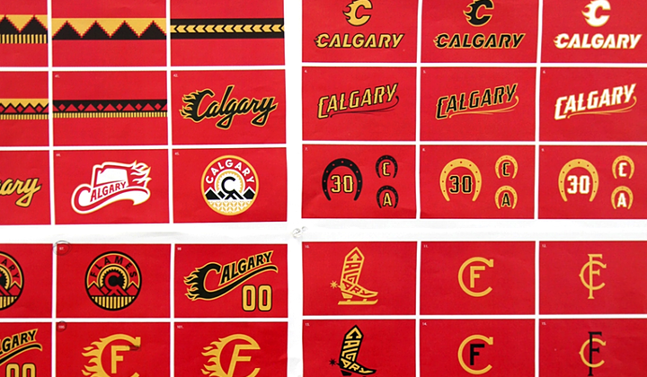
Let's wrap this up with some thoughts about what might have been. The Flames released a video on their website after the unveiling talking about the new look. It included a shot of a wall covered in unused concepts. In some of them, it's clear why they were cut. In others, less so.
I love the simplified flaming C at the top of this photo. What a great way to move that classic mark into the 21st century. But I certainly think the existing version will stand the test of time. I wouldn't be surprised to see the exact same logo still in use when the team celebrates its 50th anniversary in 2030.
If nothing else, maybe some of our concept artists can have a little fun with some of these designs. I look forward to seeing what you guys come up with.
This is always the hard part, so I'll try to make it easier with a pros/cons list.
PROS
CONS
What are your pros and cons?
And don't forget to check out the updated Jersey Galleries!

Before we get into the details of the newly unveiled San Jose Sharks primary uniforms, it might help to ask why they redesigned them in the first place. After all, they just redesigned their entire identity — logos and jerseys — in 2007. Why do it again after just six years?
Performance, in a word. According to the Sharks, the players love the lightweight third jersey. Why do you think they wear black every year come playoff time? So the main idea behind revamping the primary jerseys was to drop weight.
Sure, we can ask whether a few ounces here or there really makes any kind of difference. But then we've never played hockey at the NHL level, so what would we really know about that?
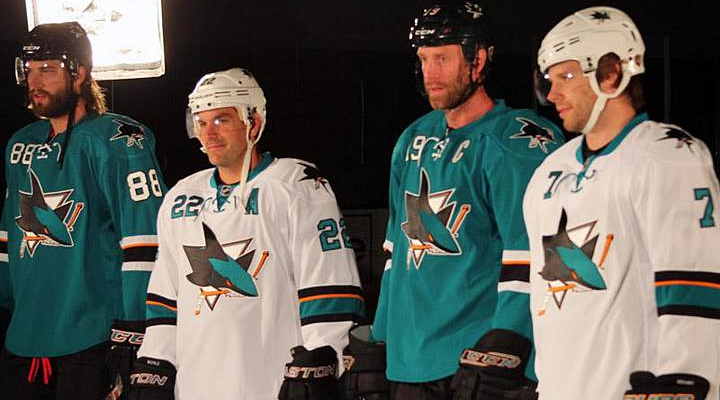 All photos and images from San Jose Sharks
On first glance, we see a highly simplified style compared to the previous jerseys. No shoulder yoke and no waist stripes. Now the teaser photos from the last couple of days make sense. The details they showed us were the only details they could. There's not really much else to see.
We'll start with the features the Sharks are touting in one of their new videos.
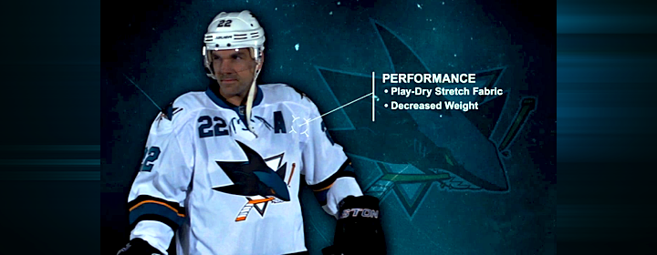
Right off the bat, it's all about performance. This is a unique story this summer. The Stars wanted a color palette they could own and the Hurricanes wanted a more traditional sweater design. The Sharks, however, wanted to keep their players from being weighed down by a heavy jersey.
This was made very clear in another video the Sharks posted, in which Sharks GM Doug Wilson and COO John Tortora talk about the design process. Here's what Wilson said:
The jersey was designed mainly with performance in mind. Remove extra weighting. Make it as efficient as our third jersey, the black jersey.
From the performance side, just the weight of it. If you take a look at our black jersey, the players really love that one. Not only the success they had with it, but weight of it. For movement and everything.
The players and trainers had the most input.
Interesting here how involved the players and trainers were. Clearly, these jerseys are more about utility and less about vanity. So good or bad, they probably won't be favorites among Icethetics readers.
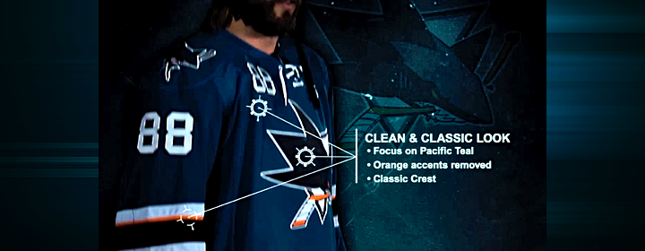
Even if the look wasn't the primary focus, it's still a critical part of any jersey. While it's important to have something the players like, the reality is it's just as important to have something the fans like. They're the ones who are supposed to be buying them.
That in mind, the Sharks listened to the feedback they were getting from fans. And if it's anything like what I read on a regular basis, they wanted the orange gone. I'll admit the original teal and grey jerseys were nice, but the orange accents were an upgrade in 2007. Sounds like I was in the minority there.

To that end, the orange has been removed entirely from the numbering and lettering. And there's now just one thin stripe on the sleeves to keep that part of the palette represented. It still works, and hopefully it will incur less wrath from Sharks fans. The picture above shows a side-by-side comparison of the old design (left) and the new.
And is it just me, or has the shade of teal been changed again? Looks the smallest bit greener.

One of the big changes was to the neck line of the jerseys. The multi-color collar has been simplified to teal — even on the teal jersey where it blends right in. And new this year are the laces you find on the black jersey. My first thought was, wouldn't the laces add extra weight? But it's become clear the Sharks just want teal and white versions of the third jersey the players love so much.
And the "traditional appearance" argument is getting harder and harder to sell in this NHL. So far, every new jersey we've seen this summer has them — except Buffalo's third which hasn't actually been released yet. Counting San Jose, 17 of 30 teams are now sporting lace-up collars. That's more than half the league.
Guess how many teams wore lace-up collars 20 years ago. Zero. How about 30 years ago? Still zero. If we go back 40 years, we find that just five of 16 team wore them. And the Sharks never have — until the black third. The point is, this is a new trend in hockey.
I'm not saying I dislike this collar style. I'm just asking that we stop using the word "traditional" to describe them. It's just not accurate.

Let's move to the shoulders. The yoke and its piping are gone, which is a relief to some. The reason I like it is that it does have the feel of a more traditional Sharks jersey. Their original sweaters didn't have shoulder yokes and they looked great.
What I am disappointed about is the shoulder patch. I was hoping for an update in that department to one of the other marks in their arsenal. In particular, I had my fingers crossed for the fin logo I included in yesterday's post. But perhaps it has too much orange. All I know is that the existing patch is basically the primary logo without the triangle. Why not try another option?
It's also disappointing to see them stick to their guns on the chest numbers. I really hoped that was going away. Only the Sharks and Sabres are still using them and it looks awful. On a more practical note, wouldn't those numbers add weight? I guess as a player you could just switch to one digit to cut weight. I assume No. 1 would be lightest but none of San Jose's goalies use it.

Here's something I like. The simplified palette of the numbers and letters was definitely a good move. Yes, it reduces weight by losing the orange layer, but it just looks more... "Sharks" to me. I don't know how else to put it. Might be a good time to use the word "traditional."

Now here's something I don't l ike. Where are the stripes? Logically, I get it. I understand the weight reduction aspect of these redesign. But I just can't reconcile that with my desire for good hockey sweater design. Twitter's ablaze with commentary on how much these resemble practice jerseys because of the lack of waist striping. And I don't disagree with the sentiment.
But if the players want it, if they say it makes a difference, we'll just have to live with it.
By the way, I shudder to even suggest this, but strictly as a way to keep the waist striping, I think I would've been all right with a little sublimation. I know, it sounds awful. But would it be worse than this?

It should also be noted that the sock striping was changed to match the sleeves.
I think I've hit all the important points in this review. I'm sure you guys will let me know if I missed anything. As I've said in previous reviews, I'm not good at giving out grades, but I can do a summary.
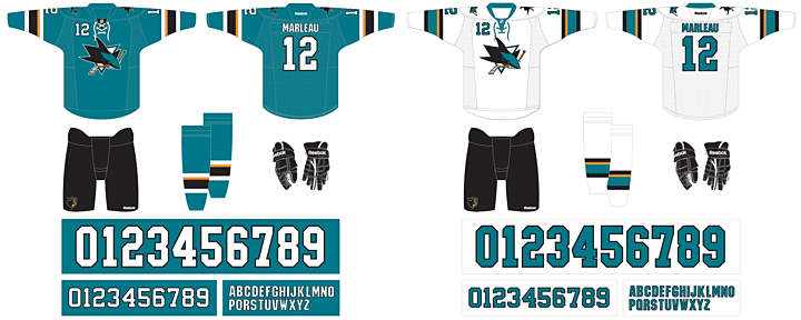
Here at Icethetics, we're so accustomed to thinking of hockey sweaters as simply pieces of design. We can therefore describe why the design is good or why it's bad. Or both. But if the Sharks' redesign has reminded us of one thing, it's that hockey sweaters are critical pieces of equipment to some of the planet's most talented athletes.
What may look cool doesn't necessarily translate to athletic performance. Anyone remember Cooperalls? I'm not trying to say they were cool, but it was an instance where design curbed performance. Those things were flat out dangerous if you took a spill. Here, it's not as drastic, but it's just as understandable.
The players asked for lighter weight jerseys. But there also needs to be a good design. It's hard to be the servant of multiple masters. With that in mind, I think the final product works. They used the opportunity to address fan issues such as the use of orange while also addressing player concerns.
The end result is a bit of a mixed bag. But then with multiple masters, so was the starting point.

Now that you've read my take, get to the comments and let me read yours.
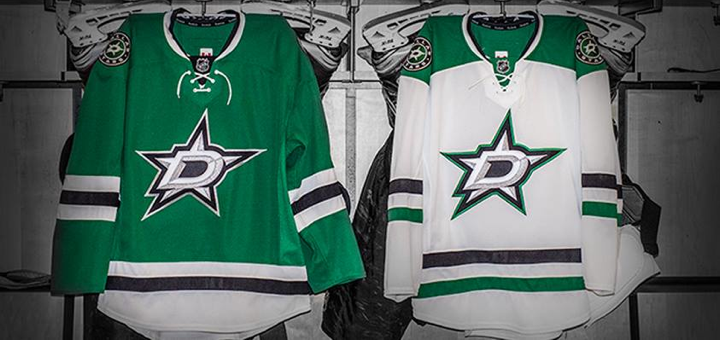 Photo from Dallas Stars (via Facebook)
First, my apologies for the delay. I know you were expecting this review Monday (probably because I told you to) but events conspired to keep me busy elsewhere. Not only did I have 11 pages worth of polls to post (IceHL logo voting!) but there's also that pesky day job of mine.
The Dallas Stars unveiled their new logos and uniforms at an event last Tuesday. Let's pick things up at the end of that event, when I got some close-up, hands-on time with the two new sweaters.
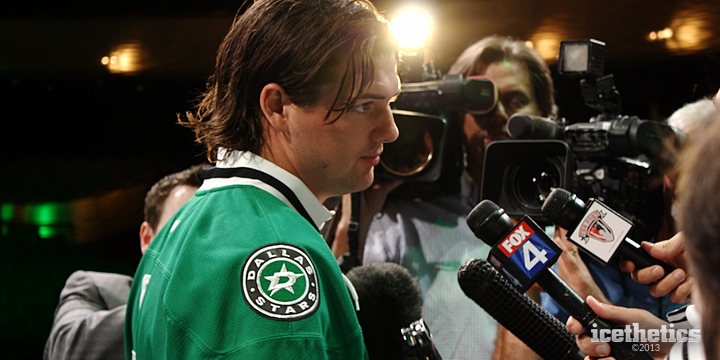
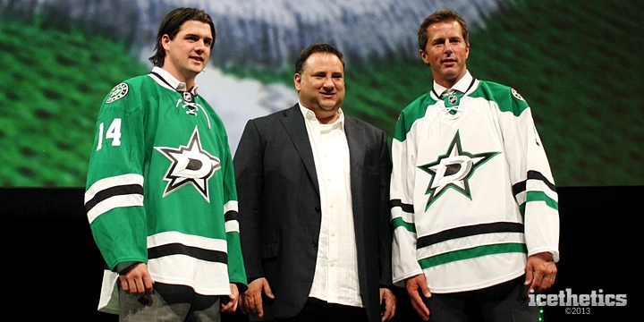
After the fans departed the Winspear Opera House, the media mob of which I was now a member crowded around three men up on the stage. Jamie Benn, Mike Modano and Stars owner Tom Gaglardi had a lot of microphones and cameras pointed at them, mine included.
But to be perfectly honest, I didn't care what Benn and Modano were saying. I wasn't there to cover hockey operations. I was there to cover the new branding. So while the "real" reporters were squeezing in for questions about offseason training habits and plans for next season, I was squeezing in for photos of the brand new threads.
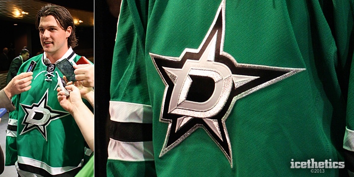
The first thing I noticed when Benn and Modano stepped out onto the stage, this is a very striking green. Truthfully, I took a moment to consider whether I was even awake. Here I am sitting in Dallas watching the Stars unveil new logos and uniforms — and it turns out they're the greatest shade of green I could imagine — something I've been pushing hard for over the past six years. Was it really real?
But a dream it was not. Or if it was, it had come true in that moment. The Stars' new look feels like one of the better designs we might see on the Concepts page — where many readers would undoubtedly declare it would never come to fruition. But this one did.
As we get started, the one thing I have to tell you is that photos simply don't do this color justice. If you get an opportunity to go see the Stars next season, I highly recommend it if only to see this green I'm so nuts about.
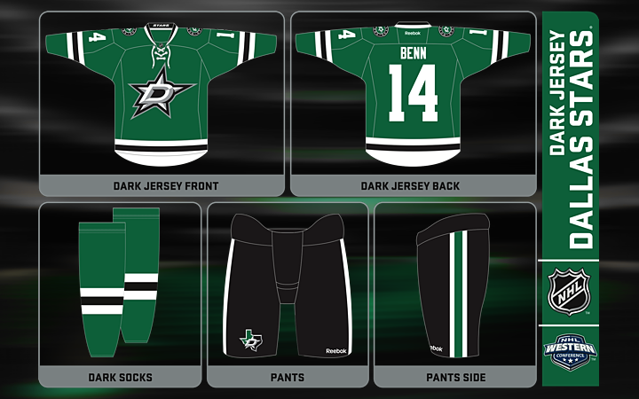
Unfortunately, I haven't seen any great photos of the full uniform on a player like we got from the Hurricanes. While this graphic shows all the important details of the look, it's sterile and detached. You don't get the same impressions as when it's being worn over full gear.
The Stars have gone back to a classic, retro style, following the trend in hockey uniforms of late. The simple, traditional striping cleverly draws the eye straight to the sharp new crest. The one-color numbers and letters are subdued yet unique. And while back in Raleigh the Hurricanes opted for a less sparkly silver in their crest, the Stars have fully embraced it.
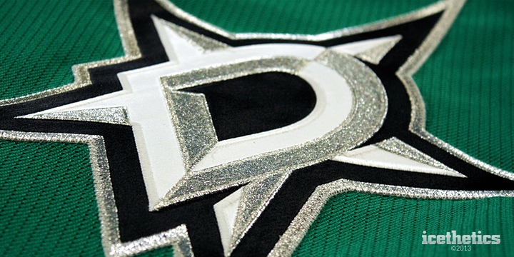
Up close, the detail is stunning. This is going to be a great hockey uniform and should be around for a lot of years. The Stars were part of the NHL's first expansion in 1967. And somehow this logos feels like it could've been introduced back then only to be updated now, 46 years later. Even the green feels like an update to what the North Stars originally wore.
I think what I might be happiest to see is that for the first time in two decades, the Stars aren't wearing a wordmark on their chest. That's been my biggest pet peeve with them over the years. It's the reason their uniforms have always been at the bottom of my list. Now suddenly they find themselves at the top.
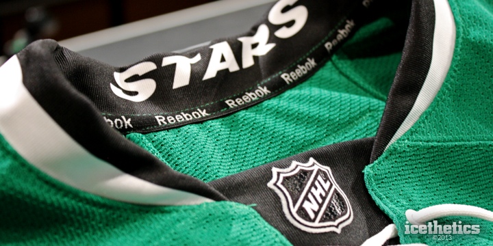
One Reebok trend I actually like is the "Hanger Effect," as they're calling it, where some sort of design detail is incorporated into the inside of the collar. That means it's only visible on a hanger, so you have to own the jersey to be able to appreciate it.
On the green jersey, it reads STARS in the collar. Meanwhile, as you'll see below, it reads DALLAS in the collar of the white jersey. It may not be as cool as Nashville's piano keys or Carolina's storm flags, but it's a nice detail to include in the design.
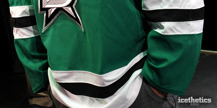
So what is there not to like about this jersey? A few things, actually. I mentioned that I liked the traditional striping style. But it runs into a problem similar to Carolina's in that it isn't strictly unique. I know positioning stripes on a sweater in a unique but traditional way is a difficult task, but the sleeves are straight off a Chicago Blackhawks jersey.
However, the matching waist stripe is where the jersey differs from Chicago's and helps the whole look stand on its own. Gaglardi said he wanted the colors of the team to be green, black and white. This accomplishes that and makes me wish the Lightning had considered keeping black two years ago.
There's another great story about Gaglardi and his stripes. After the event, I spoke with Jason Walsh, the Stars' VP of production and entertainment — the man who ushered the rebranding process. He explained how involved Gaglardi was. Multiple times a week they met to look at new designs. And when one of the final prototypes came in from Reebok, Gaglardi glanced at it for a moment and immediatley asked for a ruler.
The three sleeve stripes were supposed to each be the same width. But the the black one happened to be 1/8 inch too big. He spotted the problem that quickly. That's how dedicated this man was to the details. That's how much he wanted to get this right.
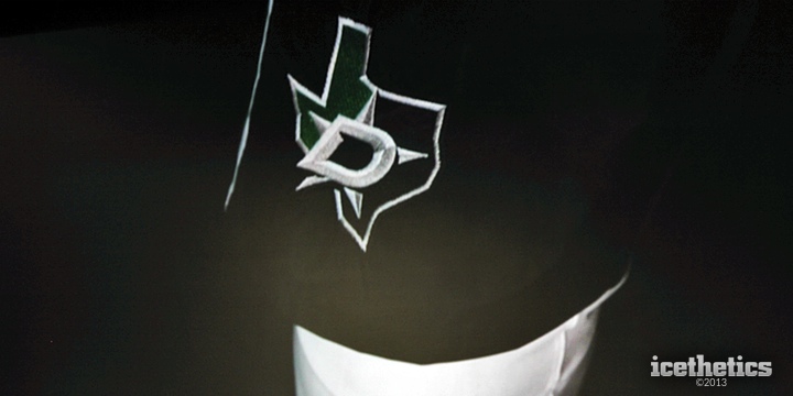
The other thing that bugged me was the placement of this alternate logo. The Stars came up with a new Texas-shaped mark only to bury it on the pants. I think I would've like to see it on the shoulders — as its predecessor had been in years past.
But in fairness, Walsh told me that idea was among the 236 variations the team looked at during the process. And he said it just didn't look right. I understand the state of Texas has an odd shape, but I'm just not thrilled about the outbreak of circular logos.
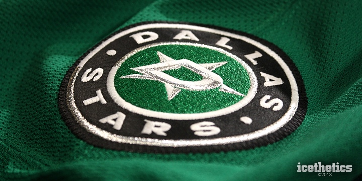
As circular logos go, this isn't a bad one, but I don't feel like it brings anything to the overall identity. It's a wordmark surrounded the D-star of the primary logo. That said, I think it serves its purpose, which is to have a shoulder patch. Carolina went without them and I do think that was a mistake.
I don't mean to keep bringing up the Hurricanes but they're fresh on my mind because both unveilings happened on the same day. And there are plenty of comparisons to draw anyway, with both teams going the traditional route with their new looks.
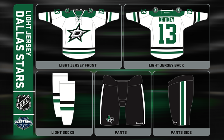
Moving on to the white jersey it's clear we're looking at a brand new template from Reebok. Every since the launch of the Edge jersey in 2007, fans have bemoaned the lack of variation in the uniform designs. But with the Stars' rebrand, a new one was certainly added to the mix.
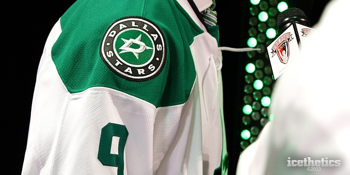
The first thing that stuck out to me, in fact, was the shoulder yoke. It's not simply rounded as is typical with hockey sweaters. But it's not square either, like the new design we saw from Carolina. It's a neat touch that makes this jersey unique among not just NHL clubs but all Reebok-clad teams.
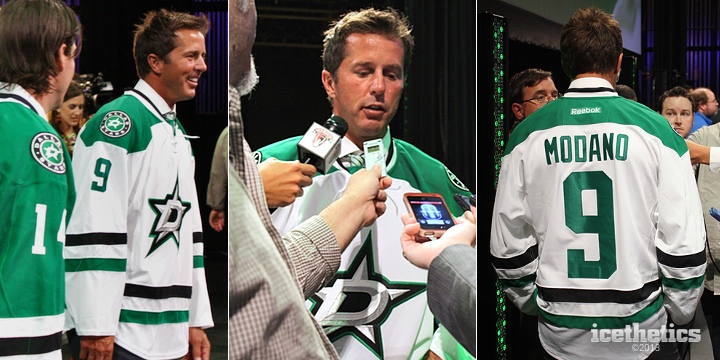
Mike Modano sure does wear it well. It's just a shame we'll never see him in action in it. But it is nice in the transition to get to see the new jersey with No. 9 on the back — since it will be the last time. As we learned Tuesday, it gets raised to the rafters next spring.
While we're looking at these photos, let's talk striping. It's still a three-stripe design like the green uniform, but it's not quite an inverse. And also like the green one, as some fans have noted, the striping isn't exactly novel. In fact, it's a lot like what the University of North Dakota has worn (both the green and white jerseys for that matter).
But despite that, both jerseys retain a feel that's uniquely Stars, and indeed unique in the NHL.
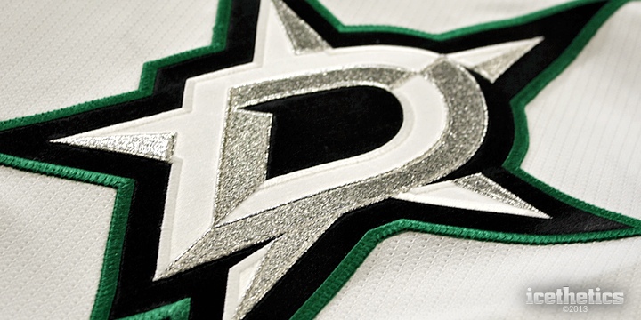
The crest varies slightly depending on the jersey. As we saw on the green sweater, the D-star is outlined in silver. Here on the white uniform it's green. It's the only green in the primary logo, in fact. But it's all you need. You don't want the logo be primarily green if that's the color you want for your sweaters.
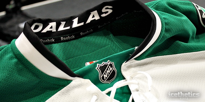
As I mentioned before, both jerseys have Reebok's Hanger Effect. You can see the DALLAS wordmark inside the collar of the away jersey. And also noticeable here is the lace-up collar. It's featured on both sweaters and it's one of those things you add to a jersey when you're going for that traditional appeal.
Just from an aesthetic standpoint, I like it. And I probably wouldn't mind if every NHL team did it. Is it functional? No. But it is a treatment that is unique to hockey sweaters. You wouldn't find it a football or baseball jersey. For that reason alone, I like it. But I can't give you a good reason for why I think it works. It's just something that appeals to my design sense.
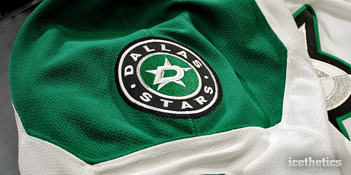
I have to squeeze in one more close-up of the shoulder yoke. I really like the idea of the Stars differentiating their look this way. Could any other team have tried this? Sure. But the Stars did it first so now they get to own it. It's one of those details taht makes me love this sweater.
And it's also why I'll have a difficult choice to make in the fall. Do I buy the green one or the white one? Maybe both.
If you'll permit me to compare/contrast the Stars and Hurricanes once more, the biggest point I have to make is how each franchise approached its identity. I wrote that I felt like Carolina lost what made it unique. On the other hand, the Stars have gone out of their way to create a look that is both unique and beautiful.
I'll wrap this up with a summary of my thoughts.
The Good:
The Bad:
So you've heard my take. What's yours?

Apparently I have a lot to say about the new look of the Dallas Stars. So I had to break my review out into multiple parts to keep it from running on too long. Tonight, you get Part 2 which focuses on the unveiling event itself. I had planned to include my uniform review here as well but as you'll see, it goes on quite a bit.
The uniform review will definitely go up Monday, which is better anyway since that's the day of the week when Icethetics readership is highest. Again, sorry for the delay but you will finally get that review tomorrow! For now, here's my take on the event.
I was thrilled to get the invitation from the Stars in early May. Icethetics, while graced with a decent following, isn't exactly a big deal as far as I'm concerned. What it is a big deal is an NHL team rebranding itself. So it was very exciting to get the opportunity to see the unveiling in person.

It takes about four hours to fly from Seattle to Dallas. So I spent eight hours traveling for a one-hour event. That's how much I love this stuff. And apart from some reader donations, this trip was on my dime. The Stars invited me but they did not fund my trip. I'm grateful to them for letting me come, but I don't want you to think that's colored my judgment as far as this review goes.
The event, titled "A New Star is Rising," was held at the Winspear Opera House, part of the AT&T Performing Arts Center in downtown Dallas. It was a state of the franchise type of occasion with the unveiling of the new branding scheduled as the main event. Because of that it was saved until the end — which annoyed those following along with my coverage on Twitter. Nobody wants to wait for anything anymore.
As I got settled in to my seat on the far right side of the venue with the other media members, I briefly met a couple of people, including Mark Stepneski who writes for the Stars' website as well as the Stars Inside Edge blog. He mentioned that he'd already seen the new uniforms. Since he works for the team, he'd already received artwork so he could update his blog. His reaction was very positive.

The program opened with a video clip that began by telling us, "it's a new day for the Dallas Stars." It was basically a highlight reel of the club's history, including scenes from its 1999 Stanley Cup championship. It also included one last look at the Stars' existing logo treatment.

We also got treated to some clips of the old North Stars — wearing green (hint, hint). But the video was really just meant to get everyone psyched up for the night's festivities. It worked because even though I'm not a Stars fan I was still pretty thrilled to see what all was in store.
 Ralph Strangis and Daryl Reaugh take the stage
From there, the Stars broadcasting duo of Ralph Strangis and Daryl Reaugh ("Razor") took the stage. They were energetic and fun all night. They began their presentation by talking about how great the fans are in Dallas. Attendance increase, high season ticket renewal rate and so forth.
Then came the big sell on why you should become or continue being a season ticket holder. It really sounded like this is an exciting time to be a Stars fan, honestly. But then I would be happy just to have an NHL team in my city. Speaking of which, the guys announced the Stars would be headed out of town for a couple of preseason games in Oklahoma City and San Antonio. Does anyone want to play an exhibition game in Seattle?
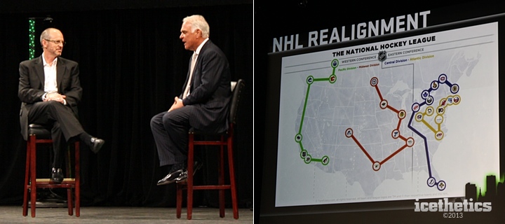 Ralph Strangis with Stars President & CEO Jim Lites and the NHL's new realignment map
Next, Ralph brought out Stars president and CEO Jim Lites. He explained a lot of the changes the franchise is going through, including the realignment of the NHL, which will put the Stars in a division with other Central Time Zone opponents for the first time since 1998. They moved to accommodate the four expansion franchises that entered over three seasons in Nashville, Atlanta, Columbus and Minneapolis. Lites pointed out that arrangement was supposed to be temporary. It lasted 15 years.
Lites talked about how happy he was to see this map that "the guys" put together. At this point, I started tweeting feverishly because it looked like for the first time we had the official names of new divisions, rather than A, B, C and D as they're currently known. The graphic labeled them Pacific, Midwest, Central and Atlantic.
But in fact, it wasn't official at all. If this map doesn't look familiar to you, it sure looked familiar to one guy who goes by the name Tom Fulery and runs a website which focuses on finding the best realignment plan for the NHL. Turns out he made the very map the Stars "borrowed" for this presentation. (At least they kept his credit intact at the bottom.)
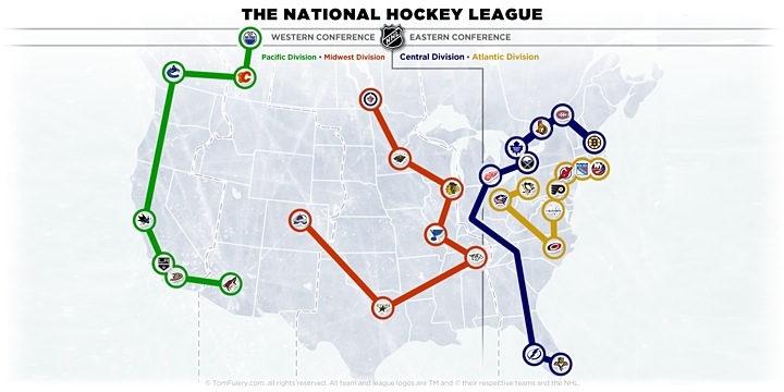 NHL Realignment map by TomFulery.com
In fairness, the map is accurate as far as how the teams will be arranged next season. The division names however, Tom just made up himself. Whether the NHL will use these or something similar is unknown as this point. But it was odd to see the Stars using someone else's map rather than their own or even the one released by the NHL itself.
Next topic: Mike Modano. Strangis and Lites spent a good deal of time talking about Modano and how much a part of this franchise he is. Then Lites announced to the crowd that the Stars will permanently retire No. 9 on March 8, 2014. Naturally, Dallas will be hosting Minnesota that night.
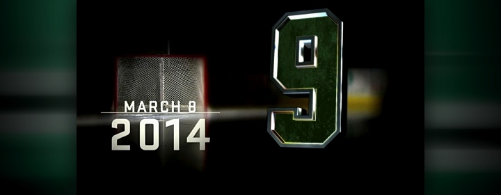
That led into a Mike Modano tribute video which seemed to show every goal the man has ever scored in a Stars uniform. It felt long to me but the fans in the Winspear Opera House were eating it up. I'm sure I'd feel the same way watching a Marty St. Louis highlight reel.
Modano came on stage and talked with Strangis a while before tossing things over to Razor, who brought up GM Jim Nill to talk about the product on the ice. This is where I took some time to get caught up on tweeting a couple of photos and other details from what I'd seen so far. Twitter was still reeling from the news that there was finally a date for retiring Modano's jersey.
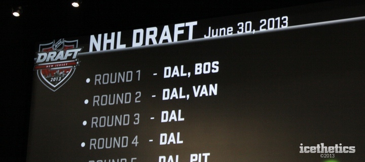 Another "borrowed" graphic in the presentation
Then something else caught my eye while Razor and Nill were talking about the Stars' position in the upcoming draft. Check out the logo in the upper left corner of this slide. That was a logo designed as a concept before the NHL released the official logo. Of course it showed up in many places around the web last winter, but you'd think an actual NHL franchise wouldn't have to turn to Google to find a logo.
It finally came time for the reason I made the journey to Dallas. Razor welcomed Stars owner Tom Gaglardi to the stage to talk at last about the new branding of his franchise. The pair chatted about Dallas' checkered uniform history, Gaglardi pondering the team had perhaps been a "victim of trends" in the past.
"There are some jerseys in our past that I think are really great," Gaglardi said, adding "some that maybe aren't quite as great."
"Can anybody think of one?" Razor joked, obviously referencing the "Mooterus" debacle of 2003.
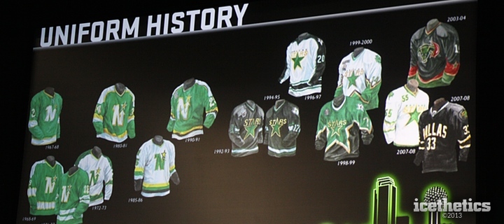
While the guys talked, on screen we were reminded of what this franchise has looked like in years past — even back to the days when they were the Minnesota North Stars. Look at all that green. (Pay no attention to that human anatomy lesson with a splash of red in the corner.)
Perhaps my favorite part of the conversation came next. Razor asked Gaglardi what was important to him in the rebranding process. His response was so great it requires a big blockquote.
I think you have to make a decision if you want to be a black and white team. I think black is a great color in a lot of ways. You look tough. I think you can look intimidating.
But I come from school of thought that black isn't really a color. And no one really gets to own black. Even more than that, we had a logo that was never really a made-in-Dallas logo.
We wore the Dallas wordmark across the chest and in hockey it's important to have your identity and who you are on the front of your jersey. It's the great thing about hockey jerseys. And I think we missed a huge opportunity to say who we were on our front.
The Rangers are the other team that don't wear their primary logo on their chest. But as an Original Six team... I don't think that really counts. We're the only team in the league that doesn't wear our logo on our chest and I don't think that's right.
Those are the words every Icethetics reader has ever wanted to hear. Black is not a color and a hockey jersey needs a logo on the front. Finally an NHL owner that positively gets it!
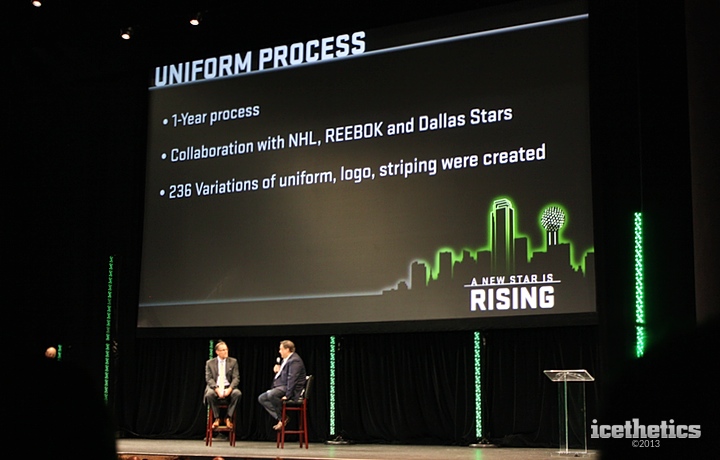
Finally, before the big reveal video, the Gaglardi talked about what led up to this night. He said the Stars logo "doesn't really stand up with the best logos in the NHL" and that the process to rebrand was "exhaustive." In fact, the whole thing took a year and involved 236 different variations. That's an enormous number!
Gaglardi also added:
It was a big endeavor because I think that we weren't necessarily, at the beginning, committed to a new logo. But for my part, I strongly felt that it was something that needed to be part of the process.
We had some of our key guys that had been with the organization, our top executive staff. We had internal and external design people. Reebok, the National Hockey League and some really smart people. I know I learned a lot through the process about what was important.
I really had no idea where we were going at the beginning in terms of what we do with color and whether the logo would change. The one thing that I believed strongly from the start was that we wanted to have— I mean, we're a Second Six franchise. Our roots trace back for a long time and we're one of the older franchises in the NHL, so I thought it was important to show that we're not a fly by night group.
A real hockey jersey with a classic appeal to it was something that this franchise really needed. I think when [the franchise] came to Dallas, that jersey in 1993 was a pretty traditional [design]. I think [it] might be the best jersey that the franchise ever had, in my personal opinion. But it was a black and white jersey. We wore black and we wore white.
All this setup was exciting because it was telling me for certain that the new sweaters would not simply be black and white anymore. That was a huge step for this club's identity as far as I'm concerned.
Gaglardi then mentioned that he received letters and emails from Stars fans across the continent which convinced him that green as the prominent color was the only way to go for his team. So glad he listened. That doesn't seem to be a priority with guys in his job these days.
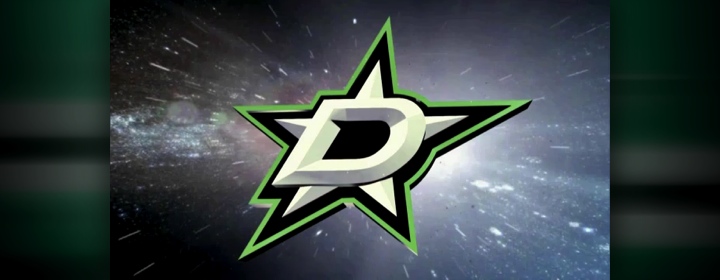
Next we got a short video that showed green overtaking the entire city of Dallas and ended with our first official look at the team's new primary logo. (See Part 1 of this review for my thoughts on the new marks.) In a nutshell, this is the ideal identity for this organization. But this logo leaked online two weeks before the event. What came next was something few in the building had ever seen before.
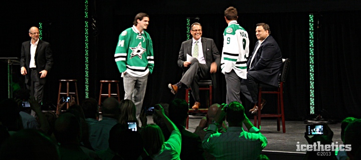
Jamie Benn and Mike Modano strutted onto the stage sporting the Stars' brand new green and white uniforms. Ralph rejoined the conversation and the five men chatted for a few moments about the new look as the crowd took it all in with cameras and camera phones pointed intently toward the front of the house. It was an exciting moment to be sure.
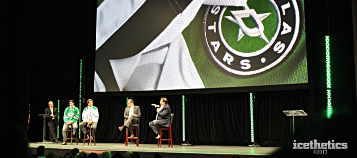
The conversation turned back to Razor and Gaglardi, who talked more on the process.
"Before we started anything," Gaglardi said, "we created a three-page brief which said all the things that we wanted out of the process." For what it's worth, Jason Walsh, the man who shepherded the rebranding effort, told me later that it was more like a 35-page brief.
Gaglardi continued: "I went back recently and read that brief and we nailed it. It's a logo that has classic and vintage aspects and yet it's modern and stands up to some of the best logos in sports. I've had several people looking at it — that I have a lot of trust and faith in — for months and really believed it's a real professional sports logo."
There's no question I have to agree with everything he said there. Gaglardi went on to discuss the new shade of green and how the Stars were now "owning" their own color for a change. This is the hallmark of some of the best sports franchises in the world, so you've got to admire Dallas for recognizing that.
The event wrapped up and the fans filed out of the auditorium. But up on stage, the Stars made Gaglardi, Benn and Modano available to talk to the media. I made my way up to grab some photos, which will be included in Part 3 — which you won't have to wait that long to read.
Afterward, the Stars set me up for a quick interview with Jason Walsh. I referenced some of that conversation in Part 1 of the review and will have more in Part 3. But it was really great to have the opportunity to speak with him about some of the design choices that were made.
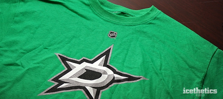
There was no way I could go home without grabbing a memento from my trip. I picked up this T-shirt and wore it on my flight home Wednesday. No one asked me about it. Perhaps I didn't run into any hardcore hockey jersey geeks at DFW, John Wayne Airport in Orange County, Calif. or Sea-Tac. But I liked getting it out into the world. It's really a great new look. And the green is just fantastic.
As I wrap things up here, I have to thank the Dallas Stars once again for inviting me, and by extension you guys, to join them and their fans on Tuesday for what was a very fun night. Be sure to check back Monday for my complete review of the Stars' new uniforms. Then I think we'll have put this subject to bed for a while.