0423: Ice Cold Avalanche
/
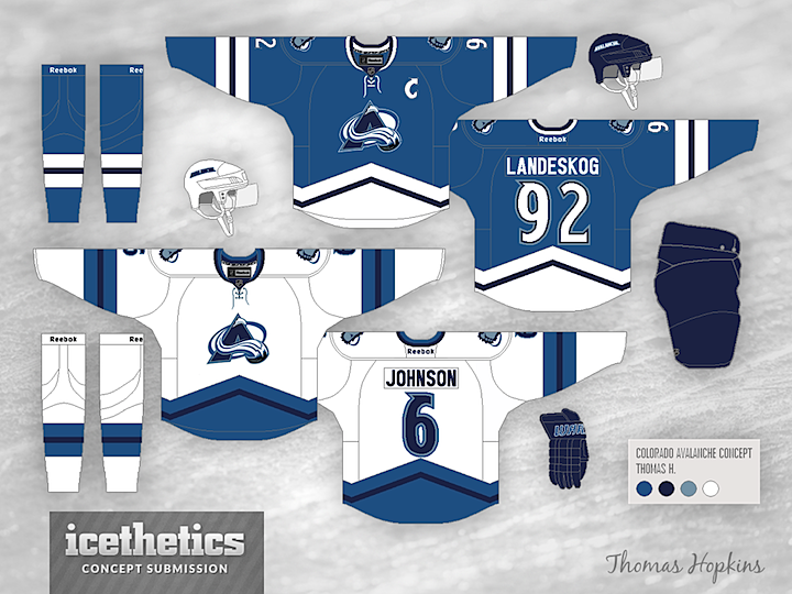
Thomas Hopkins gives us a very cold-looking Avalanche concept today. All those blues are making me very chilly. Brrrr.

Thomas Hopkins gives us a very cold-looking Avalanche concept today. All those blues are making me very chilly. Brrrr.
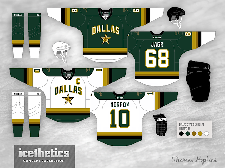
On the heels of St. Patrick's Day, I thought another green Dallas Stars concept was in order. Thomas Hopkins provides us with this look which, while more colorful, relies perhaps a bit too much on the wordmark style crest of the existing sweaters. It is the first I've seen to try a two-tone gold color scheme. Thoughts?
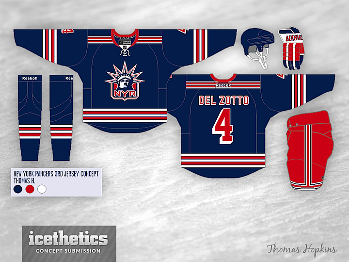
I can't stop posting Lady Liberty concepts for the New York Rangers. Most of them are just superb. Especially this one from Thomas Hopkins. By the way, you may have heard the bad news. Until this season, the Rangers had been wearing the Lady Liberty logo on their practice jerseys. Not anymore. And that's depressing.
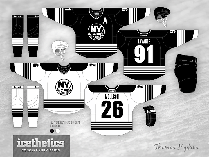
I used to think there was no way to design a good hockey sweater using only black and white. I changed my mind today. This New York Islanders concept by Thomas Hopkins is inspired by the decision of the NBA's Brooklyn Nets to adopt this simple palette when they moved into the building they will soon share with the Isles. (End run-on.) Needless to say, I'm a fan.
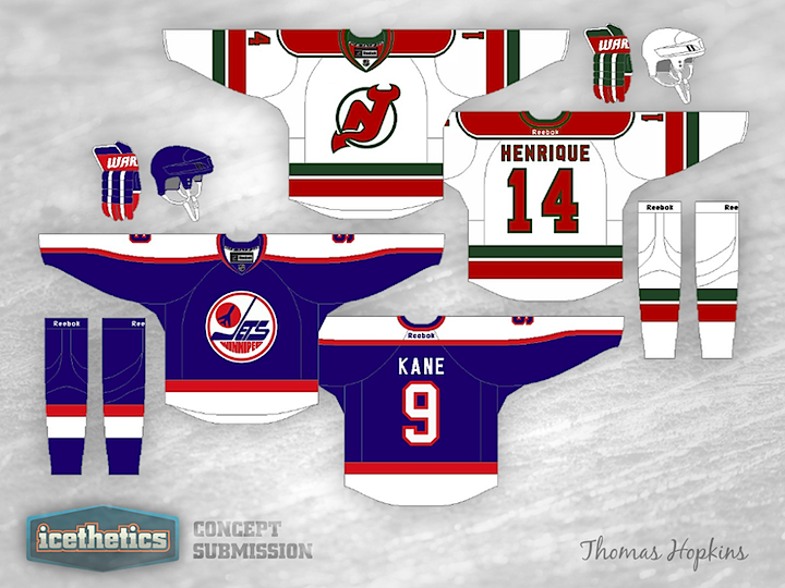
Thomas Hopkins put together this Winter Classic concept for 2014. He envisions the game taking place in Winnipeg between the Jets and the New Jersey Devils. Odd partners sure, but as classic hockey jerseys go, you could do worse.