Five by Steven Grant

Nine hundred consecutive days and counting! That's how long you've been able to find new fan-submitted concept art here on Icethetics. It's a big milestone so we're celebrating with the subject of a recent theme week where I featured five designs each from some of our most prolific artists. This time around we get a handful from Steven Grant.

By the way, in case you're keeping track, we should hit our 1,000th post on Nov. 14.

Upgrading the Lightning

This week seems to be about fixing teams whose jersey designs have gone astray. The Lightning aren't in a bad place with their present look, but as Steven Grant points out, there are certainly some elements they could add to call back to their original uniforms. Like white shoulder yokes and a the victory stripes under the arms, for example.

Start Your Engines

Steven Grant presents a unique third jersey with a racing theme for the Motor City-based Detroit Red Wings. He writes:

For this concept I was just messing around with a few ideas for a Red Wings third jersey. The striping pattern is inspired by racing stripes on old fashioned cars. The captain patch in a circle is also inspired by old cars, specifically how old racing cars had numbers within a circle. I then used their old fashioned D logo as the primary logo, and I kept the equipment from their current jerseys.

What do you say? Too far out for a franchise as old as the Wings? Or just what they need to shake up their look?

Colorado Color Ado

Come on, that headline at least has to get me a job interview at NHL.com. Right?

All right, so Steven Grant has been working on a series of "de-Edged" NHL jerseys of late. His unique take on the Colorado Avalanche brings a distinct color palette. I like the idea of trying to avoid using a white jersey, but frankly I'm not sure sky blue is the best option. What's your take?


Update

Normally I use updates for artist revisions. But this update from Steven is less a revision and more a complete redesign of his Avalanche concept.

He writes: "It's funny that you posted my Colorado Avalanche concept today, because just yesterday I was working on an update of that concept that keeps the same colour scheme but changes almost everything else."

Still, I thought it might be nice to compare and contrast so I decided to include the new design in this post.

Gradient Triple Freak Out

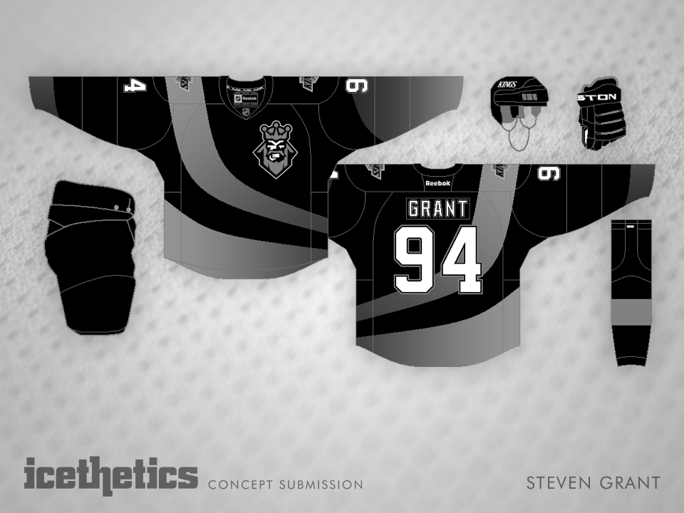
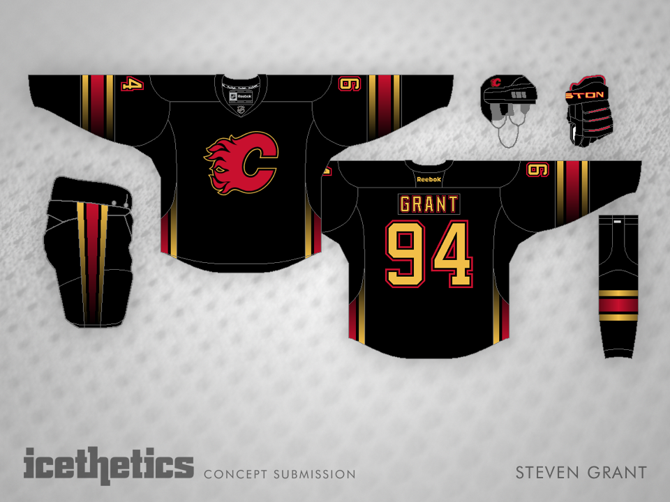
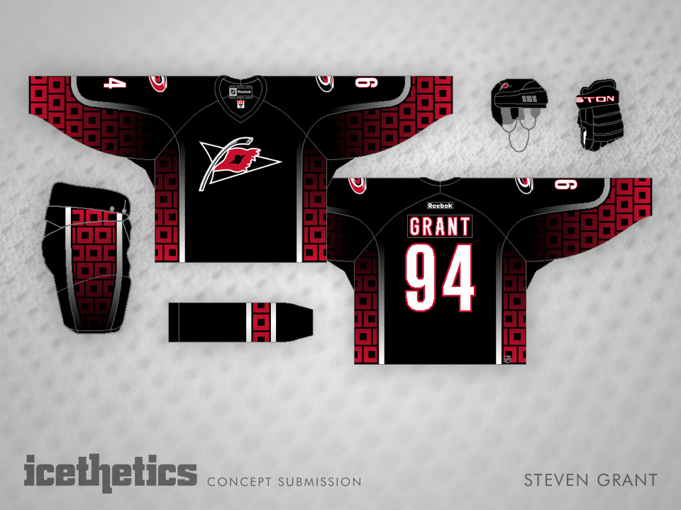
Steven Grant is normally one of the voices of reason on the Concepts page. Today, he steps out of that role for a fun Freak Out Friday experiment — with dreaded gradients! There are three concepts in the slideshow above, so be sure to flip through.

The first is a dark reimagining of the L.A. Kings' original third jersey from 1996. Then comes a Calgary jersey with stripes that actually look like flames. And finally, there's a Hurricanes design I couldn't possibly describe. Time for the weekend!