0466: Saddle Up, Cowboys

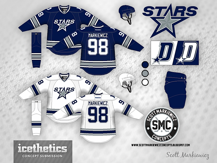
Today's theme is very obviously the Dallas Cowboys. Imagine the Stars decided to align their brand with one of the most well-known in all of sports — and certainly most well-known in their city. It might look something like this option from Scott Markiewicz.
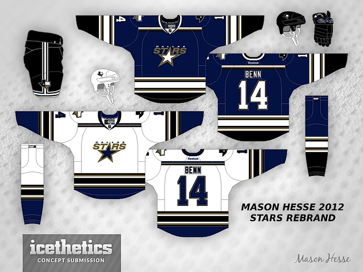

Mason Hesse also tried the blue/silver route with somewhat different results. In fact, despite using the same colors as Scott, Mason's concept feels more like an idea for the Tampa Bay Lightning than the Cowboys. If you had to choose, which option would you prefer?

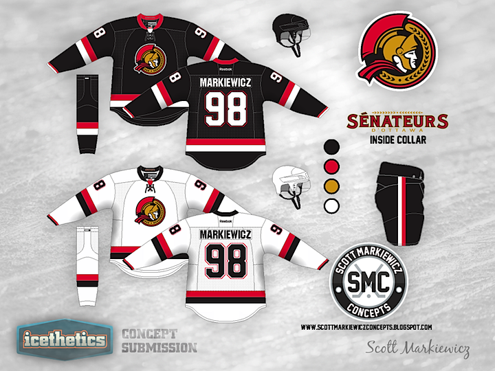
0271: Sharp Sénateurs

We've seen a lot of incredible Ottawa Senators concepts grace this pages and this one definitely joins that company. Scott Markiewicz has assembled a fantastic design that captures the history of this team and the history of its predecessor while not looking old and stale. Bravo!

0250: Barons & Griffins

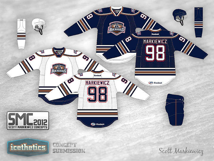
Scott Markiewicz is back with another AHL concept this week. His take on the Oklahoma City Barons has the club keeping its old Oilers color scheme but with a new striping pattern. It's not bad, but I'm definitely a fan of their new third jersey.


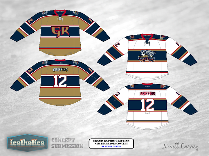
As an AHL Week bonus, we have this Grand Rapids Griffins concept from Nevill Carney. He originally created it last year as a New Year's 2012 proposal.

Now normally, I end theme weeks on Thursday so that we can properly observe Freak Out Friday. However, this week we do have an AHL-themed Freak Out so check back tomorrow for that.

0247: The Retro Whale

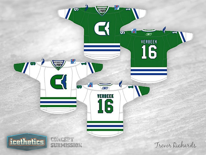
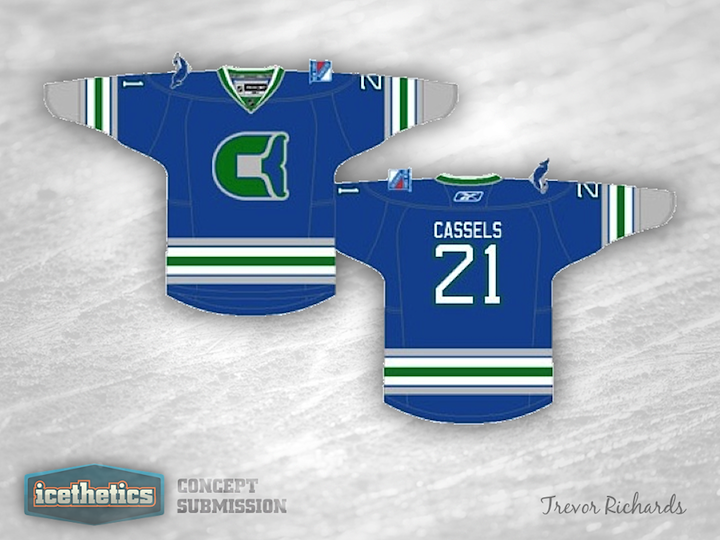
As we embark on another week without NHL hockey, I thought I'd turn the Concepts page's attention to the AHL this week. Plus, we haven't done a theme week in a while. Today, we get a couple of looks for the Connecticut Whale, starting with this Hartford-inspired throwback set from Trevor Richards.

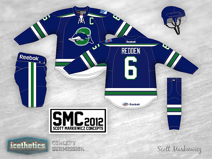
But since I don't see the Whale changing their logo anytime soon, what about this one from Scott Markiewicz?

0158: Classic Pirates

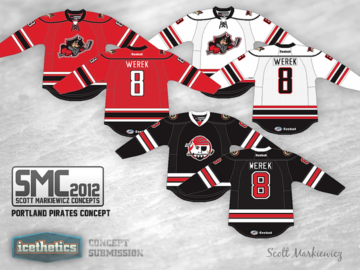
Scott Markiewicz describes his Portland Pirates update as a more classic look for the AHL franchise. It's a sharp design and certainly beats the Panthers-style jerseys they wear now. I especially like the throwback third.