Rochester Redesign
/It's been a while since we've seen something new from Justin Nahhas. Today he gives a great new set of Rochester Americans jerseys. Really sharp!
It's been a while since we've seen something new from Justin Nahhas. Today he gives a great new set of Rochester Americans jerseys. Really sharp!
You wouldn't believe the volume of Anaheim Ducks concepts coming my way these days. I think that orange Stadium Series jersey got the wheels turning for a lot folks. So expect to see a lot more in the coming weeks and months.
For now, here's a neat set from Justin Nahhas. The modern crest mixed with very traditional jersey elements and the retro Disney duck is a unique take. And be sure to click over to the black alternate he included.
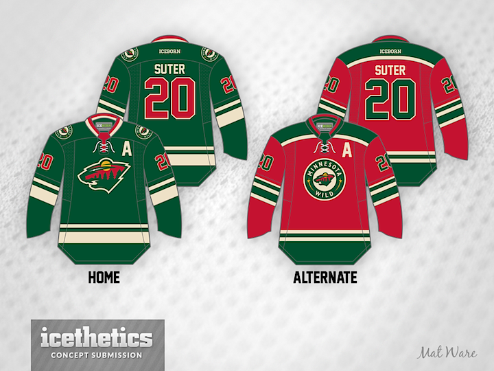
So often the Minnesota Wild are given a hard time for their "Christmas colors." And whether you agree or not, today one is the perfect opportunity to celebrate that. First up is Mat Ware whose created home and alternate jerseys to go with the team's new road sweater.
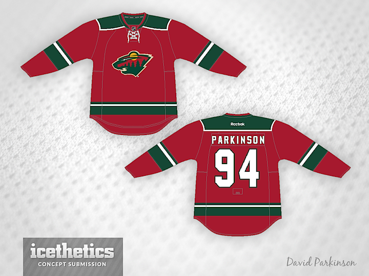
Next is a sweater by David Parkinson who put together just the right combination of red and green for that holiday feel.
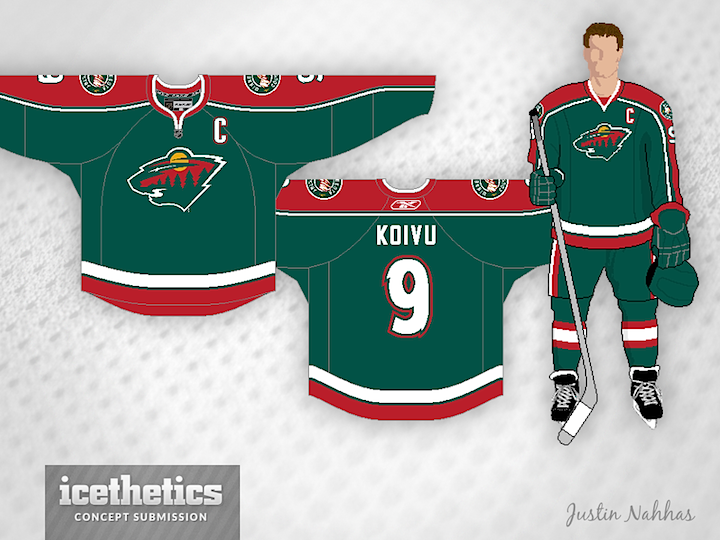
On the other hand, Justin Nahhas went with a green jersey and still achieved a similar effect.
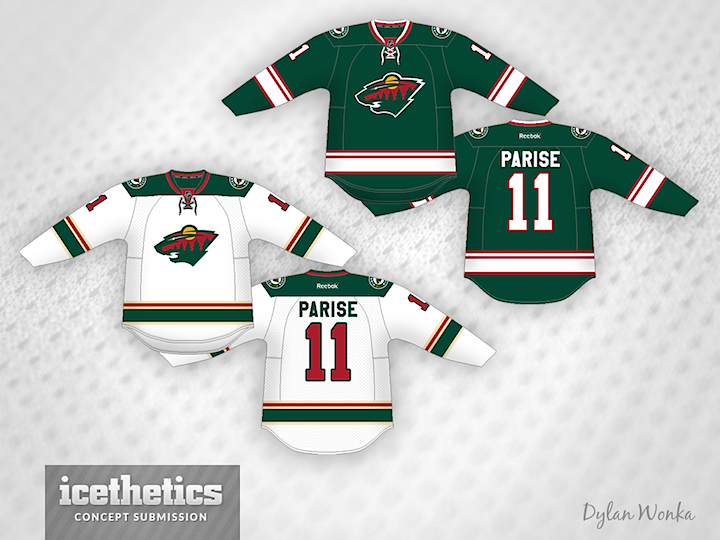
Finally, Dylan Wonka presents a pair of jerseys. The white one is pretty solid, but the Wild but the green one has some very merry striping if you ask me.
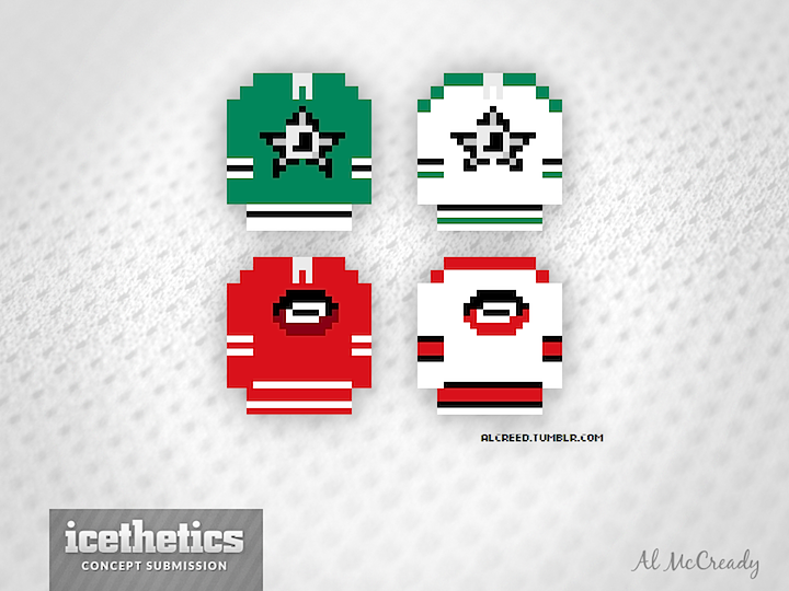
Before you go, I've got a bonus concept that was tailor-made for today. Our favorite 8-bit artist Al McCready recreated the Stars' and Hurricanes' new uniforms in his unique style. Merry Christmas!
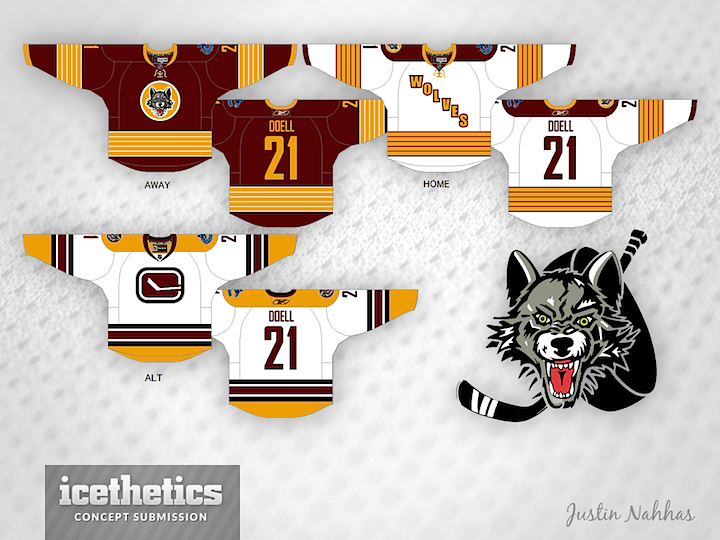
Minor League Week wraps up up with a super-sized Freak Out Friday. First, Justin Nahhas offers his redesigned Chicago Wolves jerseys. The home and road options aren't too crazy — though they do follow the template used by the Penguins in their last Winter Classic appearance.
The alternate jersey is what should freak us out. To be fair, Justin submitted this concept almost two years ago when the Wolves were still affiliate with Vancouver, but could you imagine a Canucks logo on the jersey of a Chicago-area team? Of course, the subtle "C" in that stick-in-the-rink logo could stand for Chicago, right?
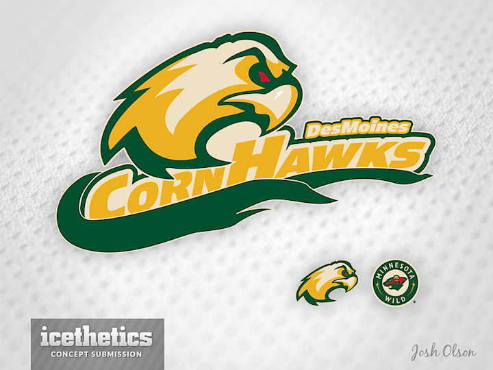
Another oldie I'm just getting around to posting is this one from Josh Olson. Last spring, in between learning the Houston Aeros were moving to Iowa and what the team's new name would be, Josh sent in this idea for a rebranding. He admits making up "CornHawks," but there's no reason it couldn't work as a team name. Do you prefer Des Moines CornHawks or Iowa Wild? (Both are a bit of a mouthful.)
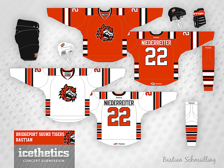
The ever-creative Bastian Schmülling completes a run of being featured on this page for three straight days. Here, he's redesigned the look of the Bridgeport Sound Tigers — swapping Islanders blue for nice shade of black. What do you think of the striping style? I think it's a little out there.
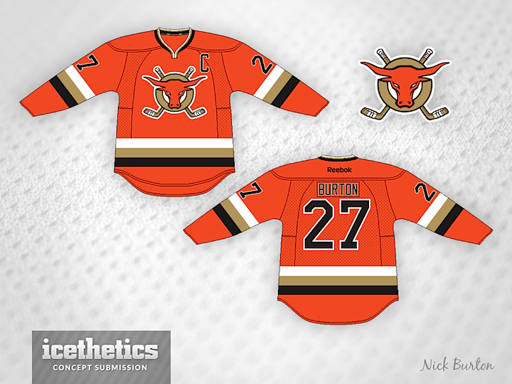
And finally, Nick Burton brings a redesigned orange jersey for the ECHL's San Francisco Bulls. What freaks me out is the sunburned bull on the crest. Yikes! Nice jersey, otherwise.
Check back here tomorrow for a concept that previews Chicago's Stadium Series sweater!

As we look to more modern jersey designs with the new Stadium Series threads, check out this Vancouver Canucks set from Justin Nahhas. He was inspired by the team's original third jersey from the 90s, but it's still a very cool look.

Justin read your comments and put together a few alternative designs.