Carolina Freak Out
/This week's Freak Out Friday brings us a unique uniform set for the Hurricanes from Bryan Dyck. Note his revision of the storm flag logo to form a "C" for Carolina.
This week's Freak Out Friday brings us a unique uniform set for the Hurricanes from Bryan Dyck. Note his revision of the storm flag logo to form a "C" for Carolina.
Zephyr has produced some unique NHL-branded hats in their time. Most intriguing to me is that it seems a past edition of the Snapback series was designed by someone who was color blind. And it inspired Bryan Dyck to create a series jerseys based on the unusual colors.
It makes for the perfect Freak Out Friday post.
They're pretty bizarre, but I kind of dig Chicago and San Jose. Are there any you like?
I know, two consecutive weeks of Anaheim Freak Out Friday posts. What's that about? I guess a lot of designers feel like they're a good starting point for some wackiness. This one by Bryan Dyck sort of speaks for itself, so I'll just leave you to it.
The Blues are one of the teams rumored to have new uniforms next season. Bryan Dyck came up with this one on his own specially designed template. What do you think?

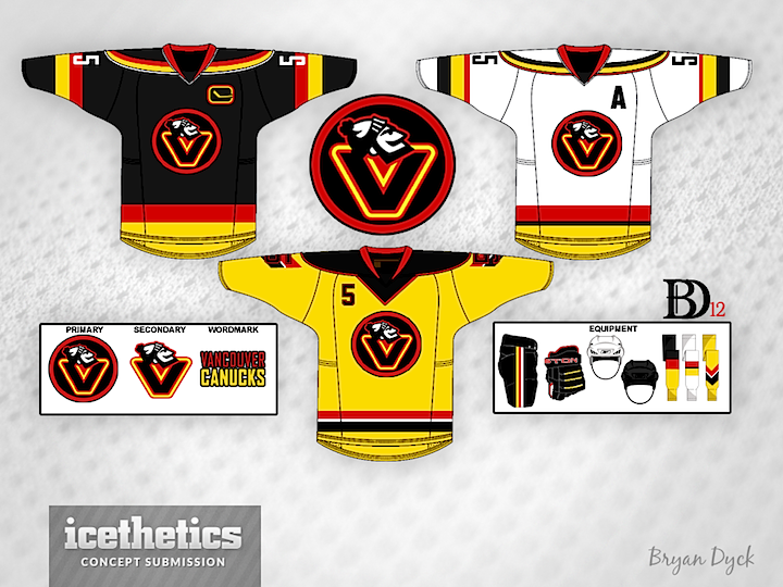
Tampa/Vancouver Week wraps up with a Vancity freak out. Bryan Dyck is merging the Canucks' 1980s color palette with their new Johnny Canuck logo. It's pretty clever but I'm not sure I'd want to see it anywhere outside the Concepts page. (Note the yellow socks!)

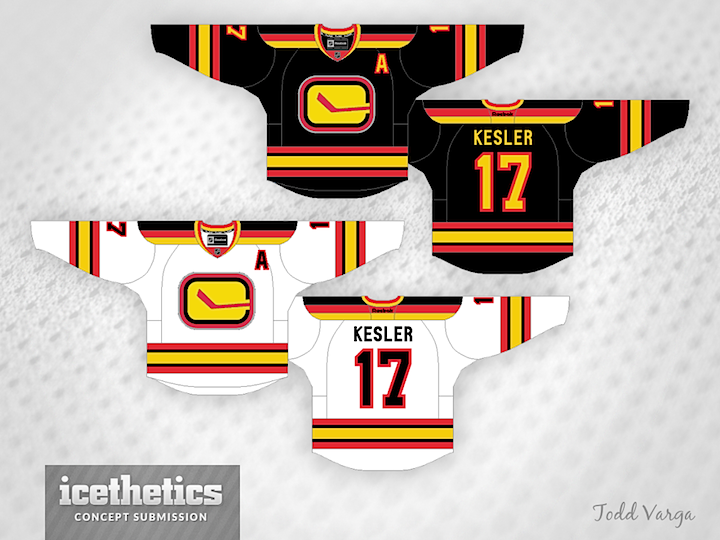
See a pattern forming here? Todd Varga added the 1980s palette to the stick-in-rink logo. Again, makes for a neat jersey set, but probably not one we'd want to see on the ice anytime soon.

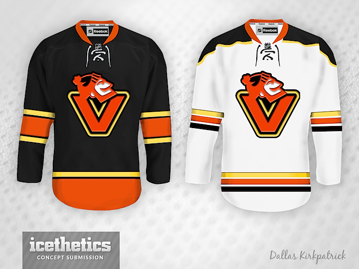
Newcomer Dallas Kirkpatrick is just scaring me now.

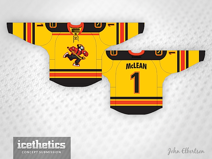
And finally, I was saving this one. Remember yesterday's Johnny Canuck set from John Elbertson? He included this yellow one as well but it fit so much better with today's theme.