0176: San Francisco Sunday, Part 2

i
315 VOTES

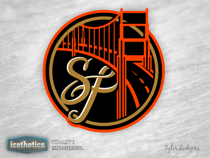
Tyler Rodgers has created a beautiful mark, which is exactly why it doesn't belong in the San Francisco Bulls' existing branding. Wouldn't fit in with that primary mark at all. But this is really a great design and I hope someone buys it from him one day.

i
252 VOTES

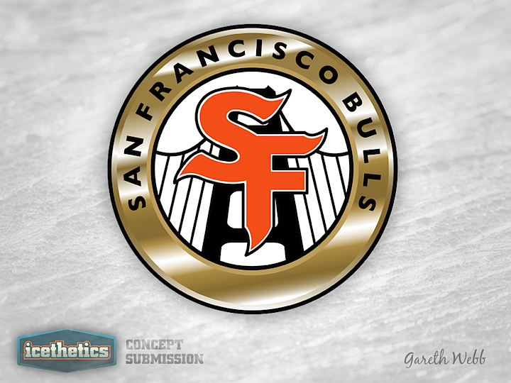
This is a pretty solid design as well, but it fits better within the Bulls' existing look, especially with the gold gradients. I'm not saying that's a bad thing, though. He's certainly improved upon their look.

i
245 VOTES

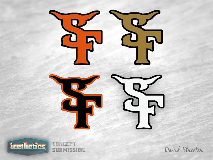
And finally, David Streeter shares a few horned intertwined SFs. He hasn't incorporated the Golden Gate Bridge, but they're still decent designs. So what do you guys think of today's set?

0 Comments
Share
i
RATE THIS CONCEPT

0043: A Fool for the Moose

i
595 VOTES

Taking a break from Winter Classic Weekends to celebrate April Fool's Day! Last year when we found out the Atlanta Thrashers were headed to Winnipeg, the rumors flew. We'd heard from Mark Chipman that he had no desire to resurrect the Jets and, in fact, every intention to carry on the successful branding of his AHL team, the Manitoba Moose. But we were fooled. On Draft Day, it was confirmed the franchise would be named the Jets. Still, Tyler Rodgers has sent in what may have been a great upgrade to the Moose brand. Shame we'll never see it go beyond this page.

0 Comments
Share