Fixing the New Moose
/Tyler Gross thinks the new Manitoba Moose logo and uniforms could've been better. He submits this design, adding that "the little bit of red in the eye is supposed to be a maple leaf as an ode to Canada the the Jets logo."
Tyler Gross thinks the new Manitoba Moose logo and uniforms could've been better. He submits this design, adding that "the little bit of red in the eye is supposed to be a maple leaf as an ode to Canada the the Jets logo."


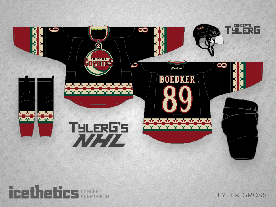
In 22 days, the Arizona Coyotes will show us their new uniforms. Until then, we have fan-designed concepts to enjoy — like this one from Tyler Gross. Should the Coyotes go down this path again?
On the day of the only Stadium Series game of the 2014-15 season season, I thought it fitting we visit some other ideas for the teams taking part. (If only I'd bothered to post it before the game started. Sorry about the delay.)
First up, John Elbertson tackles a grey jersey for the Kings, bringing back the logo from the Kings' original third jersey in 1996. The brown pants and gloves give the whole thing a unique look and feel. I do think we could ease up on the stripes though.
Meanwhile, Tyler Gross wanted to give a more traditional slant to the Sharks' outdoor jersey. It's a little Montreal-esque but it works. What do you think?
We still haven't seen what the Chicago Blackhawks will wear for the 2015 NHL Winter Classic in Washington, D.C. but Tyler Gross is hoping for something like this. All that vintage white...
If the Anaheim Ducks ever need a set of traditional style uniforms that still fit with their existing branding, Tyler Gross has them covered — beautifully.