
Wild Earth Tones
/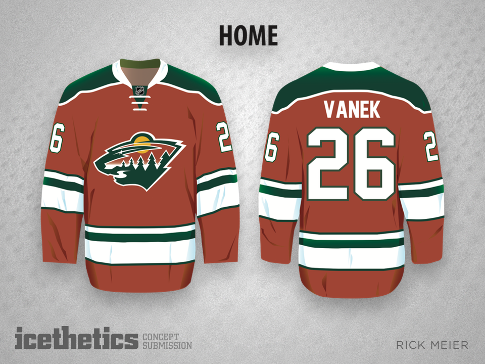
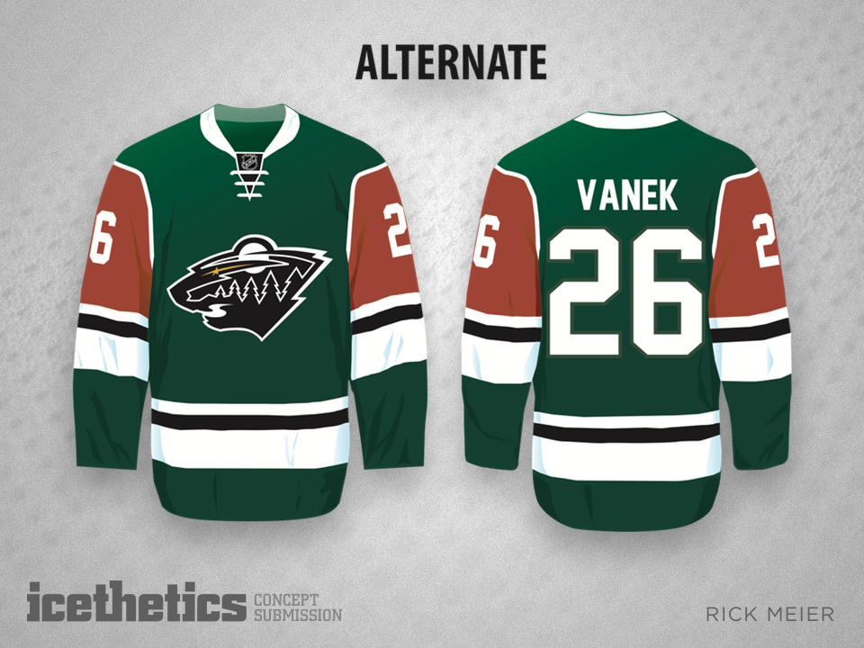

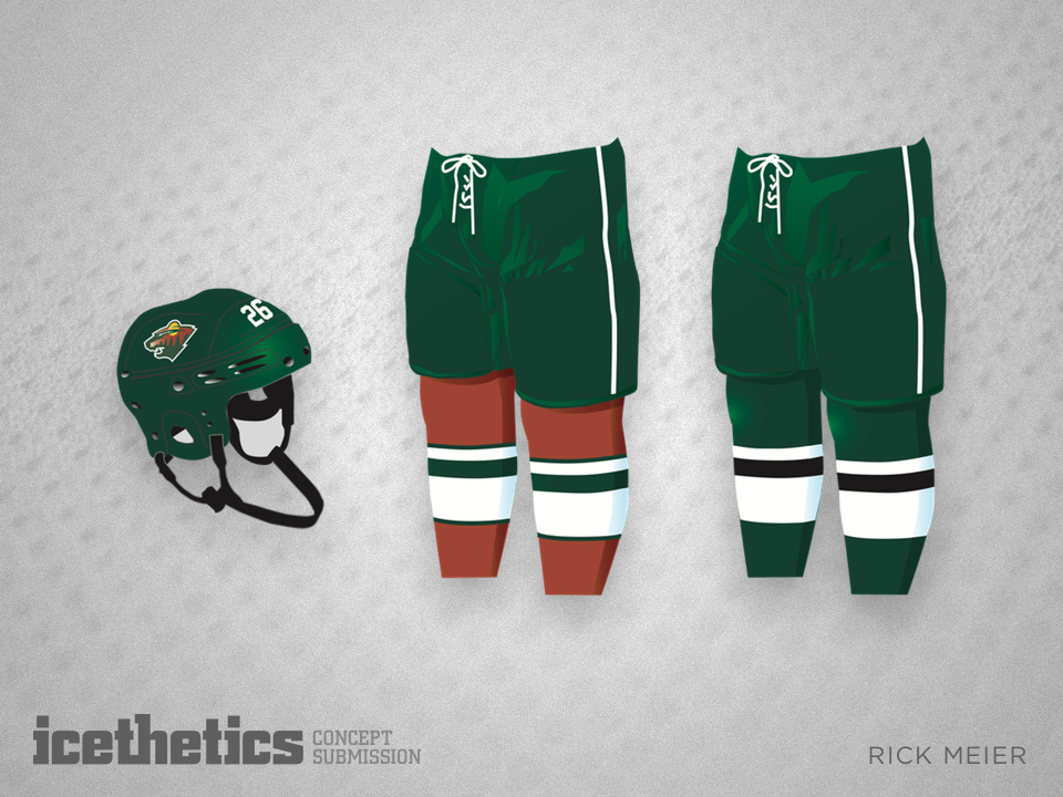
Rick Meier makes his debut on the Concepts page with a rethink for the Wild. He writes:
Having a passion for the MN Wild and hockey in general, and having heard the criticism of its Christmas colors, I decided to go with a more earth tone variation. Earth tones virtually never clash. I also did a little redesign of the shoulder patch used on their away jerseys.