
Jazzing Up the Hurricanes
/

Charlie Allen writes:
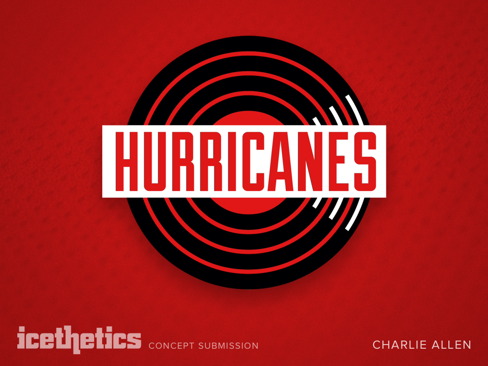
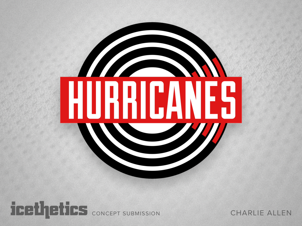
Never been a fan of the Canes' current logo, and I know I'm not alone in that belief. But I've put something together, that I think would work well.
The thinking behind it is a bit more minimalist. The 'C' for Carolina is hidden in the minimal hurricane. The circle also represents a record, because Raleigh and Durham are huge music scene towns — Indy rock, bluegrass, jazz and folk. I know most people aren't for the scripted logos, but I think the 'HURRICANES' lettering works into the modern look.
What do you think?