0460: Dallas Stars IV
/

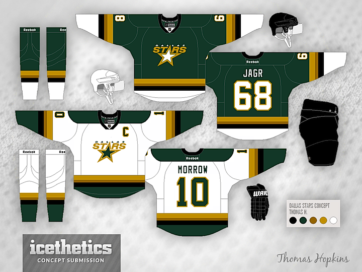
We know the Stars are expected to introduce new logos in a couple weeks, but it's likely the slanted star form will continue to be incorporated somehow. Thomas Hopkins basically kept the logo the same but redesign the sweaters with a lot more green and gold.

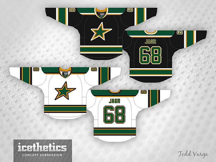
Todd Varga, on the other hand, stuck to black and white jerseys, but increased the amount of green used. I can honestly say I like this version better. Might be the simplified logo. I'm a sucker for simplicity.
