0016: Mixing Old & New in SoCal
/

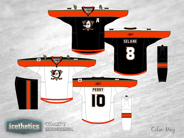
Colin May proposes mixing the old and new for the Anaheim Ducks. Back in the late '90s, the Mighty Ducks, as they were known, used a sweater design quite similar to these. Think they looked better in jade and eggplant or the more modern orange and black? What do you think of the old logo coming back? (And before you comment on the misspelling of Selanne... we know.)

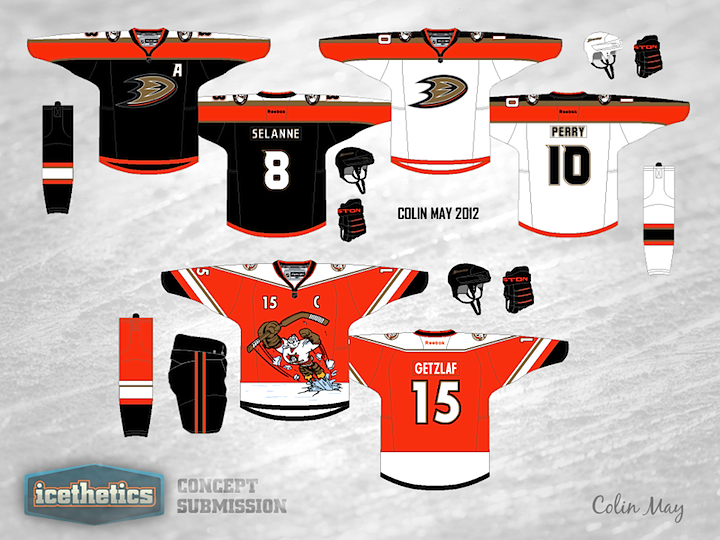
It's not uncommon for concept posts to yield lots of suggestions from readers for revisions. Every now and then, the artist will take a few cues from their critics and I'm always more than happy to add their revised work to the original post. Here's what Colin had to say:
Hey everyone, thanks for your compliments and feedback.
I made [the original] concept a long while ago. I have since updated it to feature the D logo on the chest. I also made up a Wild Wing alternate to go with these, complete with the duck mask shoulder patch that Bryan Wright mentioned.
To other concept artists: If your work has been featured and you'd like to submit a revision, feel free to do so.
