0242: Senators Re-Bourne
/

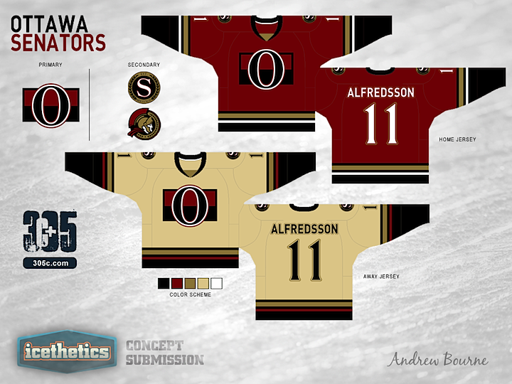
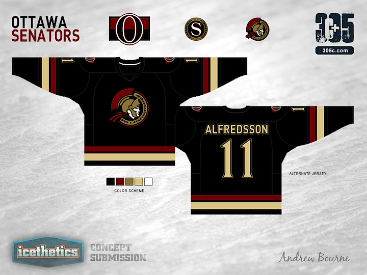
I know we just looked at a Senators concept the other day, but it's time for the next jersey set in Andrew Bourne's NHL makeover series. What do you think of his take on Ottawa's look?


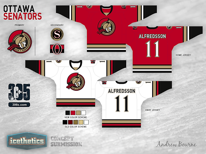
Andrew read through your comments and made some revisions to his Senators concept.
Colin M, Steve, Derek, Louie and Eaman12 either wanted to see brighter reds or a true white. So, here's both! Colin M, Derek, Garth, and Eaman12 didn't really like the use of the 'O' logo and I think I can see why. The circular Senator Head is much more strong and doesn't get mistaken for a Zero. I also thickened up my notoriously thin stripes and as for the lettering, I'm just using the Senators current font. Can't change that one... For those of you who embraced/defended the 'Ancient' golds (Jon93, Louie), Thank you! And to the rest, thanks for helping me try to fix the Sens!
