
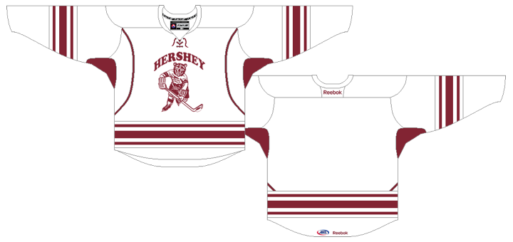
Bears Unveil Outdoor Classic Jersey
/
Hershey Bears revealed design online Monday
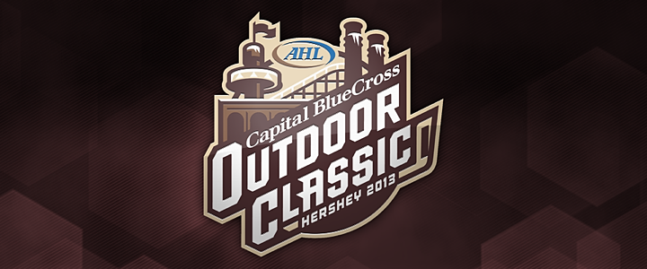
The AHL's Hershey Bears are hosting hockey's only outdoor game of the 2012-13 season. The Outdoor Classic at Hersheypark Stadium will take place on Sun., Jan. 20, 2013. And just two days ago, the Bears unveiled the special uniform they'll be wearing for that game — complete with white pants and oodles of chocolate stripes!
From the press release:
When the Chocolate and White lace up their skates for the 2013 Outdoor Classic game on Sunday, January 20 they will be wearing commemorative jerseys. The jerseys will be brown and white stripe, and have the Outdoor and 75th Anniversary logos on respective sleeves. These game-worn jerseys will be signed and auctioned off following the game, with proceeds donated to charity.
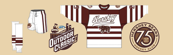 Rendering from Hershey Bears (official website)
The Bears will be facing off against the Wilkes-Barre/Scranton Penguins for this game. But I've yet to find the jersey the Pens will be sporting — and you know they'll have one! This is a team that will wear a special sweater just because it's Wednesday. Heck, you need only look back to this past weekend to see them in their Christmas sweaters.
So what's your take on Hershey's Outdoor Classic jersey?
Bears' Outdoor Classic uniform will NOT feature white pants
All right, so it turns out the Bears won't actually be wearing the white pants depicted above.
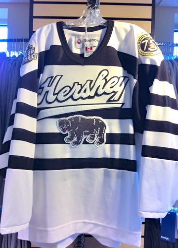 Photo by Andy LongenbergerDave Sottile of The Patriot-News in Harrisburg, Penn. did some digging. He learned today from the Bears that they will wear their standard brown pants for the Outdoor Classic next month. And let's face it, that's probably a good thing.
Along with the photo (right), here's some what was in Sottile's report:
On Wednesday, marketing manager Andy Longenberger said Hershey would wear its normal dark brown pant shells for the game, not white ones.
The brown and white striped jerseys feature the Outdoor Classic logo on the right shoulder and the Bears' 75th anniversary logo on the left shoulder. The center crest features the familiar prowling bear on all fours, as used on previous Hershey uniforms.
Longenberger said the jerseys will be auctioned off after the game, weather permitting. Proceeds from the sale will benefit Hershey Bears Charities.
He also points out the brown is much darker than it appears in the rendering that was posted on the Bears' website. You can definitely tell in the photo.
So are you disappointed about the lack of white pants? Think there's still a place for that sort of thing in modern hockey?


