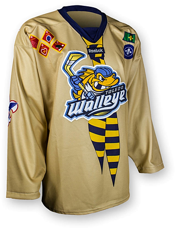
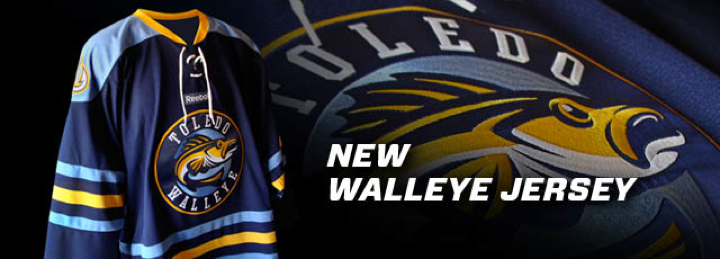
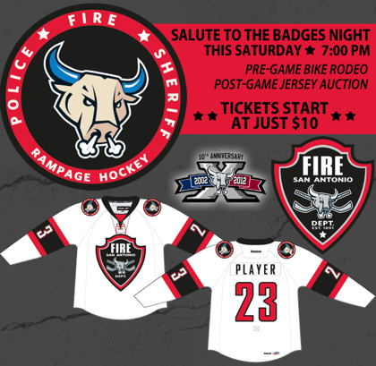
Several of you had questions about the insignia featured on the Walleye's Scout Night jersey. Are they real badges? Are the just made to look real? So I decided to do a little research to offer you some answers. And most of what I found is rather interesting!
Right sleeve features Boy Scouts of America logo

This is the most obvious mark to use on this jersey. Boy Scouts of America is the main scouting organization in the United States. And the Walleye's Scout Night will presumably be made up mostly of this group. (Not to discount the Girl Scouts, but it's probably a fair bet the boys are more into hockey.)
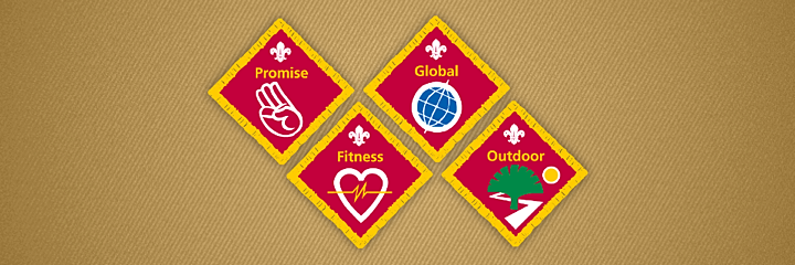
British Cub scout badges displayed on right shoulder

Here's where the jersey gets interesting — and begins to take on an international flavor. It turns out the four badges found on the upper right shoulder of the jersey are not badges any American kid would be wearing — boy or girl. These badges represent Challenge Awards given to young scouts called Cubs in the United Kingdom.
Cubs are kids between the ages of 8 and 10, according to the Scouts' official website. (In the U.K. there's no gender separation like there is in the U.S.) Now I'm curious just how many British scouts plan to be in attendance at this game in Toledo, Ohio in January.
International Scouting symbolism used on left shoulder

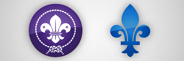
To keep the global theme of this jersey going, the left shoulder features some marks inspired by International Scouting insignia. But the thing is, they're not accurate and they hide a hilarious easter egg. The round purple logo is supposed to be the World Crest, which all scouts may wear on their uniforms. It symbolizes recognition of the worldwide Scouting Movement.
However the rectangular green logo is an enigma. My research has turned up nothing about the origins of this design. And for what it's worth, CJ_FTW writes in the comments, "as someone who's a scouter ... I have no idea what that green flag patch is supposed to be." So I'm wondering if the designer of this jersey just made it up.
All right, now onto what makes the purple logo inaccurate and what makes both logos a treat for hardcore hockey logo geeks. Check this out...

On the left is what the World Crest patch is supposed to look like. On the right is the fleur-de-lis worn for many years by the Quebec Nordiques. Now take a closer look at the fleur-de-lis featured on this Walleye jersey. How about that! (And go back and look at the actual photo of the jersey if you need more proof.)
I think whoever designed this jersey wants to see the Nordiques return to the NHL. Either that or it's an enormous coincidence (so big, in fact, that I don't believe it). Finding that alone made this extra research totally worth the time and effort.
It's also worth noting that the photo above is the only one the Walleye have offered so far. We can't tell what's on the left sleeve or on top of the shoulders. (It appears there might be another patch on the right shoulder.) I'll keep an eye out for when these jerseys are used in January and maybe I'll be able to expand this post.

