Designing the ’90s NHL, Part 2: Expansion & Relocation

If you haven't read Part 1 yet, you should start there.

When we left off with NHL logo designer Ken Loh, it was the mid-1990s. His famed "Burger King" crest — a design he thought was dead — found its way onto a new Los Angeles third jersey. And a bold proposal for the Philadelphia Flyers fell flat.

REPLACING AN ICON

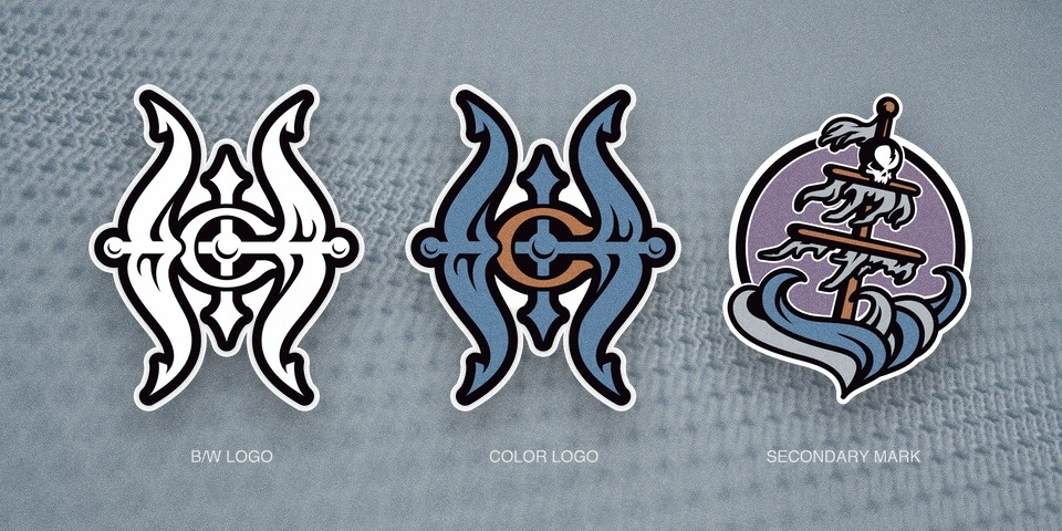
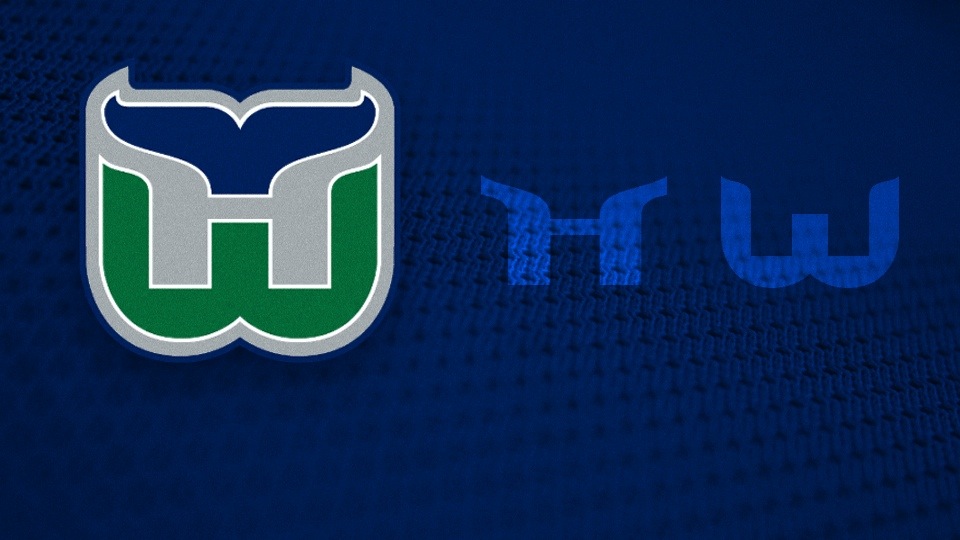
Then in 1997, the Hartford Whalers relocated. The loss of one of the greatest sports logos of all time put the pressure on The Mednick Group, as the NHL hired the agency to create a logo for the new Carolina Hurricanes — or was it "Hurricane"?
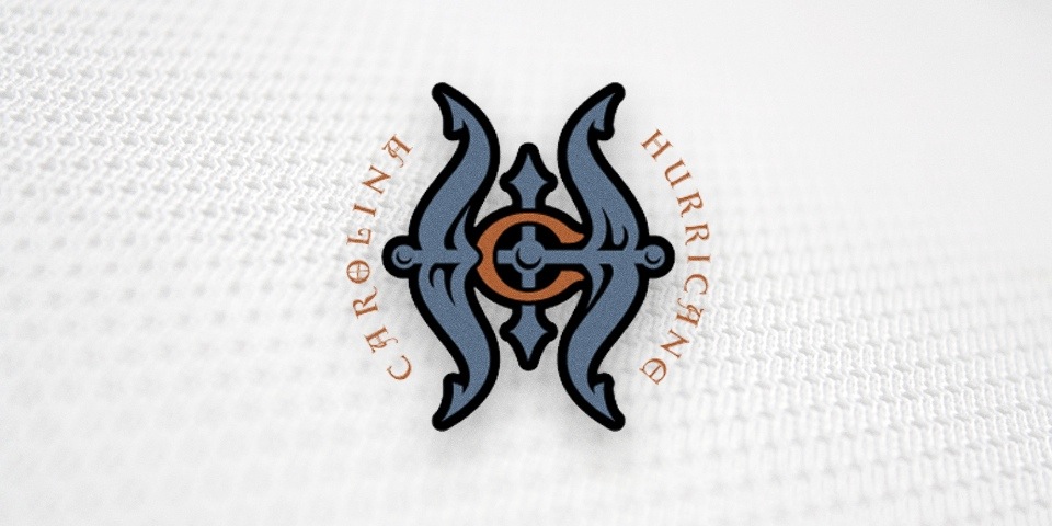
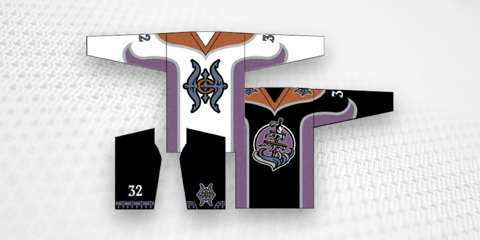
Obviously, these designs never made it to the NHL and the team ultimately went with the plural form of its name. But there's always a great story behind work like this. Ken writes: 

I wanted to make a historical nod to the Hartford Whalers since that’s where the team came from. I like teams to have history. The fans who grow up in cities around the world should have a long-standing connection to a franchise and its history.
The logo was intended to be the primary mark for the team, since it was a new franchise. At first glance, you’ll probably see “C” and “H” for Carolina Hurricane. But if you look more closely, you’ll notice that the overall “H” form has a “W” intertwined, being formed by the vertical anchor rod in the middle.
I actually wanted it to read more like “HW” than “CH.” Deep down, I was hoping the team wouldn’t move or change its name, but could adopt a variant of the HW emblem.

It's comforting to know that when it became necessary to replace the iconic Whalers logo, some of the people involved were desperately trying to find a way to let it live on.

In the end, it wasn't even a designer that created the logo the team ultimately selected. It was a copy writer at the firm named Peter Thornburgh.
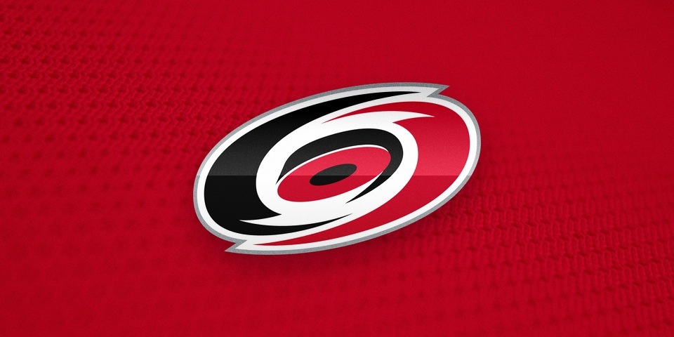
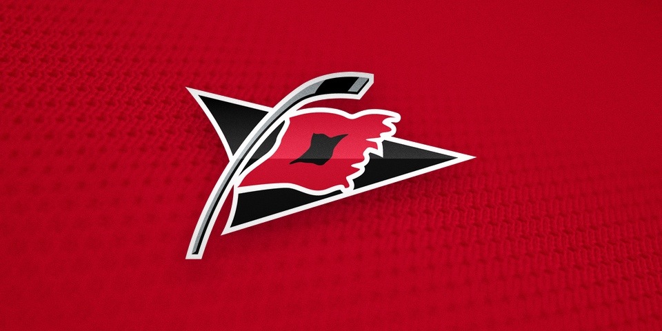
"Ironic that a writer's design beat out a bunch of professional designers," Ken said, "but he had been honing his craft designing logos for his own fantasy football teams for years. Many of us are still in the same [league] together [25 years later]!"

When Peter created the Hurricanes logos, he already had the NBA's Minnesota Timberwolves under his belt. And to think his original plan was a medical degree.

Makes you wonder where some of the talented designers behind The IceHL are headed.

GENERATING BUZZ

By this point, you may feel Ken's contributions to the NHL have been minimal. After all, his work on the Flyers fizzled. He lost out to a writer on the Hurricanes job. And his vision for the Kings all but vanished in a jersey that saw action in no more than a half-dozen games.

Kicked. Beaten. Down. But not out.

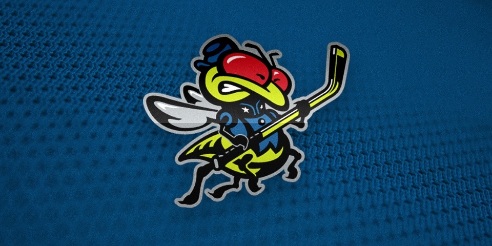
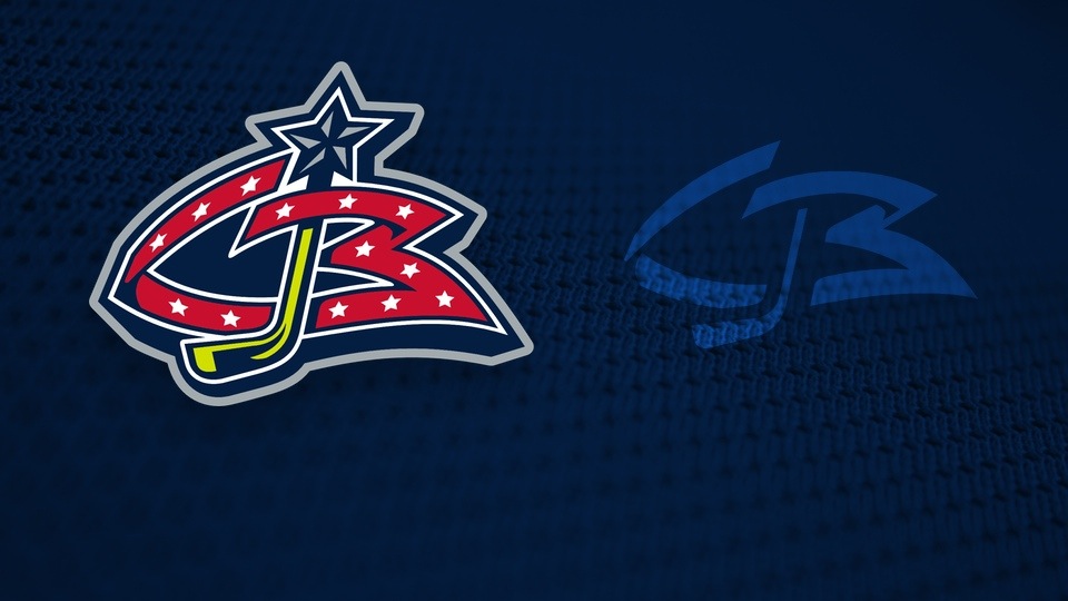
Ken's final project for the NHL would prove to be his most successful when, on Nov. 11, 1997, the owners of a new expansion franchise stood before reporters to announce its official name and logos. Meet the Columbus Blue Jackets by Ken Loh.
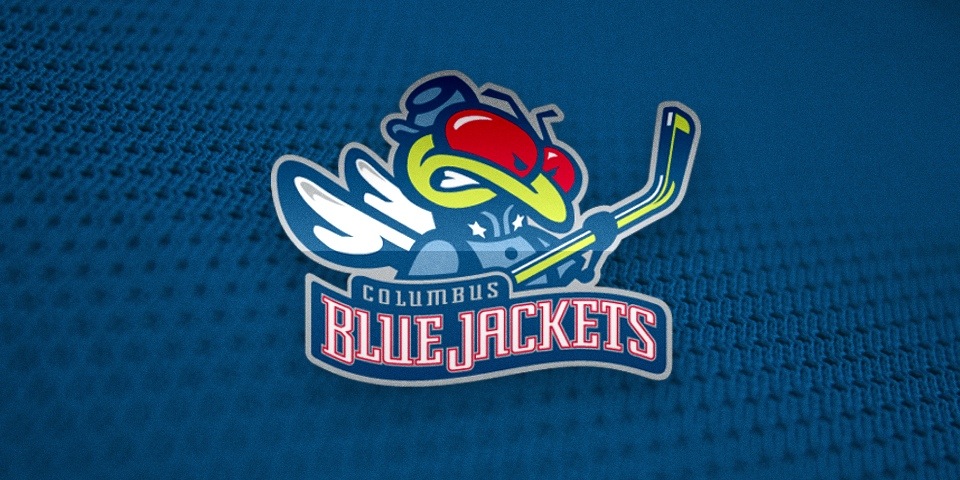
"I'd love to credit another designer, Van Duong, who worked with me on the Blue Jackets logo," Ken said. "He is one on the best designers I've ever worked with. He really helped put some of the finishing touches on Stinger and was also the main designer on the CB mark."

Ken said Van was also involved in developing designs for an NHL All-Star Game in the mid-90s.

While it's true "Stinger" and the Blue Jackets moniker didn't immediately win over many Columbus fans, Ken's work satisfied his client and will live on in the hockey history books. For seven seasons, the Jackets wore his blue, red and electric green marks before the bold fashion statements of the '90s were slowly purged from the NHL.

"I am a traditionalist when it comes to sports and logo design," Ken said. "I was being pushed to develop marks that had more appeal for kids, while I attempted to maintain a stronger sense of tradition and professionalism.

"I felt some of the direction the designers were being given at the time was more appropriate for school or camp teams, and didn’t have the lasting appeal that pro franchises — or even collegiate ones — should maintain.

"I am happy to see that Flying Elvis has stood the test of time though. Twenty years later, it doesn’t feel old yet."

WHERE ARE THEY NOW?

Ken Loh doesn't make sports logos anymore, but his design sensibilities have been employed by great companies. After spending time at Yahoo! and Oakley, he is now a driving force behind Apple's online shopping experience. Find him on Twitter at @kloh.

Scott Mednick, founder of The Mednick Group, moved on to the Hollywood film industry. His credits include Where The Wild Things Are, 300 and the upcoming reboot of Teenage Mutant Ninja Turtles. Find him on Twitter at @ScottMednick.

Finally, I know I promised never-before-seen logos Ken designed for another NHL expansion team. However, I now realize they're better suited to the third and final chapter of this story. You won't want to miss that. Stay tuned!

CONTINUE READING: Part 3: Epilogue

Designing the ’90s NHL, Part 1: Unfamiliar Flyers

Within a matter of months, the Philadelphia Flyers will reveal to the world a new third jersey. The design is a secret that's been well-kept so far. Today, we take a break from the speculation for a look back at a third jersey that never happened.

Designed by Ken Loh, The Mednick Group, 1995

Designed by Ken Loh, The Mednick Group, 1995

You may think it impossible that the Flyers ever considered making this a part of their otherwise unblemished record of classic hockey sweaters. But it was 1995 and the NHL wanted to be... bolder. Let me explain.

STARTING WITH A BANG

In 1992, Ken Loh was in his final year at Cal State Long Beach, working toward a degree in visual communications. He was intern at the Evenson Design Group in Culver City when the firm was hired by the NFL to design some new team logos.

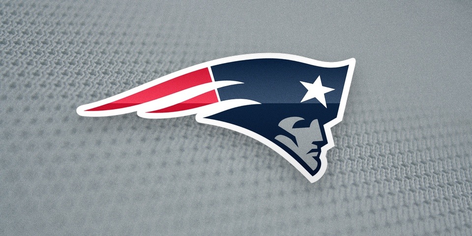
He had an opportunity most design students only dream about as he went to work designing a new logo for the New England Patriots. Two decades on, you know it well.

New England Patriots, 1993—

New England Patriots, 1993—

If that's not an epic way to kick off a career, I don't know what is. This logo helped earn Ken his next job, one that would see him tackling the NHL.

SHIFTING TO HOCKEY

Ken's talents caught the eye of Pats fan and Boston native Scott Mednick — principal of The Mednick Group, another California design agency.

"He hired me partially due to the Patriots work," Ken said, "but also because his firm was interested in pursuing more sports work for various leagues. He had contacts at the NHL, so that’s when my work with the NHL started."

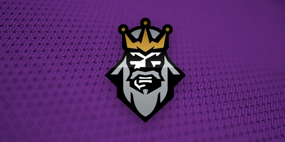
One of Ken's first projects involved designing a new logo for the Los Angeles Kings in 1993. It did not go on to become as well known, but it nevertheless found a special place in hockey jersey history.

Designed by Ken Loh, The Mednick Group, 1993

Designed by Ken Loh, The Mednick Group, 1993

The Kings elected not move forward with the rebrand, but the logo was unearthed a couple years later when the NHL was introducing its third jersey program around the league. On Jan. 27, 1996, the Kings took the ice wearing an altered version with a purple beard.

"To be honest, I always hated how the Burger King ended up with a purple beard," Ken said.  "Felt too cartoony to me, whereas my original design before it got applied to the third jersey program — with the silver/black/gold motif — was intended to be more serious and regal."

FURTHER READING: The Rise of the Burger King · The Royal Half · Jan 27, 2011

As the NHL entered the wacky world of '90s third jerseys, Ken and The Mednick Group weren't solely focused on the Kings, of course. They went to work on another team as well.

A NEW WAY TO FLY

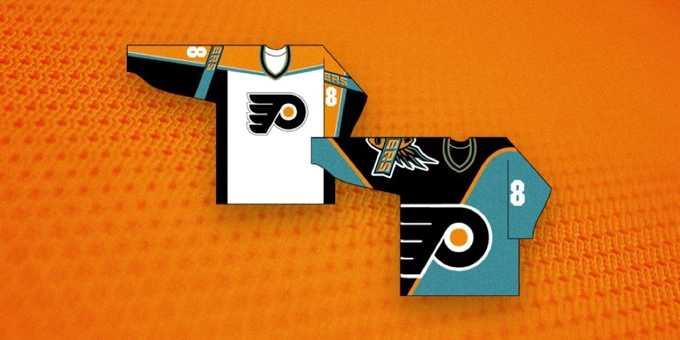
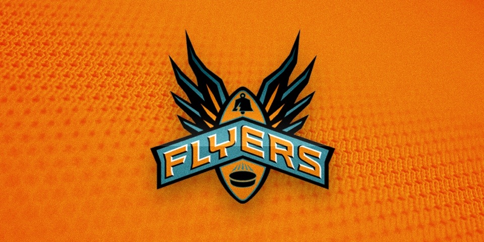
And so brings us to the reason behind today's post. In 1995, Ken and The Mednick Group focused their talents on the Philadelphia Flyers — one of a handful of teams set to debut an alternate jersey during the 1995-96 season.

Fueling the NHL's desire for unorthodox new sweaters was an advance in manufacturing technology which provided for the use of color gradients and oversized graphics. Hockey jerseys would never be the same again. Or would they?

Ken created a new alternate logo for the Flyers along with a couple of third jersey options. Here's what he told me about the process:

The idea was to break the mold and be less traditional with the designs. The league ... wanted us to push the envelope, which is probably why there were some pretty garish patterns and gradients being used for other third jerseys around the league. Personally, I was never a fan of that approach so I tended to stick with solid colors in my designs.
While the brief was to redesign the jersey, we were encouraged to come up with new, alternate treatments for secondary logos and wordmarks. There wasn’t really any expectation that any of the artwork we designed would replace any of the existing team logos or identities at that time.
I don’t really remember any specifics around the use of teal, but as I noted, we were encouraged to experiment with “bold” statements so I imagine that was part of where that came from.

Once he finished with the design work, Ken wasn't part of the conversation between the firm and the team. So he's not sure how the Flyers felt about the design or the specific reason it was rejected. But I'm sure many of you will have your theories.

For me, it's exactly what a third jersey should be. It introduced an alternate color, a special logo and most of all, it was a unique design. Looking back, the style was very '90s and it probably wouldn't have lasted long. But the short ride would've been worth it.
Ultimately, the Flyers did not introduce a third jersey during that season. But two years later came the debut of the black third jersey, a simple recoloring of their existing sweaters.

In all, five teams debuted third jerseys that first year. And it was another product of The Mednick Group that would go to be the longest tenured third jersey in NHL history. Ken's friend and co-worker Tom Thornton designed the Boston Bruins' yellow sweater.

The NHL's original class of third jerseys, 1996

"For me, the Bruins third jersey was one of the better ones," Ken said, "due to its more subtle use of angular lines and solid colors."

That sweater debuted during the 1995-96 season and was worn every subsequent year until the Reebok jersey takeover in 2007 when the Bruins underwent their own rebranding.

Two more big NHL projects still awaited Ken Loh after the third jerseys. It involved developing new identities for a pair of new teams. In Part 2, we'll take a look at those plus some never-before-seen logo designs for another expansion team.

CONTINUE READING: Part 2: Expansion & Relocation

What's hiding in your favorite hockey logos?

Earlier this week, USA TODAY published an article pointing out the hidden images in various sports logos. Of the 17 marks they included in the piece, just two were from hockey teams. I think we need to rectify that. Check this out.

Did I miss any? Drop me a line and I'll add it.


UPDATE · Jul 12 · Here are a few more logos with hidden images.

NHL JerseyWatch 2014: June Edition

Let's have a new edition of NHL JerseyWatch 2014! I can't think of a better way to get back to blogging. A lot has happened in the four months since the last update. In this edition, I'm breaking all the details down into "facts" and "rumors" — there are plenty of both!

ana10a.jpg

Ducks

THE FACTS
In their 2014-15 retailer catalog, Reebok listed Anaheim's home and road sweaters as "TBD" — foreshadowing changes on the horizon.

Eric Stephens, Orange County Register, tweeted Dec. 3 that the "plan is for [the] current Ducks third jersey to become [the] main home sweater, perhaps next year."

THE RUMORS
In addition to the promotion of the third jersey — which debuted in 2010 — a new white version will be introduced for the road. And we could get our first look in just a few days.

On June 21, HFBoards user "Ducks DVM" reported on the team's open house event held for season ticket holders last week. He wrote briefly:

No more "Ducks" on jerseys. White jersey will be unveiled at draft.

Makes sense to me. Remember, the NHL Draft starts Friday night.

Also intriguing is the artwork on goalie Frederik Andersen's new lid, revealed June 17. Designer Dave Gunnarsson said:

When you're a goalie from Denmark in the NHL, Denmark the land of LEGO, of course a LEGO goalie is helping you building a LEGO wall on the mask.

Not sure a LEGO wall would do much against a slapshot but take a closer look at LEGO man's jersey. It's orange and features the classic Mighty Duck front and center.

This has led many to wonder whether it's a sneak peek of a new Ducks third jersey. My honest guess is it isn't. In a Q&A with the team website, Andersen said:

I think it was originally meant for the Stadium Series game, but [Gunnarsson] went with a different design for that and decided to save the LEGO idea for later. 

In other words, the 2014 Stadium Series jersey probably dictated LEGO man's palette. The Mighty Ducks logo, however, I can't explain.

But there's still an open question. Will the Ducks have a new third this year? As the Magic 8 Ball would say, don't count on it. From a marketing standpoint, it makes more sense to introduce one jersey at a time.

That said, I might expect a shiny new alternate uniform from the Ducks by 2015 or 2016.

Don't count on an orange third jersey quite yet. — Photo from @davidofdaveart via Instagram

Don't count on an orange third jersey quite yet. — Photo from @davidofdaveart via Instagram

UPDATE · Jun 27 · The new look is official! The Ducks unveiled their new home and road jerseys on the morning of the draft.

Among the changes to the original third jersey design are the new Stadium Series style collar laces and numbers outlined in orange.

Coyotes

THE FACTS
The Phoenix Coyotes will be officially renamed the Arizona Coyotes on Friday, June 27 at the NHL Draft. Also from Monday's press release:

As part of the name change, the Coyotes are introducing a new shoulder patch (alternate mark) for their home and road jerseys in 2014-15. The Coyotes are also unveiling a new wordmark for this season.
The rest of the Coyotes uniform will not change in 2014-15.

Craig Morgan, FOX Sports Arizona, reported in January that the Coyotes would bring back their 1996 jersey for a special throwback night next season.

Photo origin unknown

This photo of a pant shell produced by Warrior appears to be confirmation. Check out the retro desert dog.

THE RUMORS
By the way, what the team's statement did not address was the black third jersey. Will it stay? Not according to Sarah McLellan, Arizona Republic, who says the thirds will be phased out. However, she doesn't specify a timeframe.

In the winter, Reebok told retailers that the Coyotes' third was "TBD" for 2014-15 which may denote it's being retired. My bet is we probably won't see it next season. Could mean extra opportunities for the throwback, right?

Looking down the road, Morgan and McLellan both reported that redesigned home and road jerseys are a possibility in Arizona as early as 2015-16. But I don't expect the logo to change.

Tyler Baldwin, 3TV in Phoenix, on the other hand, seems to think it's a possibility.

lak14t.jpg

Kings

THE FACTS
The Stanley Cup champion Los Angeles Kings will have a new sweater in their arsenal before the end of 2014.

The team has been wearing their "Forum blue" (purple) retro jerseys on special occasions since 2010-11. The sweaters throw back to the club's formation in 1967.

Starting next season, the team will switch to the gold version of those early jerseys. The change was revealed on March 12 by LA Kings Insider Jon Rosen, a writer for the Kings' website.

This is what the Kings' new retro uniforms will look like next season.

In Rosen's report, Kings exec Luc Robitaille weighed in on the delay in debuting the new colors.

As Robitaille shared with LA Kings Insider, the process of incorporating new jerseys is a two-year process that includes gaining league approval, and then having the jerseys made. As such, the first Legends Night in 2014-15 won’t be held until the second or third week in December.

I'm sure it'll be well worth the wait.

THE RUMORS
The purple may be gone for now, but there's a big year coming up soon. The 2016-17 season will mark the 100th anniversary of the NHL as well as the 50th anniversary of the Kings.

I have little doubt we'll be seeing more than a few flavors of retro jerseys make an appearance during that season.

By the way, as the NHL Draft nears, don't forget this gem from four years ago. Could it happen again?

Islanders

THE FACTS
Chris Botta, Sports Business Journal, tweeted Dec. 31 that we'll "be seeing more of [the Islanders' Stadium Series jersey] in coming seasons." He followed up saying that it "or something very close to it, will be the Islanders' third jersey by 2015."

Get ready to see more of this, Isles fans.

Three months later, Isles' much-maligned black third jersey was officially retired. It made its curtain call on March 23 in a 2-0 shutout win over Columbus.

THE RUMORS
Now the only real question is whether the Islanders will go without a third jersey in 2014-15 or expedite the timetable on bringing back the Stadium Series sweater.

Either way, this will be their final season in Uniondale. The Isles will skate in Brooklyn at the Barclays Center starting in 2015-16.

And don't forget that just last fall CEO Brett Yormark said the "new third jersey in Brooklyn will be black and white." Has that changed? Time will tell.

UPDATE · Jun 24 · And we already have our answer. It has not changed. A piece just published Monday from Arthur Staple, Newsday, cleared that up.

Expect a new third jersey that looks more like the black-and-white Brooklyn Nets jerseys; Yormark said he's met with the Adidas/Reebok apparel makers to start the third jersey design process.

I have no doubt the Islanders will be part of NHL JerseyWatch 2015.

Senators

THE FACTS
Responding to fan questions on Twitter back in April, Senators owner Eugene Melnyk discussed jersey options for next season.

Nevill Carney — whose name you may recognize from his Concepts page contributions —  asked specifically whether the Sens' Heritage jerseys could be promoted to home and road uniforms.

Melnyk didn't answer directly but did say they are looking into using them during the 2014-15 season. The black jersey is already the go-to third, but perhaps there's also an opportunity to use the beige Heritage Classic version on occasion. 

THE RUMORS
In recent months, retail discounts have raised questions about the future of Ottawa's red and white jerseys. But a sale isn't always indicative of a uniform redesign. In fact, it hardly ever is.

While I'm not expecting anything major for the Senators in 2014-15, they're worth keeping an eye on in the seasons to come.

Flyers

THE FACTS
Reebok's catalog suggested the possibility of a new third jersey for Philadelphia. The alternate was listed as "TBD" while the team hasn't had a third since 2010.

THE RUMORS
If the Flyers really are going to have a new third jersey next season, they've done an extremely good job of keeping quiet. I have not seen details reported anywhere else since January.

That tells me it might not be happening after all. But I'm not ready to call it just yet.

Philly's last third jersey was introduced in 2008 and became their home sweater the following season.

The Flyers used a black jersey from 2007 to 2010. Could they be planning to try black again next season? Stay tuned for updates.

pit71.jpg

Penguins

THE FACTS
Rob Rossi, Pittsburgh Tribune-Review, reported June 9 the Penguins will bring back their classic yellow in the form of a new third jersey.

The Penguins expect to introduce an alternate jersey to be worn for select games next season. One confirmable detail about the third jersey is the return of Pittsburgh Gold to the team's uniforms for the first time since 2001-02 season.
Goalie Marc-Andre Fleury said he has ordered yellow leg pads and gloves to be worn when the Penguins' don the alternate jerseys.

This only adds to a previous report from Rossi and Josh Yohe on Dec. 13.

There are tentative plans for a new alternate jersey that could debut next season. A design is not finalized, but under consideration is a jersey similar to the ones the Penguins wore during their 1991 and 1992 Stanley Cup runs.

It's the news Pens fans have been dying to hear!

THE RUMORS
What's still unknown is whether the new sweater will be an exact replica of one the black or yellow jerseys worn by Pittsburgh in the 1980s and early 90s. There are certainly a few for them to choose from.

Believe it or not, I'm expecting a yellow jersey. Decades from now, we may look back on this era with some eye rolling, but yellow has been on the upswing in recent years.

The Bruins got the trend started with their 2010 Winter Classic threads — the NHL's first gold jersey since Boston's original alternate was retired in 2006. In 2011, the Nashville Predators introduced their gold home jersey. The Sabres launched a controversial gold third last fall. And as you saw above, the Kings are switching to gold for their Legends Night look.

Everybody's investing in gold right now. Why shouldn't Pittsburgh?

stl98.jpg

Blues

THE FACTS
Reebok listed new home and road jerseys for St. Louis back in January. Lending further credence to this was a question posed by a reporter to the team owner.

Jeremy Rutherford, St. Louis Post-Dispatch, wrapped up a Q&A with Blues owner Tom Stillman on the subject, published June 2.

Q: There’s been fairly strong speculation that the Blues will change their uniforms for the 2014-15 season. Is that true?
Stillman: Yeah, I think we should break some news right here. We’re going back to the clown uniforms (with the diagonal red stripes that the Blues wore in the mid-1990s).
Q: Your smile tells us that you’re kidding about that. So is it true? Will there be a uniform change?
Stillman: Let’s talk about that another time.

Can't say I care much for Stillman's sense of humor. That's just downright mean. But seriously though, he sure didn't deny it, did he?

THE RUMORS
All right, new sweaters are on the way in St. Louis. So what do they look like? When we will see them? These are questions we can't answer yet. All I know is I'll be watching the draft on Friday just in case.

Given the current trends in hockey uniform design, the Blues are probably giving up their apron-string appearance for something a little more timeless. Prior to their Reebok overhaul, St. Louis had perhaps the best non-Original Six uniforms in the NHL.

If I had to put money on it, I'd say we see something more traditional this fall. Maybe it'll be a better fit with their superb third jersey.

Rumor has it this blue is lighter than it should be. Or can we blame it on computers?

Rumor has it this blue is lighter than it should be. Or can we blame it on computers?

By the way, another rumor floating around is that the Blues leaked a new, recolored version of their logo in the press release announcing their new CEO on June 16.

The claim is that the light blue is much lighter than it should be, not unlike the shade the team wore during the 1960s and 70s.

However, given the issues with varying digital color spaces and CMYK to RGB conversions, this sort of color shift is hardly uncommon on the web. And while the light blue may be lighter, the dark blue and yellow are as well. It's just not as obvious.

In-house graphic artists usually catch this sort of thing, but it is the summer and a lot of those jobs are seasonal. Or maybe somebody was on vacation.

Yes, it's entirely possible the Blues' next jersey will be a lighter shade of blue, but I wouldn't call this graphic the smoking gun.

tbl11.jpg

Lightning

THE FACTS
The Tampa Bay Lightning will debut a brand new third jersey next season. This has been revealed through the announcements of special season ticket packages for 2014-15 — which began on TV back in March.

The above graphic is the first hint at a possible color for the new sweater. Are the Bolts finally bringing back the black?

According to reporter Erik Erlendsson, Tampa Tribune, it's unlikely we'll get a look at the new threads before September.

THE RUMORS
At this point, it's probably beyond a rumor that the jersey will be black. It certainly won't be blue. The home jersey is blue and the Lightning just retired a blue third.

That in mind, there was this 8-year-old prototype jersey that showed up on ebay back in April. It was black. But don't worry. It was consigned to the scrap heap for a reason.

Will the Lightning dig into their history for a throwback jersey from the 90s? Or will they buck the retro trend in favor of a fresh new design?

2015 Winter Classic

THE FACTS
On Sunday, the NHL announced the 2014-15 regular season schedule, including — at last — the Washington Capitals' opponent for the 2015 NHL Winter Classic.

The Caps will host the Chicago Blackhawks on New Year's Day in each team's second appearance in the big outdoor event.

The Blackhawks hosted in the second Winter Classic in 2009 at Wrigley Field. The Capitals faced the Penguins in 2011 at Pittsburgh's Heinz Field.

The nation's capital was awarded the event last September. The new Winter Classic logo, venue and uniform designs will be revealed at a later date, according to the NHL.

THE RUMORS
The best part of any Winter Classic for many Icethetics readers is the sweaters. It's a chance to see teams to dig into their histories.

In 2011, the Caps wore their original white jersey from the 1970s. It wouldn't surprise me to see them simply go with the red version this time around.

And imagine the possibility of white pants! They were a blip in Caps history but will never be forgotten.

As for the Blackhawks, they had a great jersey in 2009 which they later adopted as an alternate briefly. Maybe they could go back to their very first black and white jersey from 1926?

I'm excited to see where both teams end up!

Stadium Series

THE FACTS
After a winter packed with six outdoor games, the NHL will scale back to just one during the 2014-15 season — the Winter Classic in D.C. Clearly the 2014 Stadium Series didn't get the kind of response the league was hoping for. But that doesn't mean they won't try again.

Michael Russo, Minneapolis Star-Tribune, said June 21 the Minnesota Wild will host a game at Target Field in 2016. But various logistical problems kept it from happening in 2015. An interesting aside from Russo:

Personally, I still hear there's more to this Stadium Series thing that has nothing to do with the Wild and that's why the Stadium Series games were scaled down this year to one. Next year, I'm told we're going to see more than one game again.

If the Wild end up hosting the Stars for that game, as intended, who gets to wear the North Stars jerseys?

THE RUMORS
On June 2, Kevin Kurz, CSN Bay Area, reported the San Jose Sharks would be among the teams hosting a Stadium Series game in 2014-15. That seems to be wrong unless the league is holding back on an announcement. But like the Wild, they should be high on the list for 2015-16.

UPDATE · Jun 24 · Or maybe I'm jumping the gun. On Sunday, Eric Duhatschek, The Globe and Mail, said that the Sharks are still planning to play outside.

It is believed that a Feb. 21 date between the Kings and the Sharks will also be played outdoors in the Bay Area, after the NHL successfully pulled off an outdoor game at Dodger Stadium last January.

Perhaps the league is indeed holding back on an announcement to firm up the details. We'll have to wait and see on that one.

asg15.jpg

2015 All-Star Game

THE FACTS
After a failed attempt in 2013, the Columbus Blue Jackets will finally host the NHL All-Star Game on Jan. 25, 2015.

The logo has been around in some form since the original announcement 2012. A decision on the format and jersey designs has yet to be announced.

THE RUMORS
Presumably, the NHL will continue to employ the fantasy draft format introduced in 2011, where two captains choose their teams.

A new jersey design was introduced for that game and was recycled in 2012. They're blue and red — a color palette that would fit nicely in Ohio's capital city.

However, there's been no official word yet regarding jerseys. So stay tuned.

One thing we should keep an eye out for this Friday at the draft is the Blue Jackets' updated jersey patch. The 2013 version was on the jerseys given to draftees in 2012. Look for 2014 draftees to wear the 2015 version. (Did you follow all that?)

The Blue Jackets introduced their 2013 All-Star Game patch at the 2012 NHL Draft. Expect to see the 2015 version this Friday.


Final Thoughts

At this point, the most exciting date on the calendar in the near term is Friday. The NHL draft opens on June 27 and with it we'll be treated to at least one new sweater — possibly more — as well as the renaming of the team from Arizona.

These JerseyWatch articles are always tricky. Decisions have been made in some room somewhere but we're not privy to them just yet. There's a lot of speculation out there but I aim to do my best to separate truth from fiction where possible. History has shown Icethetics' NHL JerseyWatch to be pretty reliable. Hoping it continues!

NHL Sweater Switch 2014: Trade Deadline Edition

Every now and then, the NHL Trade Deadline surprises us. Eleventh hour deals send away players we never expected to see in another jersey. Full disclosure: As a Lightning fan, this hit close to home as Martin St. Louis was granted his request to become a New York Ranger.

But the St. Louis-Callahan trade wasn't the only one that put big names in new uniforms. As the Stanley Cup Playoffs near, Icethetics' NHL Sweater Switch feature returns to examine some of the changes we saw during the 2013-14 season.

As you scroll through this article, you'll find collections of photos showing key players who were traded this season. Be sure to click through to see more photos.

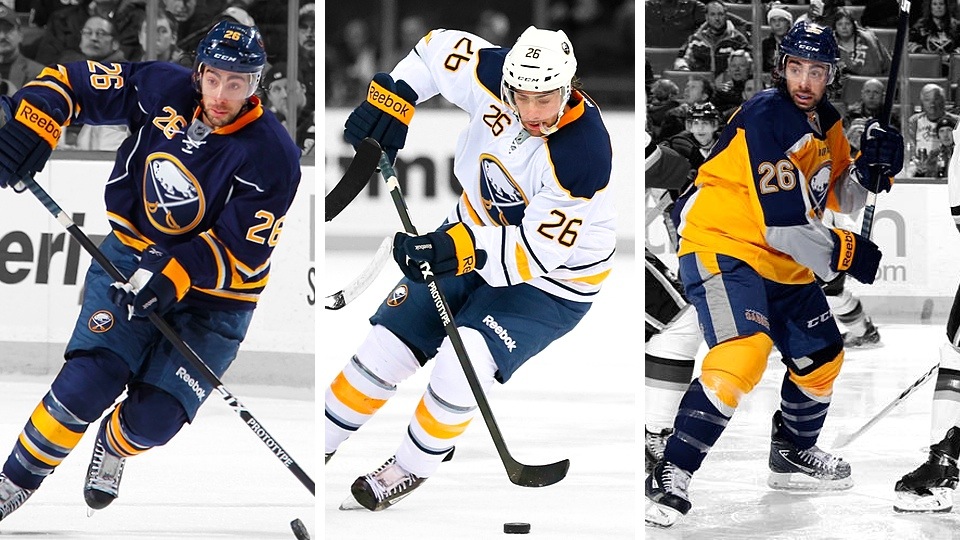
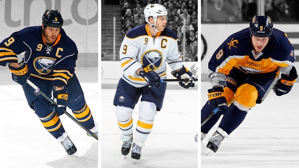
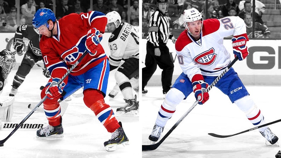
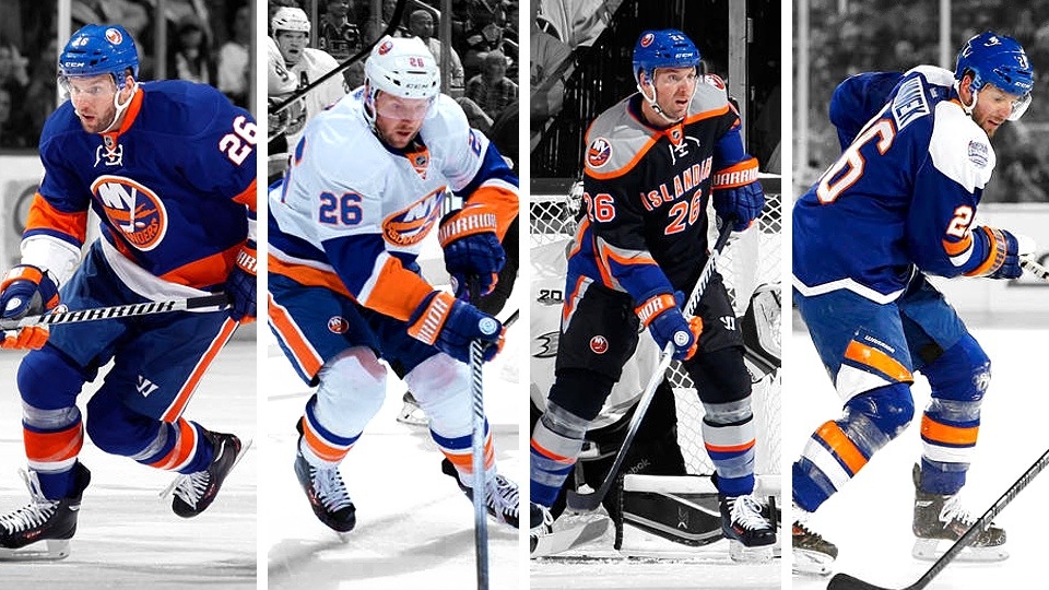
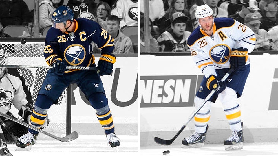
Thomas Vanek began the season as one of the co-captains of the Buffalo Sabres, wearing the "C" for home games. But three weeks into the season, he became the face of the first blockbuster trade of the season.

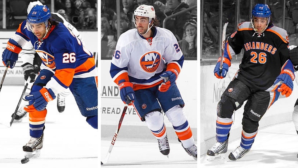
Vanek was dealt to the New York Islanders on Oct. 27 for Matt Moulson and two draft picks. On the ice, it was No. 26 for No. 26 as the players essentially swapped jerseys. Then on deadline day, Vanek was sent to the Montreal Canadiens for Sebastian Collberg.

Josh Gorges wears No. 26 in Montreal, so Vanek switched to No. 20.

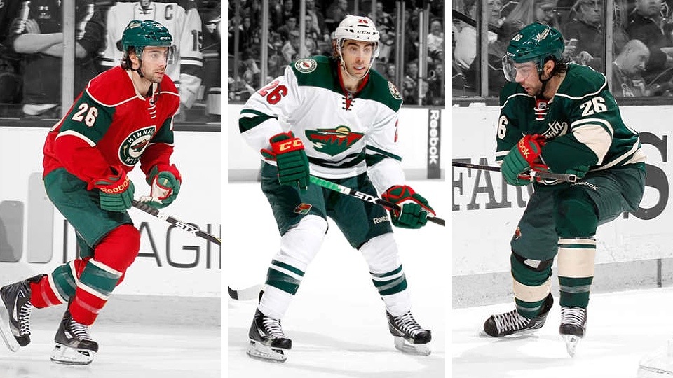
Matt Moulson also landed with a third team at the deadline (March 5). After leaving the Islanders for Buffalo on Oct. 27, the deadline saw him sent to the Minnesota Wild with Cody McCormick in exchange for Torrey Mitchell and a couple of draft picks.

Moulson kept his No. 26 jersey at each stop. He holds the record for most jerseys worn by a single player this season with 9! He wore three on Long Island (he was gone well before the Stadium Series), three in Buffalo and three in Minnesota.

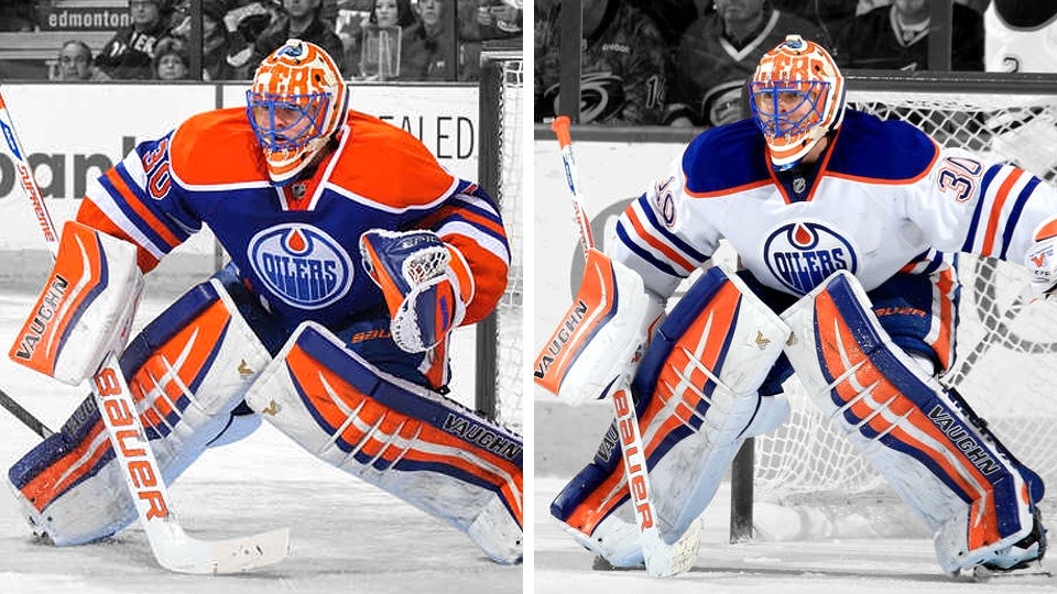
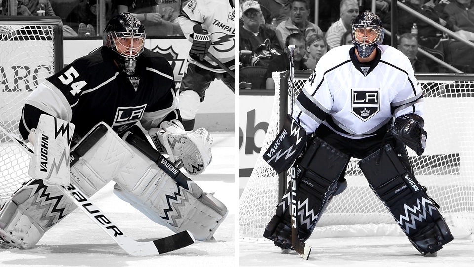
Ben Scrivens joined the Los Angeles Kings last summer, but most fans probably know him best as a Toronto Maple Leaf. He barely got half a season backing up Jonathan Quick before being traded to the Edmonton Oilers for a third-round pick on Jan. 15.

After wearing No. 54 during his L.A. stint., Scrivens switched back to the more traditional No. 30 in Edmonton — the same number he wore in Toronto.

Michael Del Zotto was a fifth-year New York Ranger when he got word he was becoming a Nashville Predator. He was dealt on Jan. 22 for Kevin Klein in the midst of a Predators road swing.

Due to the long-distance trip, the Preds had limited jersey availability when Del Zotto joined the club. He was saddled with No. 18 for his first few games, but upon arriving back in Nashville, adopted a more permanent No. 5. Del Zotto wore No. 4 in New York, but that number currently belongs to Ryan Ellis.

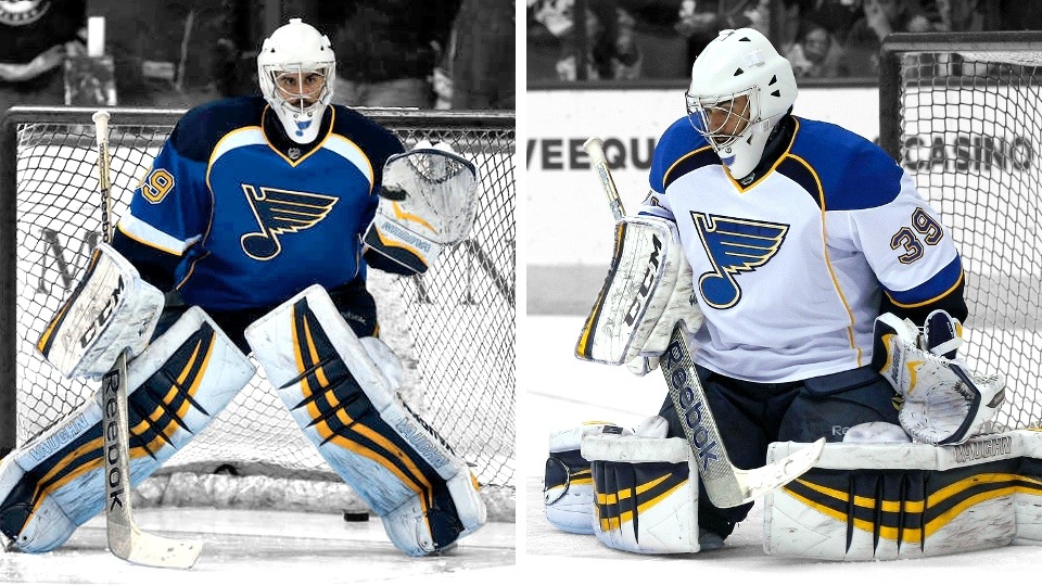
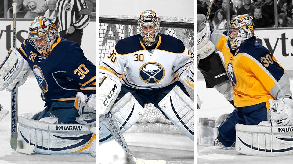
Ryan Miller was one of two men at the center of the NHL's second blockbuster trade of 2013-14. He was sent with Steve Ott to the St. Louis Blues on Feb. 28. In return, the Sabres got Jaroslav Halak, Chris Stewart, William Carrier and two picks.

Three weeks after the deal, Miller got his new Blues mask from Bishop Designs. Prior to that, he wore a plain white mask with the Blue Note on the chin. As for his number, Miller went back to No. 39, which he wore in college (Michigan State) and wears during international play.

No. 30 is available in St. Louis, but it seems like Miller didn't want it. I'm not sure what the official story is, but I understand Miller wore No. 30 in Buffalo out of respect for Dominik Hasek's legacy — though the Sabres have not retired his No. 39 at this point.

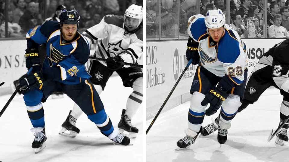
Steve Ott joined Miller in the Blues deal. He returned to his No. 29 sweater which he wore previously as a member of the Dallas Stars. He was traded to the Sabres in 2012 when Jason Pominville wore the number.

Ott was No. 9 while in Buffalo, where he'll be remembered by jersey enthusiasts as the man responsible for revealing the Sabres' yellow third jersey last September.

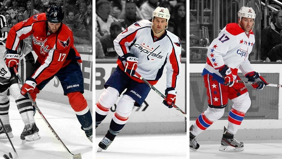
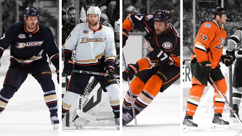
Dustin Penner saw his second stint as an Anaheim Duck end when he was traded to the Washington Capitals the day before the trade deadline (March 4) for a draft pick. He kept his No. 17 sweater in D.C.

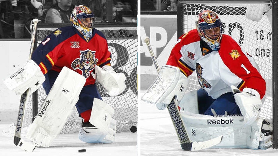
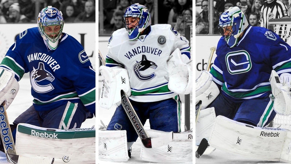
Roberto Luongo being traded was one of those deals everybody saw coming. The writing was on the wall after some rough time as a Vancouver Canuck recently. Luongo was acquired by the Florida Panthers with Steven Anthony on March 4 in exchange for Jacob Markstrom and Shawn Matthias.

While some goalies had a rough transition to their new teams, Luongo already had a custom mask in hand when he joined the Panthers — having played for team from 2000 to 2006. He simply busted out his old bucket. He, of course, kept his No. 1 jersey.

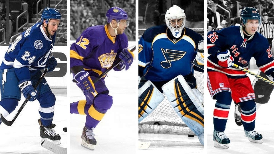
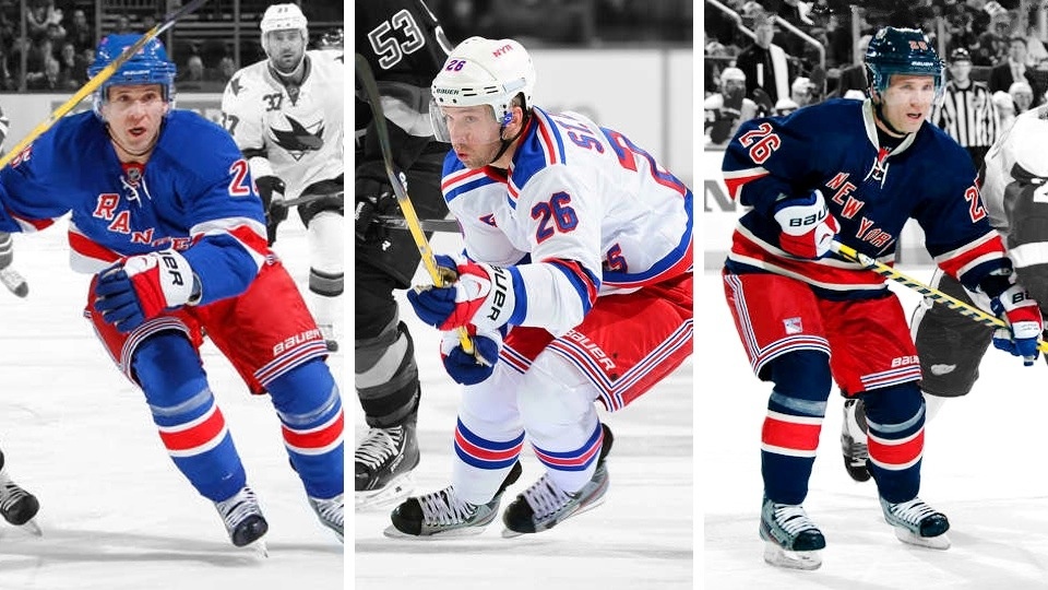
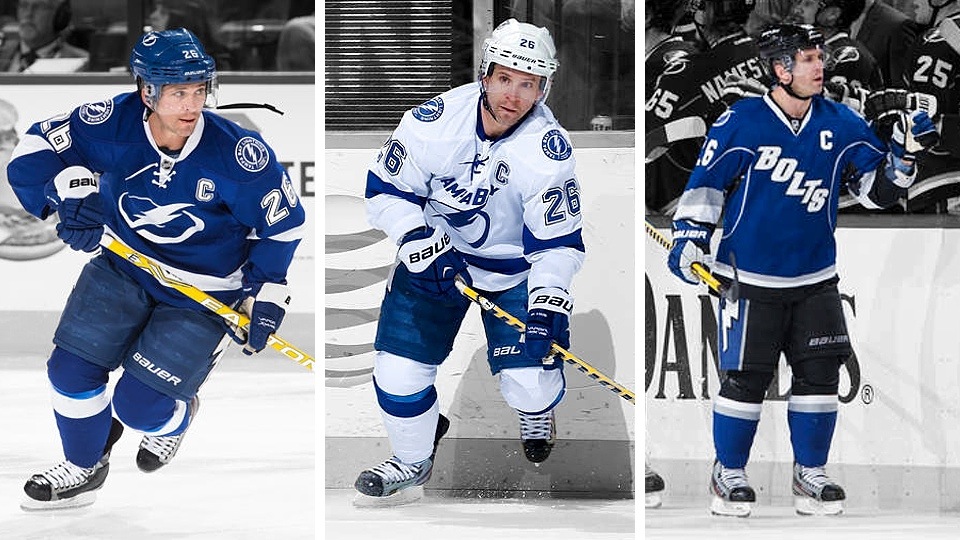
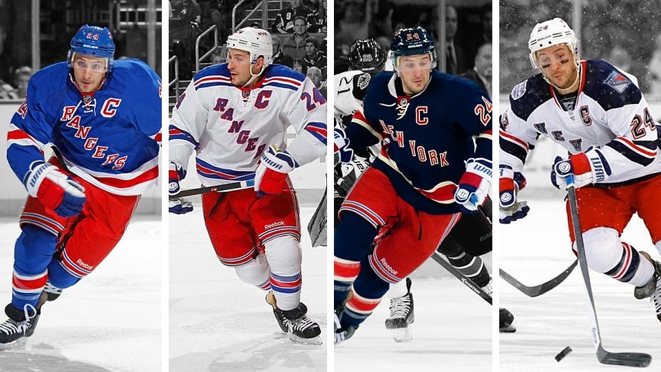
Martin St. Louis, in the first and most surprising deal of deadline day, was sent to the Big Apple for Rangers captain Ryan Callahan and some draft picks. The Tampa Bay Lightning captain's request to join the Rangers has been well-documented.

Naturally, St. Louis did keep his No. 26 jersey in New York — one that despite the hard feelings, will still likely be raised to the rafters in Tampa someday. He was the last remaining member of the 2004 Stanley Cup championship team — one that would be honored at a Bolts home game just two weeks later.

Ryan Callahan became the fourth captain traded this season as he joined the Lightning in exchange for St. Louis — the rare captain-for-captain trade. Callahan kept No. 24, which had been worn briefly earlier in the season by call-up Dmitry Korobov.

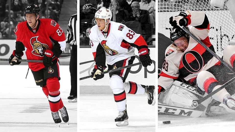
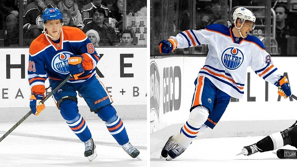
Ales Hemsky was another player traded after a long tenure with a team. He had been an Oiler for 12 years prior to the trade to the Ottawa Senators. He kept his distinct No. 83 sweater in the move. (He has worn the Sens' black heritage jersey, though disappointingly, I've been unable to track down a photo.)

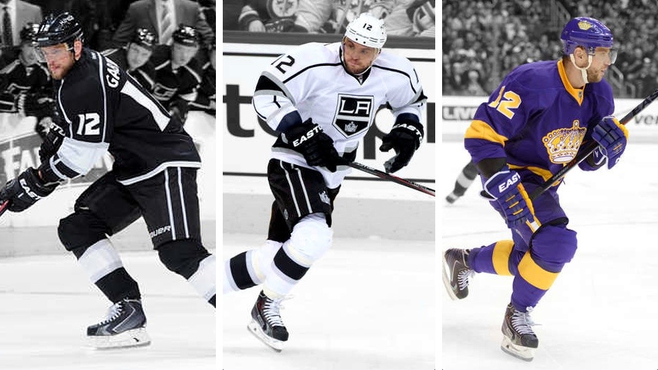
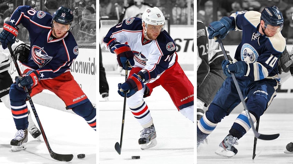
Marian Gaborik used to be a big deal. Now he just seems to bounce from team to team. The Columbus Blue Jackets traded him at the deadline to the Los Angeles Kings for Matt Frattin and a couple of draft picks.

Gaborik's No. 10 jersey is currently in use by Mike Richards so he switched to No. 12.

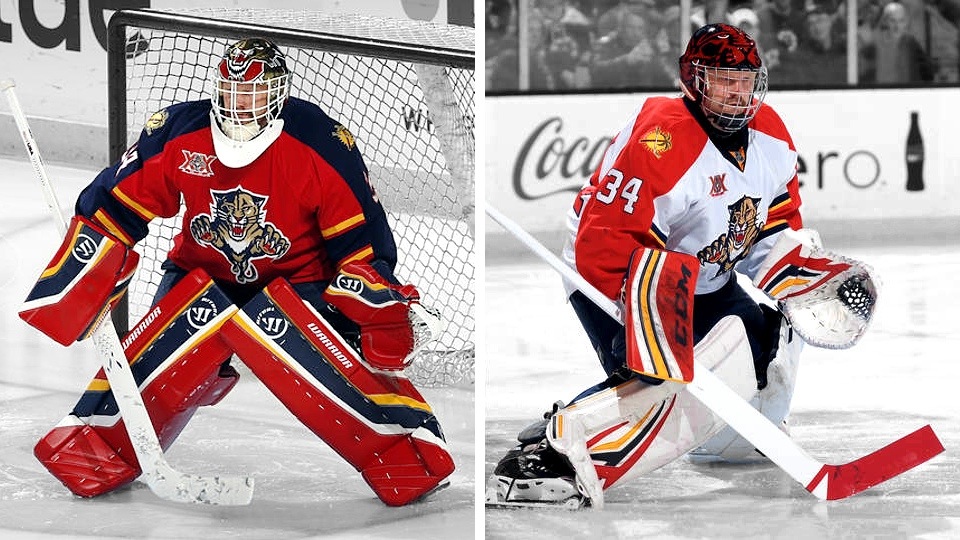
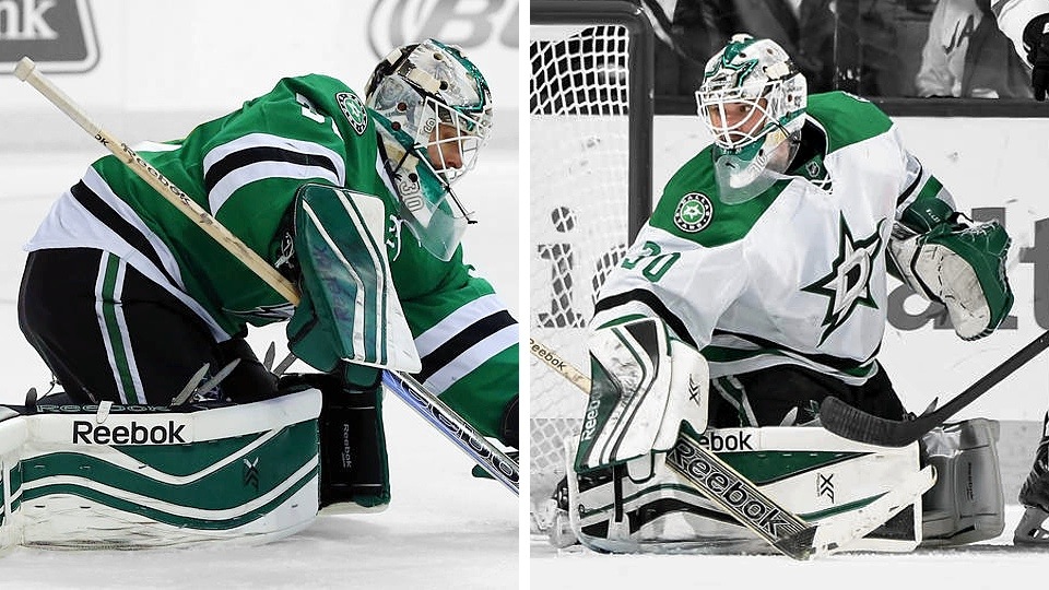
Tim Thomas was traded by the Florida Panthers in a straight goalie-for-goalie trade with the Dallas Stars. The Cats picked up Dan Ellis in return. Thomas wore John Vanbiesbrouck's No. 34 during his south Florida stint. In Dallas, he returned to his more traditional No. 30.

This trade will be remembered by history if for no other reason than the absurd color mismatch it created. Thomas had just gotten new Panthers equipment that he had to wear with his green jersey for a time in Dallas. He has since gotten new pads, at least.

Dan Ellis left the Stars for Thomas and had a similar color problem with his gear — though it was decidedly less noticeable than Thomas' red pads. Ellis joined the Panthers returning to the No. 39 he first wore in Nashville. He previously wore No. 33 during a stint with the Lightning and No. 30 while in Dallas. Wonder which he likes best.

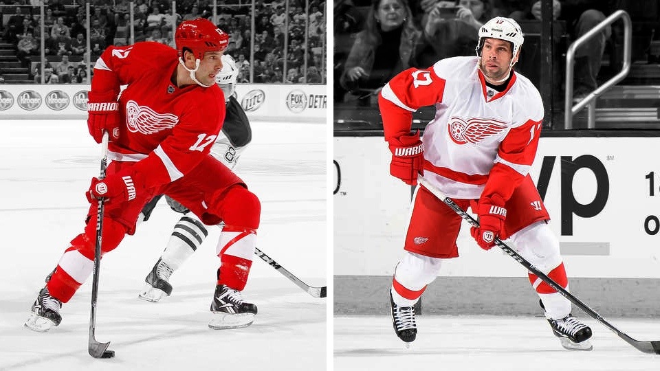
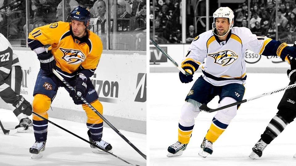
David Legwand was the last remaining original member* of the Nashville Predators before being traded to the Detroit Red Wings at the deadline for Patrick Eaves, Calle Jarnkrok and a draft pick. (*—Technically, he dressed for one game during the 1998-99 season, so it counts!)

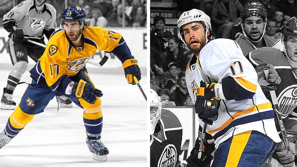
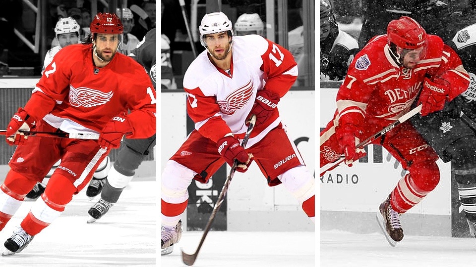
Legwand had to give up No. 11 — which seems to be popular in Detroit. Dan Cleary gave it up for Daniel Alfredsson when he joined the team from Ottawa this season. Legwand, instead, just went with Eaves' old No. 17 jersey.

Patrick Eaves spent five years as a Red Wing before heading to Nashville in the Legwand deadline deal. He kept No. 17 as a Predator.


Obviously I couldn't get to every player who was traded this season — nor would such an article be that interesting. But I hope I hit most of the big names. If there's anyone else you'd like me to add, drop a line in the comments.

What do you think of seeing all these players with new sweaters? Weird, right?