What's hiding in your favorite hockey logos?
/ Chris SmithEarlier this week, USA TODAY published an article pointing out the hidden images in various sports logos. Of the 17 marks they included in the piece, just two were from hockey teams. I think we need to rectify that. Check this out.
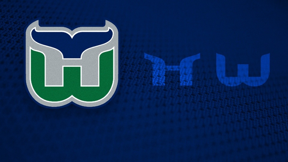
Any list like this simply must include the Whalers. The hidden HW has been a hallmark of great logo design for more than 40 years. How could the USA TODAY article leave it out?
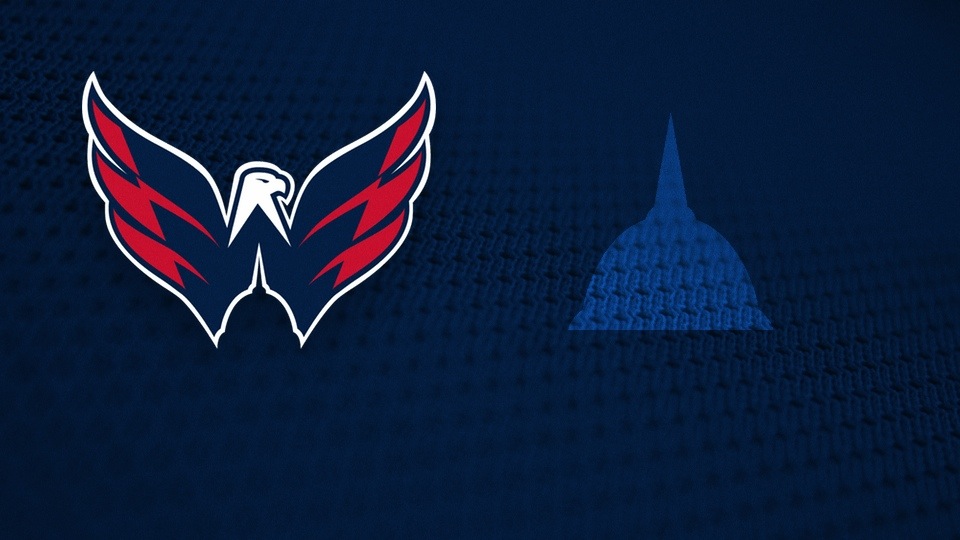
The symbolism here is well documented. Apart from the W formed by the eagle's wings are representations of the U.S. Capitol Dome and Washington Monument.
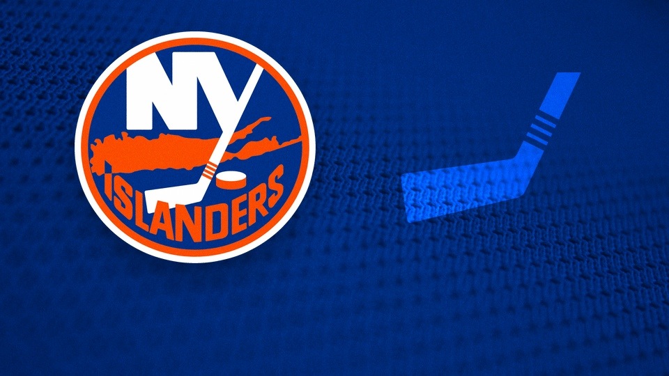
Yeah, the I points to the team's (soon to be former) arena on Long Island, but what we love are the four stripes on the hockey stick, representing the team's Stanley Cup championships.
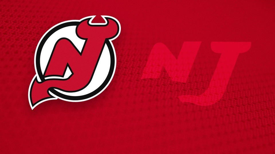
Every once an a while I get an email from someone who just discovered the Devils logo forms an NJ. They're always so excited about it too. When did you first see it?
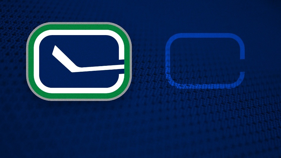
It's called the stick-in-the-rink logo for obvious reasons. But have you noticed how the white line around the rink forms a C for Canucks?
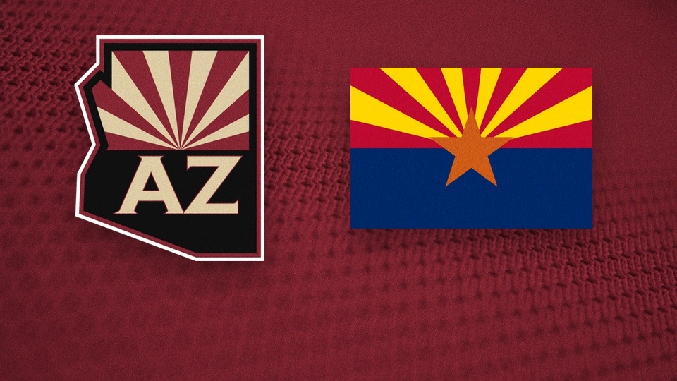
If you've never seen the Arizona state flag, then you probably didn't know that's what inspired the Coyotes' shoulder patch. Is your mind blown?
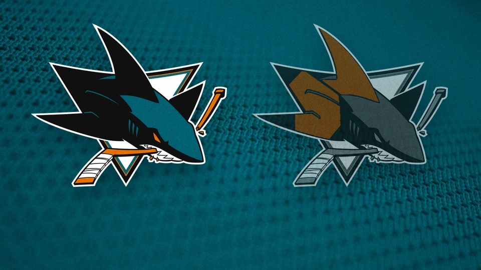
I'm probably forcing this one, but every time I look at the Sharks' logo, I see a very subtle SJ in the fins. You kind of have to want it. Who's with me?
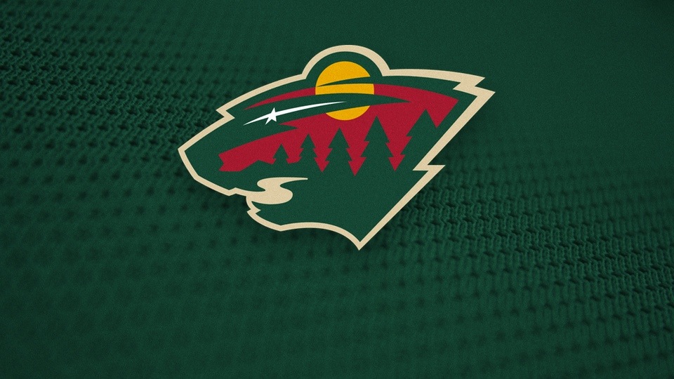
Within the silhouette of a bear's head is a setting sun, a shooting star, a forest and a river. Never has one logo incorporated so much amazing symbolism so well. Bravo!
Did I miss any? Drop me a line and I'll add it.
UPDATE · Jul 12 · Here are a few more logos with hidden images.
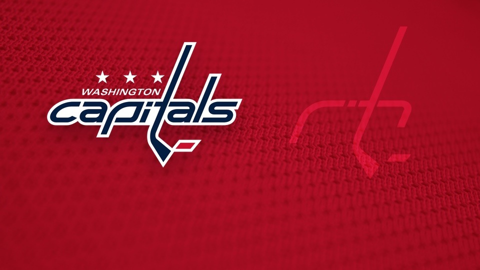
Ever wondered why the P in the Caps logo is such an odd shape? Perhaps it was designed to help form the shape of a goal net along with the stick and puck.
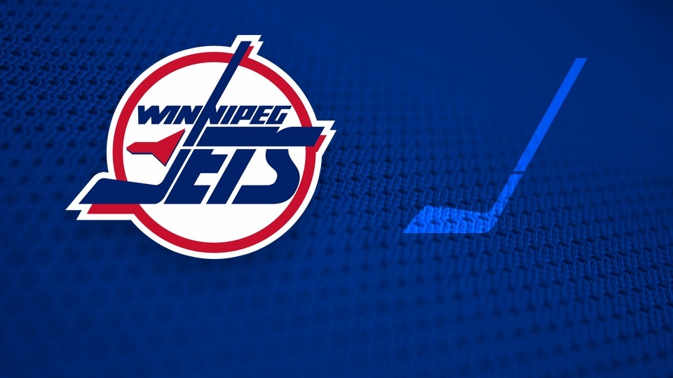
This one is probably pretty obvious to most people, but — just in case — have you noticed that the J in the old Jets logo doubles as a hockey stick?
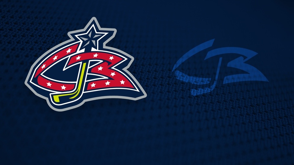
The original Blue Jackets logo, used on the team's first uniforms, isn't just a generic ribbon with a hockey stick in the middle. It spells out the team's initials, CBJ — albeit out of order (CJB).
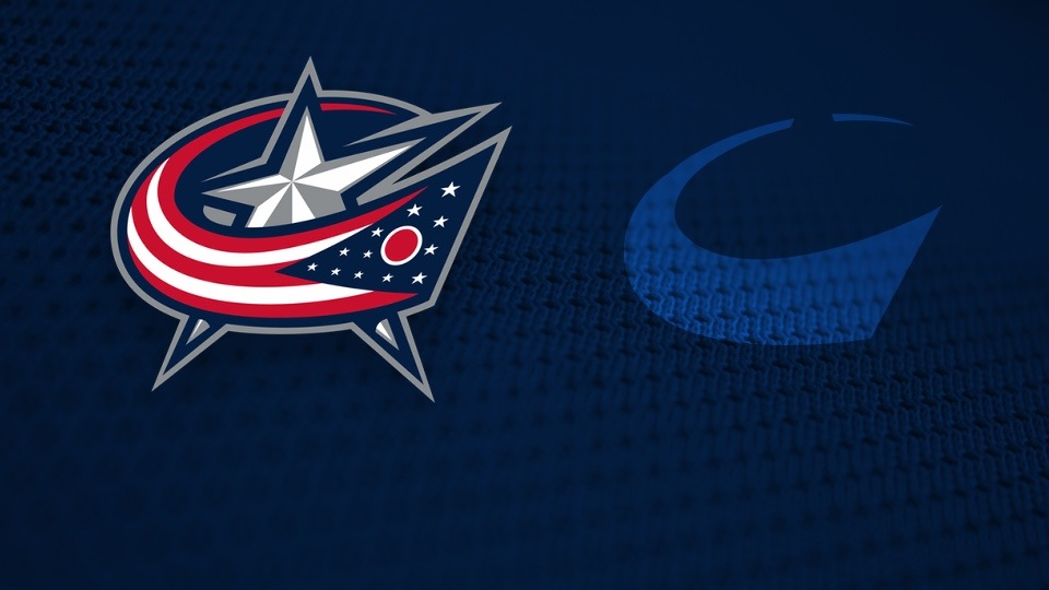
The Jackets later adopted this logo which first appeared on a 2003 third jersey. The Ohio state flag wraps around a silver star forming the shape of a C for Columbus.
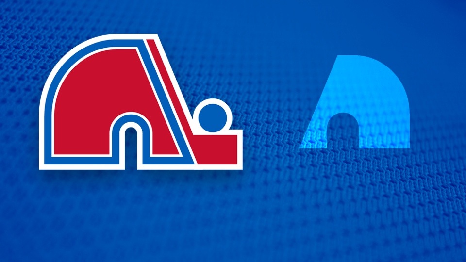
If you lose the stick and puck and flip that Nordiques logo around, you get an abstract N. Some people also claim to see a Q formed by the stick.
