More changes to the minor leagues in 2016
/A little from the AHL, ECHL and SPHL all mixed in. At least six teams will sports new logos.
Read MoreA little from the AHL, ECHL and SPHL all mixed in. At least six teams will sports new logos.
Read MoreWitness the beginning of the next century of Toronto hockey branding!
Read More
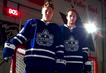
At the end of last week, the AHL's Toronto Marlies revamped their uniform set across the board, adding new home and road jerseys as well as the sharp new third jersey seen above.
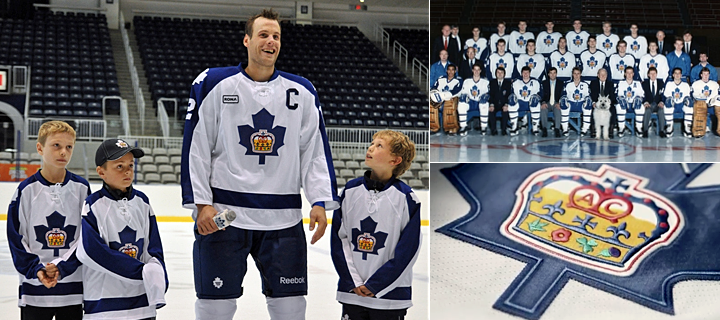
On Saturday, the Marlies hosted an event for season ticket holders and unveiled this retro alternate uniform, which is a tribute to the Toronto Marlboros — an organization that's been around for nearly 110 years. (They currently exist as the OHL's Guelph Storm, actually.) The Marlies produced this video to explain that history.
For those without video, here's the transcript:
The Toronto Marlboros are deeply enriched in Canada's hockey history, with a focus on developing talent since franchise inception in 1903. The Toronto Marlboros have been home to hockey's elite, including George Armstrong, Ron Ellis, Mike Palmateer, Charlie Conacher, Steve Thomas and many more. Now, the symbol worn proudly on their chests, become a beacon of hope for today's Toronto Marlies. With a nod to our past, it's time to turn our eyes to the future with the official unveiling of the Toronto Marlies' third jersey.
It's insightful if you can look past the bad writing. For example, the first line says "enriched in Canada's hockey history" when they obviously meant "entrenched" (and even then, there are more appropriate terms such as "rooted"). But none of that is the point of this post. I'm just being a grammar snob.
I say it's insightful because I truthfully didn't know anything about this team or where its name came from. I never took the time to look into it either, but I guess that's the point. I always enjoy learning about the history of hockey franchises in Canada. There's just so much there.
 Prior to the third jersey unveiling, on Thursday the Marlies gave us our first official look at their new home and road uniforms — which aren't exactly a huge departure from what they've been wearing.
This change was simply to put their look more in line with that of their parent club, the Toronto Maple Leafs — who made some upgrades in 2010. All that really means is the collar has changed and a pair of waist stripes have been added.
So while technically the Marlies will be sporting three new jerseys this season, they won't really be sporting anything "new" this season. It's all about recognizing where they come from (Marlboros) and where they're going (Maple Leafs, hopefully, right?).
Hard for this team to go wrong with sweaters like these. What do you guys think?
The Marlies posted another video on their Facebook page today from Saturday's unveiling.