Poll: Scouts vs Mighty Ducks


vs
Kansas City
SCOUTS
Anaheim
MIGHTY DUCKS


REMEMBER: You're choosing the WORST logo!

Time for the third round now. Anyone else surprised that, despite the uproar over the Buffalo Sabres' new logo, it managed to get eliminated from the Quest for the Worst in only the second round? Anyway, just thought it was worth noting.

Place your vote and then feel free to leave a comment as to how you came to your decision. Tell all your friends to drop in and vote! The more voices heard, the more accurate the results!

Poll opening date
Sun Feb 10
Poll closing date
Thu Feb 14

Just To Freak You Out XXVI

After a week off, Freak Out Friday is back in action tonight! And there's some pretty crazy stuff here. We're beginning in Alberta with a rivalry between the Edmonton Oilers and Calgary Flames.

Now, we've seen "If They Mated" concepts created simply by recoloring one team's logo with the other's colors. This goes a step beyond that. Actual time and effort was put into this. And that in itself is frightening.
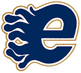
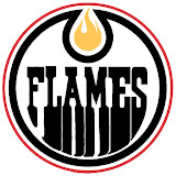
Yeah, I'll understand if you need a minute after seeing that. But hold on, now. Wait until you seem these logos on jerseys.
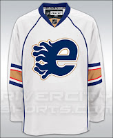
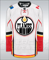
I really don't know what to say about that. But while we're on the topic of odd jerseys, I have these.
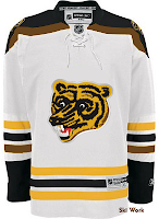
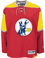
The Boston Bruins should never use this logo ever again. I understand it as something coming out of the 1970s. But we're all a little older now and just look at it. It's ridiculous. Meanwhile, the Kansas City Scouts on a Wild jersey? Just weird.

Now I've got some offbeat logos. The first is a Kings/Ducks mixture.
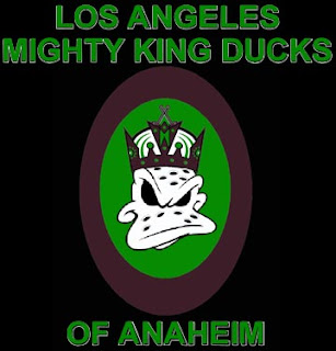
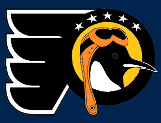
The Los Angeles Mighty King Ducks of Anaheim is pretty spectacular. But how about the Pennsylvania Flying Penguins? (No, I didn't make that up.)
Also we've got a morphed Minnesota Wild logo, making obvious use of the letters MW much to my disapproval.
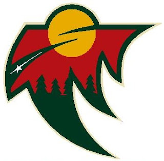
It's not like I don't appreciate the work put into this, but the Wild have a pretty awesome logo as it is. To do this to it has got to be considered heresy in some manner. Which reminds me...
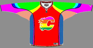
Yeah, it takes "Flaming C" to a whole new level. (No pun — or offense — intended.)

All right, yes the pun was very much intended.

Poll: Sabres vs Scouts


vs
Buffalo
SABRES
Kansas City
SCOUTS


REMEMBER: You're choosing the WORST logo!

The second round is now underway! Place your vote and then feel free to leave a comment as to how you came to your decision. Tell all your friends to drop in and vote! The more voices heard, the more accurate the results!

Poll opening date
Thu Jan 31
Poll closing date
Mon Feb 4

Poll: Blues vs Scouts


vs
St. Louis
BLUES
Kansas City
SCOUTS


REMEMBER: You're choosing the WORST logo!

Place your vote and then feel free to leave a comment as to how you came to your decision. Tell all your friends to drop in and vote! The more voices heard, the more accurate the results!

Poll opening date
Wed Jan 16
Poll closing date
Sun Jan 20

If They Were Still Around Today

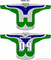
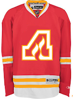
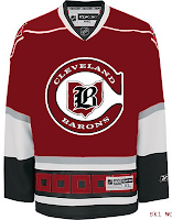
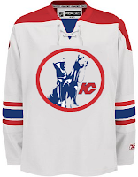
In today's concepts post, we'll be getting all nostalgic for the old teams that doesn't exist anymore. The fun part is we're going to take a glimpse at what some of those classic clubs might have looked like if they'd made it into the Rbk EDGE era. Just to make things easy, we'll go geographically from east to west.

Kicking things off in Hartford, how about a Whalers logo that covers the entire jersey?

The sweater on the right features the Atlanta Flames logo in a design borrowed from the Chicago Blackhawks. If that's not classic enough for you, remember the old Cleveland Barons? Here's what they might look like if they had hurricane flags wrapping around the waist.

And next to that is a Kansas City Scouts design sans the yellow in the flavor of the Phoenix Coyotes. Speaking of the Coyotes, enjoy this irony.

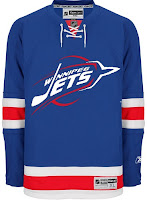
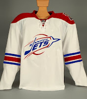
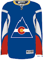
The Winnipeg Jets logo you see on these jerseys is a concept design that I posted a while back here on the blog. As you can see, these jerseys borrow from the New York Rangers and, ironically, the Coyotes. And we'll finish our trip westward in Colorado. Here's what the Rockies might've looked like in a uniform modeled after that of the Buffalo Sabres.

Don't forget that if you have any concept art you'd like to share with the folks here at NHLToL, you can always email me at nhllogos@gmail.com.