Canucks unveil quartet of new sweaters for 50th anniversary
/Vancouver Canucks home/road/alternate/throwback jerseys for 2019-20
On Thursday, the Vancouver Canucks surprised us with the reveal of the four new sweaters they'll be wearing during the 2019-20 season. The club's new look includes some nods to the past in what they call their 50th Season Jersey Collection.
There was no hype. No excruciating countdown. No advance notice at all.
The day after the 2018-19 season officially ended—with the St. Louis Blues miraculously hoisting their first-ever Stanley Cup—the Canucks wasted no time in getting fans prepped for 2019-20.
I kinda like that. Don’t make people wait. Just get right to it. Sure, it's taken me two days to get around to putting this story together, but I'm not complaining.
What makes this reveal interesting is that it's the first time we've ever seen an NHL club introduce four new sweaters for a single season. Though, I can see why some would argue there's not really anything "new" here at all. It’s all just a new spin on the past.
The Canucks are a team with a well-documented history of identity troubles. They've seemingly been through every color in the visible spectrum over the past five decades. And for better or worse, the team is embracing that to mark this major milestone.
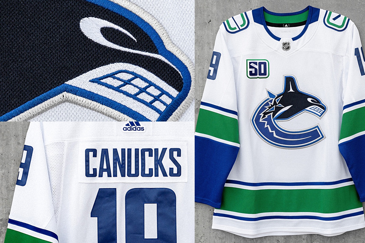
Let's start with a closer look at the primary home and road uniforms. The underlying construction of these jerseys hasn't changed—same colors, same striping and patterns. It's only the adornments stitched on after the fact that are changing—the crest and shoulder patches.
The arched "VANCOUVER" has been removed from the chest and the orca has been enlarged. The old stick-in-rink logo, used since 2007, has been replaced with a newly updated version.
These revisions may seem minor, but they're a big step toward improving the overall aesthetic of the Canucks. That said, there's still more that needs to be done.
The most glaring issue is still the fact that the club's logo and uniform bear two completely separate color palettes. You won't find green in the primary mark. You won't find midnight blue or silver on the sweaters. And the logo's First Nations art style is in no way represented in the striping pattern of the sweater.
These are the two most important brand elements and they're completely at odds with each other. I'm just a little disappointed they didn't take the opportunity to fix all of it at once. But that's the idealist in me.
The pragmatist understands why this happened the way it did. It's a lot easier in the grander scheme of things to make small adjustments. The jersey hasn't actually changed in any way—which saves money on manufacturing—nor has the primary logo—which saves money on everything else.
This is all just about giving a new feel to the same elements. And to be honest, it all looks just fine together. Sometimes, a few steps in the right direction is all you can ask for at one time. Perfection is just something to keep striving for even if you can never attain it.
The Canucks were one of the only teams to wear the same third jersey throughout Reebok's tenure with the NHL. From 2008 (when thirds were reintroduced) to 2017 (when Adidas took the reins), the modernized stick-in-rink jersey was a fixture. Given its popularity, it only makes sense to bring it back in some fashion.
For 2019, we get a new underlying design, more closely based on the 1970 jersey that inspired it. In fact, the Canucks are calling it their "Heritage" jersey. In those early years, the blue logo was only worn on the white jersey while a white version was used on the blue sweater. But from 2008 to 2017, it was blue on blue. That gets rectified now.
This version also gets the thick green double-stripes from that inaugural jersey, but without the white accent line between them. I'm not sure why they ignored that. I'm a little worried about the lack of contrast between the green and blue on the ice. But that’s just being nit-picky.
The updated throwback logo is a gem! If you look closely, you'll notice that the angle of the stick has been altered and the green outline made thicker, both of which emphasize the "C" shape. Plus, the white-on-blue just stands out so much better.
Another interesting element of this sweater is the upgraded number system. It employs the same Agency-style font as the primaries, but there's now a perforated pattern in it that's meant to represent the West Coast rain. The sleeve number have also been widened to be easier to read.
There’s also a “hanger effect” treatment in the collar that reads, “We Are All Canucks”—a slogan used frequently by the organization. The only big drawback for me is the thick white collar. You’ve got green stripes all over the rest of the sweater but no green in the collar? Feels like a mismatch.
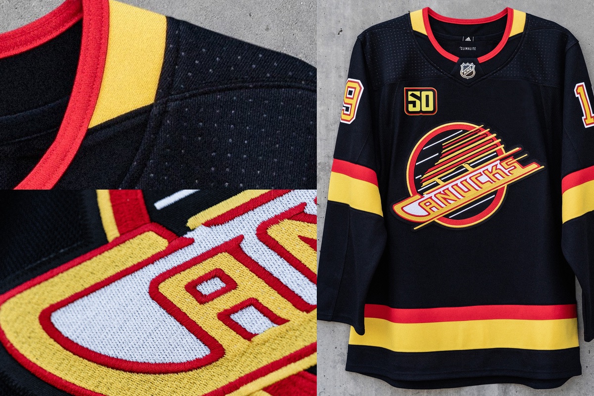
The last of the four new sweaters is the least surprising. The Canucks held a fan vote last summer to determine which throwback would see a few games during the 50th anniversary season. Overwhelmingly, the Black Skate design was chosen over the Flying V and Original Orca options.
If you subscribe to the theory that fans tend to prefer the look they grew up with, this makes sense. I would guess Vancouver's core fan base are in their 30s and 40s, meaning they came of age in the 1980s and '90s when this jersey was in use.
Most recently, the Black Skate made an appearance during the 2015-16 season for a Retro Night during the 20th anniversary of Rogers Arena. Before that, we hadn't seen it on the ice since 1997.
Vancouver Canucks 50th Anniversary logo suite
All four jerseys will be adorned with a special patch to mark the franchise's 50th anniversary. It's a blue "50" outlined in white and green—except on the throwback jersey, where it uses the retro colors.
According to the Canucks' website, "a complete jersey schedule" will be released after the NHL announces the 2019-20 regular season schedule. That should be here before the end of June. What we do know is that the blue Heritage jersey will be worn for 10 games while the Black Skate will see action in three.
And with that, I can't think of anything more to say about the Canucks or their new sweaters. So I'll leave it to you!


