Adidas reveals eco jerseys for 2019 NHL All-Star game
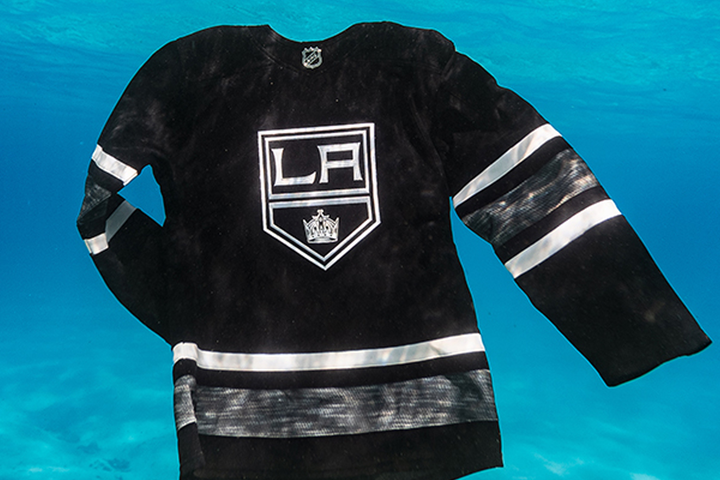
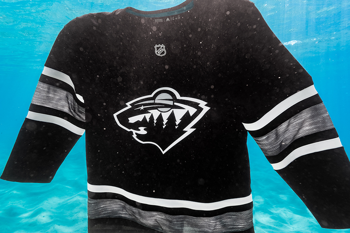
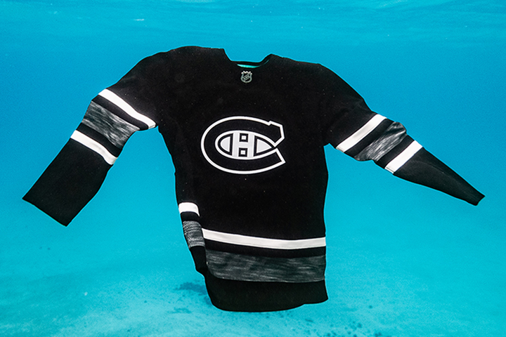
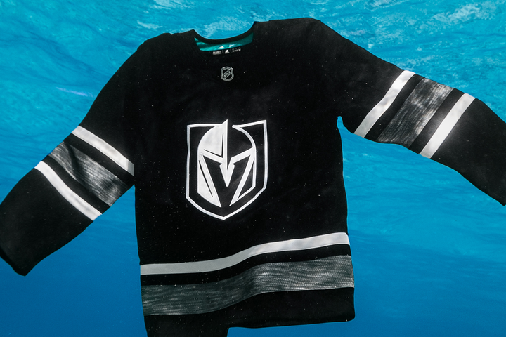
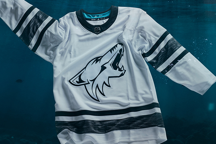
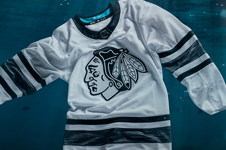
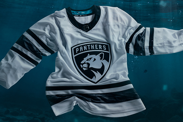
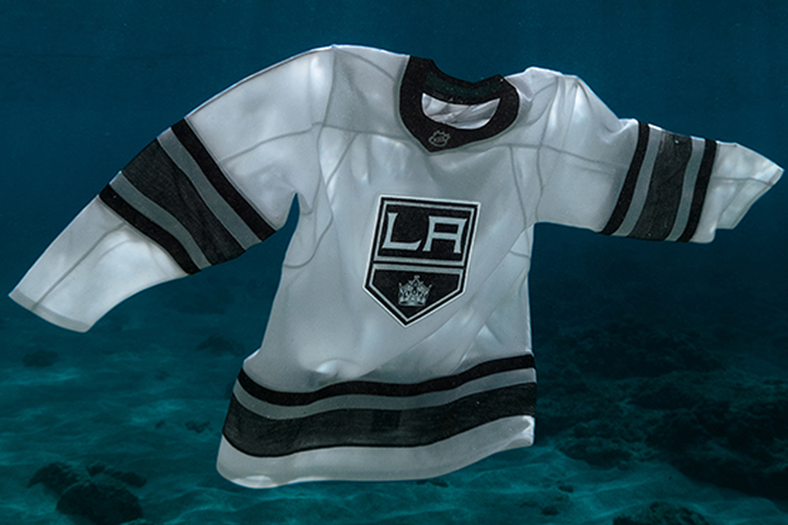
/This morning, the NHL and Adidas unveiled the jerseys to be worn at the 2019 NHL All-Star game in San Jose later this month. The highlight of uniforms isn’t the design so much as the way in which they’re manufactured. Adidas partnered with an organization called Parley for the Oceans to use “repurposed” and “upcycled” materials — debris from the sea.
If you felt like the teaser images Adidas released earlier in the week didn’t leave much to the imagination, you might be excused for wondering just how much imagination went into designing the jerseys in the first place. I don’t mean to be sour, but I, along with most hockey fans, have become accustomed to the NHL going a little wild with All-Star sweater design — including separate designs for each of the four divisions the last two years. This year seems to be a complete 180 from that. Two dull jerseys.
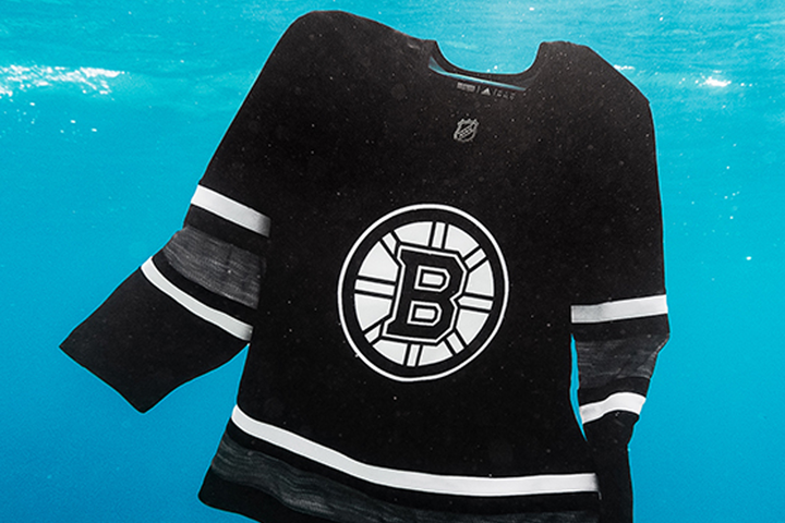
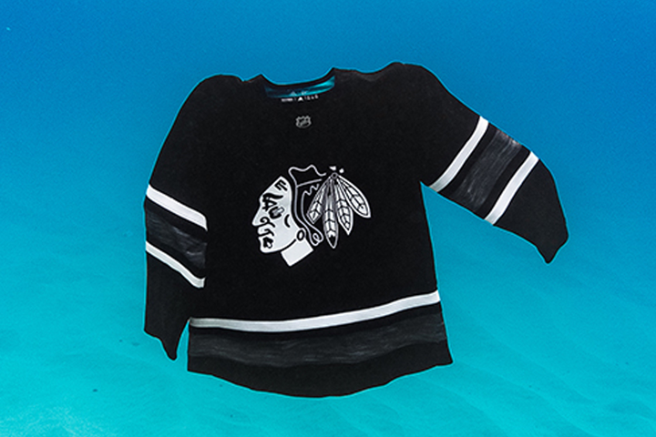
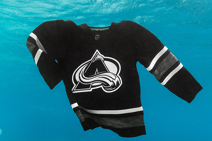
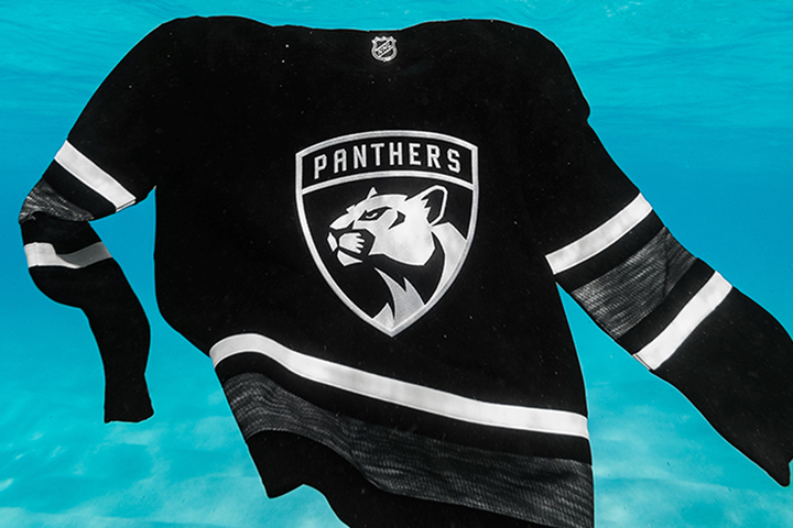
Basically, each All-Star player will have a black jersey and a white jersey with a monochromatic version of their individual team crests. There is no visible color in any of the jerseys. I say “no visible” because there is some teal inside the color that can’t be seen when the jersey is being worn.
Here are all the black versions. Click to enlarge or scroll down to see the white ones.
The one that looks most out of place the Rangers with that shield on the front. Here are the whites.
While the design feels like an afterthought, I am intrigued by the idea of using recycled materials to create hockey jerseys. So many have to be manufactured every year and if we can clean up some of the pollution in our oceans while creating game-worn collectibles, who could complain about that?
Yet I’m torn. I love the idea of environmental responsibility in jersey production, but here it clashes with my love of great hockey sweater design. What Adidas seems to be saying is we can have one or the other. Not both. I find that hard to believe, but here we are.
Sure, Adidas defends the monochrome design by saying it’s “inspired by the colors of the game — crisp white, like a fresh sheet ice and contrasting black, like a brand-new puck.” But that’s a tough sell when you consider they brought the exact same palette to the MLS last year. (Yeah, I get that a soccer ball is black and white too, but really?)
The Adidas press release goes on to say that “the environmentally-conscious uniforms create an instantly classic aesthetic that pays homage to tools of the game” — proving that “instantly classic” is the oxymoron that you sense it is. If I was being an ass I’d call them “instantly disposable.” Which is maybe part of the point.
To some fans, the NHL All-Star game is a disposable event. Why not make the temporary jerseys out of garbage? Only the jerseys aren’t disposable. They’re not eco-friendly in the sense that they’re biodegradable. You can’t, for example, throw them in the ocean in the way they’ve been showcased in the promotional photos above. They’ll be there for as long as the plastic bottles they’re made from.
I love seeing an artist create something beautiful out of junk or found materials. That was the opportunity here. Adidas could’ve put every NHL All-Star into — I don’t know — a bright pink jersey if they’d told us they’re made from trash that’s no longer killing baby seals. Instead, an old adage comes to mind: “garbage in, garbage out.”
All right, all this negativity is fun to get off my chest, but the truth is there’s stuff to like about this year’s All-Star set. The striping may be a bit boring, but they tried to liven it up a bit with that heathered pattern that was such a hit on the Team North America jerseys at the 2016 World Cup of Hockey. Credit there.
Each player’s individual team crest is a great touch! I’d love to see that repeated in future All-Star games. I don’t even mind the black and white that much, to be honest. I almost prefer it here. Take the color out and maybe it helps a little when you have to high-five a division rival after a goal. Plus, if I buy a Nikita Kucherov All-Star jersey, I get to have a Lightning logo on the front instead of a generic NHL shield.
Hm, after two paragraphs I seem to have run out of compliments. I’m sorry, I mean even the name and number fonts on the back are as generic as they come.
And couldn’t we have a little bit of color? A small accent here or there beyond the shoulder patch? The NHL has made such great strides in recent years to get away from all the black and navy blue jerseys that used to fill the benches. It’s a colorful league. Showcase that at All-Star Weekend!
I may have mocked the highlighter yellow and traffic cone orange from last year’s All-Star jerseys, but I’d take them in a heartbeat over the boredom we were served today.
So, here we are at the bottom. I don’t normally do grades, but I’ll do it here. I’ll give them an “A” for trying to protect the planet for future hockey fans. I’ll give them a “D” for the blandness of the design.
What do you think?

