Best Concepts: Top 15 of 2015
/Four years running and we haven't missed a beat. Regular readers have been finding new reader-designed jerseys and logos on the Concepts page every single day since 2012. As we embark upon a new year's worth of fan art, let's look back at the best of 2015.
15 · Tristan Mani: Le Bleu
The countdown kicks off with something never before seen in the NHL — the Canadiens in blue!
Tristan Mani has been working on a series of alternate jersey concepts for a handful of NHL teams. In October, we got to see how easy it would be for the Habs to have a brilliant third. All they'd need to do is swap the bleu and rouge of their home sweater.
"Would love to see this happen. It's a beaut!" —Jaden Lane
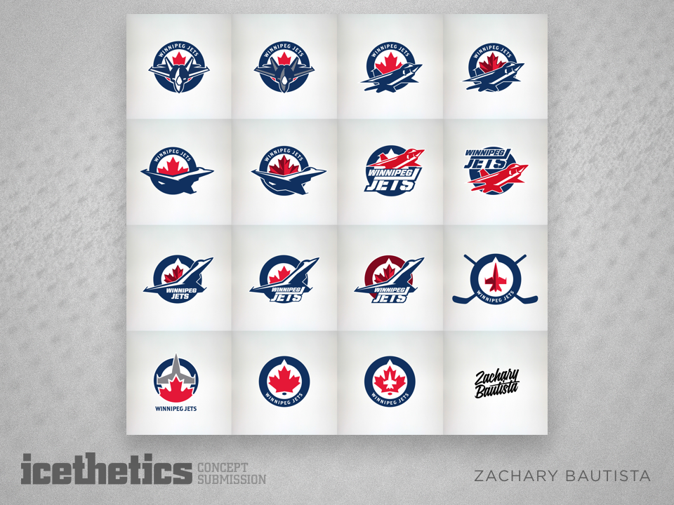
14 · Zachary Bautista: The Jets Package
Zachary Bautista has only ever made one contribution to the site, but it was easily one of the best of all time.
He set out to improve upon the Jets' existing branding in March with a variety of stunning logo designs.
"Literally all of these look better than what they currently have. Brilliant work!" —Cameron Miles
13 · Hayden Duench: Pitchforked
The minor leagues haven't always gotten a ton of love from the Concepts page. But that changed this year when I started Minor League Sundays.
Now we focus on a farm team at least once a week. And it was newcomer Hayden Duench with his unique take on the AHL's Albany Devils in December that was one of the best.
It may not have garnered much in the way of comments, but it earned plenty of five-star ratings.
12 · Nick Burton: Fixing Washington
Nick Burton is no stranger to our annual countdown — he had five of the top 14 concepts last year. This time around he's being honored for sharp yet subtle Capitals concept.
In November, Nick created a new home and road set that combined styles from the team's past and present.
One comment was very fitting:
"This should be a concept of the year nominee. It's that good." —J J Anderes
11 · Matt McElroy: Holiday Spirit
It wouldn't be a proper "best-of" countdown without an appearance by the talented Matt McElroy. Regular visitors have watched him hone and evolve his skills over the years.
Now for the fourth year in a row, Matt's "ugly" Christmas sweater design is, well...
"Best one yet, Matt!" —Richard Morin
10 · Jamie Robertson: Colorado Classic
Jamie Robertson has been submitting concept art for a few years now — but if you ask me, 2015 was absolutely his breakout year.
Jamie debuts on our countdown with this post from September after being inspired by Colorado's new third jersey crest. He created a gorgeous home and road set based on that logo.
"This is a look that will last through the ages! The color scheme really suits them well. They need to update to this look ASAP!" —Johnny Cortese
9 · Dylan Nowak: Milwaukee Makeover
We rarely see work that is less than brilliant from Dylan Nowak (formerly credited as Wonka) — but this design from September earned him his first-ever appearance in our countdown.
After the AHL's Milwaukee Admirals unveiled their new branding, Dylan wasn't a huge fan of the jerseys — so he just made them better.
"THIS is why Milwaukee needs an NHL team." —David Lemley
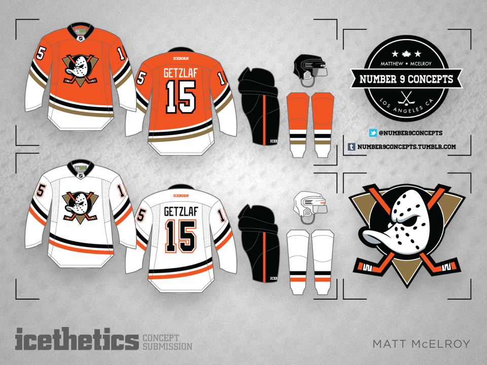
8 · Matt McElroy:
Mighty Bronze & Orange
Well before the Ducks' new orange third jersey had been leaked, Matt McElroy submitted a design, posted in June, that would earn him another place on our list!
Turns out he was definitely on the right track in terms of predicting the future. The question now is how long before the team adopts a white version?
"This concept is PERFECT in every sense of the word. The Ducks must adopt this NOW." —Paul Gheduzzi
7 · Dylan Nowak: Retro Rochester
Halfway through our countdown, Dylan Nowak makes his second appearance with another AHL concept.
The Rochester Americans are celebrating their 60th anniversary this season. But back in May, Dylan got the ball rolling early with retro jersey ideas.
"The Amerks will always have the classiest uniforms in all of sports. This is a great concept." —Jeffrey Thunders
6 · Brian Brideau: Inverted Ducks
When the Ducks finally revealed their new third jersey in October, Brian Brideau was inspired to create a white version.
The old Mighty Ducks logo may never fully return, but the fact that this was one of our most popular concepts of the year suggests the team should probably consider it.
"The Ducks need to bring back the Wild Wing logo! Works great with the current color scheme." —Antoine Desormes Jr.
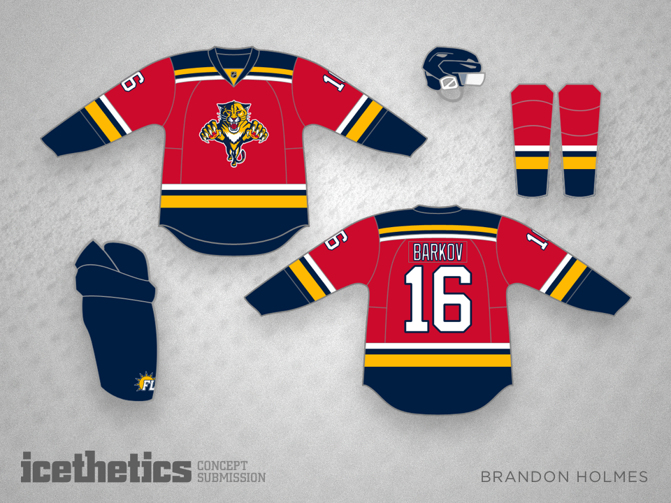
5 · Brandon Holmes: Cat Trio
As we near the finish line, Brandon Holmes is about to make history. He's never been featured in our annual countdowns — but the fifth-best submission of 2015 won't be his last.
Brandon's home/road/third set for the Panthers was shared December just before we learned the team is about undergo a complete overhaul. But given this ranking of a design inspired by the team's original look — maybe they should think twice.
"Now someone needs to send this design into the Panthers front office. This is incredible. Great job." —Jeffrey Thunders
4 · Nate Fein: 25 in the Shark Tank
Sharks fans have long-professed their love for their team's original uniforms. This year they got a treat when the club brought back that first teal jersey for a handful of games this season.
But in June before we knew that was really happening, Nate Fein showed us just how cool they could look.
"Perfect! Get the factory on the phone!" —Corey Fischer
3 · Justin Cox: Colorado's 20th
Justin Cox last appeared in our countdown in 2012, but when it comes to his own team, there's no way he doesn't knock it out of the park.
This Avalanche set from June was absolutely one of my personal favorites — and obviously a large number of readers agreed.
This design wasn't just the third highest-rated of the year — it was also the third most-viewed!
"These are perfect. The first Avalanche jersey concept in their entire history that I would rank in the top 10 in the NHL." —Joe S.
2 · Brandon Holmes: Super Senators
Brandon Holmes earns another spot on our countdown with a truly brilliant home/road/third jersey set for Ottawa posted back in May.
And by the way, the Senators have now shown up every year on our list of the best concepts of the year.
Icethetics readers are designing some amazing Sens jerseys — so why are the team's actual jerseys still so terrible?
"Amazing. Best concept I have ever seen to be honest." —Ben Jones
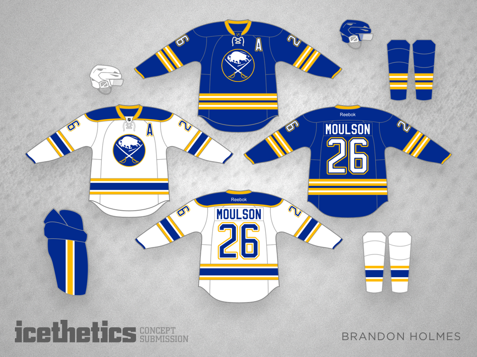
1 · Brandon Holmes:
Want All the Money, Buffalo?
At last we've reached No. 1 and your eyes are not deceiving. For the first time ever, a single artist has claimed three of the top five positions in our countdown!
Brandon Holmes' home and road set for the Buffalo Sabres from August was the No. 1 highest-rated concept of 2015!
Turns out readers agreed when I suggested these sweaters could be big sellers. I get the impression the team would have a hard time keeping them in stock.
"All the yes. I would buy both these in a heartbeat. They are perfect." —Andrew Cottrell
There it is. Another outstanding year of concepts on Icethetics. Keep them coming!
By the way, the top two concepts were the first two I've ever seen with an AVERAGE of five stars after 400 votes. Simply outstanding.
Of course this list always gets me thinking. Knowing how popular some of these designs are, why don't these teams try them out — even just as a third jersey? Given the fact that the Sabres and Senators keep showing up on our countdown, I think those two teams really need to look at new, more traditional jerseys. And quickly!
What do you think of this list?
MORE BEST CONCEPTS: TOP 14 OF 2014 | TOP 13 OF 2013 | TOP 10 OF 2012


