
Designing the ’90s NHL, Part 3: Epilogue
/Before you dig in, first catch up on Part 1 and Part 2.
What began as a feature on an unused Flyers third jersey design took me in unexpected directions. Exchanging emails with Ken Loh over the weekend got me thinking a lot about the jerseys and logos the NHL introduced in the 1990s.
PUT SOME TEAL ON IT
The decade welcomed nine expansion teams, including a pair in 1993 — one of which was the Florida Panthers. To my surprise Ken and The Mednick Group also worked on proposals for them. These logos have never been seen outside that circle before today.
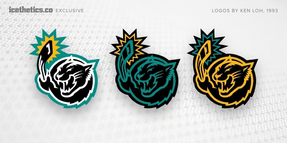
These designs reminded me of a Miami Herald article from 2010 by George Richards.
Bill Torrey said he had to fight with then-owner Marti Huizenga regarding the team's colors and uniforms back in 1993. Said she preferred the Marlins black-and-teal color scheme, which then, was all the rage.
That quote is finally validated visually with this work which demonstrates exactly how black and teal might have been used. But Ken admits he was not particularly proud of it.
I’m actually really glad that never saw the light of day since I felt it was too cartoony. I much preferred the simpler, more emblematic approach which, [in my honest opinion], had better potential for a longer lifespan.
However, I was a lowly designer, pretty fresh out of school at the time and, despite my credentials of having come to the agency with the New England Patriots work under my belt, I didn’t really have much pull back then.
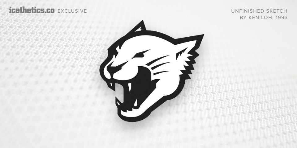
Ken opposed incorporating a hockey stick into the design. Above you can see an unfinished sketch he shared — a version of the panther without the stick.
Other concepts from the Panthers' logo design process can be found on display these days in the team's arena in Sunrise, Fla. On the wall are framed drawings of early sketches.
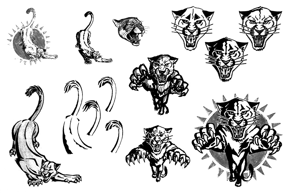
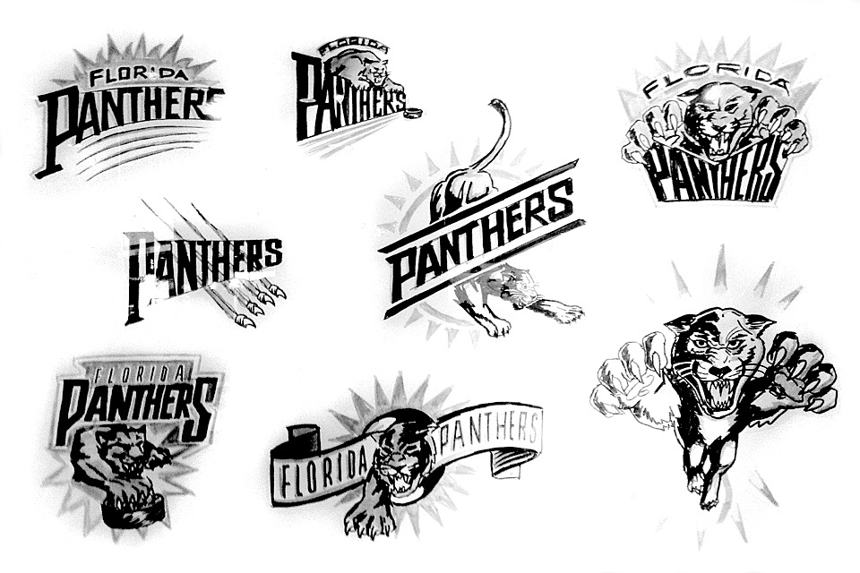
My thanks go to Drew Goldfarb and David Silverstone for providing the original photos.
SURVIVING THE ’90s
The Panthers aside, I starting thinking about how many new logos were introduced during that most design-challenged of decades. How many are still around? The period was notorious for trendy designs that lacked staying power. Is that a fair judgment?
So I went back. Back to black. When many of us think back hockey design trends of the '90s, we conjure a simple but derisive acronym: BFBS — black for black's sake. In 1989, four NHL teams wore black jerseys. A decade later that number had tripled — 12 out of 28 teams had a black sweater in their arsenal. Let's begin there.
Be sure to click through the logos and read the captions as they offer insight into the designs as well as the years they were introduced and subsequently jettisoned.
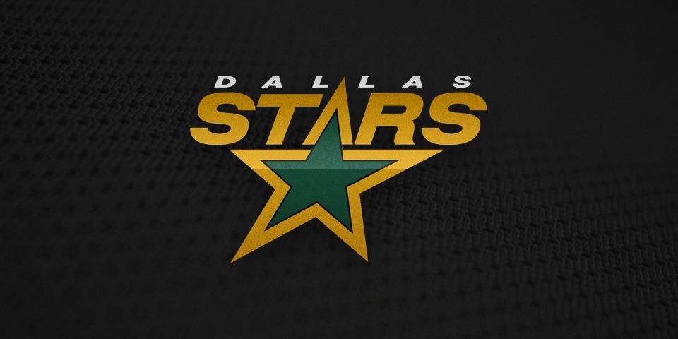
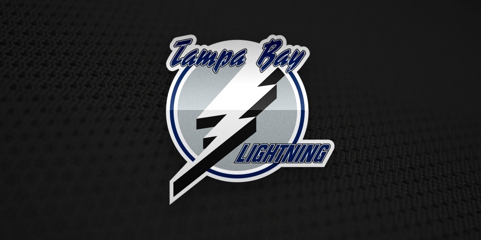
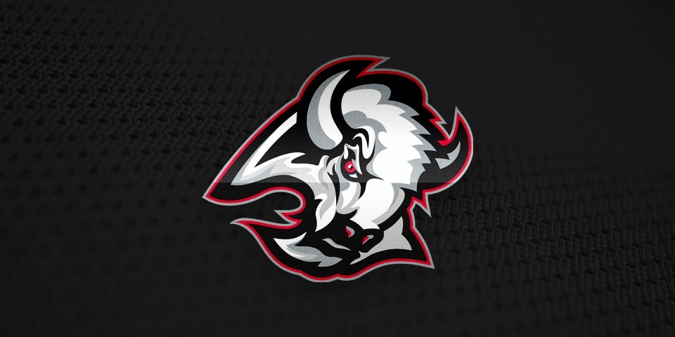
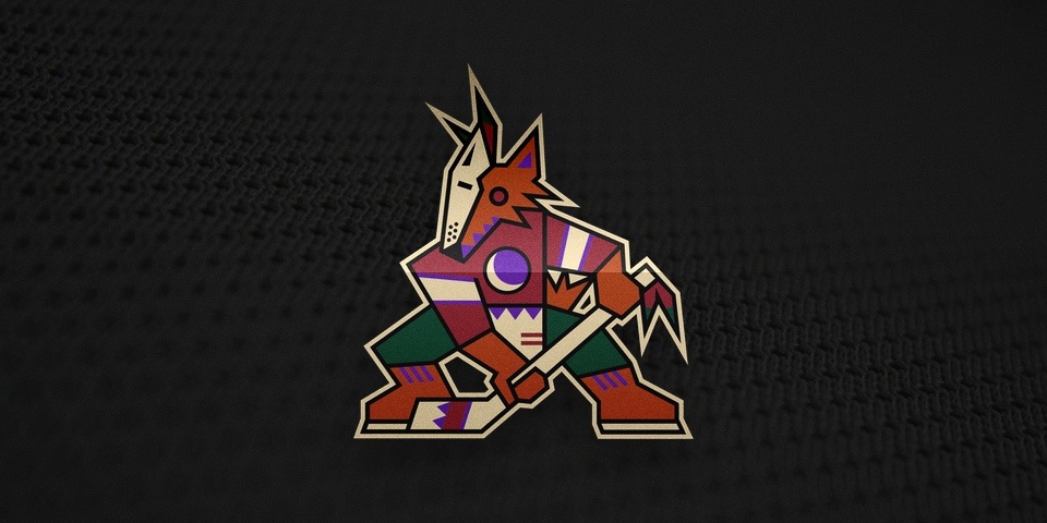
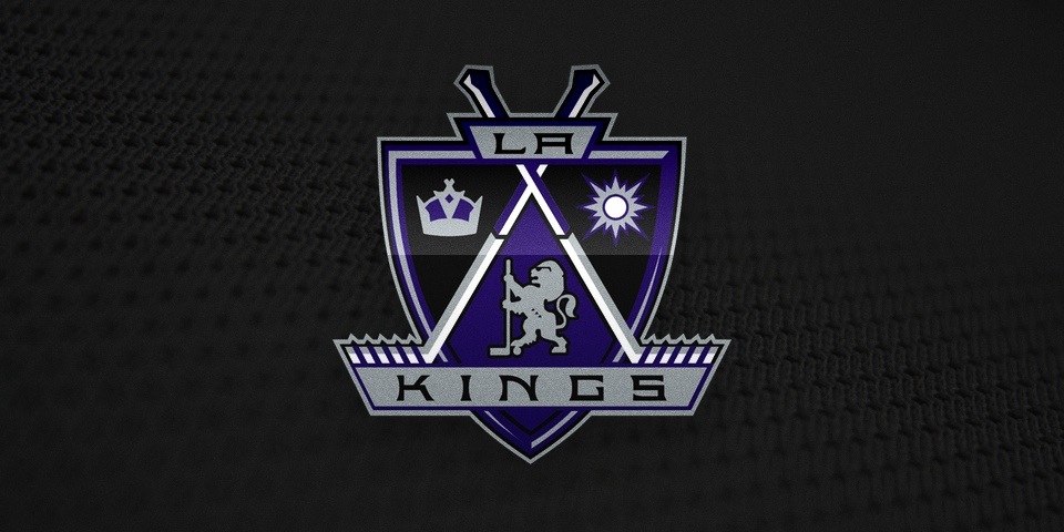
Teams like Coyotes, Kings and Sabres suffered through some unfortunate designs at that time. Others like the Lightning and Stars were just plain boring and lacking in any sense of style — good or bad. But don't start thinking the non-black jerseys were immune.
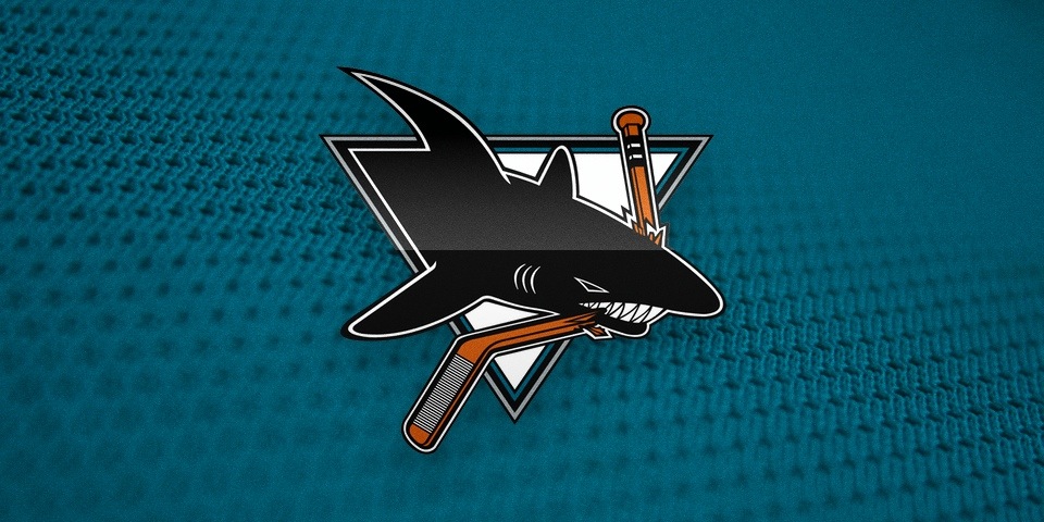
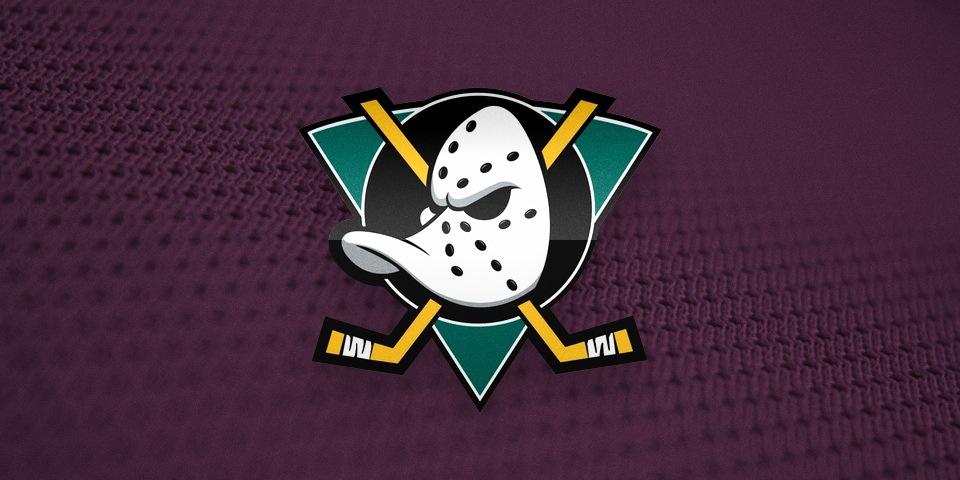
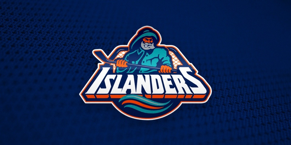
In fact, these were some of the worst offenders of the '90s. Look at them all. What do they have in common? Ken Loh said it. The hockey sticks. Only someone who isn't a hockey fan would do that to a team logo.
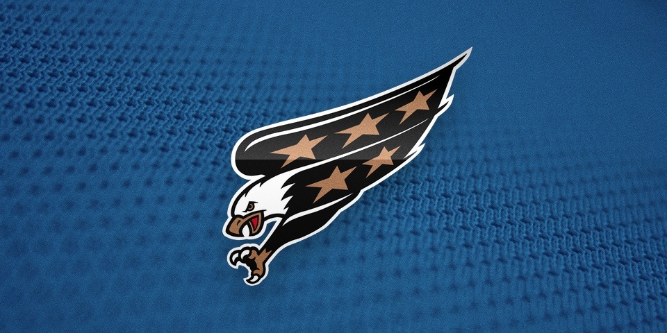
And while the Caps logo above may not have a stick — though the secondary mark sure did (a lousy puck, too) — I'd bet money those open claws once held a stick at some point during the design process. Kudos to whoever forced that eagle to release it.
I'm certainly making the '90s out to be like the Dark Ages of hockey logo design. But truthfully, it wasn't all bad. Some logos are still around — after a bit of nip and tuck.
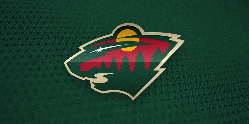
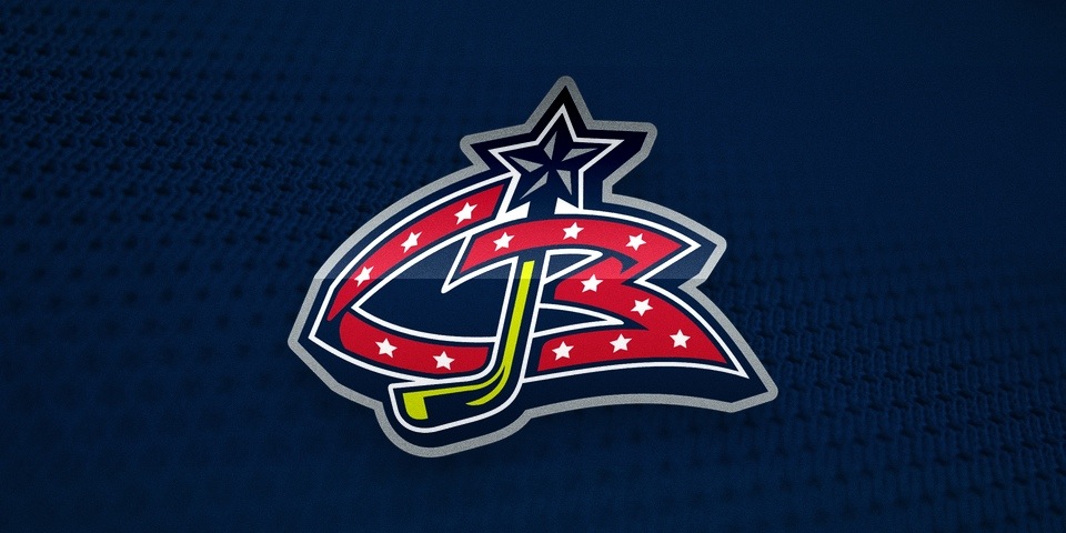
Perhaps more fascinating were two of the last logos to come out of this decade. The Minnesota Wild and Columbus Blue Jackets didn't play their first games until 2000, but their logos were absolutely products of the '90s — though they couldn't have been more different.
Have I warmed you enough yet to the idea that not everything produced in the 1990s was bad? Because it wasn't. There are a handful of '90s NHL logos I haven't mentioned here. You know what they are. I held them to the end for the catharsis.
Let's bring it full circle. Back to the Sunshine State.
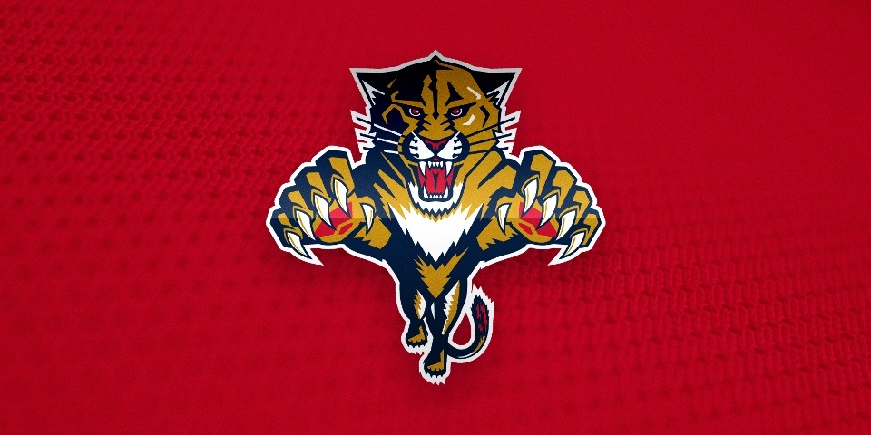
See? There were some gems. Granted, the majority were flops. Of the 20 logos that debuted in the 1990s, 15 did not live to see drinking age (21, I mean). But the ones that did deserved to. Survival of the fittest, you might say.
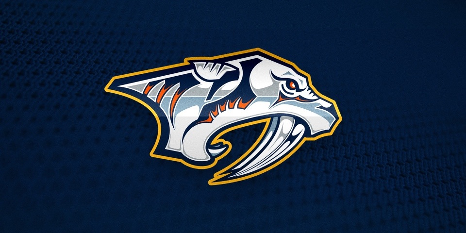
But didn't I just berate the Sharks and Predators for being too intricate? Why do I suddenly love the Panthers logo? Look closely. The difference is in the details. For Florida, it adds to the animal ferocity. It adds to the design — rather than detracting from it.
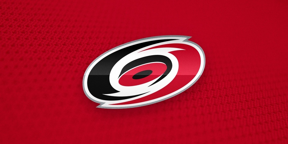
The Hurricanes logo was designed by a copy writer and hides a hockey puck at its core. Cardinal sins? Maybe, but you try to do better. No one else has yet. And there's been ample opportunity. So I'm happy to see it entering its 18th year. Stick tap to Peter.
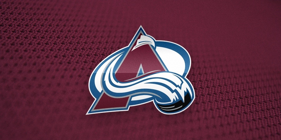
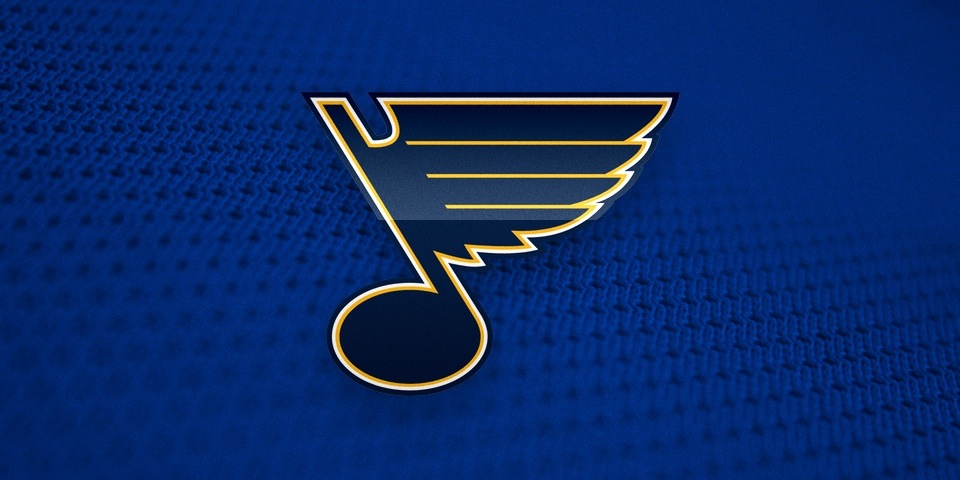
As for the Avs and Blues, well there's simply no way to improve upon perfection. Period.
I grew up in the '90s and it's sometimes hard for me to fathom that it was two decades ago. I still feel like a kid most days. Time flies. But here's the thing. I was the target audience for those trendy designs back then. And now I do this. So was it successful marketing after all?
You be the judge.