Springfield marks 20 seasons with a few theme jerseys
/We'll get back into regular blog posts today with the AHL's Springfield Falcons, who are in the midst of their 20th anniversary season. To mark the occasion, they've sported a handful of theme jerseys throughout the season. Let's take a look.
Hometown Heroes Night
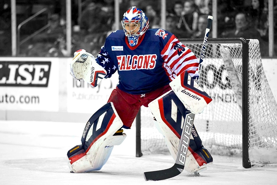
Over Veterans' Day weekend, the Falcons celebrated their hometown heroes with a very patriotic sweater. It was a blue jersey emblazoned with stars on the right sleeve and a field of red and white stripes on the left sleeve. Both shoulders feature the team's 20th anniversary logo.
It's hard to deny this one's pretty ugly. The sleeves are what do it. The numbers there are barely readable. And what's with the generic text on the chest? I'm just not a fan of this one.
That aside, on Fri., Nov. 8, the Falcons hosted the Adirondack Phantoms to the tune of a 3-0 shutout victory. Even the ugliest of jerseys looks a little better with a solid win.
20th Anniversary Night
On Sat., Jan. 18, the Falcons celebrated their 20th season with a special set of blue jerseys. Now these I can get behind. There's nothing special about them, but it's a solid, traditional sweater design.
Front and center on the chest is the anniversary logo — nothing special about it either. But what I really like is the original Falcons logo used as the patch on the right shoulder. The current primary logo, which debuted in 2010, is on the left side.
As you can see from the photos, the Falcons faced the Providence Bruins — wearing yellow from top to bottom, helmets included. Springfield managed a 5-3 win, improving to 2-0 on theme jersey nights.
Pink in the Rink Night
The Falcons wore their third and final theme jersey of the season last week. It was Pink in the Rink Night at MassMutual Center on Sat., March 1.
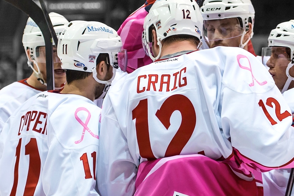
As pink jerseys go, this set stands out for its unique ribbon. The design, featured in small form on the shoulders and large form near the waist, creates crossed hockey sticks at each end of the ribbon. Teams don't usually tend to be that clever with these jerseys.
The crest is a pink-infused version of the 20th anniversary logo and some sweeping ribbon-like stripes wrap around the waist. It's one of the nicer pink jerseys I've seen this season.
According to the Falcons' promotional calendar, that does it for theme jerseys in 2013-14. Which of the three was your favorite? Vote in the poll on the right or leave a comment below. Or both!

